Unseen photos by Brian Griffin capture intimate side of Depeche Mode in stunning new book
Photographer Brian Griffin has collaborated with paper specialists Fedrigoni Group and design studio The Cafeteria to publish Mode, an incredible new photo book containing unseen images of Depeche Mode taken in the 1980s.
Printed by Pression, Mode is a highly-anticipated release that started as a Kickstarter campaign. After gaining traction courtesy of eager Depeche Mode fans, the book smashed its fundraising goal and has gone on to help produce the initial run of 1,250 copies.
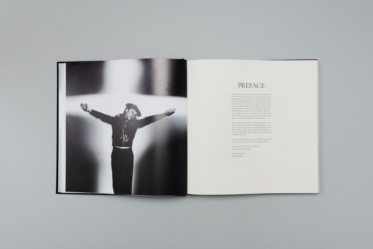
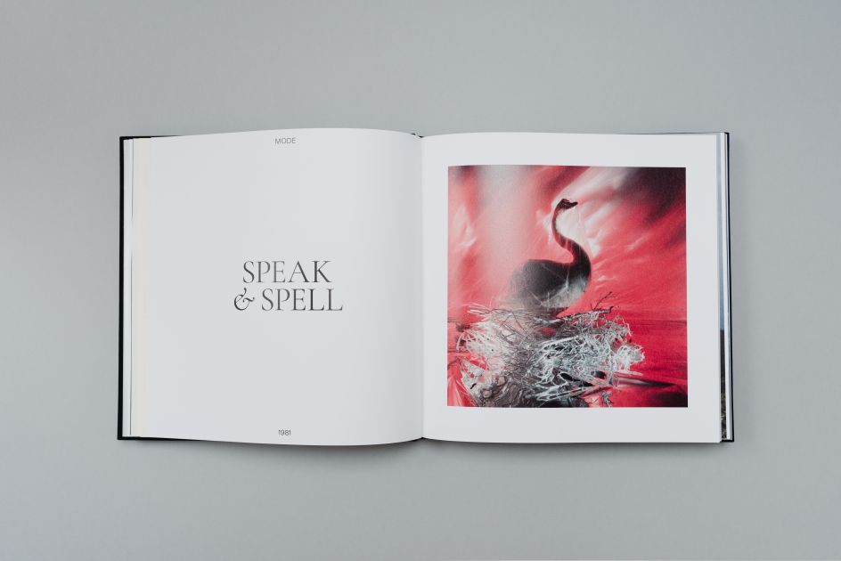
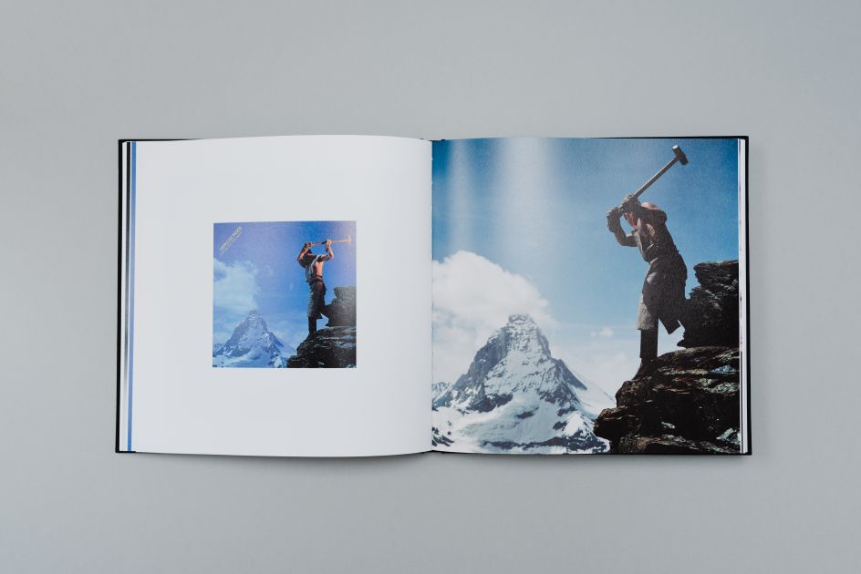
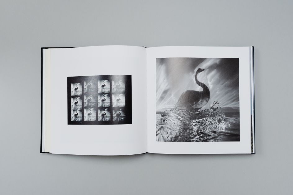
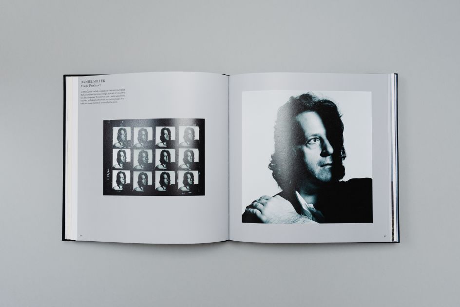
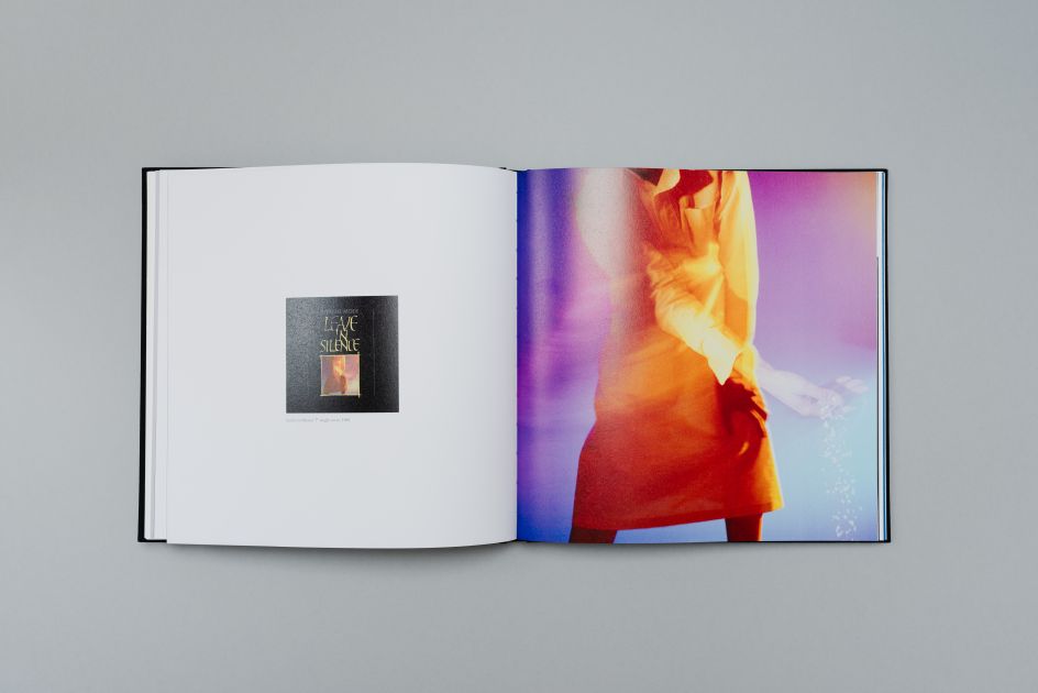
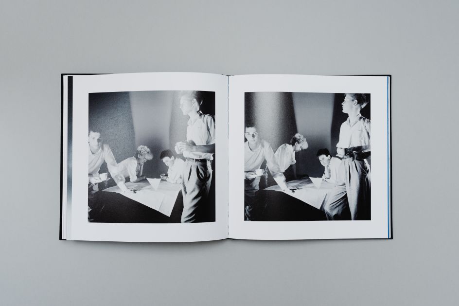
Its success and popularity are because it contains previously unseen images of the band taken by photographer Brian Griffin. These pictures offer a unique glimpse into the early years of Depeche Mode and provide an intimate portrait of a band that was finding its feet.
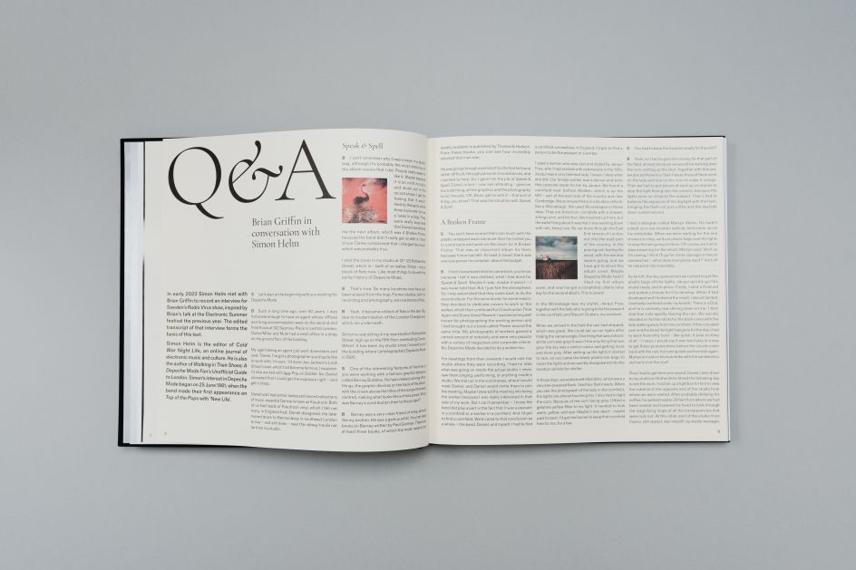
Even before it hit Kickstarter, though, the idea for the book came from a conversation between Brian and his friend and music producer Vaughn George. This discussion led to Brian reflecting on his work and eventually developing into an interview with music journalist Simon Helm, which became the book's introduction.
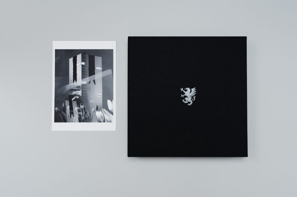
Printed on Fedrigoni's Arena Ivory Bulk and Symbol Tatami White, MODE is a beautifully designed book that shows off Brian's photos at their best. The uncoated Arena Bulk gives the text a warm, tactile quality, while the high bulk and matte finish of Symbol Tatami allows the images to pop with exceptional clarity and definition.
"This is a complete collection of Brian's Depeche Mode photography, so it has the potential to be a collectors' piece", comments Designer Julia Whalley from The Cafeteria. "The material choices reflect that sense of wanting to make it special, almost archival in feel."
Unlike conventional papers, the slightly creamy finish lends the photos a certain depth and seriousness often associated with a classic art publication. This was a deliberate choice because it was felt that, while Depeche Mode is a 'pop' band, a glossy paper might have given the book too much of a disposable, magazine-like aesthetic.
Brian Griffin added: "Having worked with bulky papers before, I knew I wanted the same feeling for Mode. The book is designed to be a historical document from the '80s, so my vision was to embody the era through the design.
"I've worked with Catherine Carley and The Cafeteria team before, and so I knew they could provide the same level of attention to detail when creating Mode."
The Cafeteria were also familiar with what Fedrigoni could offer, leading to a finished product that played to everyone's strengths. "We had shown Brian Symbol Tatami samples previously, and it impacted him, so it was always in the mix when finalising papers for Mode," explains Catherine Carley, Managing Director at The Cafeteria.
"Texture and contrast were very important in our decision-making. The overall book needed to feel inviting and special, from solid black cloth-bound cover turning into metallic end-pages leading into the softer inners full of rich content.
"The contrast in colour and texture as you switch from Arena Bulk to Symbol Tatami helps define the content and adds another layer for the senses to enjoy. Getting the right combination and balance between the text pages on Arena Bulk and the image pages on Symbol Tatami was essential to creating the right aesthetic for the book."
Ambra Fridegotto, marketing manager at Fedrigoni, commented: "Fedrigoni is proud to have been the paper of choice for Mode. We have a long-standing commitment to supporting the arts; we're delighted with the results of this collaboration with Brian Griffin and The Cafeteria."
Mode is available to order from the Vaughn George website.
Editor's Picks


Trending


](https://www.creativeboom.com/upload/articles/86/862919952c0ad18439004228895a431dc6e45ffc_732.jpg)
Podcasts


Editor's Picks
Further Reading