Brighter Later: Lettering and typography at the British seaside to be celebrated as the clocks spring forward
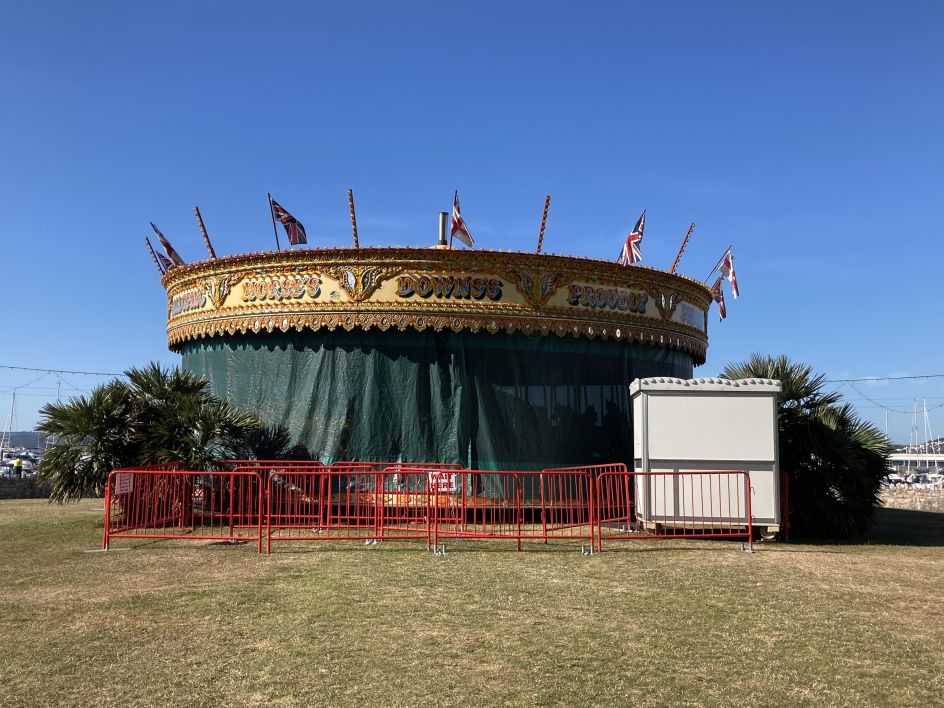
For those who share a love of graphic design and the British seaside, an inspiring walk around Blackpool this spring promises to uncover its hidden typographic gems.
Hosted by Sarah Horn, designer at studio.build and author of En-Suites Available, along with Justin Burns, Head of Art & Design at Leeds Beckett University and researcher of British seaside typography, the tour on 14 May will begin at the Comedy Carpet, then lead from the promenade onto the adjacent streets and deep into the seaside city. It will showcase a selection of favourite signs from Sarah's critically acclaimed book, alongside insights, and historical references by Burns.
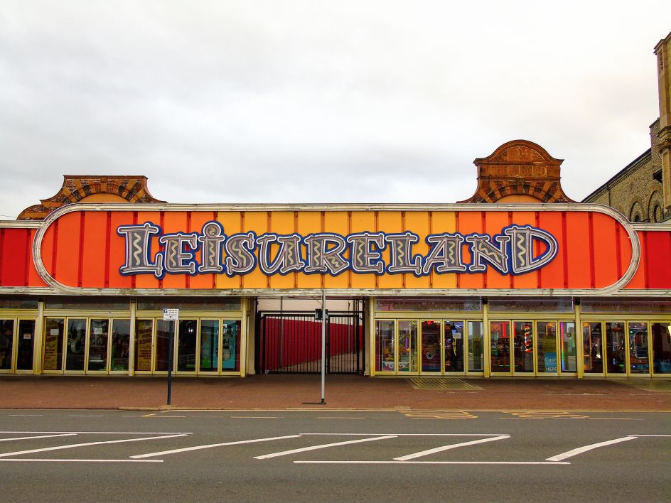
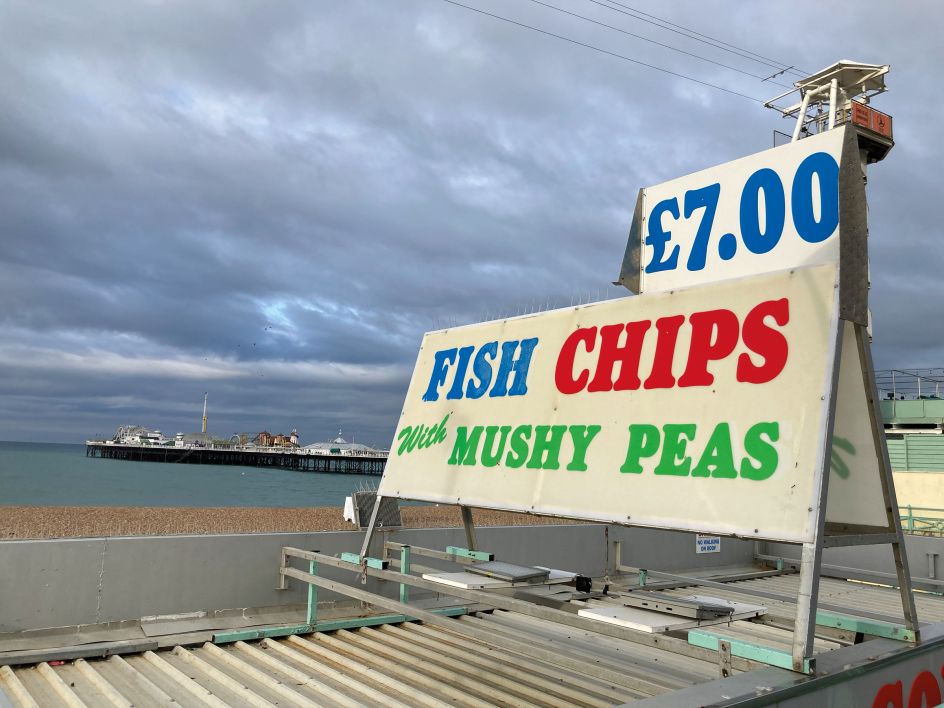
Speaking of his love of the British seaside, Justin says: "The waft of salt and vinegar in the air, the bright lights and neon sounds entice us to the piers, seafronts and harboursides. Alongside these sensory experiences, our visit to the coast is informed by the discipline of graphic design – and, in particular, lettering and typography – playing a significant role in the identity and promotion of resorts. Inscribed, painted, or fabricated letterforms visually package our trip to the seaside and form the expected visual aesthetic."
In his ongoing body of work, Justin explores the relationship and importance of graphic design in the built and natural environment of the seaside. "The work has resulted in the visual mapping of the origins of some of the most recognised letterforms along the promenade," he explains.
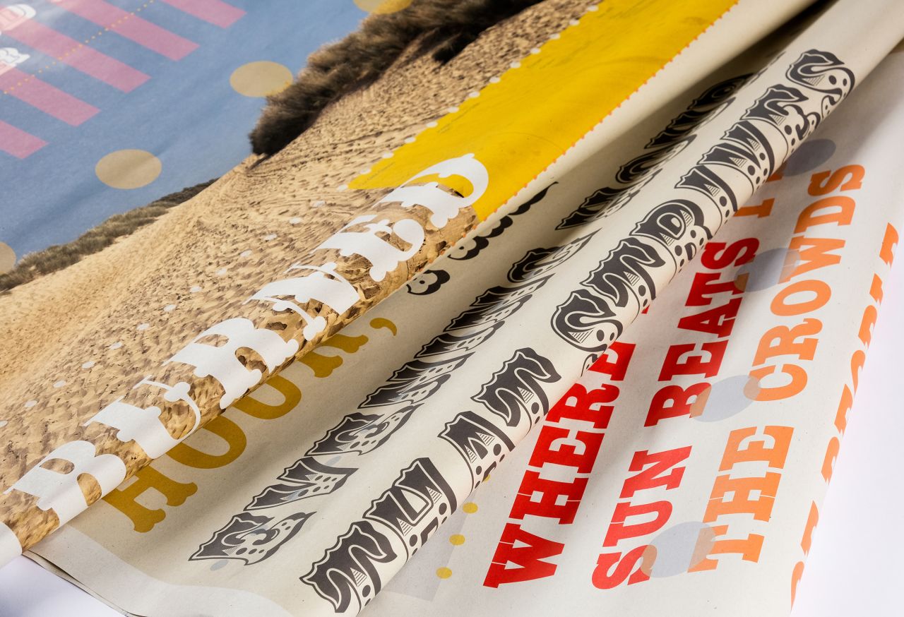
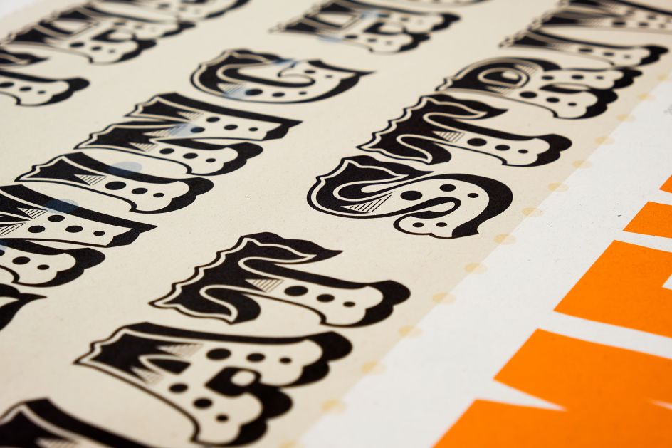
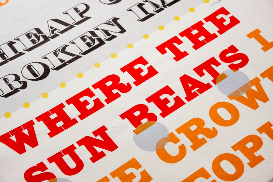
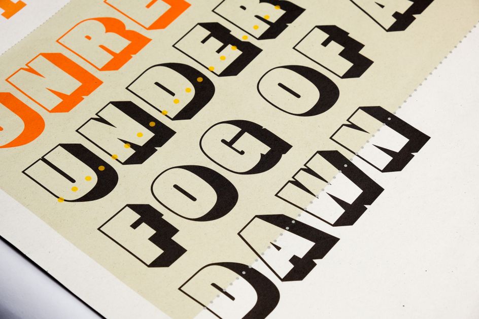
His research resulted in Resorting to Type, a recent exhibition in Margate that documented the influences of nineteenth-century bold advertising typefaces such as Serifs, Slab Serifs, Fat Faces, and the under-documented Tuscan in its decorative and chromatic flamboyance. "These large display 'jobbing' faces, initially used for posters, notices and playbills in the early 1800s subsequently co-opted and used for circuses, fairgrounds, and theatres," Justin adds. "Many of the letterforms have also formed as part of designs of posters, guidebooks, and advertising of the resorts and how to get there."
Following the survey of Margate, current studies are taking place at Blackpool and Brighton, mapping the usage of typefaces the impact on the design and experience of "place" across some of our most visited resorts. This research will culminate in an exhibition of seaside typography at The Ditching Museum of Art + Craft in May 2023.
"Just a few miles from Brighton, the small village of Ditchling has a rich, distinct lettering and typographic history, with the museum housing an extensive archive of works exploring large display typefaces designed for transport, leisure, and public information," says Justin, "many of which are prominently used at the seaside. The museum's collection and history will provide context to the detailed survey of the typographic landscape of the British seaside and engage visitors in summer events exploring the visual language of the coast."
Justin adds: "Morrissey wrote, 'This is the coastal town, that they forgot to close down' in an observational snapshot of the British seaside in 1988. Many coastal towns have since re-energised, with resorts such as Brighton, Margate and Morecambe embarking on development schemes that embrace their identifiable past – through forward-facing strategy, in which graphic design contributes significantly. There's plenty to see here yet, Steven."
The Blackpool Type Walk, hosted by Sarah Horn and Justin Burns, will take place on 14 May, beginning at the Comedy Carpet. To book tickets and find out more, go to Eventbrite.
Editor's Picks


Trending


](https://www.creativeboom.com/upload/articles/86/862919952c0ad18439004228895a431dc6e45ffc_732.jpg)

Podcasts


Editor's Picks
Further Reading