The Collaborators reinvent Norwegian food brand with happy Scandi packaging
The Bristol design consultancy helps to reposition Freja Natural Norwegian Bone Broth as a natural, healthy and fulfilling choice.
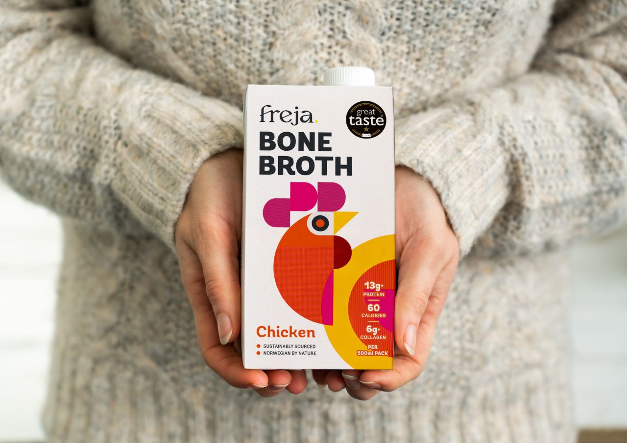
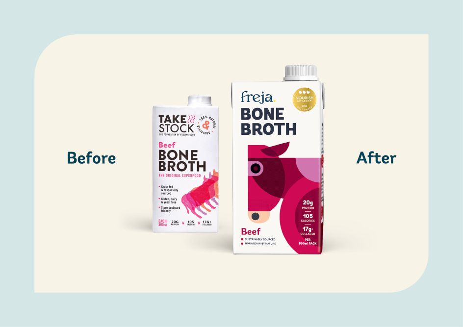
One of the world's oldest culinary confections, bone broth, is a liquid made from boiling animal bones and connective tissue. The UK's best-selling bone broth, previously known as Take Stock, has now been rebranded by Bristol-based brand design consultancy The Collaborators, with the new name of Freja Natural Norwegian Bone Broth.
Originally launched during lockdown, Take Stock quickly achieved best-seller status on Amazon in the UK. However, founders Jessica Higgins and Ed Armitage believed that to fully realise the potential of their award-winning product and successful business model, it would need a rebrand.
They turned to The Collaborators, which specialises in food and drink and worked with them to establish a new positioning and distinctive brand identity. The repositioning aims to drive category growth and assert Freja as the leading brand in stocks and broths.
Key challenges
A key challenge was to address the issue of provenance: unlike its competitors, Take Stock was neither made in Britain nor organic.
The name was also problematic as it was hard to own, didn't translate well in other languages, and added to the confusion between bone broth and ordinary stock.

The Collaborators recommended leaning into the brand's Scandi provenance. Its research revealed that Norwegian culture is perceived as clean, healthy, outdoorsy and generally very positive.
It's also consistently voted one of the happiest countries in the world with the lowest use of antibiotics for food-producing animals in Europe, including organic farming. (In fact, 'organic' is not even a point of difference in Norway because high animal welfare and good farming practices are the norm.)
With a clear strategic direction, the new name perfectly captures the brand's essence with its soft, nurturing sound and Scandi origins. The positioning was built around the idea that Freja natural Norwegian Bone Broth helps people to live well, respect nature and eat happily.
Design elements
The Collaborators created a distinctive tone of voice and established Freja's minimal, bright, happy Scandi brand style.
With the need to stand out both on-screen and shelf, packaging has a light, bright simplicity and hints of the previous Take Stock pack design. Inspired by Nordic graphics, geometric shapes combine to create quirky variant illustrations that cue flavour and add some Scandi personality.
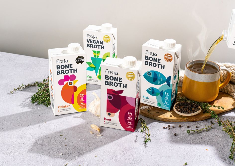
In contrast, the rest of the brand world is fresh and paired-back, with a limited colour palette that allows important information and packaging to pop.
The soft launch is already rolling out across packaging, comms and a new website and is receiving an overwhelmingly positive response.
Clear values and authenticity
"We wanted to build a complete brand for Jess and Ed," explains Mary Lewis, creative director at The Collaborators. "One that's built on clear purpose and values and is authentic across all its touchpoints.
"It was important that we added personality and charm too," she adds, "and Freja's Norwegian provenance was a gift in that regard. We had a lot of good stuff to work with!"
"The Collaborators have always been enthusiastic and positive about our brand," says Jessica Higgins, founder of Freja. "It's been very well received by our customers and the trade too. We're delighted with the rebrand."
Editor's Picks


Trending


](https://www.creativeboom.com/upload/articles/86/862919952c0ad18439004228895a431dc6e45ffc_732.jpg)
Podcasts


Editor's Picks
Further Reading