Can you dig it? Colossus craft new identity for quirky wine brand Archer Roose
Greg Almeida, co-founder of Colossus, explains how they rebranded Elizabeth Banks' canned wine brand and gave it a new lease of life.
When you think of drinking wine, you generally think of cradling a nice big glass in your hand. Sipping from a can isn't everyone's cup of tea. But canned wine makes a lot of sense, allowing you to drink it anywhere. And that's exactly the freedom offered by Archer Roose.
The brand has a strong reputation within the industry because of its focus on quality wine, taste and flavour. And that's no accident. Archer Roose, co-owned by Hollywood actress Elizabeth Banks, scours the best wine regions in the world to find consciously crafted, high-quality varietals, including sustainable and vegan luxury canned wines.
But you can't rest on your laurels forever. And so, to rebrand their mission for the modern day, they approached Colossus, an award-winning ad agency and design studio based in Boston, USA.
The brief
"The creative brief called for us to modernise the brand and create a more holistic design language that extends beyond packaging and into the realm of advertising, marketing, social, digital and on-premise scenarios," explains co-founder and executive creative director Greg Almeida. "All while making the brand distinct in a crowded category."
In other words, after several years of relying solely on the product, the brand needed a bulletproof brand and visual identity they could build on for years to come.
To an extent, Colossus was pushing against an open door. "The foundational elements of the Archer Roose brand were already solid," Greg notes. "It's a great product that is sustainably produced and ethically sourced. And these were collaborative clients who were genuinely nice people. It's not every day that we can say that with a straight face."
Strategy and design system
So how did the team respond? "First, by drinking all the wine!" says Greg, and he's only half-joking. "Second, we audited the brand's place in the world, looking at the four C's: consumer, culture, company and category. It always helps to ground ourselves in as many insights as possible before jumping into design. Next, we worked with the clients to better understand the pain points, needs and existing brand equities."
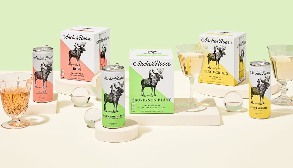
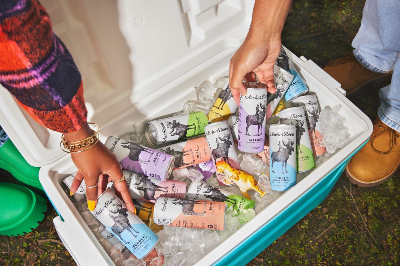
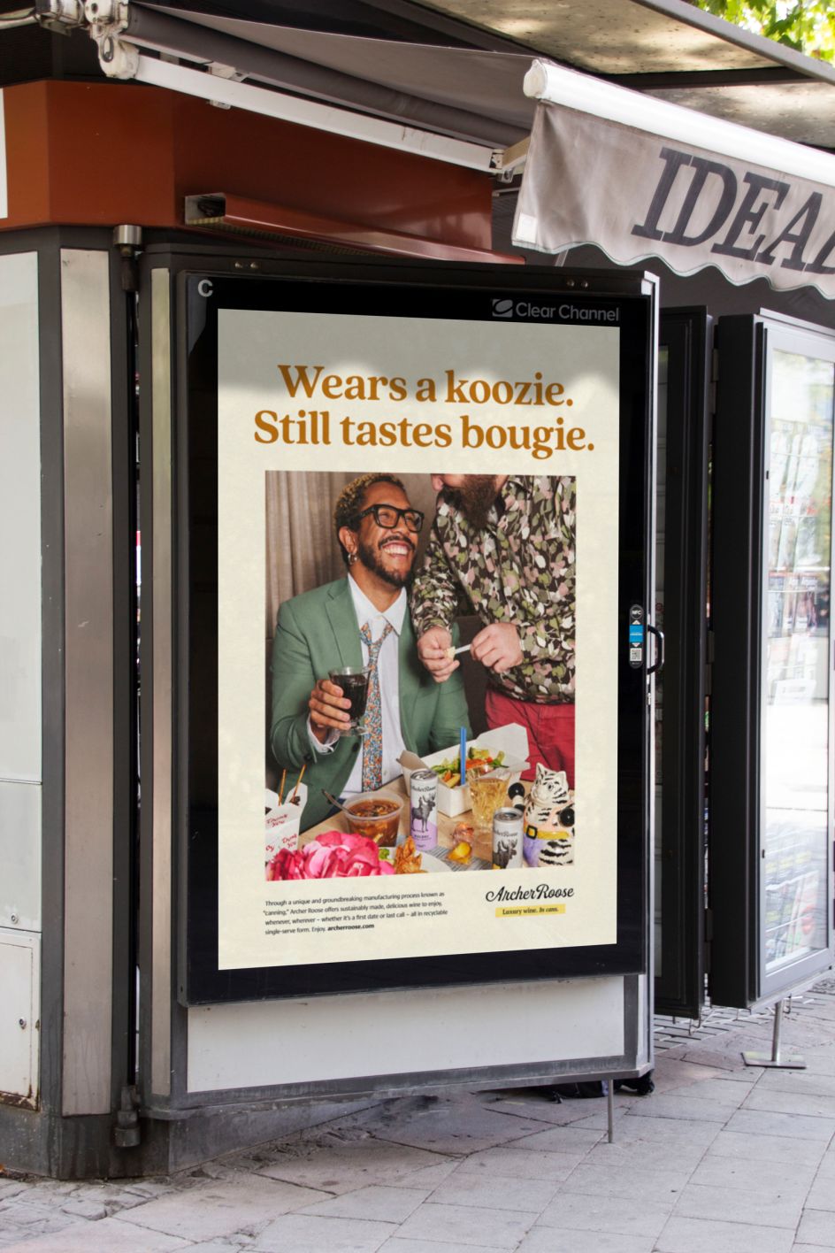
From there, they created a design system built on a vibrant colour palette, updated packaging and typography, along with editorial photography and quirky illustration. "Above all, we worked to ensure the design system was approachable, fun and inclusive, which differs dramatically from the stuffy, condescending, head-up-ass wine category at large."
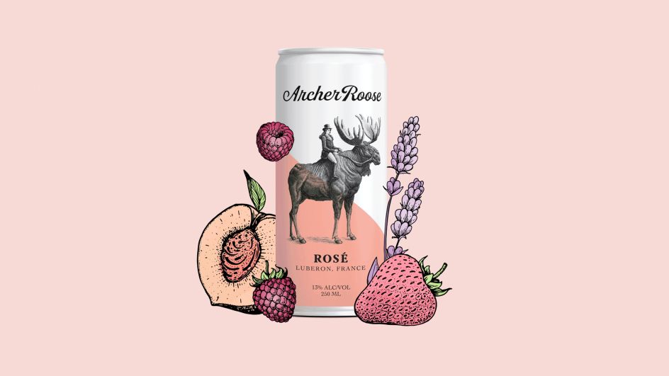
The team paid particular attention to the colour palette, which has long been a defining characteristic of the brand. "Historically, the brand had relied on a more muted, pastel palette to articulate each grape varietal: Malbec, Pinot Grigio, etc.," explains Greg. "We worked to preserve the essence of that and ensure taste appeal, but pushed the saturation to a more modern place with monochromatic progressions of each colour-way."
Typography and packaging
As for typography, the new brand uses Quincy CF for display and headline type. "It's a beautiful serif typeface from Connary Fagen, and much like the wine produced by Archer, it has both old-world and modern characteristics," explains Greg. "It's warm and fluid, with enough odd qualities to make it feel human."
For body copy and paragraph styles, meanwhile, they used Cora from Bart Blubaugh at TypeTogether. "It's a clean sans serif with some unique angles and Romanesque stone qualities," says Greg. "It works really well in both print and digital formats."
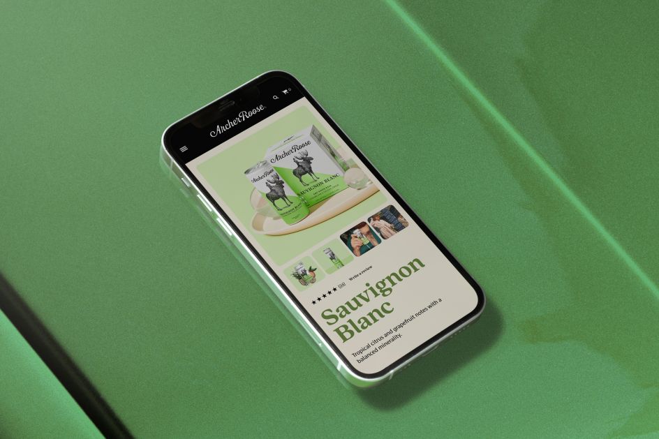
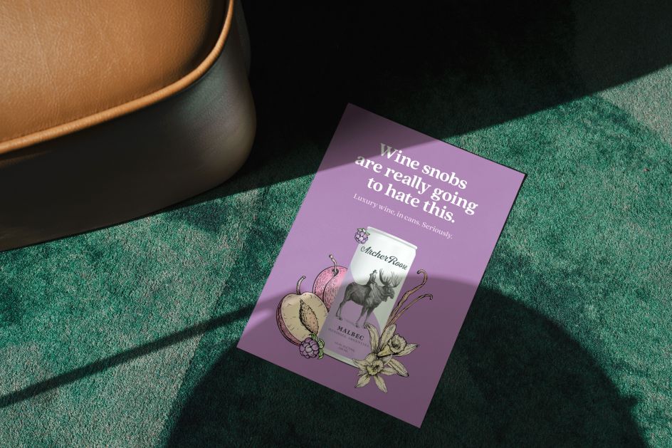
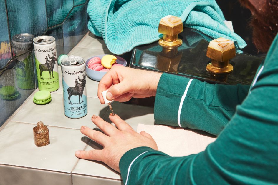
Regarding packaging, the Archer Roose brand already had great equity in its 'moose lady' icon, which sits at the centre of its designs. "In the past, they had experimented with various approaches for their core lines, as well as limited-edition grape varietals, boxes, bags, cans and multipacks," says Greg. "We leaned into the four-pack to revamp the cans and worked to optimise colour, typography and hierarchy."
Basically, then, they were improving on what the brand had already started. "We love the idea of putting wine in cans as opposed to the typical glass bottles," enthuses Greg. "It's more efficient and environmentally friendly. Recyclable packaging weighs less to transport, reduces the carbon footprint, and reduces carbon emissions."
Photography and illustrations
For the lifestyle and talent-based imagery, Colossus brought in the photographer Nina Gallant. "She has a wonderful style that feels voyeuristic but somehow still warm and approachable," says Greg. "For the more refined product and packaging stuff, we brought in Leonard Greco. He has a complimentary aesthetic and a really elegant approach to styling that felt right for the brand."
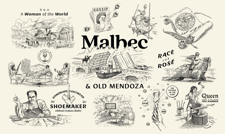
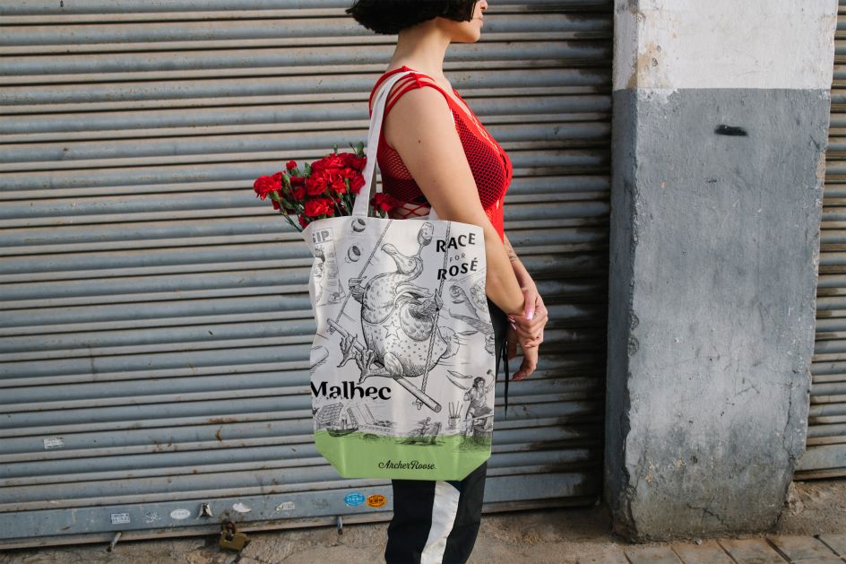
They also worked with two illustrators, Nathan Yoder and Phillip Harris, on new illustrations based around Archer Roose, the brand's steampunk namesake. "She is a fictitious rebel of the Gilded Age who travelled the world with boundless curiosity, living by her own rules," says Greg. "Her image adorns the packaging and has been the brand's focal point since its inception.
"Knowing this, we wanted to build on that illustration style to extend beyond the packaging. We worked with Nathan and Phillip to create a library of cheeky images for use in other brand assets. Both illustrators have a distinct style that feels classic and hand-crafted. Marrying an old-world illustration style with the irony of modern humour was the name of the game."
Editor's Picks


Trending


Editor's Picks
Further Reading