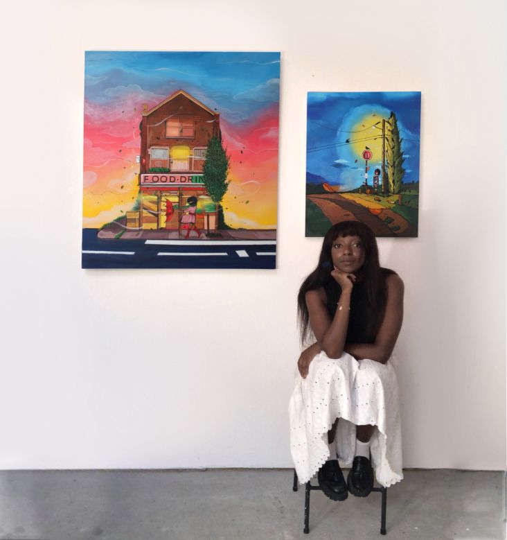
People People's rebrand celebrates the diversity of Washington State Parks
Discover how the Seattle agency helped to create a unified identity for a body that manages over 100 state parks and covers around 120,000 acres of land.
National parks are, by definition, open to all, but not everyone takes advantage. Washington State Parks wanted to do something about that, and so they turned to Seattle-based creative agency People People to help them rebrand.
The Washington State Parks and Recreation Commission manages over 100 state parks and properties, totalling approximately 120,000 acres. The Commission provides a variety of recreation opportunities for citizens and provides stewardship protection for a diverse array of natural, cultural and historic resources. Programs include long-distance trails, boating safety and winter recreation.
The organisation's main issue was that its branding was not inclusive or celebratory of the state's unique and diverse environments. On the plus side, they had seen record numbers of visitors during the pandemic and wanted to capture that reconnection with nature and outdoor recreation.
Specifically, there was a desire for the Washington State Parks logo to strengthen the belief that the outdoors should be welcoming and accessible to all — from seasoned nature enthusiasts to first-time adventurers — and represent the range of memories and emotions tied to these remarkable places.
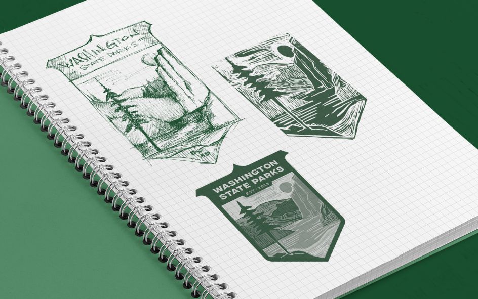
It all added up to quite a challenging brief, but at the same time, it gave People People a clear direction for what their scoped research and new visual identity needed to achieve.
Research and development
To understand what held the greatest importance for Washingtonians, People People worked with the client to develop a survey that would help shape its new visual identity. Over 6,000 replies confirmed the expected: Washingtonians deeply value the natural beauty of the state and appreciate the classic look and feel of the original logo.
Further, respondents reflected on deep emotional connections to their state parks, with many sharing heartfelt memories and significant life moments experienced in the outdoors. With this in mind, People People set out to depict the beauty of Washington inclusively — a landscape where the viewer could imagine a true range of emotions.
"The research allowed us to test our visual ideas by asking ourselves: in this landscape, could someone imagine getting married while another remembers nursing heartbreak?" explains People People strategist Kate Schenot. "Would this image feel like it could encompass the best moment in someone's life and yet offer someone peace and healing from their worst pain? Can it look like a fun place for a casual jog while also feeling appropriate as a place of profound feeling?"
Design elements
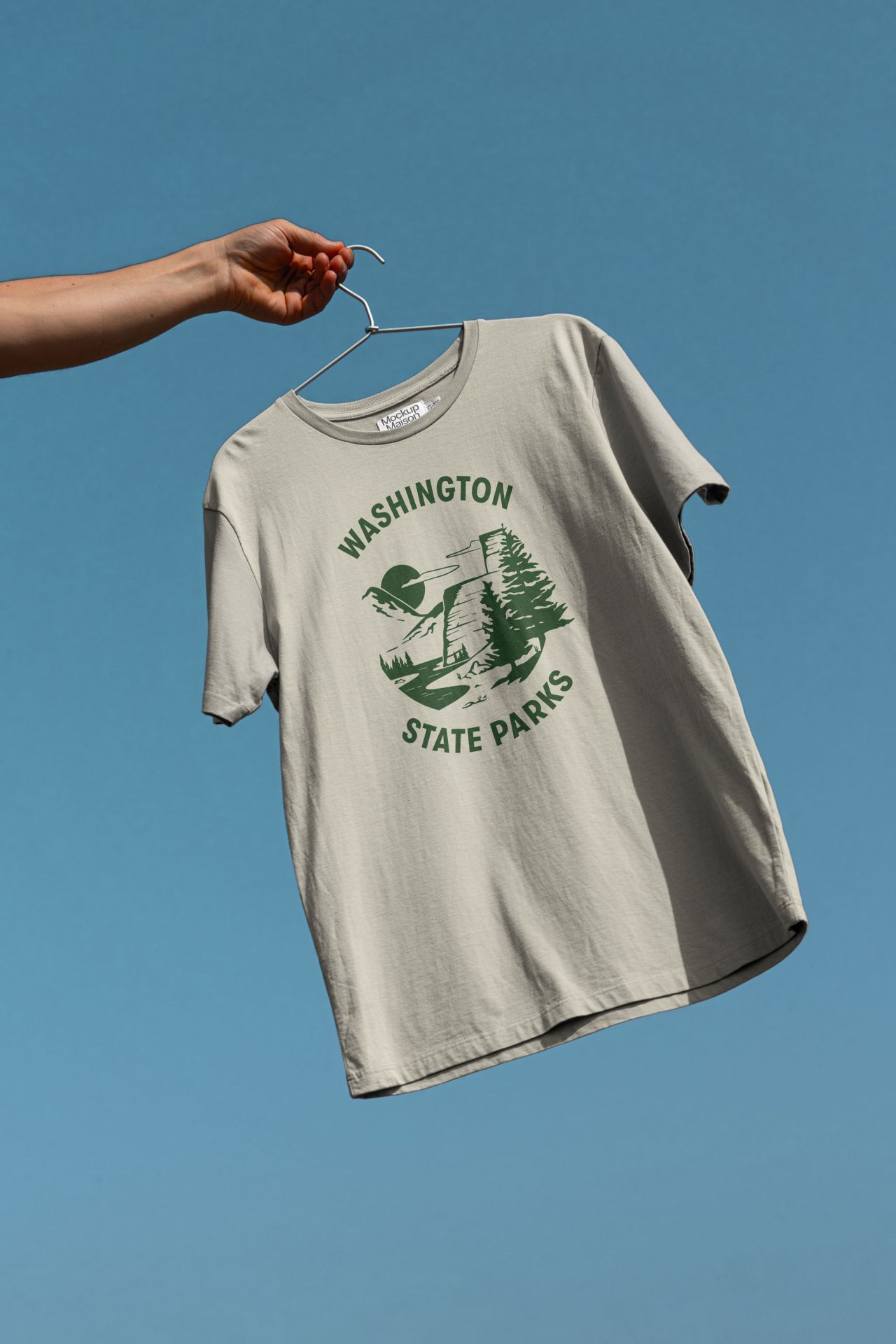
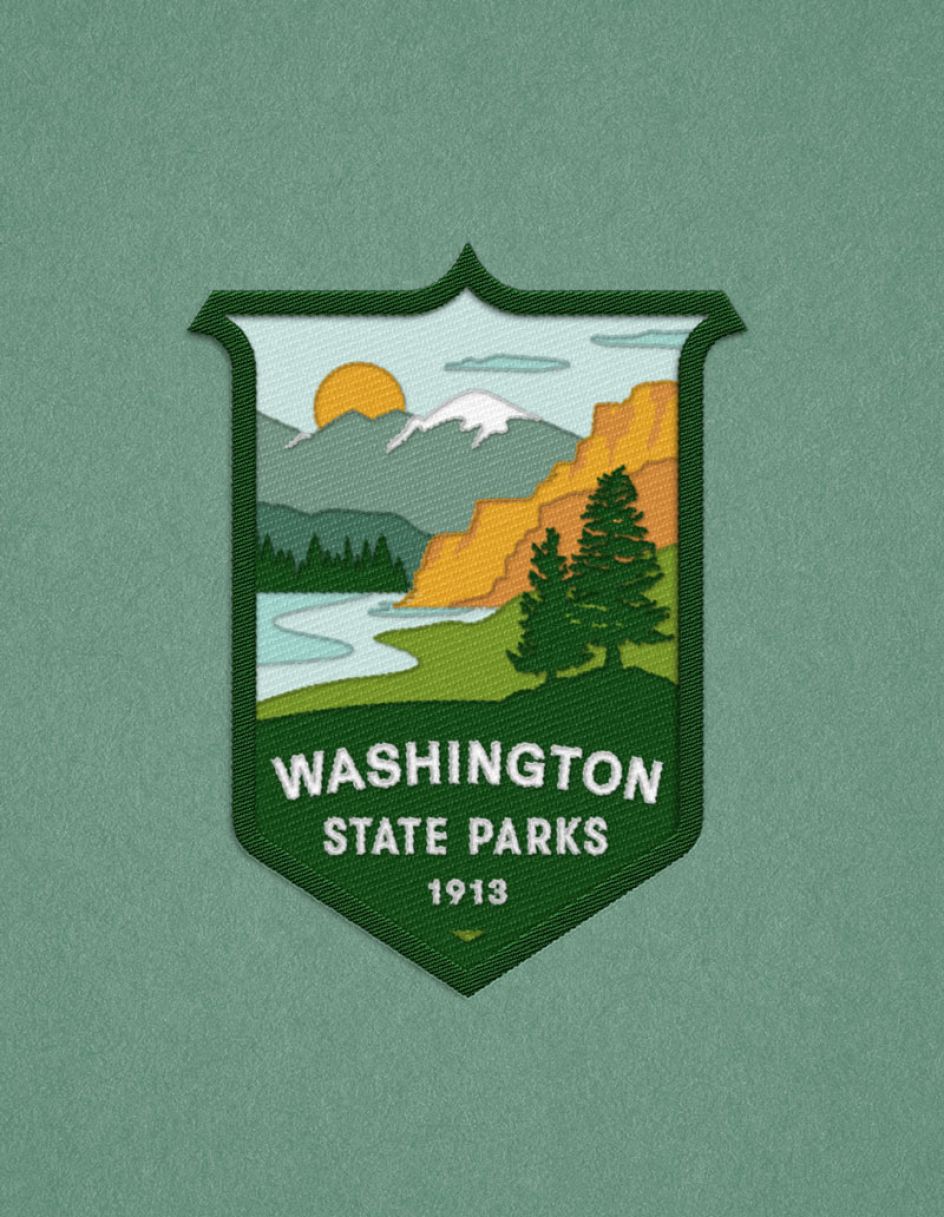
The resulting logo is a geographic fiction, combining elements from western and eastern Washington, such as Mount Spokane, columnar basalt formations, picturesque coastlines and the official state tree: the Western Hemlock.
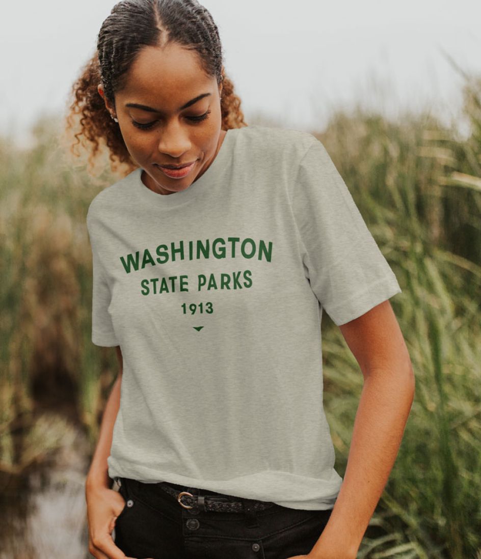
Utilising research to influence their design, People People modified the layout and typography and updated the colour palette with brighter, warmer tones. Careful consideration was given to font selection, with GT Walsheim chosen as the primary supporting font for its readability and subtle nostalgic nods.
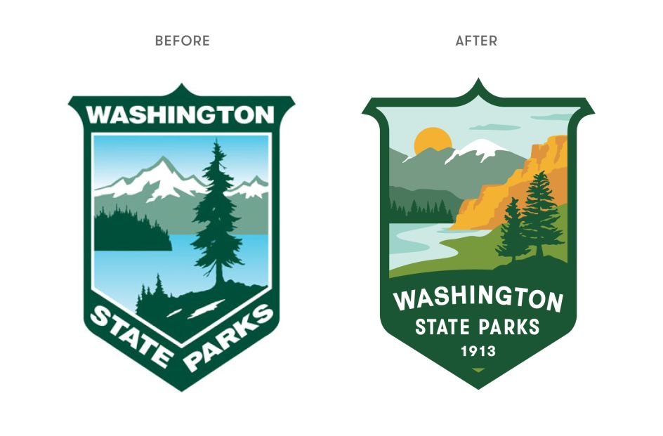
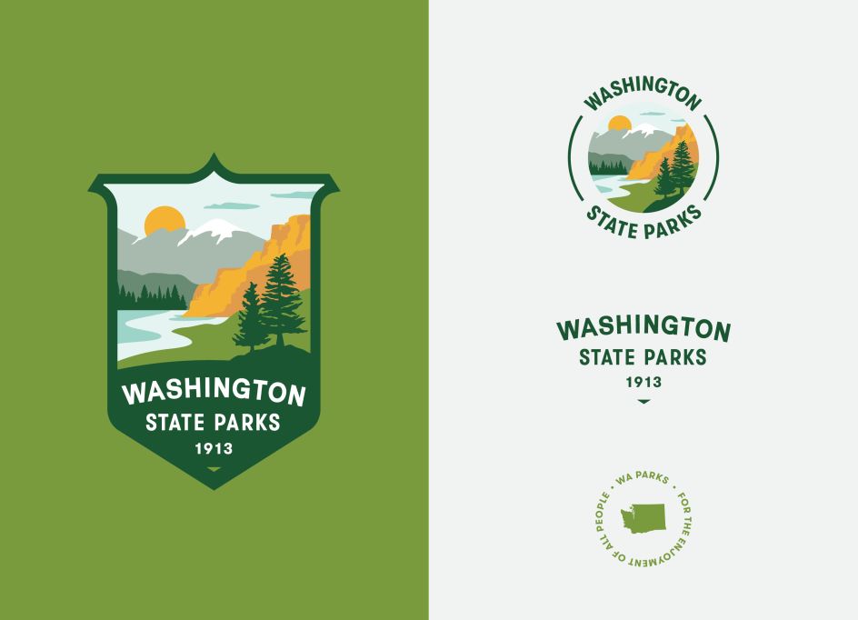
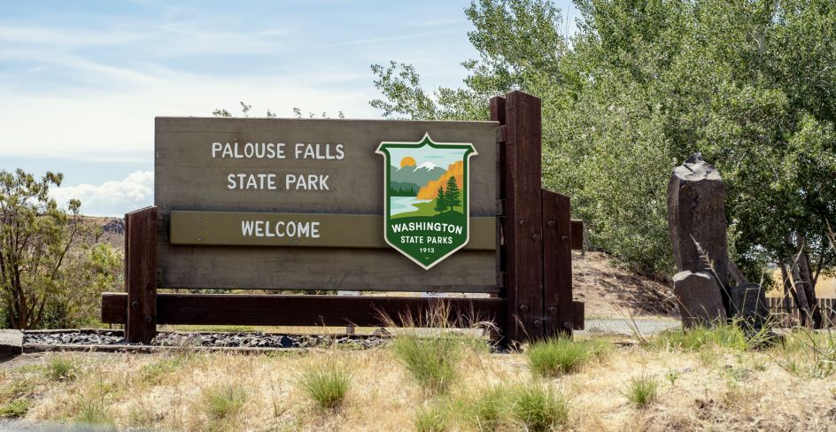
As requested by the client, People People maintained the original shield but added a curved shape within its form to soften the overall composition. They also reoriented the text to sit at the bottom of the container for unity and legibility and added a small 1913 to represent the year Parks was founded.
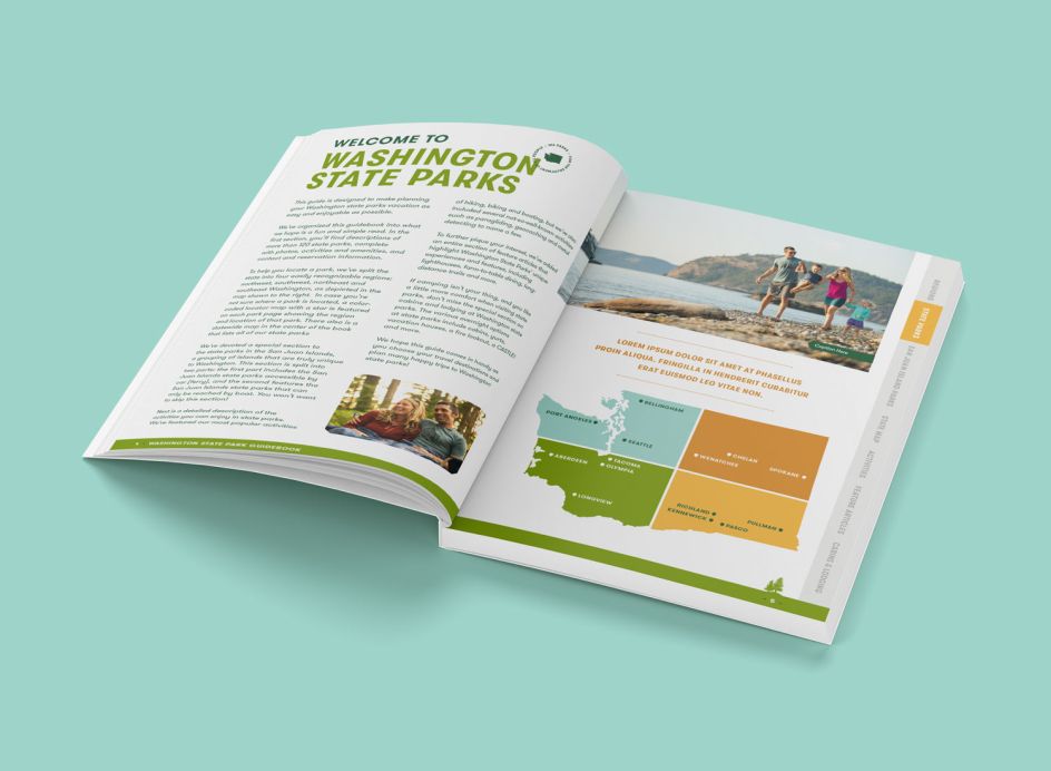
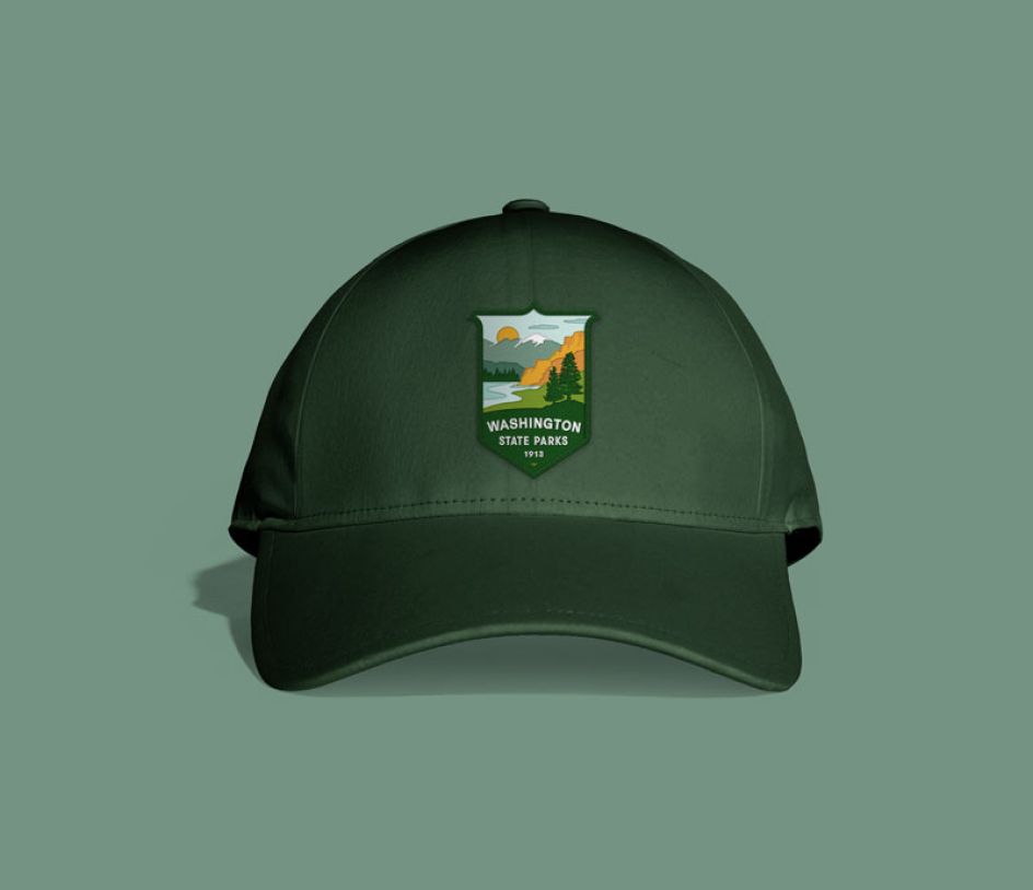
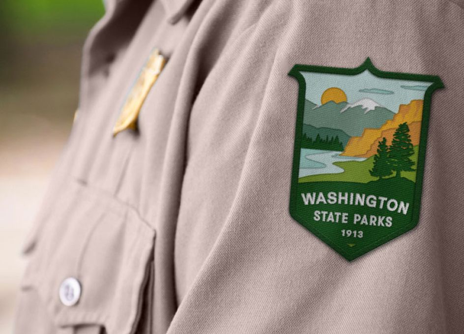
The new logo and visual identity will be gradually implemented across various touchpoints, including park signage, vehicles, uniforms, brochures, merchandise, and digital platforms. The final design captures the wild and welcoming spirit of Washington State Parks, inviting people of all backgrounds to connect with nature and create lasting memories.
"Our new brand is rooted in our past, has a solid foundation in the present, and will lead us into our next chapter," says Stephanie McDermott, the park's brand and creative marketing manager. "The adjustments to our logo – evolving landforms, broadening our colour palette, unifying our text – signify this new era."
Editor's Picks


Trending


Editor's Picks
Further Reading