Olivia Zhao's designs for home fragrance brand are quite unique
You don't often see fragrance packaging inspired by geographic coordinates. The Boston-based designer explains the intriguing story behind this project.
Founded in New York in 2016, Homesick is a home fragrance and lifestyle brand with a simple goal: to bring joy to your home by helping you feel closer to the people, places and moments that matter most. It specialises in luscious and vibrant scents for the home.
When it comes to the design and packaging of products like this, several obvious visual cliches come to mind. So we take our hats off to Boston-based designer Zhenqi (aka Olivia) Zhao for crafting something more original and eye-catching.
Quite frankly, mapping and geographic coordinates don't like the obvious inspiration for a home fragrance brand. But once Olivia explains the thinking behind her concept, everything becomes clear.
A breath of fresh air
"As an art director, embarking on the rebranding of Homesick was a creative voyage that filled me with excitement and purpose," she recalls. "My primary goal was to breathe new life into the brand by encapsulating the essence of cherished memories in every product, forging an intimate connection with our customers."
So how did she get from there to geographic coordinates? "My concept aimed to assign a unique identifier or alphanumeric character to each distinct scent, making it intensely personal and immediately identifiable," she explains.
"To infuse depth and texture into this concept, I repurposed discarded folded paper as the backdrop, adding a tactile dimension to our visual narrative."
Capturing memories
Importantly, her creative process mirrored the essence of Homesick's mission: to encapsulate memories authentically.
"I ventured into diverse communities, engaging with locals, sampling evocative scents, and delving into the heart of their stories," she explains. "From reliving childhood memories in the heart of Texas to deciphering the enchanting scent of libraries with seasoned librarians, every journey fueled our fragrance curation.
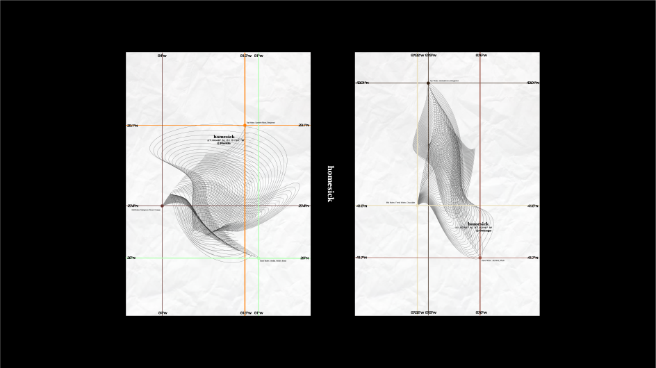
"My creative muse drew inspiration from the art of scent extraction employed by brands. I envisioned a world where each scent bore its unique GPS coordinates. These points would become lines, and lines would transform into captivating surfaces, each weaving a distinctive narrative for every scented candle.
"By infusing corresponding colours to represent these fragrances, I ensured that each candle was adorned with a distinct colour palette, forging a profound personal connection and making the brand unmistakable."
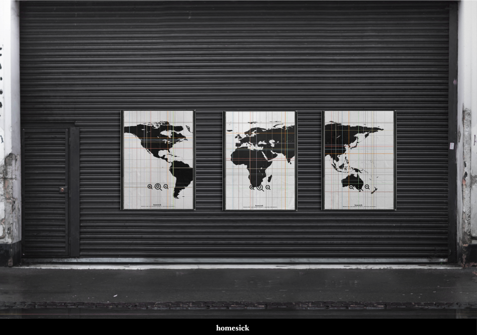
Boxes, bags and billboards
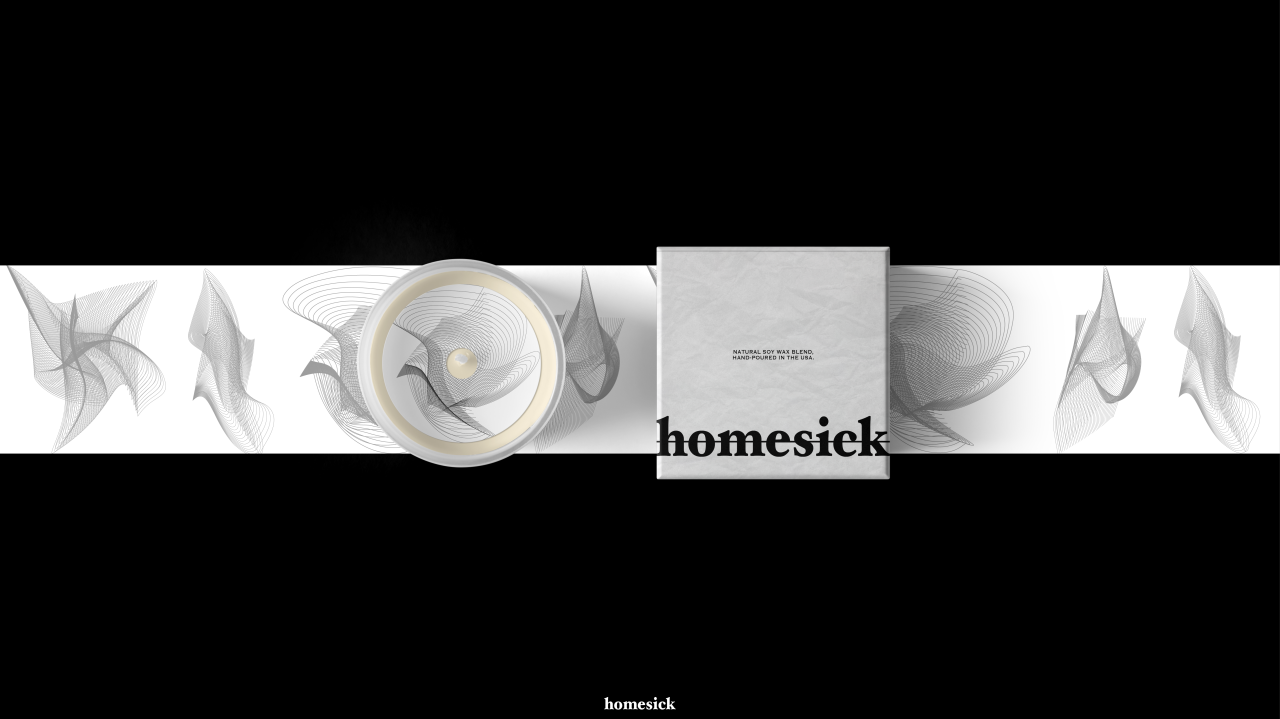
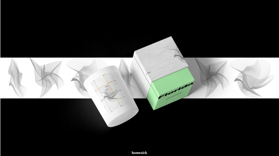
She adds that the packaging design for the candles presented a unique canvas for her vision. "I envisioned the box as a masterful representation of a geographic coordinate system map. Here, the unyielding 0 degrees of longitude acted as the stage for two specific latitude and longitude lines.
"These lines dynamically placed each candle's image in a different location on the packaging, crafting an individualised pattern for every product. Distinctive representative colours at the package's bottom provided the finishing touch, elevating their visual appeal."
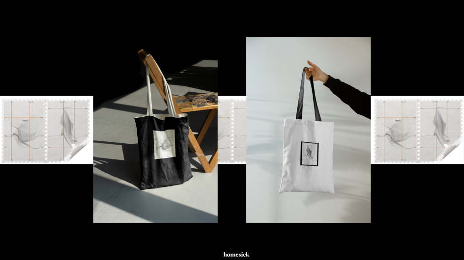
She extended the same thinking across all brand assets. "Our branded shopping bags resonated with the core of our brand, homesickness," she notes. "A small stamp, a timeless yet extraordinary symbol, echoed the sentiments of longing and nostalgia. The potential to transform these stamps into stickers held the promise of amplifying brand recognition."
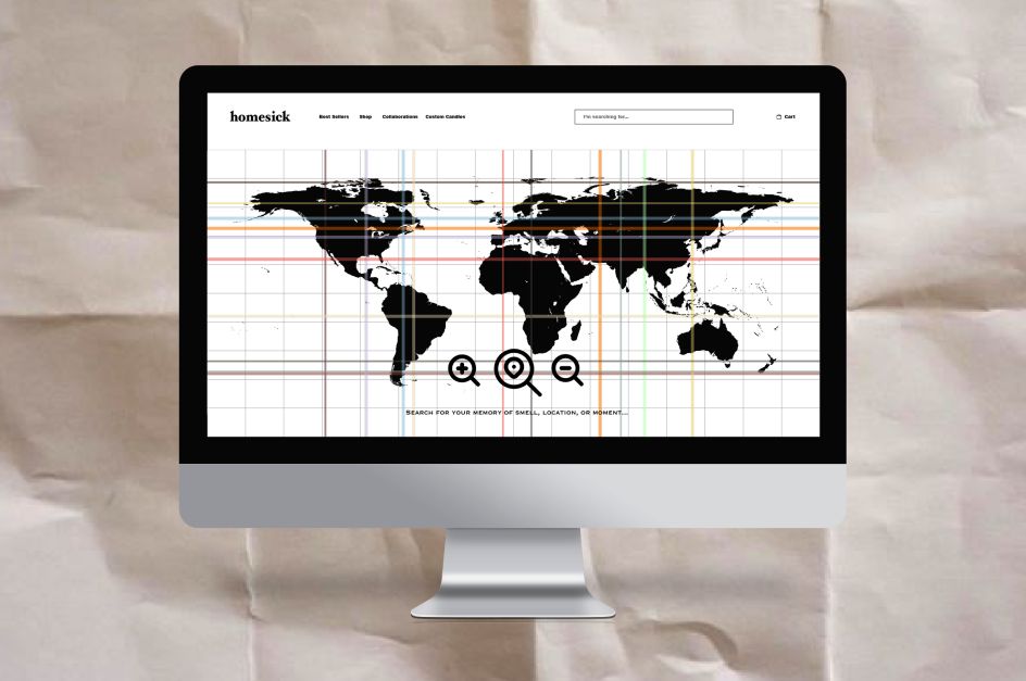
The brand's official website and interactive billboards breathed further life into this sensory journey. "The homepage unfurls a captivating global map," Olivia explains, "replete with vibrant latitude and longitude lines. This interactive interface invited customers to embark on a personal voyage of memories, from Fenway subway stations in Boston to cosy milk tea stores on New York's East 8th Street."
In short, Olivia's creative journey on this project stands as a testament to the artistry of memory. "Every visual element was meticulously crafted to capture the essence of each location and memory, fostering an unbreakable bond with cherished customers.
"All the while, I remained true to the brand's environmental-friendly ethos, embodying a commitment to sustainability in using discarded paper as the main material in my design."
Editor's Picks


Trending


](https://www.creativeboom.com/upload/articles/86/862919952c0ad18439004228895a431dc6e45ffc_732.jpg)
Podcasts


Editor's Picks
Further Reading