AIGA's 50 best covers of the year are a celebration of the physicality of books
Earlier this month, the American Institute of Graphic Arts revealed the winners of its 50 Books | 50 Covers Competition, and the results are an insight into how design choices celebrate the object quality of the book.
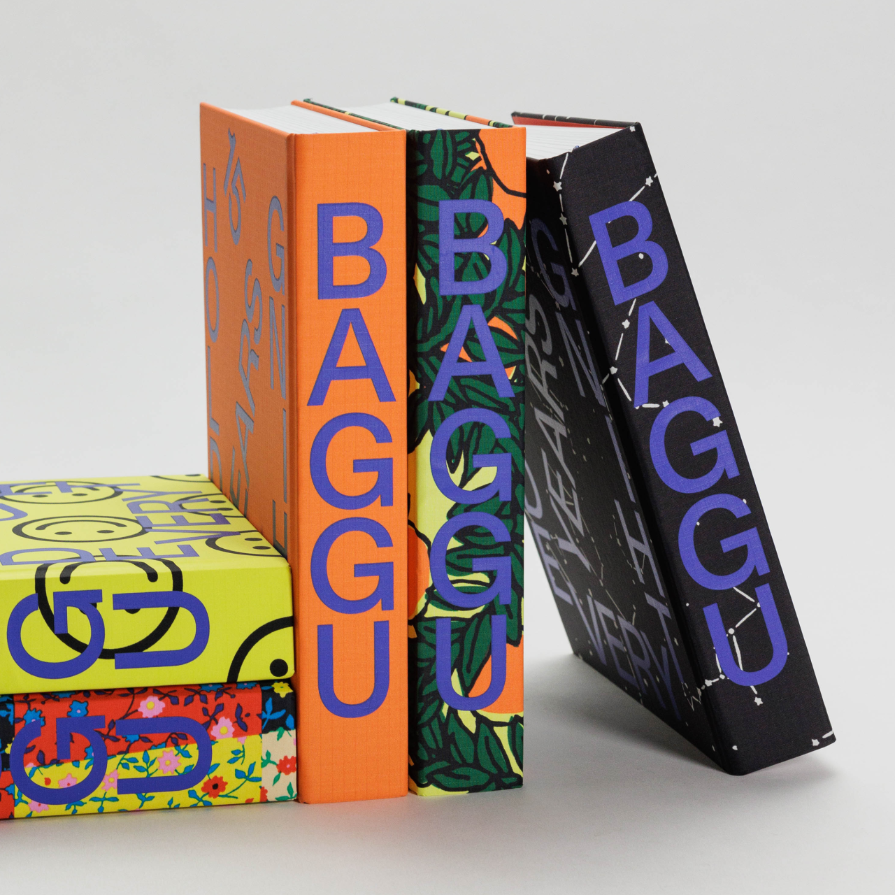
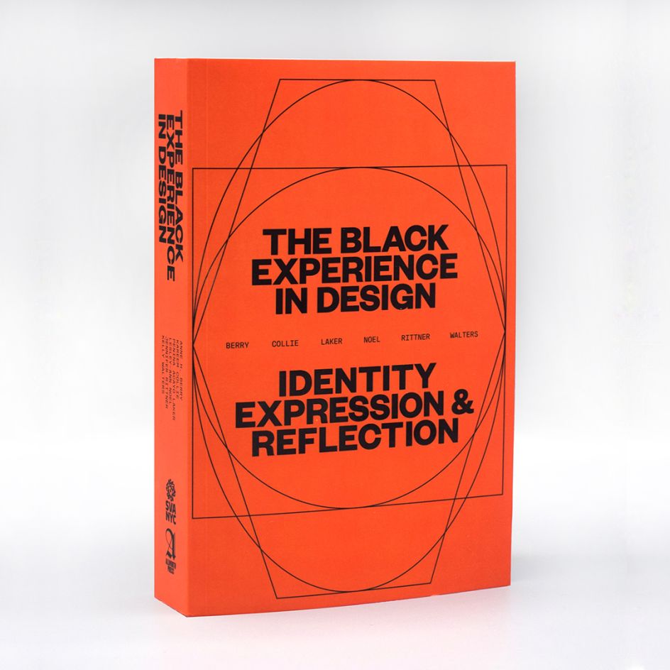
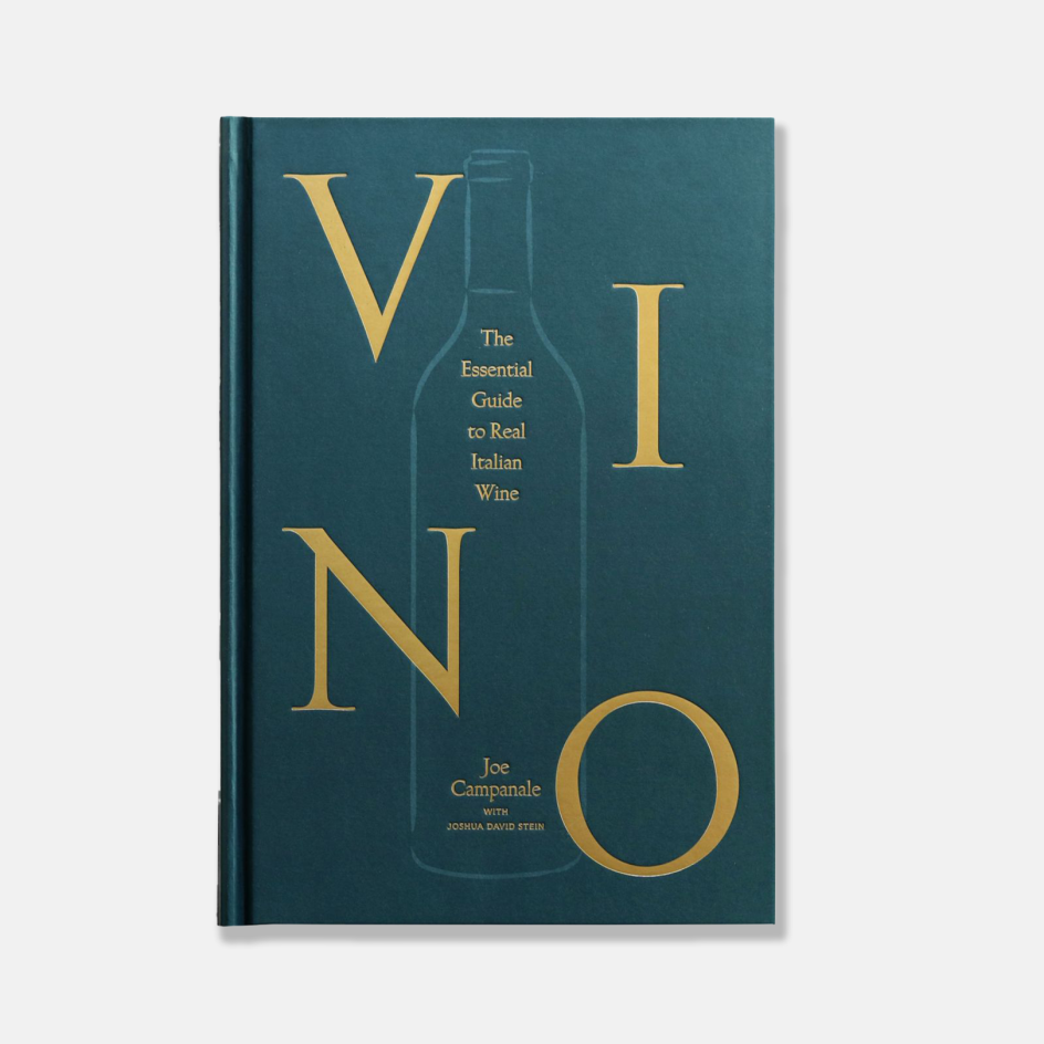
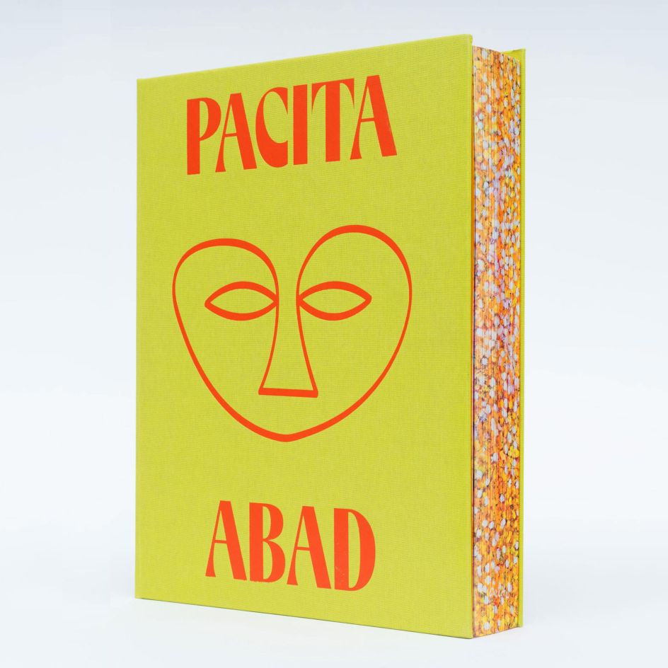
First established in 1923 as the Fifty Books of the Year competition, AIGA's 50 Books | 50 Covers award has been running since 1995 and seeks to recognise and showcase excellence in book design from around the world. This year's winners include jacket designs that experiment with mediums and materials to create covers that connect with their contents.
Whittled down from 487 entries from 27 countries, the top 50 covers were shortlisted by a panel of jurors, including Andrew Satake, Rob Giampietro, Renata Graw, Ramon Tejada and Xiaoqing Wang.
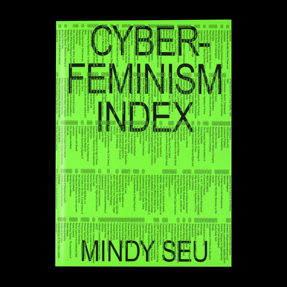
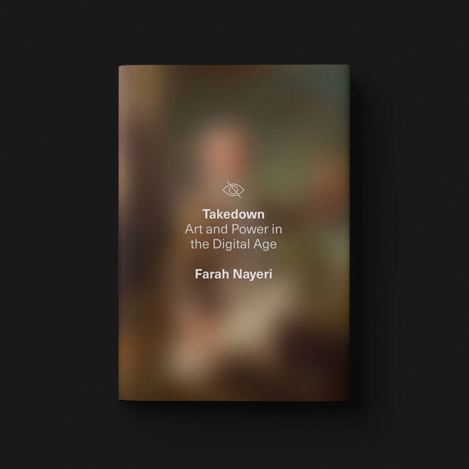
Standout entries include Farah Nayeri's cover for Takedown: Art and Power in the Digital Age, which playfully blurs out its design like an obscured phone screen, and Laura Comb's garish cover for Mindy Seu's archival project Cyber-Feminism Index.
"The jury and I were very impressed with both the quantity and quality of the entries this year, which made choosing only 50 extremely difficult," says Andrew Satake Blauvelt, AIGA 50 Books | 50 Covers, Chair. "Having judged the competition before, I noticed a much greater diversity in the subject matter across all the categories, which was refreshing!"
What struck Andrew and the jurors, in particular, were fields such as cuisine and exhibition catalogues devoted to artists of colour. "The strongest covers really connected to the book's content, while the book designs displayed a penchant for material choices that emphasised the physicality or object quality of the book," he adds.
Trending techniques were also a point of interest, with exposed bindings, elaborate page sequencing and mixed paper choices attracting positive attention. "For me, there was a greater overall sophistication in book design, with a mix of aesthetically beautiful and graphically brash approaches in the final choices," Andrew adds.
As ever, though, there's always room for improvement. So if you're thinking of submitting an entry next year, keep in mind that Andrew noticed: "While print quality and craft were high, sometimes typographic detailing stumbled."
Editor's Picks


Trending


](https://www.creativeboom.com/upload/articles/86/862919952c0ad18439004228895a431dc6e45ffc_732.jpg)
Podcasts


Editor's Picks
Further Reading


](https://www.creativeboom.com/upload/articles/bc/bca64f0003ea18084a2d90e59bf9bd1b3cb71223_732.jpg)