Northern Block shares its love for the marker pen with new experimental typeface, Hubsch
Designer Jonathan Hill discusses the development of Hubsch and how designers may wish to use it.
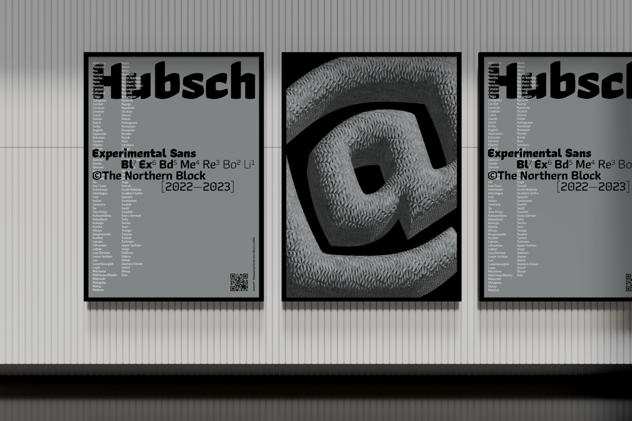
At Creative Boom, we're always on the lookout for new typefaces, and we're especially interested to see foundries take an experimental approach. There's no point in just being wacky just for the sake of it, though: there has to be an underlying, original idea or goal if you want to push typography forward. And here's a project that fits right into that wheelhouse.
Hubsch is a new experimental typeface from The Northern Block, an award-winning, independent type foundry based in north-east England. And it's inspired by nostalgia and the evolution of the marker pen: two things we can definitely get on board with.
Designed by Jonathan Hill, the sans-serif face pays homage to the marker pen's journey through time and its different forms of expression in street art and graffiti, particularly the work of Keith Haring, and then later with the rise of Banksy.
Armed with a rich melting pot of ideas from historical references and his fascination with artists who draw with marker pens, Jonathan's experimental typeface began its journey with his memory of watching Tony Hart from the children's BBC show Take Hart (1977-1983) drawing with a chisel tip marker.
The smell and sound of the marker pen moving across the surface took him back to his childhood, and just as Hart embraced the pen's movement and accepted its destination, Jonathan took the same approach with Hubsch.
Background
Hubsch includes seven weights with obliques and over 600 characters per style and is available as a variable font. Language support covers Western, Southern, and Central Europe.
It's built on the principles of modernist fonts that are fit for use with new technology, including a variable font version. This typeface pushes experimental boundaries with its organic hand-drawn aesthetic. It is not just about nostalgia; it refers to joy and the fundamentals of introducing this handwriting to typeface markets.
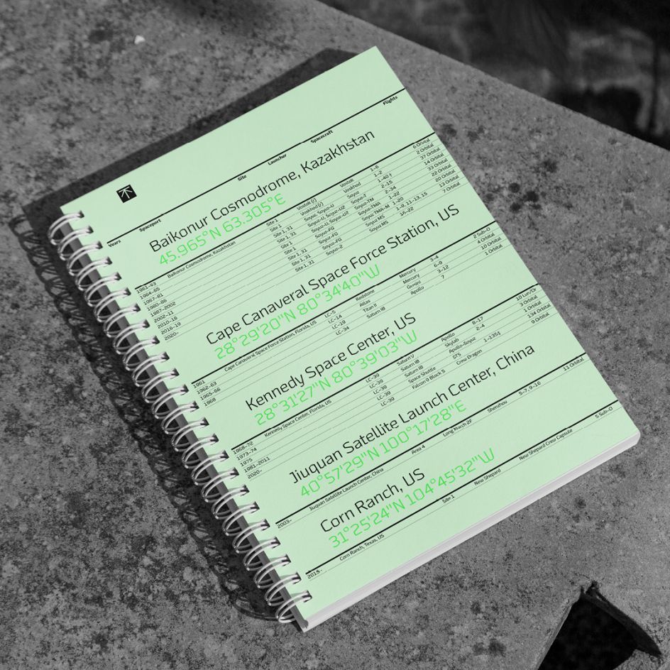
Whilst Hubsch is experimental, its underlying construction is based on simple optical rules that merge bold, unapologetic marks of the pen with digital precision to create a balance that grounds the letters to the grid. Neither hand-drawn nor digital components dominate; they occupy the same space as piano keys.
Importantly, the foundry is keen to point out that this is not a Blackletter font. Hubsch follows its own set of rules with logic, organised with absolute values to make the aesthetic modern and fit for purpose.
Used at small sizes, it's designed to be a reading pleasure, while at large sizes, it shouts out in a visually pleasing way.
Use in design
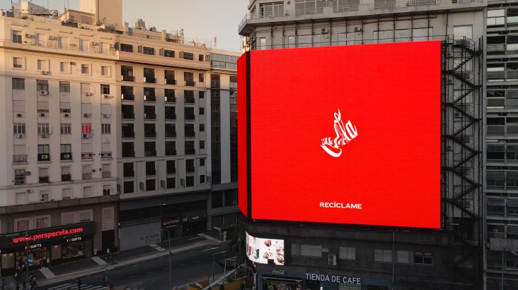
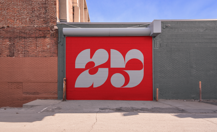
Pigeonholing this font, though, isn't easy: its free-flowing marker nib-to-square angles put this experimental typeface into a mixed-use category. In other words, it would sit just as comfortably at home in a video-game interface as it would in concrete for a piece of public architecture.
Hubsch finds its mark of distinction in the balance between the marker pen's handwritten forms and the constraints of a pixel grid. Convex curves flow in a subtle direction but are not utterly rounded, so the aesthetic feels both technical and hand-crafted in the same measure.
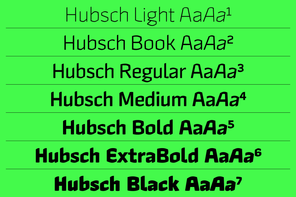
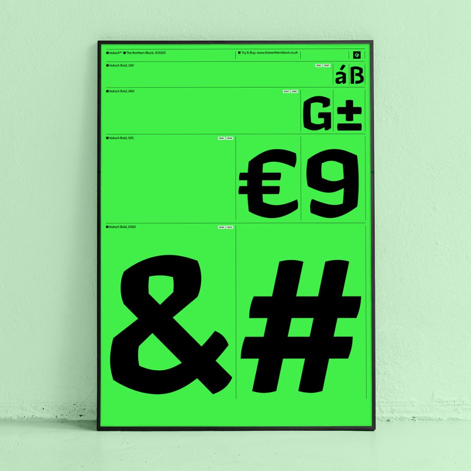
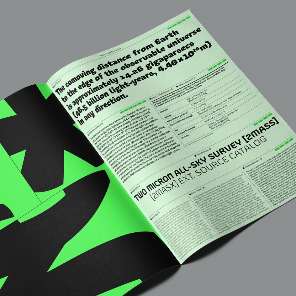
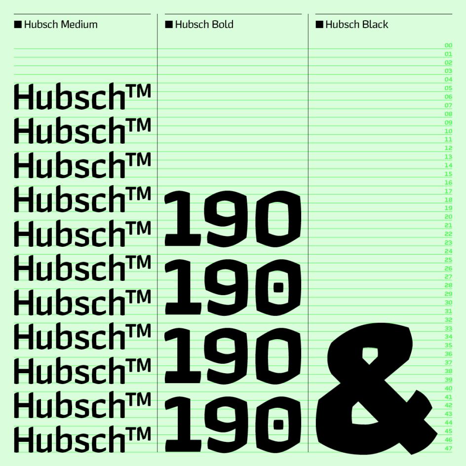
The name, by the way, derives from the nickname of 14th-century printmaker Martin Schongauer. When spelt with an umlaut (i.e. Hübsch), it means pretty in German. This adjective also indicates how well the letters fit visually with their straight and curved sides.
Pushing the boundaries
While Jonathan is best known for designing modern geometric sans, Hubsch offered him greater freedom to push boundaries into experimental territory he had not entered for a while.
"I really enjoyed how the marks made from a chisel tip marker are unapologetic," he says. "There is nowhere to hide; you must accept its path and embrace the mistakes. This is different to my previous project, Leida, a serif which we released earlier this year.
"I could only carry so much forward from Leida into Hubsch, knowing Hubsch would have a different creative approach," he adds. "The vision for Hubsch was clear from the start. The only thing in doubt was my ability to draw by hand, but as the process developed, the outcome for Hubsch became clear once I was satisfied with the drawings."
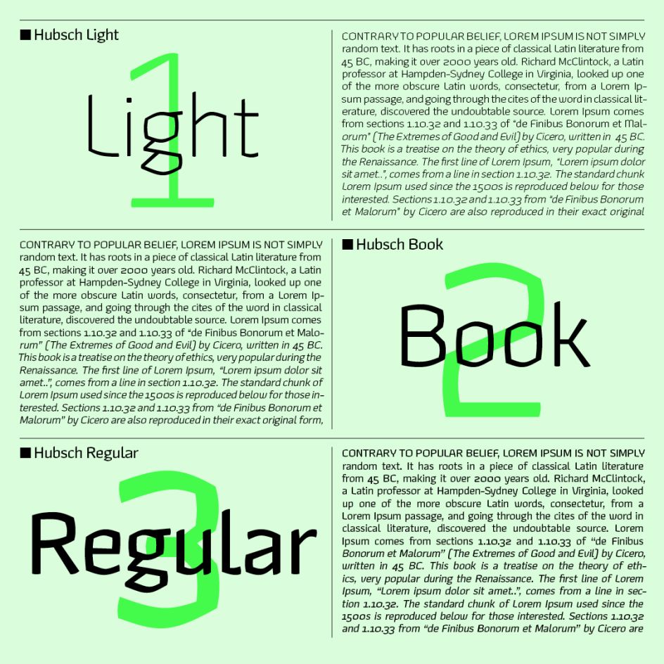
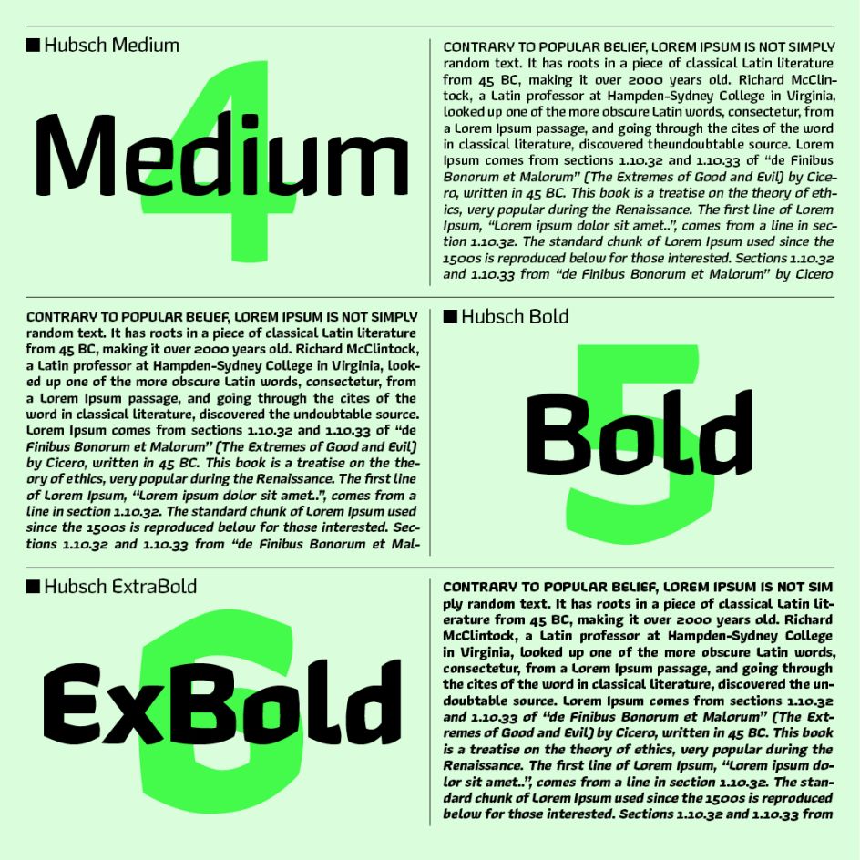
Also working on the project was Head of Brand, Donna Wearmouth, who has a passion for typography and created the marketing graphics and campaign concept for Hubsch. Senior type designer Tasos Varipatis, meanwhile, took on the role of producing Hubsch in its variable font capacity.
Hubsch is available to licence here.





](https://www.creativeboom.com/upload/articles/86/862919952c0ad18439004228895a431dc6e45ffc_732.jpg)
