Type trends for 2024 every designer needs to know about
We canvas a selection of design industry experts to learn what will be big in typography over the next 12 months. Their answers may surprise you!
Royal Television Society's annual two-day event by Studio Kiln
Whether you work as a type designer, graphic designer or any other form of creative, you probably find typography central to your work, at least occasionally. So it's worth keeping an eye on the latest trends.
That doesn't mean you have to blindly follow them, of course. But you certainly need to know which direction the discipline is going. Even if you decide to plough your furrow in the exactly opposite direction, you need to know that you're doing so and why.
To help guide you, we've sat down with some of the design industry's best-known experts and got their input into the trends likely to dominate in 2024.
Of course, predictions are notoriously difficult, and no one can know the future with certainty. But they'll certainly give you an idea about where things are heading. (As will our recent roundup of graphic design trends, by the way.)
Meanwhile, for more typographical inspiration, check out our guide to 50 fonts that will be popular with designers in 2024, which also features three bonus trends we haven't included on the list below.
Trend 1: Quirky and characterful sans
If there's one overarching typographical story of the last ten years, it's the shift from serifs to sans-serifs. As Mark Richardson, designer and founder of Superfried, explains: "In a digital world viewed on the small screen, sans are widely preferred for wordmarks. In the absence of an additional logo, though, there's a risk of becoming too similar. So, we have seen more quirky sans typefaces being released.
"In 2024, I think this will continue," he adds. "And previously reluctant clients will be more open to this direction when presented with the risk of not being seen in a sea of sans."
In his view, that's no bad thing. "For those that can not stomach awkward decenders or inconsistent letter widths, a sans with character may be the solution," says Mark. And offers an example of how that can look in practice.
 features Grilli Type's GT Ultra](https://www.creativeboom.com/upload/articles/6b/6b55fb1b847b711970641a55cb4da3fc204cf9a7_944.jpg)
North's work for Howdens features Grilli Type's GT Ultra
, using Strawford](https://www.creativeboom.com/upload/articles/7f/7f3f25ccd8f76cdf0734c1f63b8bdaf8b39bacb1_944.jpg)
Superfried's work for Seven Hills Design, using Strawford
"I have been a big fan of type foundry Atipo for the past couple of years," he explains. "They have great typefaces and the option to 'pay what you want' or via a post on social media. One family in particular, Strawford, provides some really great details that soften the often sharp and clinical junctions of modern sans. The result is distinct and sophisticated whilst remaining approachable. You can see Strawford in action in our own project for Seven Hills Design."
Trend 2: Semi-serifs
The obvious alternative to an overabundance of sans-serifs is, of course, to opt for serifs instead. But there's also a third option that's been emerging recently.
"Sitting comfortably between a serif and sans-serif is an elegant and understated reinterpretation of a classic typeface," explains Rosie Garschina, executive creative director at Trollbäck+Company. "Semi-serifs are a unique breed in the type world that captures the spirit of a traditional serif and combines it with the modern simplicity of a geometric sans-serif.
"This style can often create the right amount of personality for a brand and offer the best of both worlds," she adds. "Commerical Type's Canela has beautiful touches of both styles and reinterprets traditional forms of typography".
Trend 3: Funky and chunky
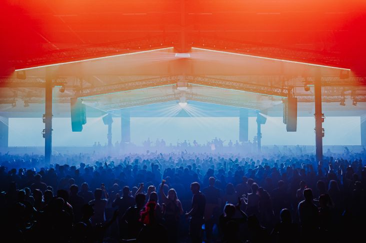
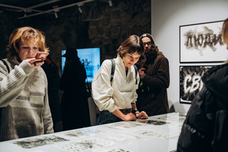
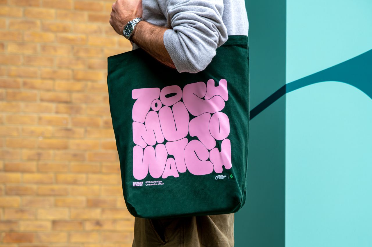
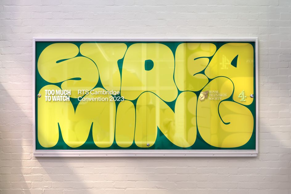
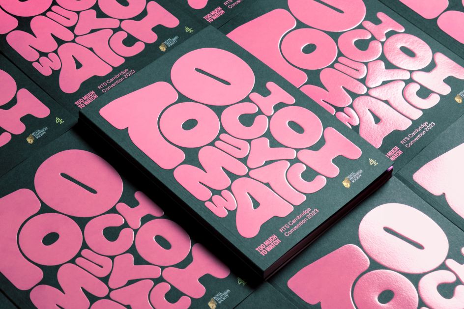
Carolien Grebe, client manager at JDO Global, identifies our third trend as: 'Funky and chunky'. By that, she means: "Rounded corners, rounded everything. Text that isn't just text can take over the canvas; it's part of the actual graphics. A mix of pragmatic and not. Fun, fluid, organic. A combination between thin and thick lines; energetic, with different paces."
Royal Television Society's annual two-day event by Studio Kiln
Royal Television Society's annual two-day event by Studio Kiln
Royal Television Society's annual two-day event by Studio Kiln
Examples of the funky and chunky trend can be seen in the recent identities for Tokyo Dome City by &Form and Royal Television Society's annual two-day event by Studio Kiln.
Trend 4: Large type families
Our next trend is more overarching and goes beyond individual typeface styles. "As brands continue to merge and consolidate, larger type families create opportunities for consistency and recall," says Rosie. "Type families with diverse weights and styles help unify complicated and layered brand architecture systems under a single shared typeface. In these instances, typography plays a major role in creating attribution across many pieces of communication and can be a valuable tool for unifying complicated ecosystems."
She's been recently putting this approach into practice at Trollbäck+Company. "While rebranding Sesame Street and Sesame Workshop, we used a type family that was broad enough to unify the two identities while allowing each brand to have its own unique voice," explains Rosie.
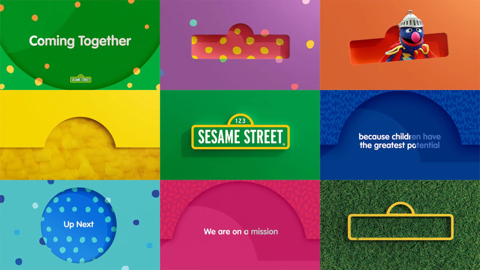
Sesame Street by Trollbäck+Company
Trend 5: 3D and interactive
"2024 is gearing up to be the year 3D fonts come into their own," says Mark Nichols, creative director at WMH&I. "And we're not just talking about any 3D, but truly immersive, interactive fonts." His evidence? "Tech like the Meta Quest 3 and Apple's Vision Pro are propelling mixed media VR, anticipating fonts tailored for AR, bridging the gap between distinctiveness and usability," he responds.
Eve Warren, senior creative at LOVE, agrees that 3D type is likely to be a big part of 2024 typography. "It's become a big trend lately, and I expect it to evolve moving forward," she says. Examples can be seen in the work of art director Thomas Burden, 3D artist Eva Cremers and creative director Daniel Escudeiro.
"With Adobe introducing a 3D tool into Illustrator and the rising popularity of tools like Blender, these techniques will become more accessible to designers and art directors," predicts Eve. "And they'll enable them to create playful and tactile work that adds dimensions to everything from campaigns to book designs, packaging and beyond."
. Photography by Hanina Studio](https://www.creativeboom.com/upload/articles/b1/b19808cdbba9b80ce32d7deb9406ed10a3b6768c_944.jpg)
Type Hype by Eva Cremers. Photography by Hanina Studio
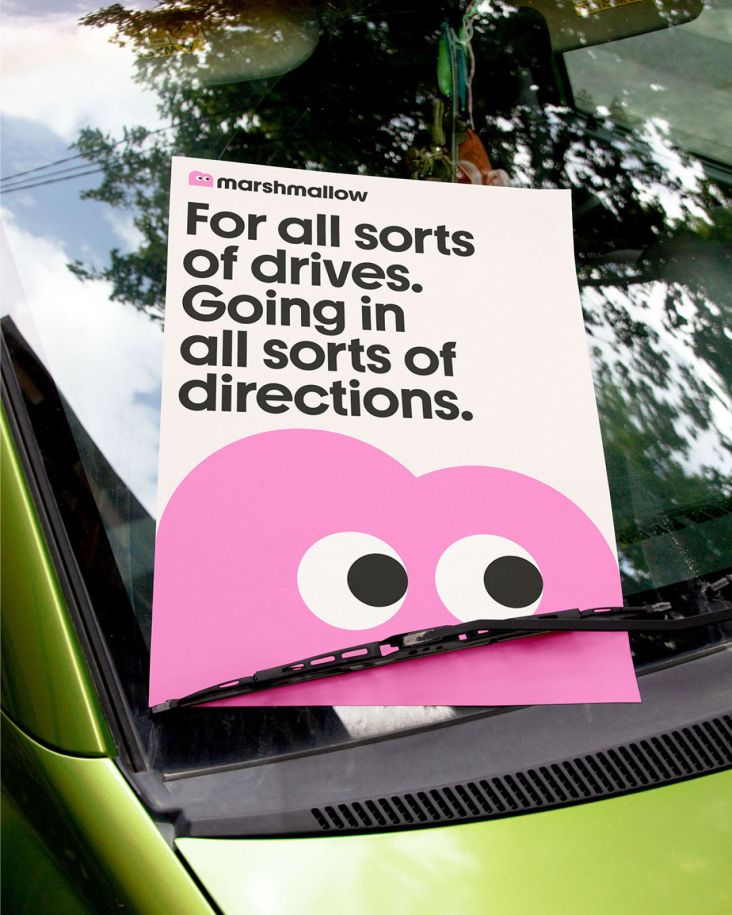
Trend 6: Massive x-height
Accessibility always needs to be front and centre of type design. And it's something Carl Rylatt, design director at UnitedUs, has been thinking a lot about lately.
"The more conscious we get about accessible design, the more we find that some of our favourite 'go-tos' as a designer are counterintuitive for many people," he points out. "Want to create impact quickly? Then your mouse may well be heading for those super chunky, condensed typefaces, set in all caps and 'hey presto', BIG IMPACT! Unfortunately, though, setting fonts in all caps, especially in tandem with low-contrast typefaces, can cause real legibility issues."
Which is why he thinks 2024 will be the year of the 'massive x-height'. "This allows designers to maintain the integrity of the shapes of words while still treating lowercase type as they would display type," he explains. "This means designers can achieve both legibility and impact without sacrificing either." Examples can be see in the font Mint Grotesk Display and the identity work by Ragged Edge for Marshmallow.
Ragged Edge for Marshmallow
Trend 7: Rise in open source
Designer Jessica Strelioff and strategist Danielle LaRoy at Goodside Studio are predicting a rise in open source fonts and foundries in 2024.
"While we believe that type designers should absolutely get paid for their work and hope this trend brings with it a more scalable way to pay for fonts, we think tightening client budgets and an increasingly long list of creative touchpoints such as VR and AR will drive an even sharper rise in open source or free-to-try fonts," they reason. "And that will only serve to reinforce these trends toward experimentation and imperfection."
Trend 8: A nostalgic backlash against 'blanding'
Digitally-led branding is a logical progression, but will we see companies buck the trend to ensure standout in a crowded market? "We've seen a trend of big names switching to uppercase sans to address the digital, small-screen inadequacy of their traditional wordmarks," Mark Richardson says. "The logic was sound, but it was also a shame to see, as some of those classic brand designs were truly iconic."
Partly in reaction to this, he believes we'll see designers look back to the past in 2024. "Times are very challenging right now," he reasons. "During difficult moments, we often seek nostalgia. So perhaps we will see more brands adopting this strategy, retaining and refreshing rather than completely rebranding. Some may even scrap recent rebrands and revert to previous iterations, like Burberry earlier this year."
That said, being inspired by the past doesn't necessarily mean blindly repeating it. "Some recent serif fonts have taken on a retro and vintage slant," notes Andy Briscoe, associate creative director at JDO Global. "A good example is Rakume by Graphicxell. It's tradition reinvented with a modern rule-breaking twist; elegant and anything but bland."
Artist Rhox combines old with new in nostalgic series of motion covers for music playlists
Such reinvented retro fonts are often on Superfried's radar, he adds. "We're always looking for personality and own-ability in a world of words. When time and attention are in short supply, what we say and how we say it matters like never before, so we love to say it with unapologetic personality and style. "
Trend 9: Multilingual typefaces
Most discussions around typography tend towards the functional and technical. But culture comes into it too, believes Malex Salamanques, director at cultural and creative consultancy Space Doctors.
"There is an important voice in typeface design that is becoming more prominent: feminist designers that believe that letters and their shapes carry deep cultural, social and political meaning and responsibility," she explains. "Fonts coming from Latin American and Perso-Arabic designers are committed to honour origin aesthetic and functional values in response to local challenges and needs. They intentionally leave behind the neutrality linked to the European tradition to better communicate – and honour – content."
As an example, she offers Tipastype's font Achtli, which is designed to make characters more recognisable for adult first readers in Mexico. There's also La Contraste, a trilingual display typeface covering Tifinagh Arabic and Latin scripts, by French Tunisian designer Naima Ben Ayed. "In 2024," Malex predicts, "we will see more multilingual typefaces made to honour content and embody its social and cultural dimension".
Trend 10: Use of AI
How could we write a trends article without mentioning AI? Caspar Lam and YuJune Park, co-founders at design consultancy Synoptic Office, explain how this new tech is affecting typography just as much as any other design discipline.
"Type stands at the intersection of design and technology," they note. "It is foundational to communication. While we're still in the early days of AI, designers are rapidly exploring how type can be created with these emergent tools. Stability AI recently announced that Deep Floyd IF now has the ability to not only render letterforms but also set type on any material and setting. The typography can be shown in various spatial relationships and alongside objects of different properties. This tool will only contribute further to the explosion of typographic experimentation and illustration using generative AI tools."
, by Andrea A. Trabucco-Campos and Martín Azambuja](https://www.creativeboom.com/upload/articles/61/61ef8a76df4e3f6f94a96b3f994fad983c247593_944.jpg)
Artificial Typography, by Andrea A. Trabucco-Campos and Martín Azambuja
, by Andrea A. Trabucco-Campos and Martín Azambuja](https://www.creativeboom.com/upload/articles/47/47075600518dd96e78899db02c73d2dd5ceb8cc2_944.jpg)
Artificial Typography, by Andrea A. Trabucco-Campos and Martín Azambuja
Such developments are covered in a recent book titled Artificial Typography, by Andrea A. Trabucco-Campos and Martín Azambuja. "Using Midjourney, they wrote prompts to generate typographic forms in the style of 52 iconic artists such as Bridget Riley and Piet Mondrian," note Caspar and YuJune. "The goal was to create letterforms as if the artist themselves had done it, and reimagining what a letterform can be in the process."
"Every innovation in production processes from mechanised printing to AI has led to gains in productivity and the distribution of form and ideas. As this technology grows, designers must wrestle with the relationships between creation and curation, and our role in the art and craft of translating, creating and articulating communication".
And earlier this year, world-renowned design director and typographer Craig Ward shook up the way fonts are made with NFTy.pe, a revolutionary new platform that is a "top-to-bottom rethink" of the type industry. Believe us, a lot more change will come.
Trend 11: Variable fonts
Let's be honest: we've been saying variable fonts will be "rising in popularity next year" for some years now. But in fairness, they have continued to rise in popularity, and that trend seems set to continue in 2024. So, we make no apologies for including them at the end of our list.
"Stepping into the world of variable fonts is like unlocking a new dimension of typographic artistry," enthuses Duncan Gravestock, design director at F37. "Our recent exploration with Dalton Maag and their widescreen typeface attests to this. Beyond just static designs, these fonts enable dynamic animations, especially when paired with interactive code, reshaping digital type design."
Duncan also points to the rise of unique and ownable variable sliders. "Designers will want to have more control over the feel and dynamic of a typeface," he believes. "A bespoke and ownable variable slider can give you that freedom to express the font in so many ways and allow that total control over the look and feel."
](https://www.creativeboom.com/upload/articles/66/66f744d9e3ca334e3f11cff1a85113697b9f4770_944.jpg)
Craig Ward's NFTy.pe
Editor's Picks


Trending


](https://www.creativeboom.com/upload/articles/86/862919952c0ad18439004228895a431dc6e45ffc_732.jpg)
Podcasts


Editor's Picks
Further Reading