Angel and Anchor create coffee & ice cream brand with heaps of personality
The Belfast-based branding specialists have pulled off another winning identity for Little Sister: a takeaway hatch on the northern Irish coast.
The owners of Lost & Found, a brew bar and eatery on the north coast of Ireland, have a long relationship with Belfast-based studio Angel and Anchor. They first partnered with them in their rebrand, which we covered in our news story. And now they've joined forces once more to craft a sister brand, literally called Little Sister: a takeaway hatch serving speciality coffee and soft serve ice cream.
Art direction and colour palette
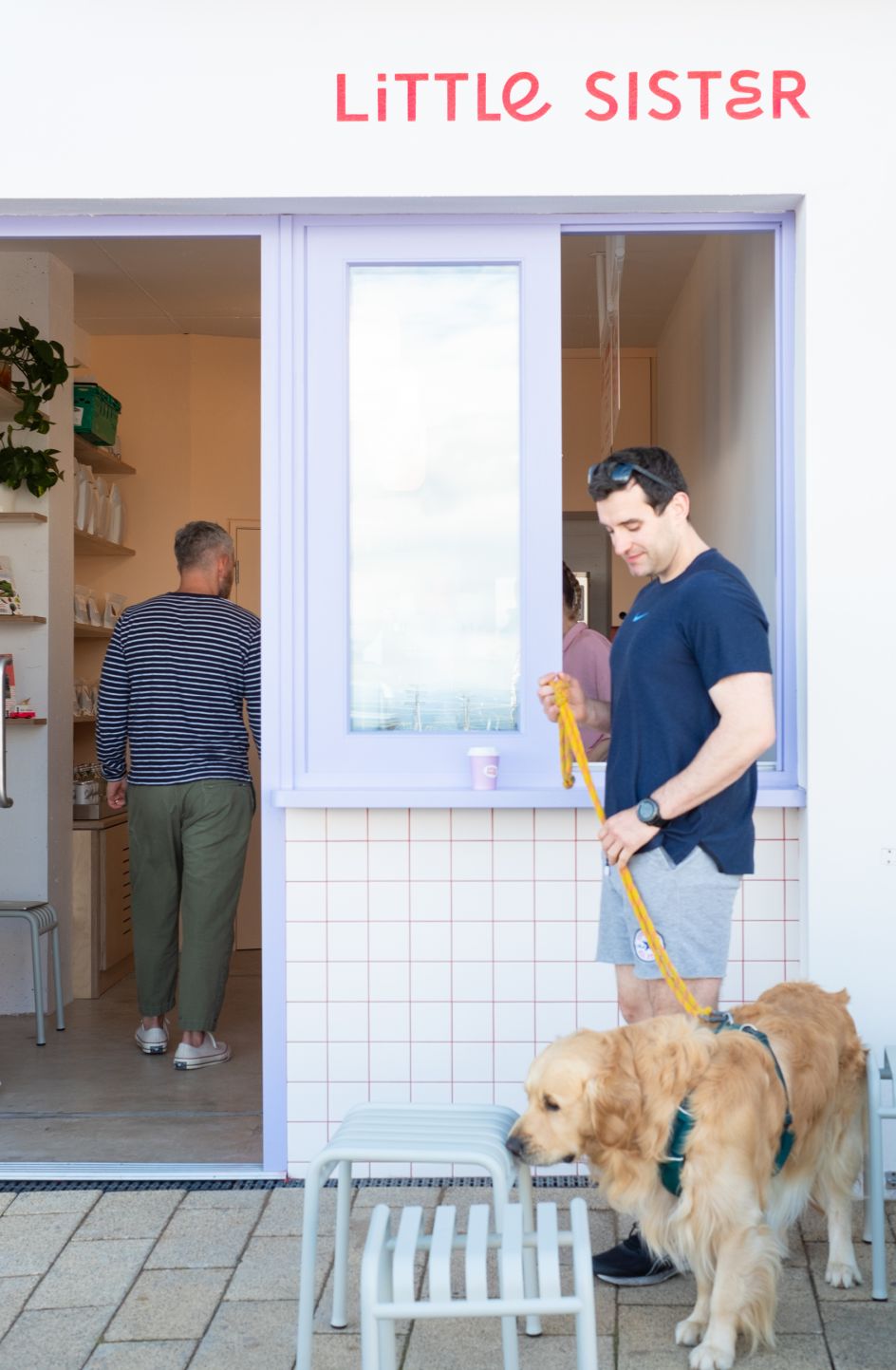
The new brand was designed to be part of the Lost and Found family, but with its own unique personality. Art direction was a key part of the creative scope, starting with the shop's fit-out and influencing other visual choices.
This direction informed fit-out details such as tiles, signage and surface colours, which immediately express a vibrant and fun personality characterised by bright hues and minimalist design. Key features of the interiors are inspired by classic ice cream shops, speciality cafe culture and modern editorial product photography.
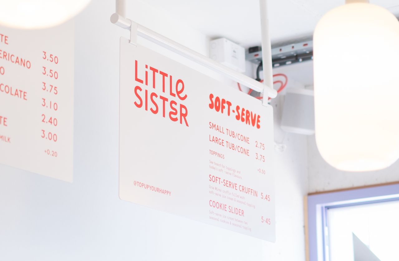
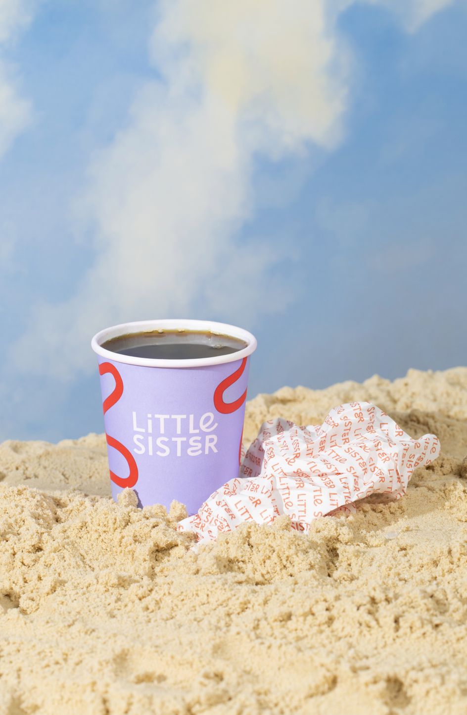
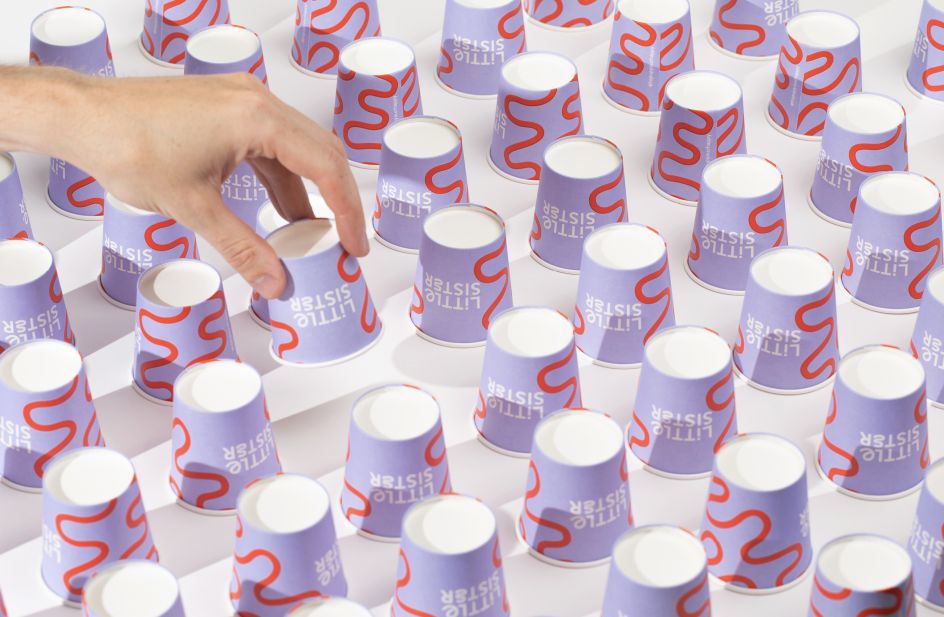
The brand identity flows through the details of the space. Parma violet purple, light peach and bright mailbox red form a sweet but punchy palette of colours, which splash the walls, contrasting grout with tiles, while a shiny coffee machine dips the shop in an upbeat personality.
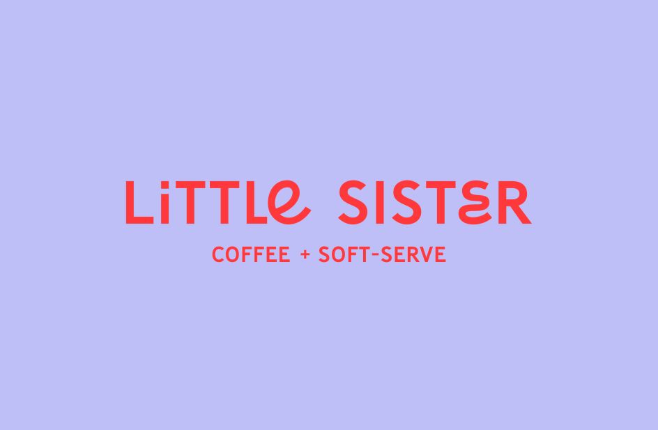
Typography and logo
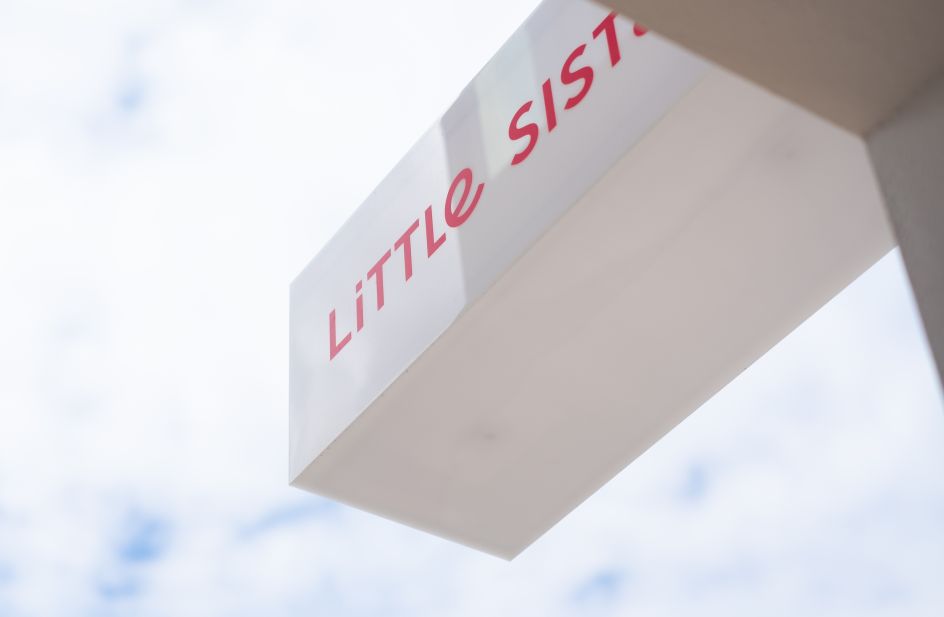
As for typography, Little Sister's custom mixed-case logotype combines a minimalist sans-serif with swirling letterforms. The round open curves inspired by children's handwriting paired with straightforward type create a playful nod to Lost & Found's approach to their new project and echo the nostalgic notes in their main branding.
Specifically, the curly 'E's' composed of flowing curves interrupting the tall sans serif's uniformity gives the brand an air of child-like mischief. Such playful hints throughout the brand evoke an overall sense of family-friendly fun.
Alongside the main logotype, alternative bubbly, inflated hand-drawn lettering provides a cheerful dose of personality used throughout signage and packaging. A pairing body copy in a monospace style makes for an approachable and relaxed feel in printed elements such as menus and shop opening hours.
The logo mark, meanwhile, is an abstract swirl inspired by the north coast ocean waves, winding country roads and soft serve ice cream swirls. Its design echoes the shape of the custom 'E' in the logotype with extended curves, becoming an illustrative motif for the brand, used across packaging and signage.

Brand language and copywriting
Brand language plays a lead character role in the new identity. A well-thought-through messaging strategy showcases the shop's personality and carves out a firm foundation for copywriting. It includes copywriting vignettes of north coast-specific, nostalgic immersion, uniquely identifying Little Sister's voice.
"Servin' up" is the spark for their keyphrase formula, which encapsulates the endless possibilities of the north coast. This paints a nostalgia-tinged picture of "wet hair and sandy toes," "break-time for beach architects," "big 'get-in' group selfies," and "back-seat sleepers" on north coast road trips.
Further emphasising the lighthearted, curious and friendly nature of the branding is the line 'Top Up Your Happy,' which hints at the seaside antics of regularly topping up sunscreen and keeping the morale sweet with sweet treats. "Whether you are a parent of little ones or reminded of your own little self," the team say, "this language system will hit you hard in the feels."
The overall message is clear and unambiguous: a visit to Little Sister is a unique way to experience the north coast, with something for everyone, including delights for mature palettes and big, soft-serve flavours for little hands.
Editor's Picks


Trending


Podcasts


Editor's Picks
Further Reading