StudioSpass installation for Chinese art fair is a textbook example of interactive art
Interactive artwork is great in theory, but in practice, it can be difficult to get viewers to play ball. Here's a great example of how to get them on side, from Dutch agency StudioSpass.
Who doesn't love an art book fair? It's a fabulous way to get fresh creative inspiration and potentially some great gifts for loved ones, too. And even better if there's some actual art to bring the event to life and elevate it above just a visit to your local bookshop.
Case in point: StudioSpass, a design duo from Rotterdam, was recently asked to create an installation for an art book fair in Shenzhen, China. And the approach they took proves the maxim that sometimes the simplest ideas are the best.
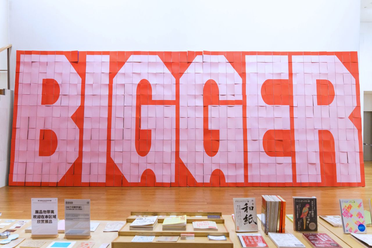
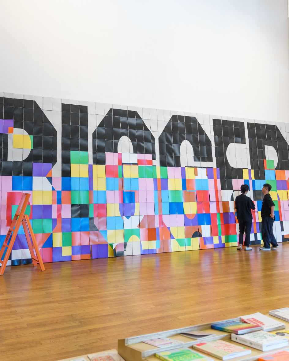
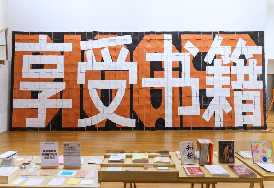
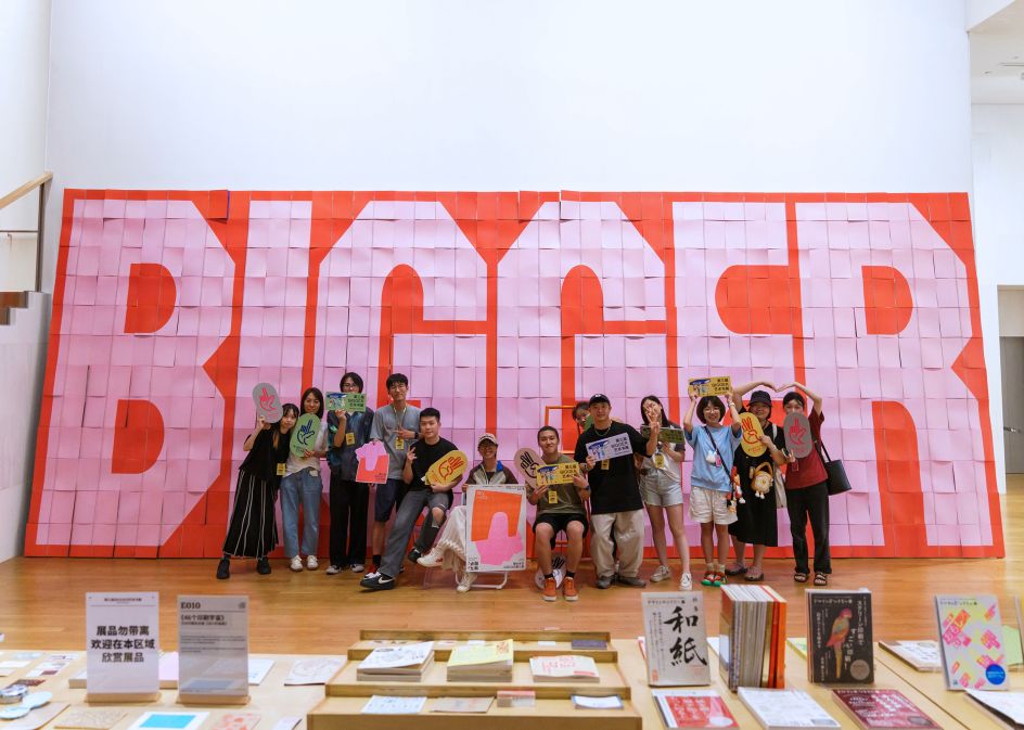
'Bigger' is an art book fair in Shenzhen organised by BranD magazine, an international bi-monthly magazine focusing on multidisciplinary communication design for businesses, with English and Chinese versions. For the installation, Jaron Korvinus and Daan Mens of StudioSpass decided to build it out of books themselves: 264 books, to be exact.
Colour-changing
The duo combined the books to form one large, interactive typographic composition. Each page displayed a snippet of the same typographic design in a different colour. It meant that when visitors turned the pages of the individual books, they could uncover new design layers and create custom colour combinations.
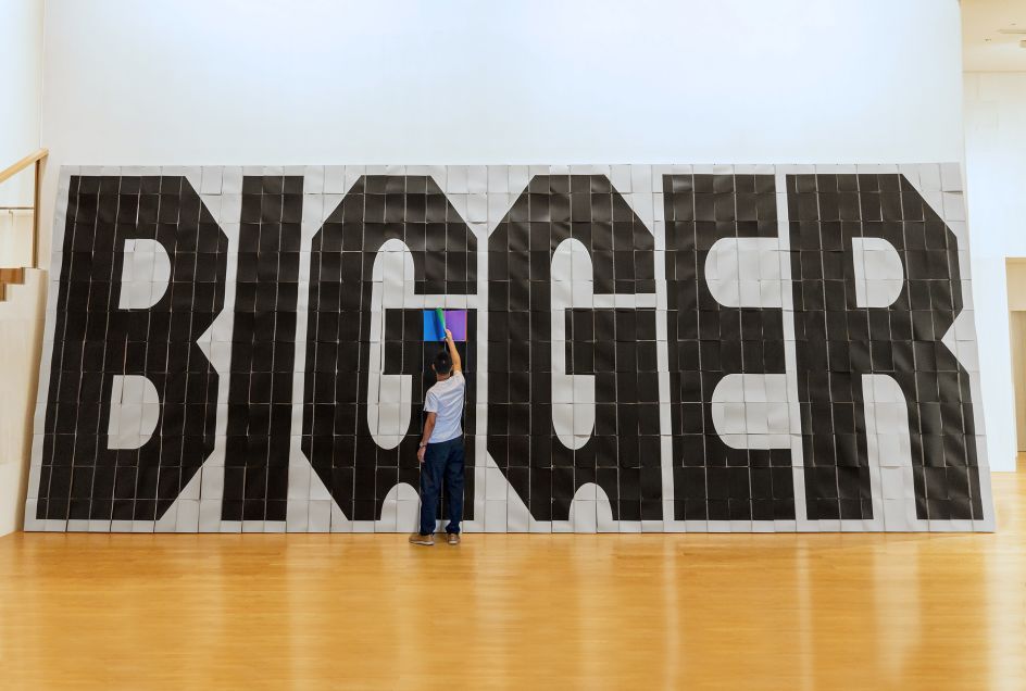
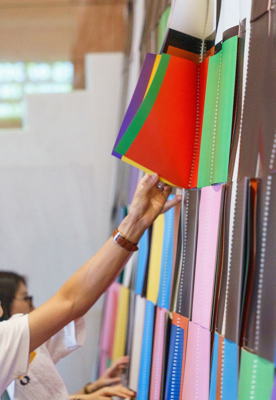
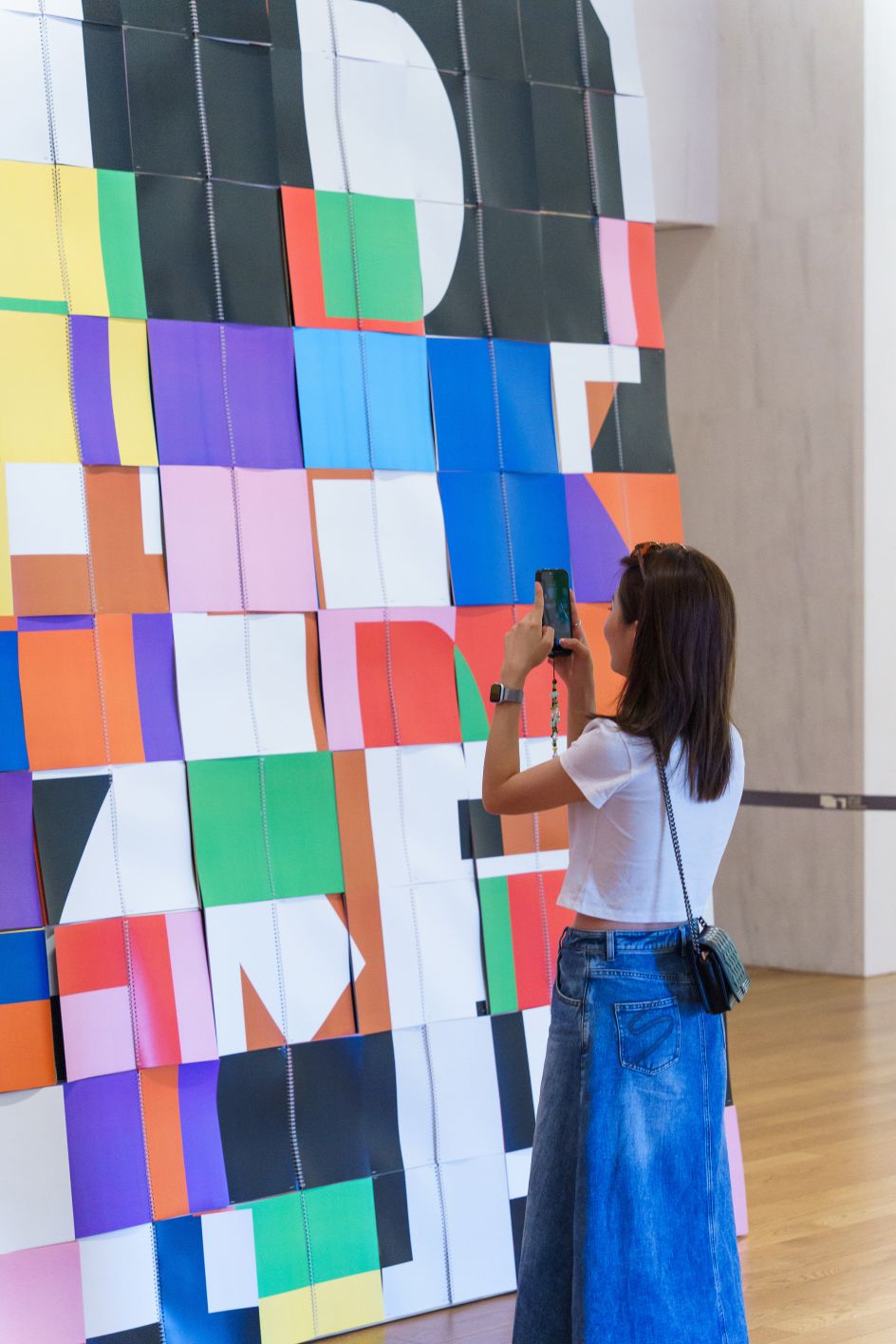
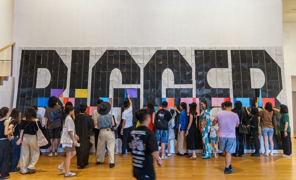
In other words, by turning the pages, the total composition of the work would change over time. Finally, a collective effort of turning all the books to their final pages revealed a large hidden typographic statement: 'Enjoy books!' in a bespoke typeface custom-made for the project.
It's a clever way to encourage interaction with artwork that's super-effective due to its simplicity. Turning pages is something universal that most people are familiar with, and it allowed visitors to get involved without needing lots of explanation.
Plus, the idea was executed brilliantly. The high colour contrast of the designs enhanced interaction to create new compositions, and as the books got used, the pages would bend and add more texture to the work.
Relinquishing control
'Bigger' is the first installation by StudioSpass presented in China and builds on earlier interactive installations by the studio presented worldwide. "We aim to discover various new ways of how graphic design can be presented and interact with people," explains Jaron. "We love to create designs in a framework and hand them over for the people to play with. Having no control over the output and being surprised by the results of interaction never ceases to amaze us."
More broadly, StudioSpass works across identities, campaigns and spatial design projects and is known for combining a rigorous, considered and intelligent approach with a playful sensibility.
The studio is interested in exploring the boundaries of visual systems and how these can be presented in various ways. Their work ranges from graphic identities and experimental typography to spatial design and experiences in public spaces. Responding to space as a given context is often the starting point for their creative process in which their fascination for form, material and interaction perfectly align.
Editor's Picks


Trending


](https://www.creativeboom.com/upload/articles/86/862919952c0ad18439004228895a431dc6e45ffc_732.jpg)
Podcasts


Editor's Picks
Further Reading