Film Fest Gent's animated rebrand contains a clever nod to the nature of movies
Independent creative studio Mutant™ has created an animated new identity for Belgium's largest film festival, Film Fest Gent, and it contains a genius subtle nod to the nature of motion pictures.
First established in 1974, Film Fest Gent is an all-encompassing, ten-day celebration of cinematography. Bringing together the best of every genre for public entertainment, inspiring conversations and an enriching atmosphere, it truly is a paradise for film lovers and filmmakers.
This year's festivities saw Film Fest Gent hit a significant milestone in the shape of its half-centenary. To make the occasion, it teamed up with advertising and design agency Mutant™ to create a colourful, moving rebrand that pays homage to its history while looking to the future. As the studio puts it, "turning fifty never looked this good."
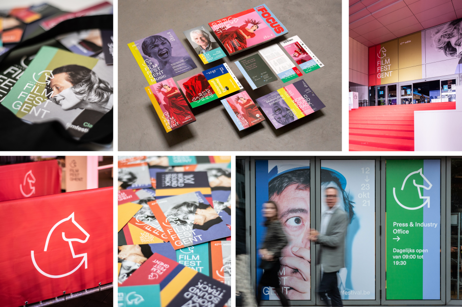
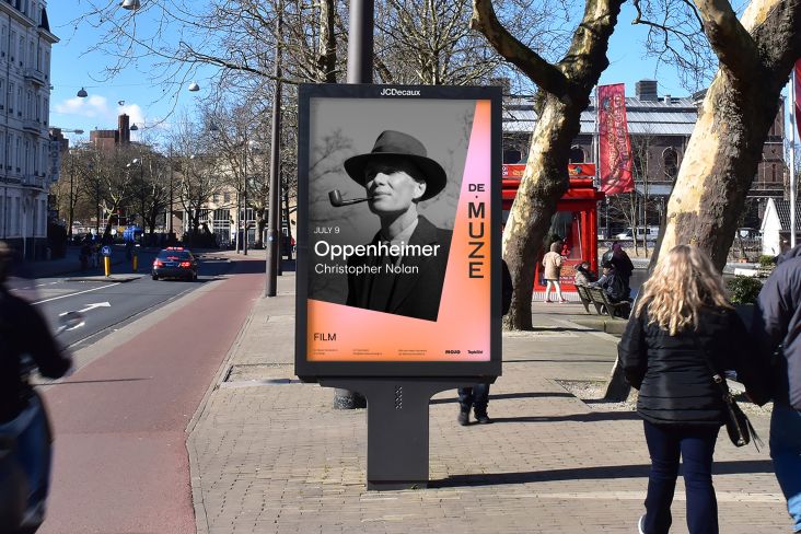
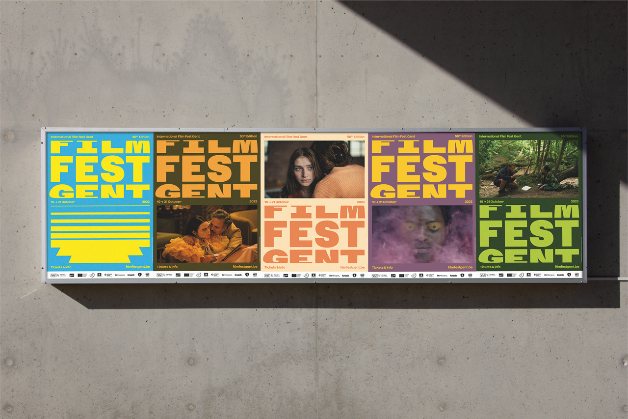
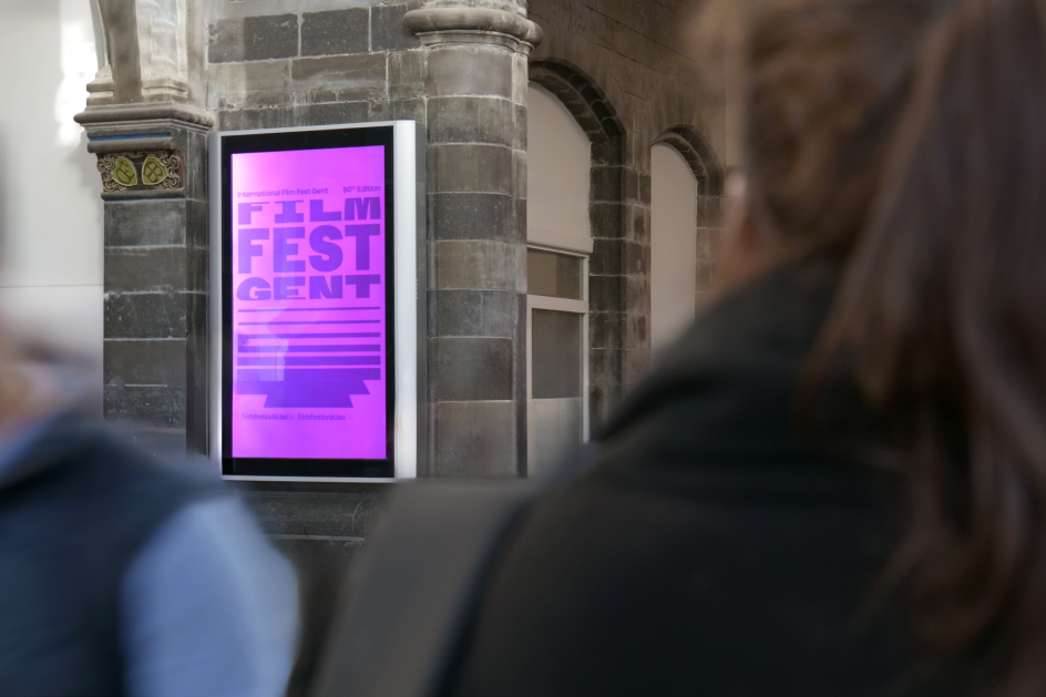
Appearing across every aspect of the festival's branding, including digital assets and OOH material, the new identity bursts with vibrant, striking colours and revolves, almost literally, around a cleverly designed logo.
This wordmark, set in Displaay's Azeret Mono, sees the words Film Fest Gent stacked vertically, with the top and bottom words appearing squeezed as if trailing off into the distance. No, this isn't an error on the designer's part but is, in fact, a canny reference to the film reels of yesteryear, specifically the circular shape of Joseph Plateau's Phenakistoscope.
It sounds like a bit of a mouthful, but according to Mutant™, the Phenakistoscope motif serves as a homage to the rich cultural heritage of Belgium's biggest film festival. "Both the still and animated version of the contemporary design set an expressively dynamic tone, illustrating the jubilant atmosphere of a true festival."
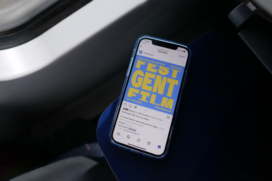
That's right, this logo runs with the motion picture theme by appearing to rotate, with each word scrolling past like the frame of an old film or a still from an animated wheel. As for the three main colourways that dominate the identity, these were defined before any material from the featured movies was confirmed.
"The palette was then extended by taking samples from the richness of all the movie poster imagery once contestants were announced," adds Mutant™. "This radiant use of colour can be felt throughout the communication and resonates in a world far beyond dark cinema halls."
This appears to just be the beginning of an ever-evolving identity, too. The studio confirms that the "unique thematic pattern" present in the rebrand will change year after year, allowing each festival going forward to tailor its look to a specific need while also appearing consistent under the same design umbrella.
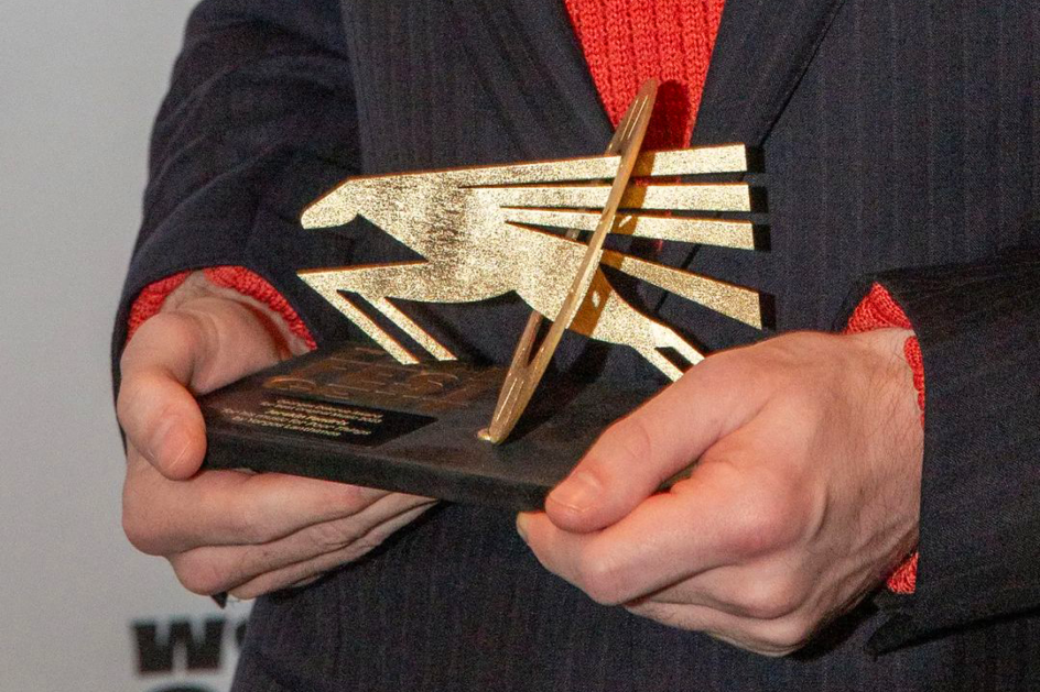
The new identity doesn't mean the iconography of the previous look has been done away with, though. The horse of Film Fest Gent is a design staple of the festival, and its history is closely linked to that of Ghent. Indeed, the Joseph Plateau Honorary Award features a Phenakistoscope with images of a horse that appears to gallop all around it.
This icon has received a "design upgrade", not an overhaul, while the other film prizes have been reinterpreted by German illustrator Benedikt Luft to continue the equestrian theme. "The festival's icon now bravely jumps forward towards the future of film and is used to accompany the word mark as a brand asset where relevant," Mutant™ explains.
Benedikt adds: "Films have always played a big role in my life; it's one of the most interesting and accessible art forms out there.
"In a world where we are constantly confronted with an incessant flow of images and information, cinema offers the space for reflection, focus and new thoughts. An inner process that can thus be translated into taking action, developing a critical eye and living a life full of empathy and positive change."
Editor's Picks


Trending


](https://www.creativeboom.com/upload/articles/86/862919952c0ad18439004228895a431dc6e45ffc_732.jpg)
Podcasts


Editor's Picks
Further Reading