Switchboard LGBTQIA+ support line gets a 50th anniversary rebrand
Creative agency Nice and Serious 'creates space for every conversation' by drawing inspiration from the service's history.
A lot has changed for the LGBTQIA+ community in the past 50 years – not least the addition of some letters to that acronym.
But the Switchboard support line has been there for five decades, helping people find an understanding ear at any point on their journey with sexuality and gender identity.
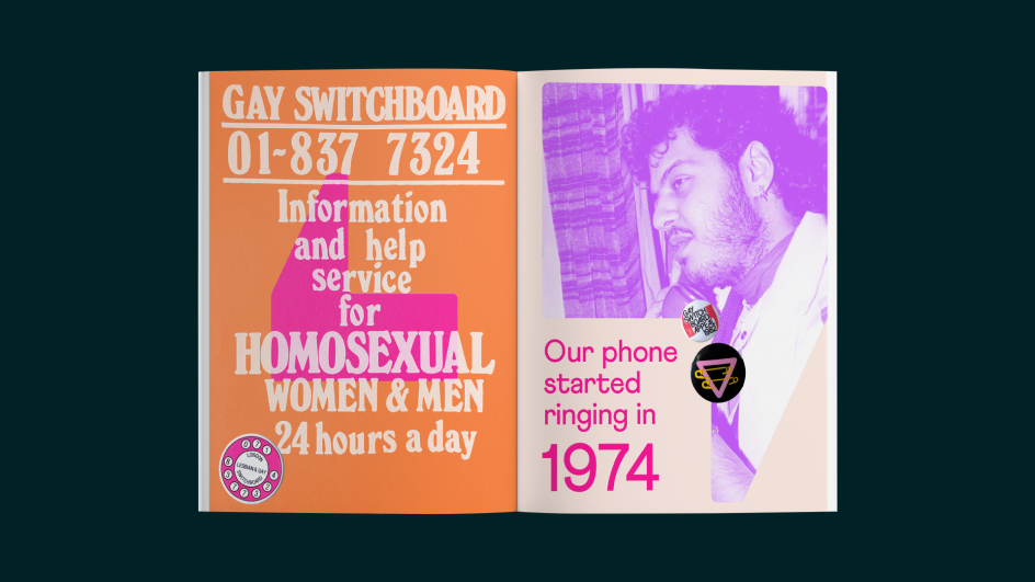
So London-based Nice and Serious was able to look back at the charity's work since its inception in 1974 to draw inspiration when Switchboard decided on a rebrand to mark the milestone.
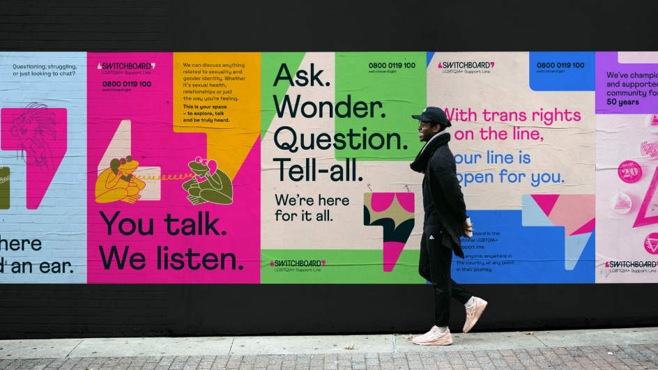
Built around the idea of creating 'space for every conversation', the new brand positions Switchboard as a welcoming space for anyone in the extended LGBTQIA+ community to talk about whatever is on their mind.
Harriet Kindleysides, senior strategist at Nice and Serious, says: "We developed a project process built around bringing together as many perspectives as possible to create a brand which feels both true to the Switchboard experience and relevant for the wider community.
"This included people who identify as LGBTQIA+ from across the Switchboard team, their volunteers, and voices from the extended community. Together, they helped influence our approach and were consulted throughout the project to strengthen our work."
Nice and Serious developed a tone of voice that can be adapted for every conversation and situation. It developed three core principles to allow Switchboard's voice to adapt while remaining consistent. The first is 'sensitivity', being warm, open-ended and creating space for others to talk. The second is 'dependable', bringing a sense of calm and reassurance. And the third is to be 'illuminating', putting a spotlight on hope, and stepping up with clarity and conviction when needed.
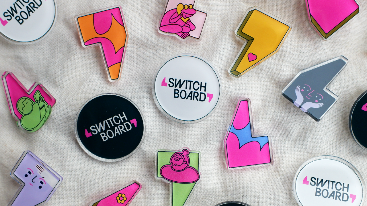
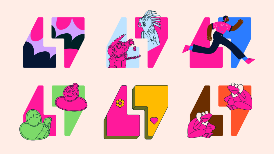
The new visual identity references Switchboard's archives, drawing inspiration from 50 years' worth of materials hosted at Bishopsgate Institute in London. Pin badges and the sense of pride from wearing them were a key part of Switchboard's story. Among them, one badge, in particular, inspired the central motif of the new design system – the speech marks that hold the space for conversations.
Anna Barton, senior designer at Nice and Serious, adds: "Focusing on the speech marks allowed us to design the new canvas for conversation while honouring Switchboard's history. The logo itself takes its form from this bit of history, with bespoke lettering housed in the space between the two marks. The speech marks become a key part of the brand's graphic language – a dynamic canvas for different moods and messages.
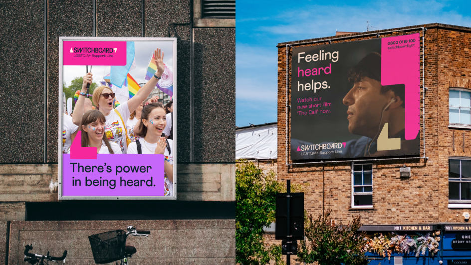
"Among the different identities that Switchboard has had over the years, pink was always a defining feature, so we kept this as a central colour to build on this historic association. But to reflect the diversity of the changing community, we also developed a dynamic colour-pairing system inspired by the rainbow flag. Like the tone of voice, this allows flexibility within the design system – it can be soft and sensitive, as well as bright, proud and illuminating.
"The personality of the community came through powerfully in the archive materials; we wanted to keep a sense of this spirit within the new brand. In particular, the tactile feel of the old notes and memos inspired the use of a typewriter typeface to support headlines."
The result was an open-ended illustration style to allow the brand to continue to be a space for community expression, and Switchboard intends to build on this by collaborating with illustrators from the LGBTQIA+ community itself to build a library of brand assets.
Stephanie Fuller, CEO of Switchboard, says: "Switchboard's 50th Birthday year provided us the perfect opportunity to refresh our brand. Creating a new visual identity that celebrates our past continues to establish our relevance in the present and will carry us into Switchboard's future."
Editor's Picks


Trending


Editor's Picks
Further Reading