Wolff Olins' new logo brings back a sense of fun to agency branding
Just when we were all getting tired of clean-yet-bland minimalist logos, the veteran agency throws a curveball with its new wordmark.
You've most probably heard of Wolff Olins, but if you're on the younger side, you might not realise just how influential they are. Put simply, they're pretty much the OGs of modern branding design.
Founded in 1965 in London's Camden Town by designer Michael Wolff and advertising executive Wally Olins, they were one of the first agencies to focus on corporate identity. They went on to help develop some of the world's most iconic brands, including The Beatles' Apple Records, Unilever, Johnson & Johnson, Google, Airbnb, the NHS and the London 2012 Olympic Games.
Of course, they put as much work into their own branding as that of others. So we're excited to see them today announce a global refresh of Wolff Olins' brand expression, including a new visual and verbal identity, wordmark, website and assets.
The logo
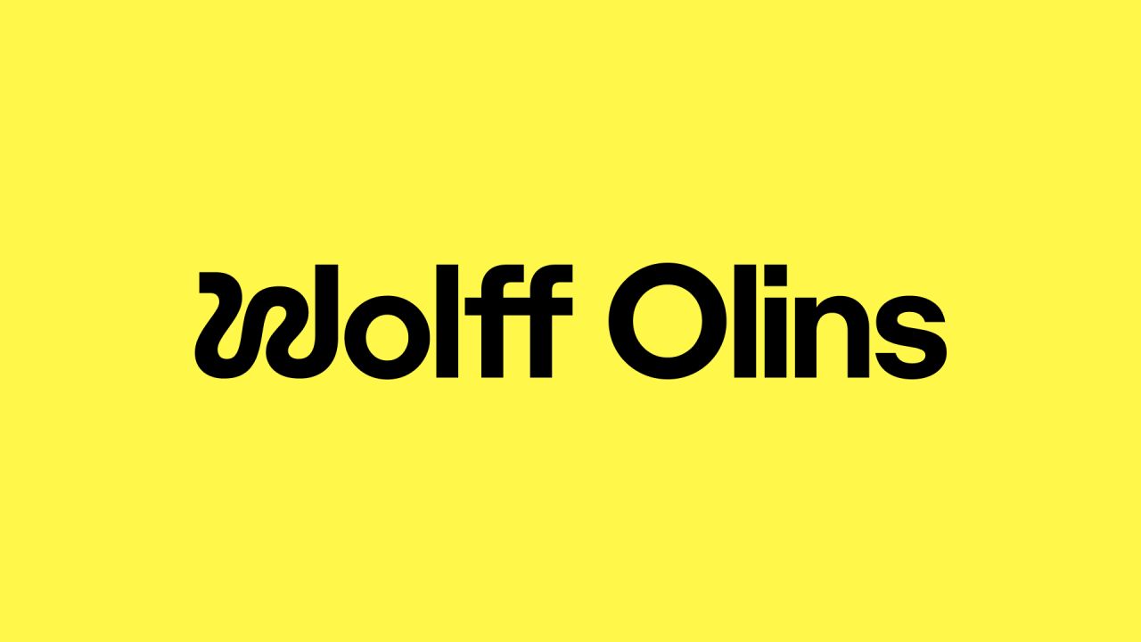
A lot of deep thinking and sophistication has clearly gone into this brand transformation, and it's about more than just a logo. But let's be honest: it's the main thing people will discuss. Because that 'W' is pretty far out.
This wildly squiggly, yet still legible, initial character contrasts sharply with the other clean, orderly and professional-looking sans-serifs. And we'd argue that's all to the good. Without it, we'd be looking at a rather bland, tech brand-style logo which looked good in 2010 but which we've started to tire of lately.
Its inclusion adds a dash of youth personality, cheeky rebelliousness and... well... creativity, something which is paradoxically lacking in the branding for many a creative agency these days. This sense of personality intensifies further in the animated version of the logo, which sees the 'W' emerging, snake-like, before uniting with the rest of the logo.
That's not to knock tech branding per se, of course. If you think about it, a geometric, orderly logo for a tech company does make conceptual sense because tech products are meant to be orderly, predictable experiences; no one wants an iPhone that has a mind of its own. Creative agencies, in contrast, are expected to be more spontaneous, innovative and, sometimes, unpredictable places: that's where the best work gets done. So, a little splash of that in the branding is no bad thing.
It seems that's pretty much Wolff Olins' thinking here, although, as is typical these days, their press release expresses this in much more poetic language.
"The W and O of the new wordmark represent the maths and the magic, the fusion of the creativity and rigour that has always been at the heart of Wolff Olins," it reads. "The W of the new logo captures one of Wolff Olins' core pillars: enjoy the ride – inside the business as a team and externally with its clients.
"It also reflects the non-linear journey it goes on with clients, the value it places in experimentation and diverse perspectives – it's not about the easy or most direct path to find the solution but about the search for what will create transformative brands for clients and give them their competitive edge.
"The O of the new logo represents its commitment to strategic rigour and precision. This combination of creativity and rigour has driven Wolff Olins from day one, along with a deeply rooted commitment to finding better and more positive ways to do business and make a difference in the world."
Er... right. Seems like one squiggly letter and a bunch of sans-serifs are doing quite a lot of work here, then. But we kind of get what they mean.
Meaningful connections
The brand refresh and creation of the new website has been led by global principals for design Wayne Deakin and Thomas Wilder, along with creative director Tyler King. The new website, which was developed in partnership with product studio Oak, showcases some of Wolff Olin's most recent transformational work across an array of sectors, including work from GSK, LG, Instacart, TikTok, Uber, The Met and Leeum Museum of Art.
And Wayne Deakin believes this is very much a redesign for the times. "The world's been through a significant moment of reckoning politically, socially, environmentally and economically; it's profoundly changed how people feel," he explains. "People are feeling disconnected, burnt out and undervalued. It's harder than ever to captivate employee's hearts and minds. And people are seeking out more meaningful connections in their lives.
"The new identity signals how we look at today's challenges and find answers for our clients. This journey is far from straightforward, especially in today's fiercely competitive and messy landscape, but it's one we enjoy and thrive in."
Thomas Wilder adds: "We find enjoyment in the wild, weird and wonderful during the creative process as we search out what's special. When it boils down to the core essence of what we do at Wolff Olins, it starts with the alchemy of curious individuals here who want to make magic for our clients day in and day out.
"Ultimately, our goal is to help brands become transformative. As our approach evolves, our offerings expand, and new offices open, we felt it was time for a transformation ourselves. We hope you enjoy it as much as we've enjoyed the ride getting there."
Expanding the agency
The new branding comes at an interesting time for the global consultancy. As well as opening up in LA this year, they've also made a raft of new hires across 'experience' and 'culture' in recent months as part of a drive to deepen its focus on these core areas.
Boosting its culture and experience talent in the past year has been Martin Hargreaves and Markus Nonn, who joined as creative director and associate creative director for environmental design, respectively; Alex Bradley, who joined last month as executive strategy director for Experience; and Kwesi Blair and Julia Race, who joined in the summer as senior strategy director and senior director of Culture, respectively.
"We've been defining and pioneering new eras for brands for nearly 60 years," says global CEO Sairah Ashman. "As the world, society, and clients shift, it's important to keep things fresh and evolving. There's such an amazingly diverse range of clients and talent out there, and we want to make sure they know who we are and what we're all about. That's why we're refreshing how we go to market to better reflect what we believe and do and continuing to build a global team of the most amazing talent to serve our clients with an integrated, holistic offer."
Explaining the role 'experience' and 'culture' play within their philosophy, she continues: "Experience and culture go hand-in-hand when building brands: A single powerful future vision and ethos made true inside your business through your culture and employee experience and outside through each and every interaction with your audience.
"The right internal culture brings a brand to life, and the right brand attracts people to that culture. Through well-conceived and designed experiences, a brand is made real, inside and outside the organisation. That's a powerful virtuous circle if you can make it all work harmoniously.
"If you take the right approach, you can use brand as a tool to unite people and partners across an organisation and get them working as one, towards one common goal. With your direction set and your people aligned and inspired to act, you can design and deliver experiences for customers and, beyond that, make a real impact. That's how you achieve transformation."
Editor's Picks


Trending


](https://www.creativeboom.com/upload/articles/86/862919952c0ad18439004228895a431dc6e45ffc_732.jpg)


Editor's Picks
Further Reading
](https://www.creativeboom.com/upload/articles/c6/c6c61bd8fc04434adcee7d90d766a1b1154c597b_732.jpg)