DNCO creates new visual identity for Florentia Village, a maker space in north London
DNCO's new branding for a maker space in north London celebrates 'the love of making' to ready the development for future expansion and attract more maker-entrepreneurs.
Florentia Village is a north London secret. Established as a textile manufacturing centre in the 1970s, this creative maker space in the Harringay Warehouse District is home to over 40 makers and design-led businesses today.
Now DNCO has developed a playful, industrial-inspired identity to raise Florentia Village's profile and ready it for future expansion as developer General Projects redefines and reinvigorates the campus, doubling its size with more than 90,000 sq ft of new facilities.
The brief
DNCO's brief was to create a brand that preserves the tradition of making while injecting new interest and energy into the creative maker space. DNCO developed the positioning, narrative, brand identity, website and multiple large-scale mural designs.
The new brand celebrates the creative process with the slogan: 'For the love of making'. It also reflects the area's long history of making, which spans fruit pastels to pianos. When major employers moved out, light industry and artists moved in. Today, Harringay Warehouse District is an established community within the Tottenham Creative Enterprise Zone and is protected by Haringey Council with a policy on warehouse living.
"Any creative space in our capital is worth celebrating and protecting," says Brenda Sjahrial, senior strategist at DNCO. "Florentia Village is particularly special. It has a homegrown charm and sense of independence that is hard to replicate. We wanted to ensure our brand captured its character and allowed a degree of freedom for artists to make their own.
"Our challenge was to create a brand positioning and narrative that spoke directly to our audience and supported them in their creative endeavours," she adds. "For creatives, it's often about the process as much as the output. 'For the love of making' captures that all-encompassing, exhilarating and idiosyncratic creation process."
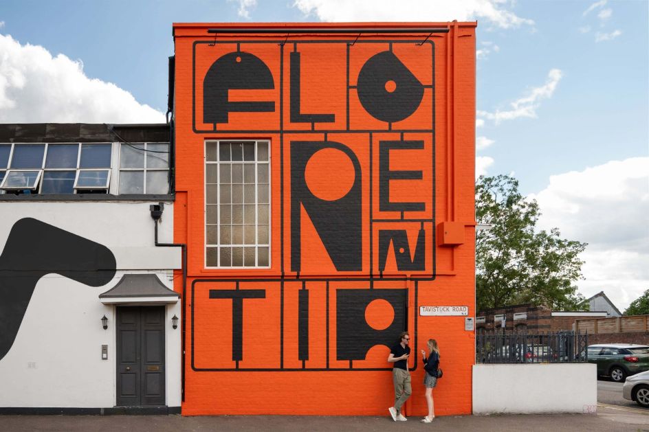
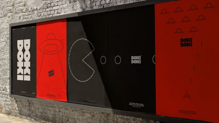
Type and logo
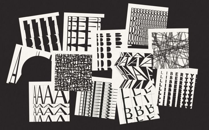
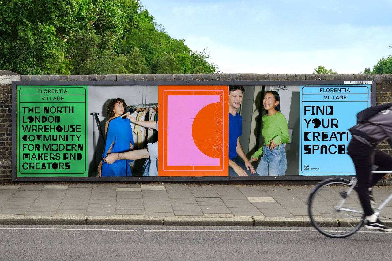
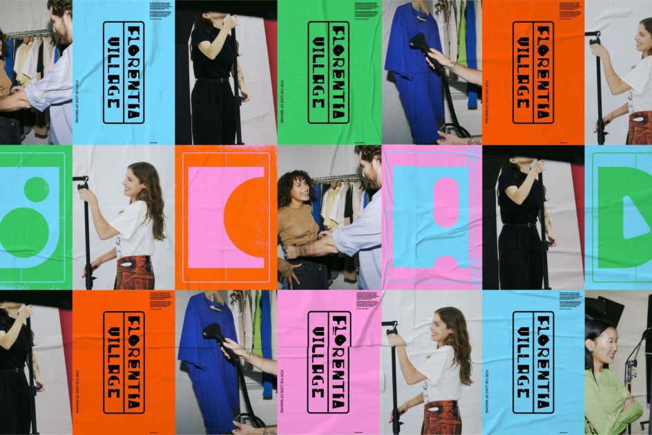
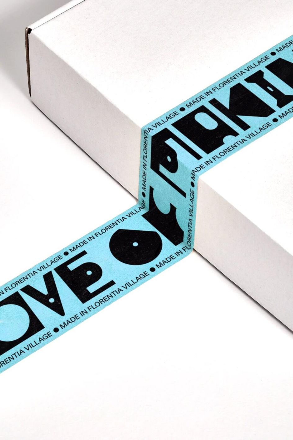
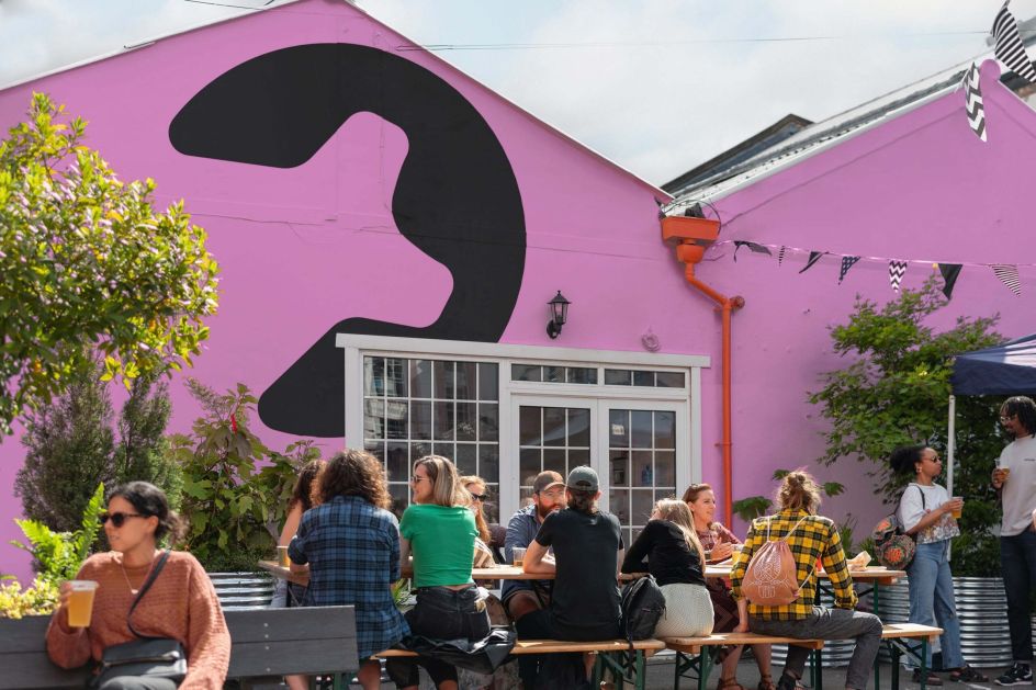
DNCO's typographic system borrows bolts, hinges, disks and manufacturing motifs to evoke the joy of craft in progress. A poppy and bright palette pairs with monotone textures that reference the fly-posting advertising in the area. 'Unpolished' and 'individual' were key watchwords, emphasising process over perfection.
"We were inspired by tools of the trade and the industrial nature of moulding, where pour lines are revealed as connecting lines of sprue," says Maria Hamer, senior designer at DNCO. "With this as a starting point, we developed a flexible framework to showcase the individuality of the makers. Abstract shapes that convey making and assembly are utilised as alternative glyphs in this bold and playful identity.
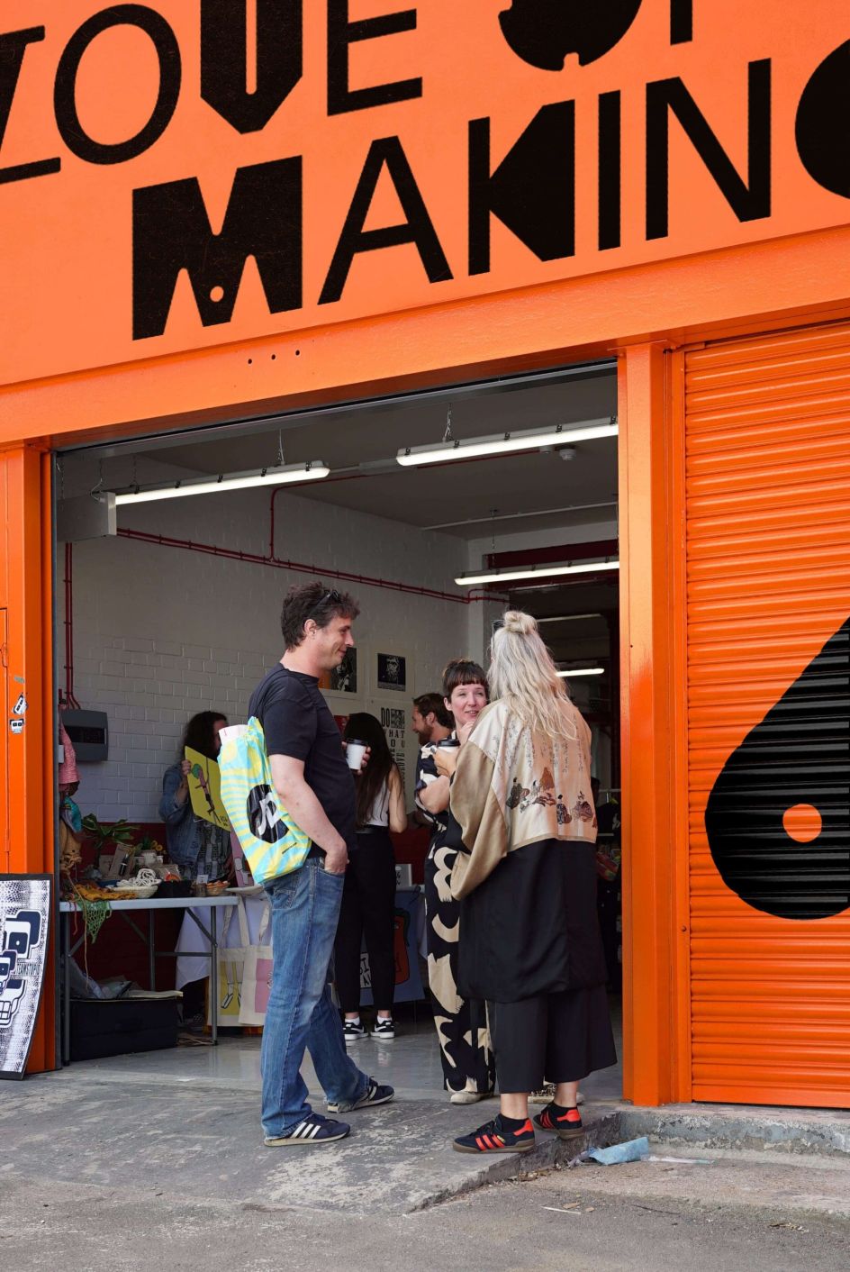
"It's an identity that doesn't shy from grain and imperfections; in fact, we embrace them," she adds. "Lo-fi textures, cut-out portraits and strong flash photography are reminiscent of DIY zine culture that invites everyone to get involved. We wanted an approach that reflects and celebrates the surrounding warehouse district while thoughtfully injecting fresh energy into the area."
The custom-designed, flexible logotype reassembles perpetually to reflect a place that is constantly creating. The sprue framework – the solidified channels through which molten material is poured into a mould – allows the brand to showcase the personalities of the different makers and artists.
The brief asked for a digitally native brand that would also be a hardworking tool in the physical world. The colours and graphic language help unify radically different architectural aesthetics — charming cottage-style buildings from the 1970s sit alongside new contemporary corrugated steel warehouses.
"Our ambition at Florentia Village is simple," says Connor Brazendale, asset manager at General Projects. "To create a place that people love and want to work, whilst enhancing the incredible creative community that exists in the Harringay Warehouse District."
"The new identity celebrates the independent and entrepreneurial spirit of makers through a joyful expression of the brand. It is also underpinned by a simple, powerful message: that no matter the size of business or enterprise, a community can be brought together by the love of making."
Editor's Picks


Trending


Podcasts


Editor's Picks
Further Reading