Frightfully free fonts: 6 Google fonts for Halloween designs
Seeking spooky typography but don't want to pay for it? These brilliant horror fonts aren't just high quality; they're free for both personal and commercial use.
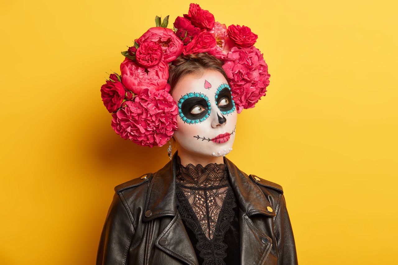
Image licensed via Adobe Stock
It's Halloween season, and whether you're working on a big commercial project or just a poster for a local event, you want your design to convey a sense of suspense, fear, unease or outright horror. And the right font can make all the difference.
However, you don't necessarily want to license an expensive typeface for a one-off occasion. But you don't want to taint your design with a cheap and nasty free font either. Fortunately, there are several free Google Fonts that are perfectly suited for Halloween.
Inclusion in the Google Fonts library – a repository of respected, open-source typography projects – is typically a mark of high quality. And they're free for personal and commercial use, with no requests for donations or need to provide an email address, so you can download them with minimal fuss and with zero guilt. (For more options, see our guide to the best Google Fonts.)
So take your audience on a spectral journey through our selection of horror-themed Google Fonts. From eerily extended serifs to curiously curved sans-serifs, these fonts will ensure your projects are hauntingly memorable!
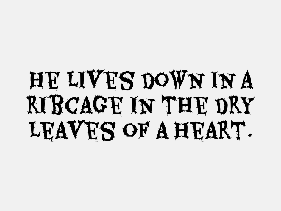
1. Creepster
With a dripping, melting aesthetic reminiscent of horror movie posters from the 1950s and '60s, Creepster is purpose-made to give your designs an instantly spooky vibe. That makes it perfect for everything from Halloween invitations and party posters to website headers and social media graphics. Developed in 2011 by Sideshow, an offshoot boutique type foundry of the Font Diner retro display font foundry, this font supports 41 languages. It was designed by Stuart Sandler and David Cohe.
Why it's spooky: Ghastly, gory and gruesomely gleeful, this font will bring an eerie, unsettling vibe to your designs. It is ideal for creating Halloween materials of all kinds.
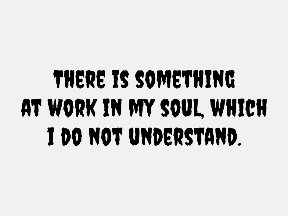
Creepster via Google Fonts. Quote from Mary Shelley, Frankenstein
2. Nosifer
Here's something a little different: a bold and unsettling font with sharp, aggressive edges and blood-drip embellishments. The typeface was designed by the late great Vernon Adams, who said: "Nobody knows where Nosifer comes from. It emanates a dark stench as it drips from the Internet." Available in OTF and TTF formats, Nosifer offers a great way to evoke a truly sinister atmosphere within your Halloween designs.
Why it's spooky: The unusual combination of rigid geometry and bloody drips calls forth images of classic vampire tales and horror narratives, intertwining an assertive presence with a subtext of horror and brutality.
Nosifer via Google Fonts. Quote from Stephen King's It
3. Butcherman
If you're working on anything related to zombies, Butcherman is a great choice. This disturbingly top-heavy horror font was also designed by Vernon Adams, who once described it as "a zombified display font, hacked and chopped and left for dead, yet still crawling". With a rusted, decayed aesthetic that's unlike anything we've seen elsewhere, this is well worth considering for your Halloween designs.
Why it's spooky: There's something very skull-like about the shape of this font. And this eerier silhouette, coupled with its sharp, jagged edges, creates a visual synonymous with decay and a post-apocalyptic or horror movie setting.
Butcherman via Google Fonts. Quote by Ryan Mecum, Zombie Haiku: Good Poetry for Your…Brains
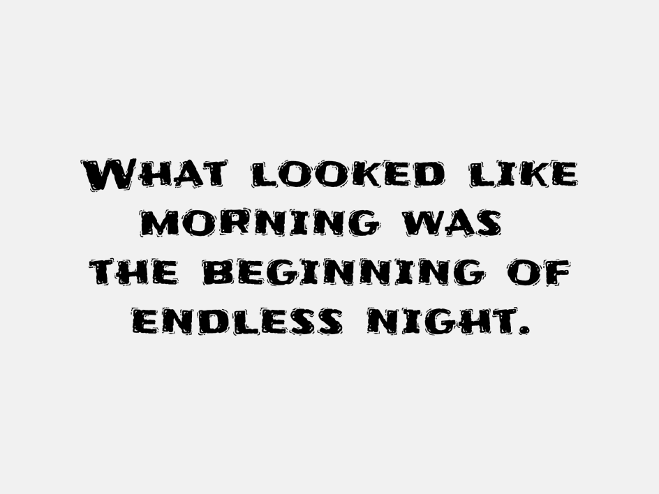
4. Eater
Eater is a friendlier-looking font than the ones we've featured so far: more reminiscent of a scary children's book than an R-rated slasher movie. A regal yet decayed font with sharp serifs and a dripping, corrosive aesthetic, it's perfect for creating elegantly eerie designs for your Halloween creations. Makers Typomondo describe it as "a display font infected by the darkest of a rare disease that slowly spreads at night while the web font user sleeps".
Why it's spooky: The juxtaposition of Eater's curvy, serif form with its jagged barbs makes for an unsettling ambience – but not one that's too scary for kids.
Eater via Google Fonts. Quote by Thomas Harris, The Silence of the Lambs
5. Frijole
Frijole is a chunky display font that on the fact of it is more playful than horrific. Yet there remains an underlying sense of the disturbed within its bold, blocky characters, making for a lighter, whimsical take on spooky. It was designed by Sideshow, who described it as "bold, spicy and satisfying".
Why it's spooky: Despite its seemingly cartoon-line nature, Frijole can convey a quirky, unconventional sense of unease when paired with the right kind of spooky illustration. Indeed, in the right design, it could become even more unnerving than a purposely horror-like font.
Frijole via Google Fonts. Quote by William Peter Blatty, The Exorcist
6. Metal Mania
Heavy metal bands from the 1980s are commonly associated with horror-themed album covers and occult-themed song lyrics, not to mention (largely imagined) accounts of Satanic backwards messages. So, while Metal Mania is more about nostalgia for rock-and-roll rebellion than Halloween as such, these elaborate, other-worldly serif characters could certainly serve the purpose of a Halloween font within an appropriate design.
The font was designed by Dathan Boardman of Open Window, who says: "Metal Mania was inspired by lots of Heavy Metal album covers and posters. Only the most 'Metal' elements were combined to make the quintessential Heavy Metal font. First drawn were the inline forms, and then they were traced, utilising a playful 'cutout' effect."
Why it's spooky: Its intricate, slightly warped design, reminiscent of classic rock album covers, imparts an old-school, mystical and rebellious vibe, aligning perfectly with vintage and rocker-themed Halloween visuals.
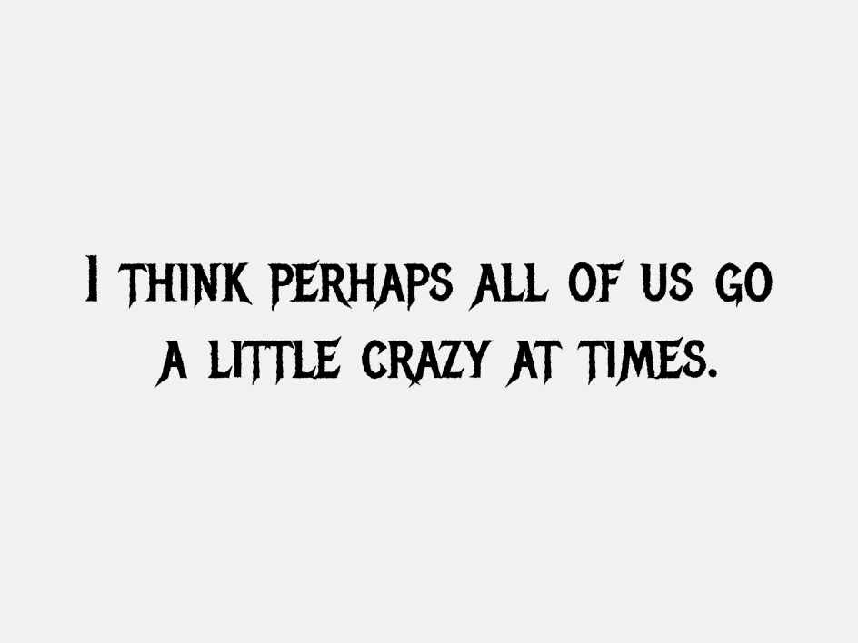
Metal Mania via Google Fonts. Quote by Robert Bloch, Psycho
Editor's Picks


Trending


](https://www.creativeboom.com/upload/articles/86/862919952c0ad18439004228895a431dc6e45ffc_732.jpg)

Podcasts


Editor's Picks
Further Reading