People People demonstrate how to brand a drink that no-one can describe
Thorntail Hard Argave is somewhere between a seltzer and tequila. Read on to learn how the Seattle branding studio made it all make sense.
Ever had a drink that you found difficult to describe to someone? Frustrating, isn't it? Well, that's exactly the challenge that Seattle branding studio People People were faced with recently when they were approached by the company behind Thorntail Hard Agave.
The makers of this new agave-based beverage, now available at QFC and Fred Meyer in Washington and Oregon, wanted to develop a unique, eye-catching brand that resonates with consumers. But there was one big hurdle.
Thorntail Hard Argave defies categorisation: it's not quite a seltzer, not quite tequila, but something new entirely. This posed both a challenge and an opportunity for the studio to do something different.
Research and Strategy
In developing a solution, People People carried out a market audit, and their designers identified two prevailing trends.
Firstly, logos of hard seltzers were often set against white or highly saturated colours. And secondly, products that feature agave as an ingredient typically showcase an icon of the plant. To break apart from the norm and communicate the product's uniqueness, People People opted for a different approach.
Packaging design
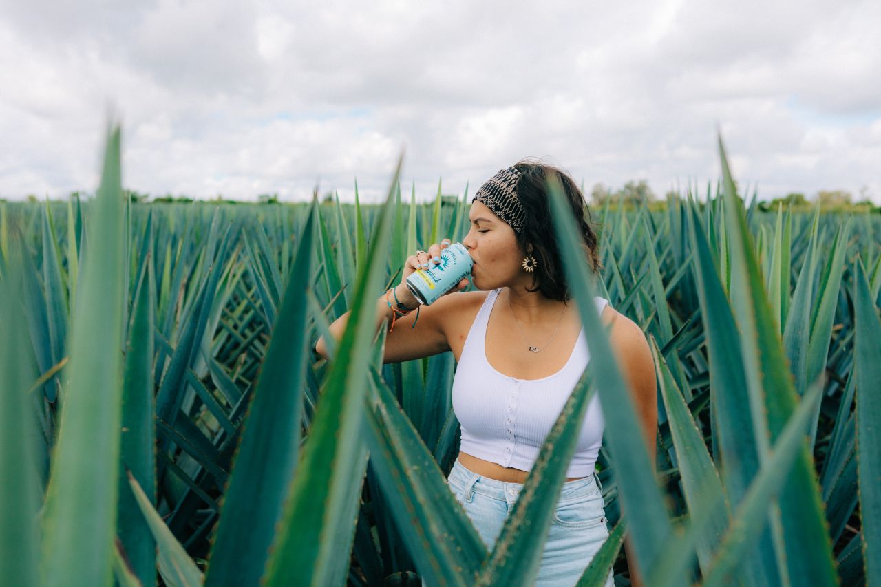
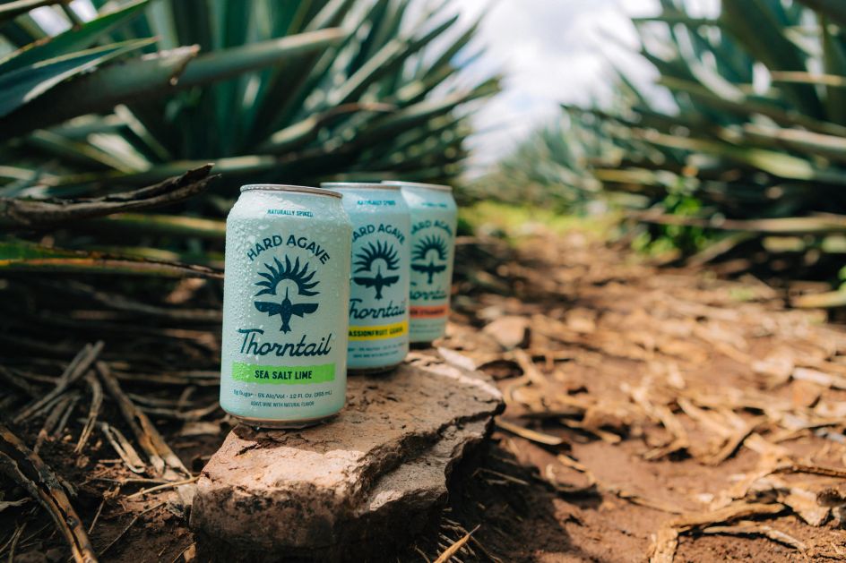
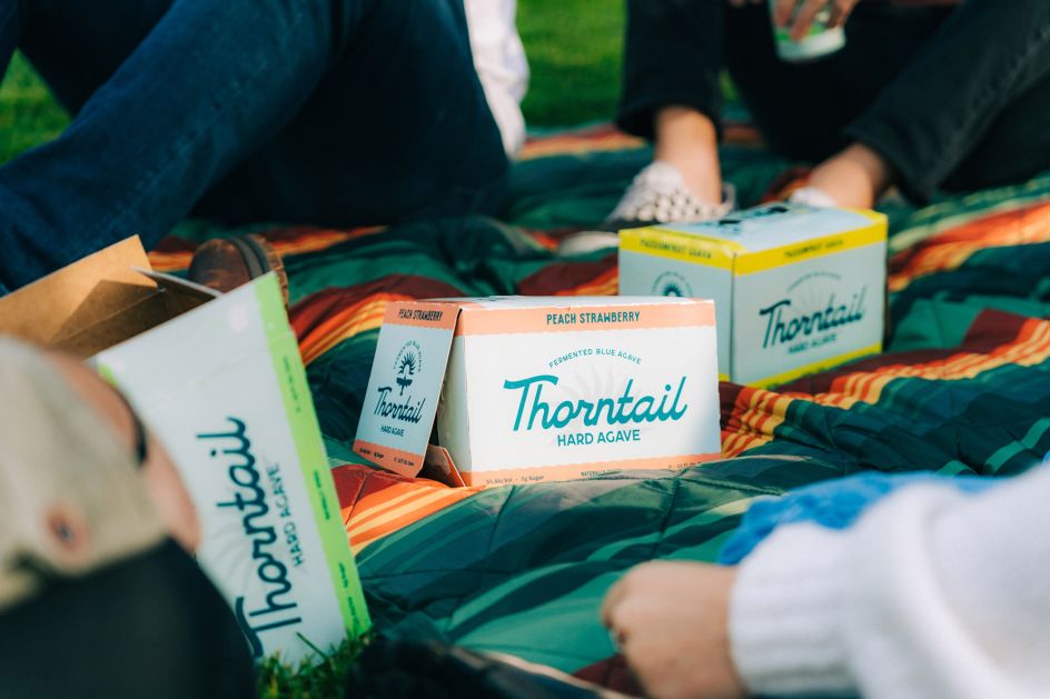
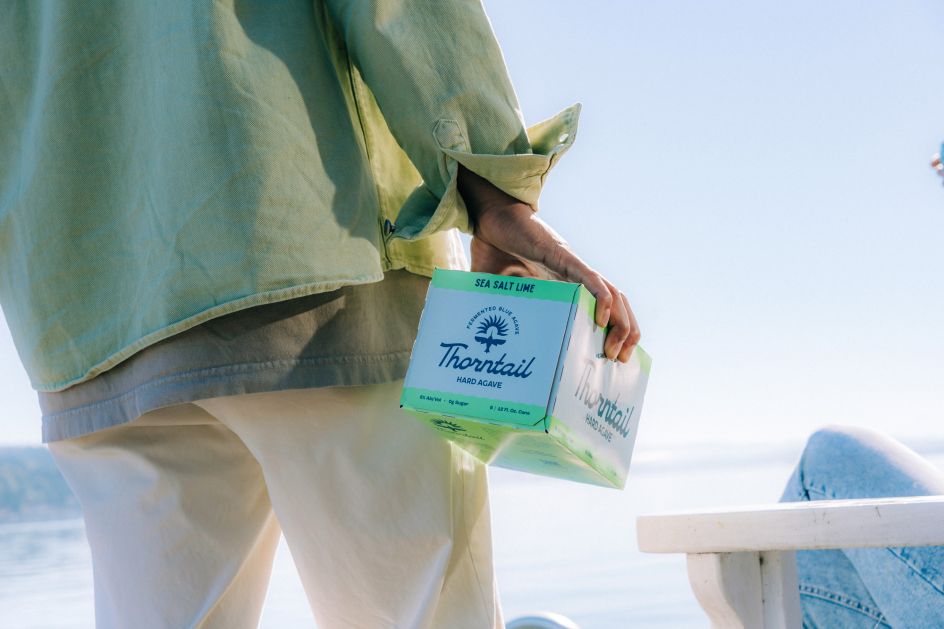
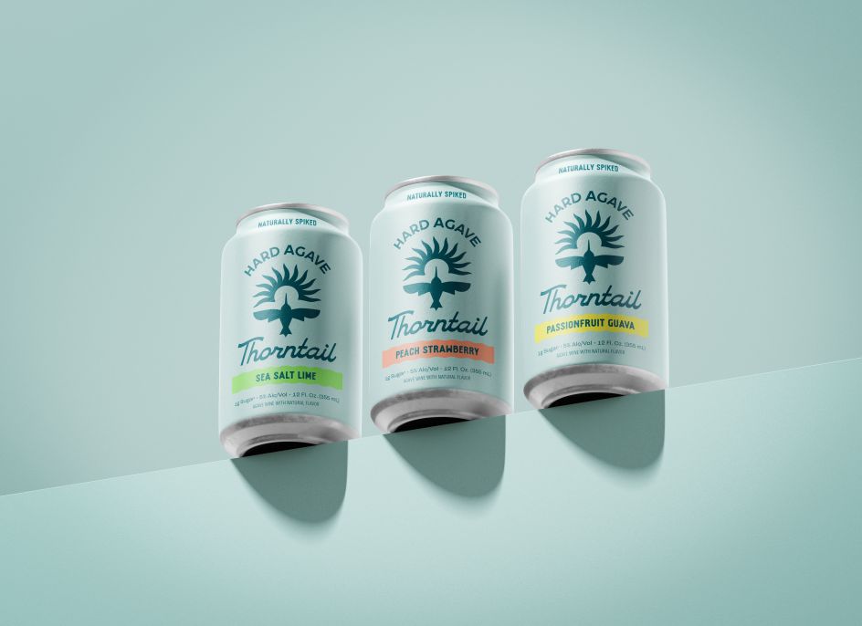
An overarching goal for the packaging was to feel fresh, vibrant and invigorating: attributes that align with the product. With only 2g of sugar and an alcohol by volume of 5%, the product's lightness is reflected not only in its taste but also in its visual representation.
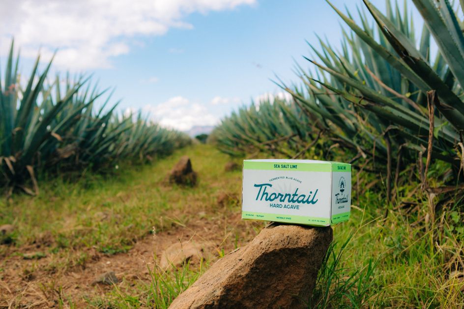
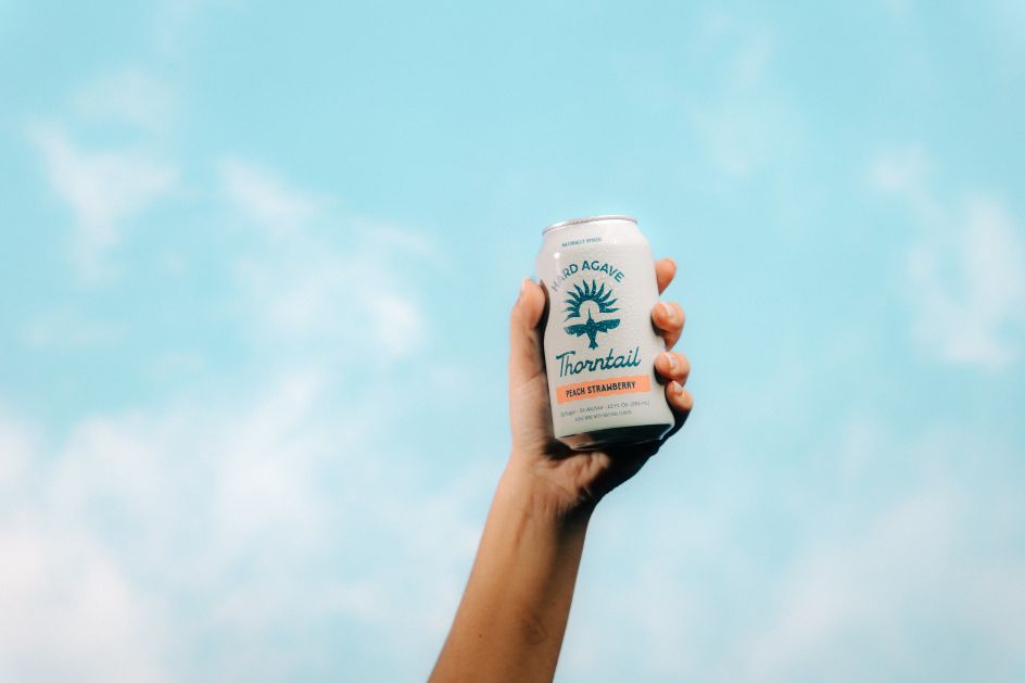
The brand, cans and six-pack boxes all showcase a distinctive tone-on-tone pairing of light and dark teal blues. Inspired by the Blue Weber agave plant, from which Thorntail's fermented agave is derived, the colours evoke a sense of brightness that mirrors the beverage's refreshing taste.
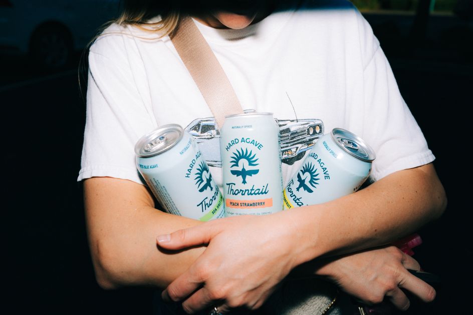
Also, as a strategic move to bolster brand recognition, designers maintained colour consistency across all packaging, side-stepping the typical industry practice of changing backgrounds on a per-flavour basis.
Illustrated approach
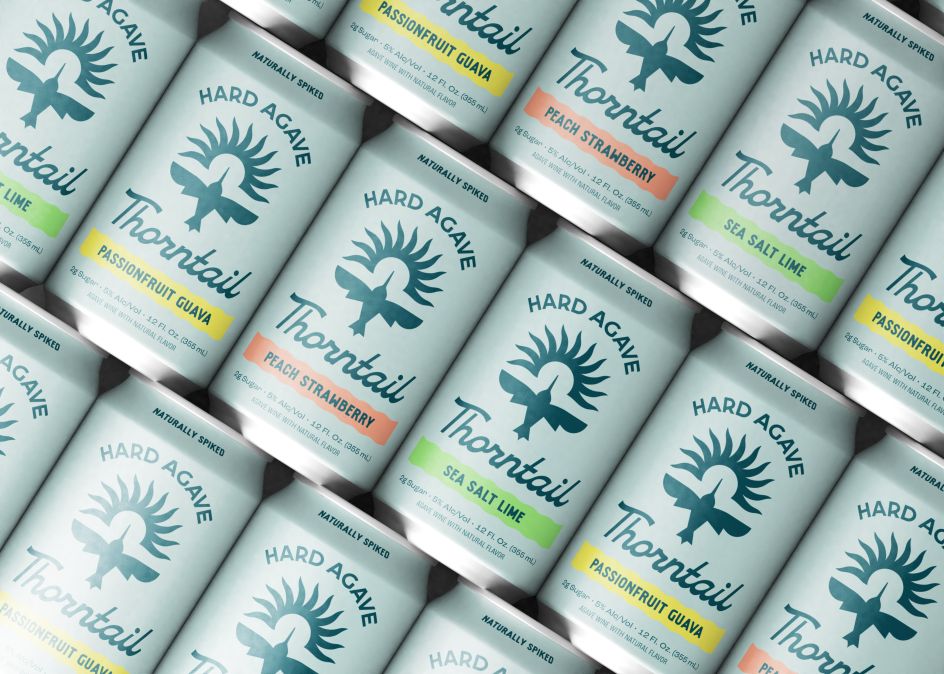
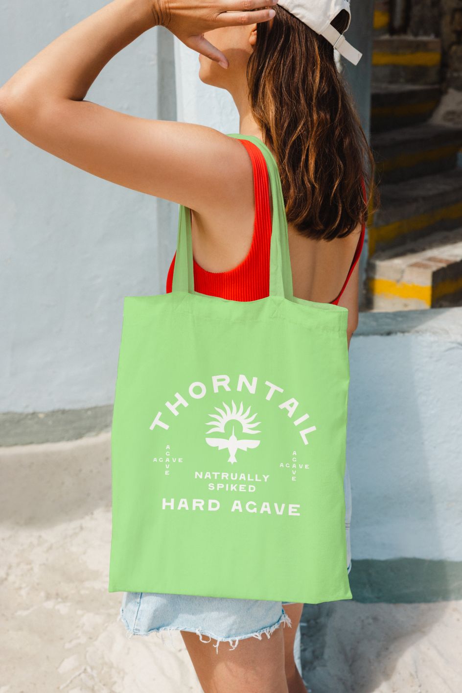
In a departure from the usual agave plant graphics, People People drew inspiration from Thorntail's namesake: the thorntail hummingbird. Known for pollinating agave plants, these hummingbirds embody the same light and zippy characteristics as the beverage.
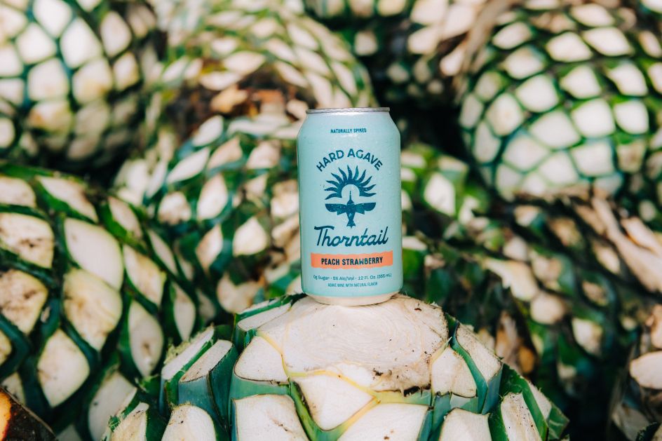
The visual identity features an abstract illustration of the hummingbird, symbolising upward flight for an uplifting feel, accompanied by a script typeface inspired by the hummingbird's graceful movements.
'Hard Agave' or 'Fermented Hard Agave' is prominently displayed alongside the logo and product name to pique consumer curiosity. Meanwhile, recognising the limitations of can space for detailed information, People People created Thorntail's website as a hub for in-depth education. The website features a playful infographic that takes consumers on a journey, detailing the production of hard agave from farm to can.
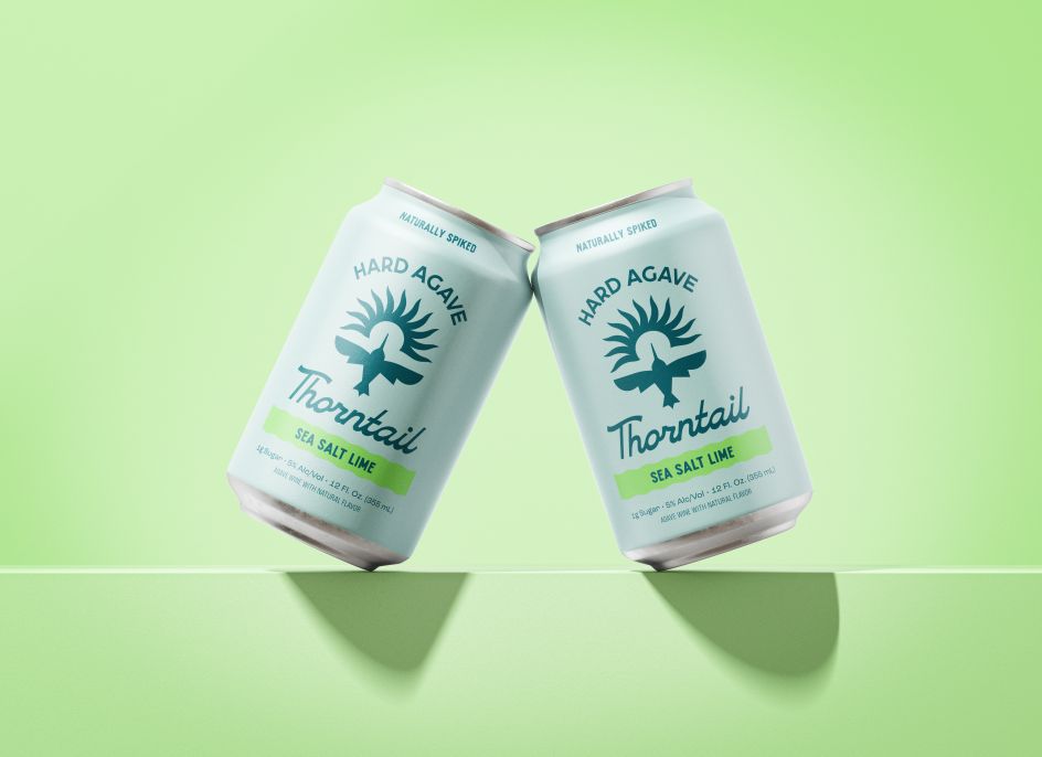
In summary, the completed design is as light, energetic, and uplifting as the beverage itself, featuring an abstract illustration of a thorntail hummingbird, complemented by a script typeface and tones of teal influenced by the Blue Weber agave plant.
The result of this original creative approach ensures that Thorntail Hard Agave not only stands out on the shelves but also strikes a chord with consumers seeking a unique and refreshing experience.
Editor's Picks


Trending


](https://www.creativeboom.com/upload/articles/86/862919952c0ad18439004228895a431dc6e45ffc_732.jpg)
Podcasts


Editor's Picks
Further Reading