Good Habit builds serene brand identity for AI marketing tool, Wonda
The London studio's visual identity for a new AI tool, Wonda, avoids adding to the noise with a simple, emotionally engaging design.
As our recent special report highlighted, AI is no longer a niche interest but is increasingly integrated into the toolkits of agencies everywhere, and used on a day-to-day basis. And that applies just as much to marketing as anywhere else.
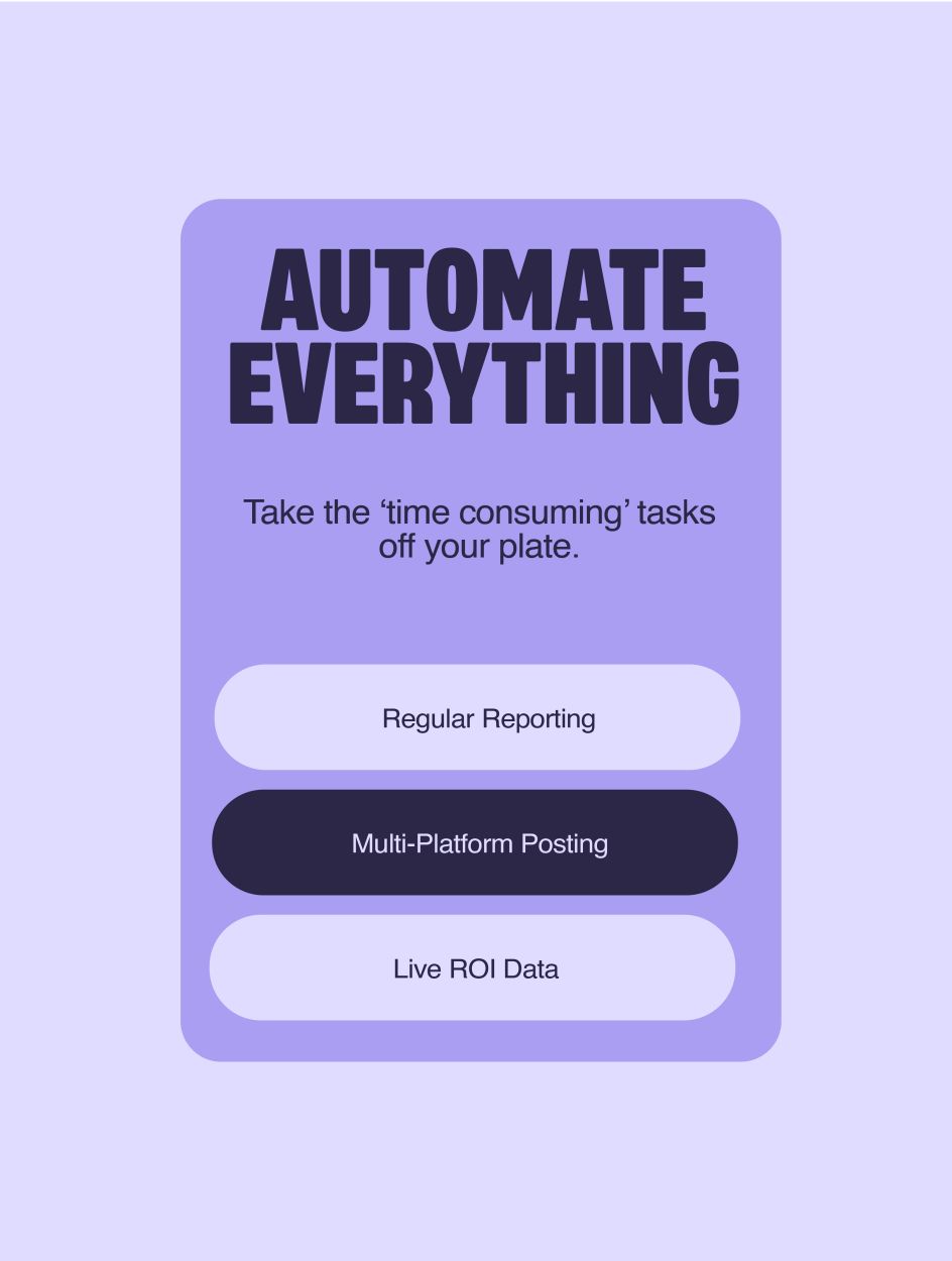
Hence, Wonda was created: an AI marketing platform that gathers, consolidates, and analyses multi-platform marketing campaigns.
Wonda offers users a simplified and automated approach to managing marketing tasks, providing a clear overview of campaigns through an AI-driven dashboard.

Additionally, it aims to streamline marketing processes, automate mundane tasks, and generate daily reports automatically, offering marketers a more efficient and stress-free experience in their work.
To create a brand identity for the tool, its makers turned to Good Habit, a London-based design studio founded by Chris Smyth.
The brief
"The client's original brief intrigued us," says Chris, "as they wanted to create a tech brand that would have a devoted following. They wanted their customers to love the brand, not just the product, deeply." Part of this effort was developing a symbol that had strong merchandise potential.
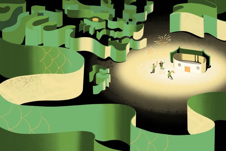
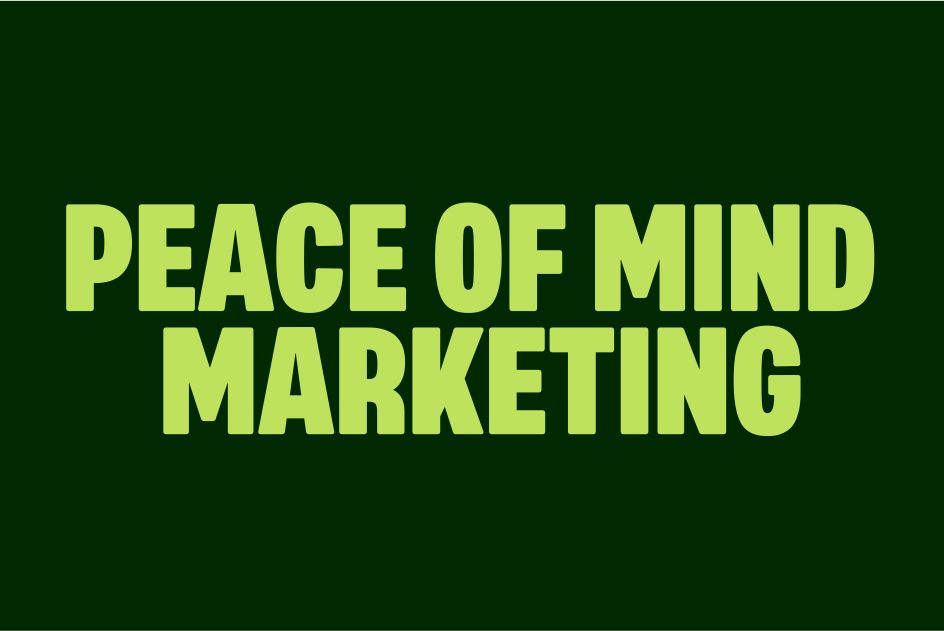
Chris provides context about why this was so important. "This is not just a SaaS that you log into every now and again," he explains. "It's the centrepiece of a marketing department: a global overview of your efforts. Marketers are often overloaded, so using Wonda should make you feel like you've been pulled back a little from the chaos. You're seeing an overview of your wins, what's going right, and what you can improve.
"AI often presents endless opportunities, but it can also simplify complex inputs and bring calm," he adds. "We felt Wonda should do the latter rather than add to the noise. So the core visual idea was to make this tool feel peaceful and magical."
Visual identity
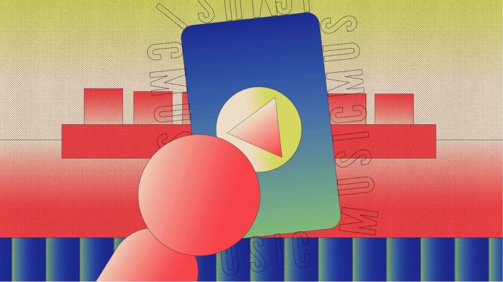
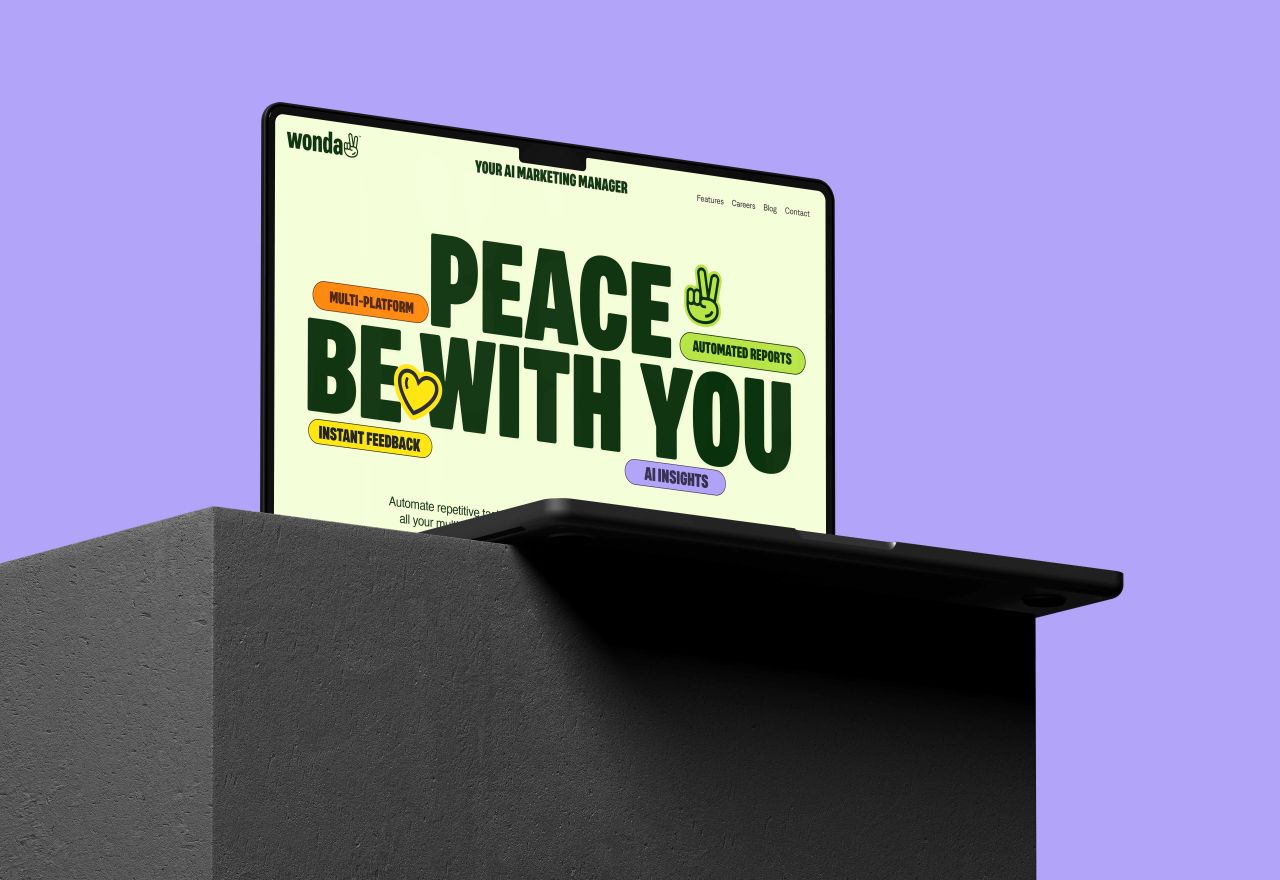
With all this in mind, the Good Habit team came up with the idea of the peace symbol, which stands at the centre of the visual identity. "We imagined that once people connected with the product and brand, this would sum up the feeling, and they might want to stick it to their laptop," reasons Chris.
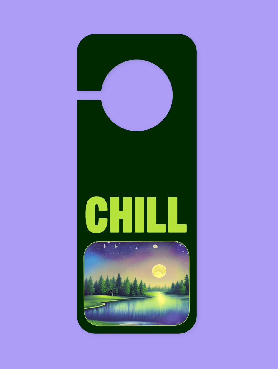
Being that Wonda is an AI-based SaaS tool, they felt it was important to utilise AI in the illustrated visual language wherever possible, he adds.
"We worked with prompt engineers from Mariana Art Design to create the perfect whimsical and imaginative visual world for Wonda, giving the client a never-ending opportunity to develop further visuals by adapting prompts."
They used this AI foundation to draw a vibrant colour palette directly from the generated image. "We paired it with the confident typeface Mello, which we selected for its human feeling, glyph collection, and ability to make a statement," explains Chris. "It became the perfect match. We also turned many glyphs into an animated branded iconography pack by introducing a small, playful flick into the logo and the icons."
Editor's Picks


Trending


](https://www.creativeboom.com/upload/articles/86/862919952c0ad18439004228895a431dc6e45ffc_732.jpg)
Podcasts


Editor's Picks
Further Reading