Run For The Hills creates playful illustrations to refresh brand for kindred 'Open House' hospitality space
Go-to design team for edgy and cool interiors also chosen to revamp the club's brand.
Award-winning studio Run For The Hills had already redesigned the inside of West London hospitality venue Kindred when asked to follow up the work with a new brand identity.
Set within a gorgeous grade II listed mansion, Bradmore House, Kindred is a space for co-working, live events and food and drink.
But much as Run For The Hills' interiors team has added extra layers of styling to the venue, injecting more heart and soul into the space, the brand identity also needed a creative evolution.
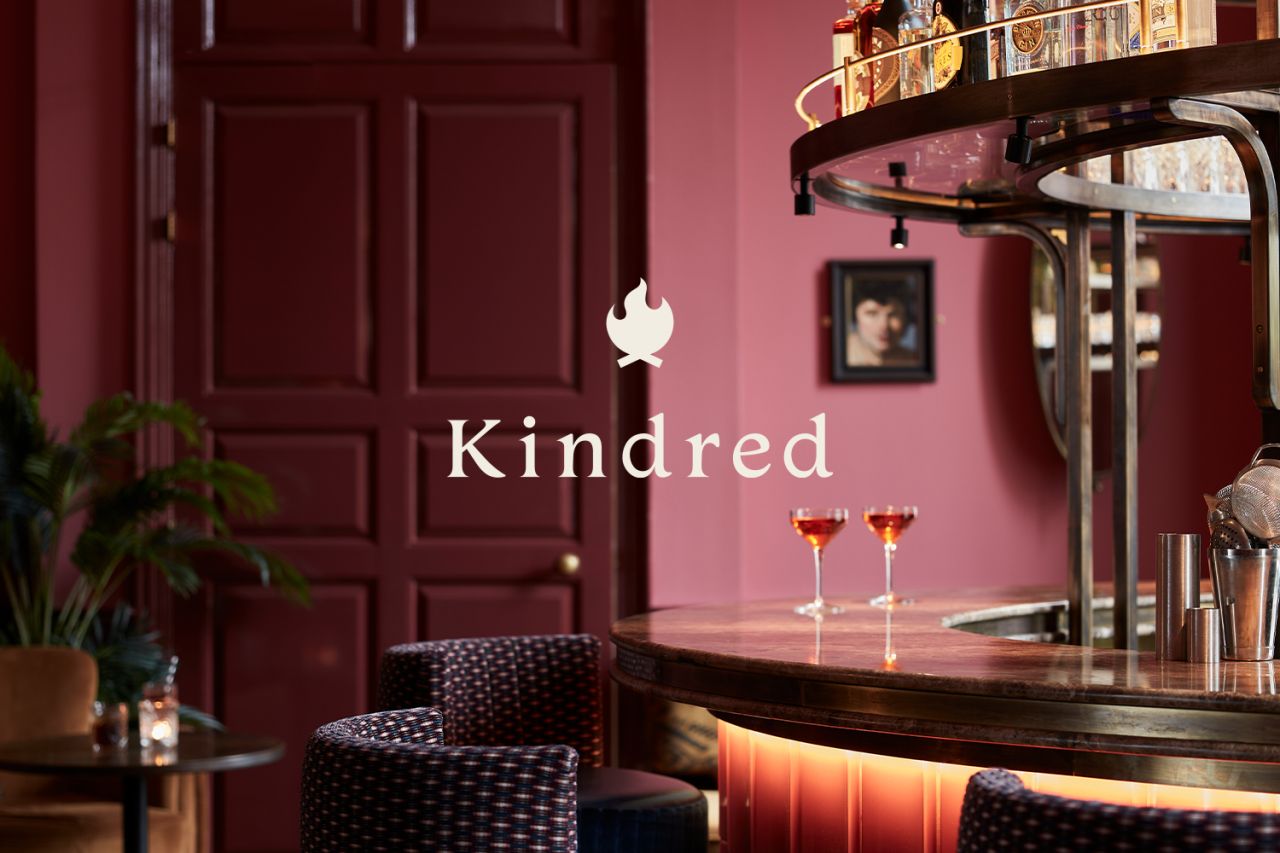
The design team started by re-working Kindred's logotype and campfire logomark. Opting for a slightly more modern serif for the logotype and honing, smoothing and simplifying for the mark.
They also created a darker and richer colour palette, taking cues from the refreshed interior styling. Deep burgundy red from the design of the new Salon Bar on the top floor of Kindred, a luxurious blue from the new banquette seating, and a soft green taken from the library bookshelves. An orange accent colour finishes the brand palette, and pops of orange can be seen in the interior scheme of some armchairs and accessories.
"For the rebranding project, it was important to keep the essence of what makes Kindred great – the playful but professional tone of voice, the sense of togetherness and, of course, the campfire concept," says Chris Trotman, co-founder of Run For The Hills.
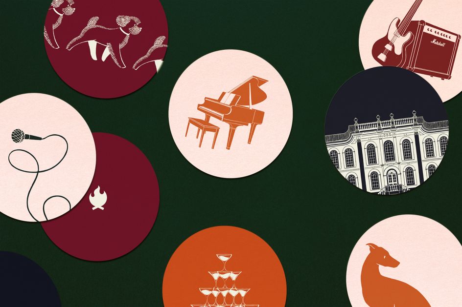
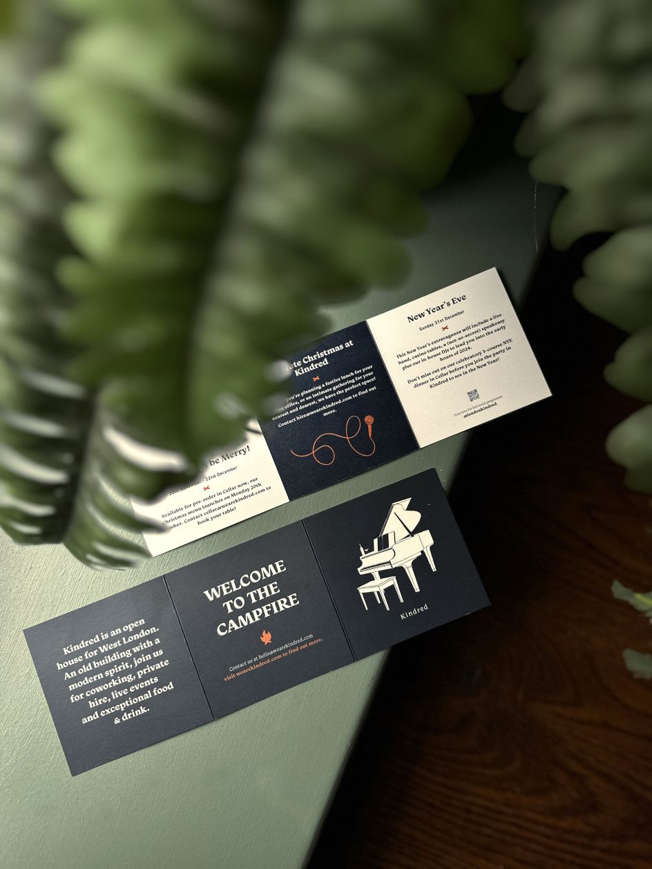
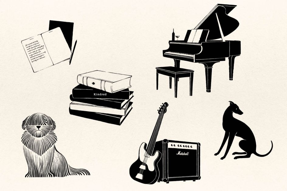
The next development was a playful new illustration style, creating unique monochrome illustrations to help bring to life what makes Kindred so special: a grand piano, branded drum kit and microphone on a looping cord to represent Kindred's dynamic roster of live music events.
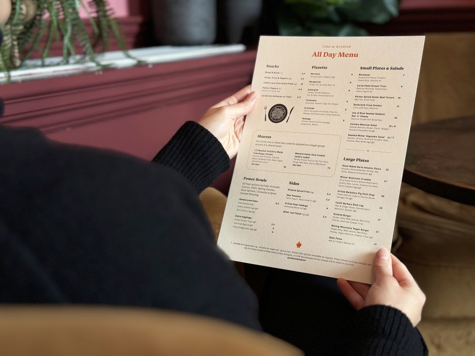
Notebooks, coffee cups, and canines represent the venue's dog-friendly membership co-working spaces. And a rich collection of food and drink-inspired illustrations showcasing Kindred's fantastic food and drink offerings for use across menus and marketing materials.
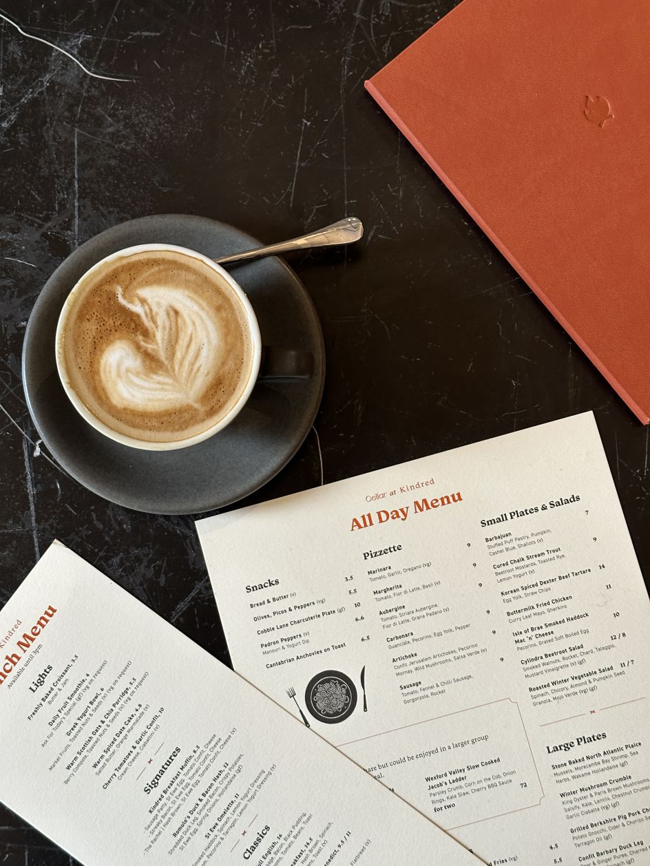
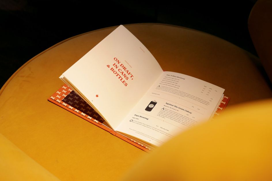
After thoughtfully pairing perfect typefaces and adding extra decorative touches, the studio started to work up the full suite of menus. The pièce de resistance is a stunning 40-page drinks book with a tan-orange cover featuring an understated campfire emboss printed on subtly textured Fedrigoni paper with matching orange stitching.
Chris Trotman adds: "It really is a piece of storytelling in its own right, with a narrative talking about the provenance of everything Kindred does, championing its independent London suppliers - all artisans and family businesses. The tone of voice is whimsically descriptive and full of the new illustrations which take the reader on a journey through the makers who pour their passion into their very special products."
Run For The Hills also came up with the idea of creating a 'cocktail toolkit' to illustrate all of Kindred's distinct cocktails. A set of components including different glass types – from lowball and highball to flutes and shots - with lots of illustrated decorative embellishments like ice and fruit, all created individually, meaning that it'll be easy to create new cocktails for future updates to the book using the ready-made tool kit components as the bedrock.
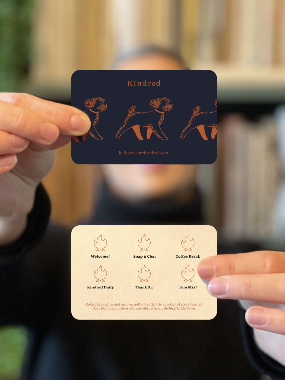
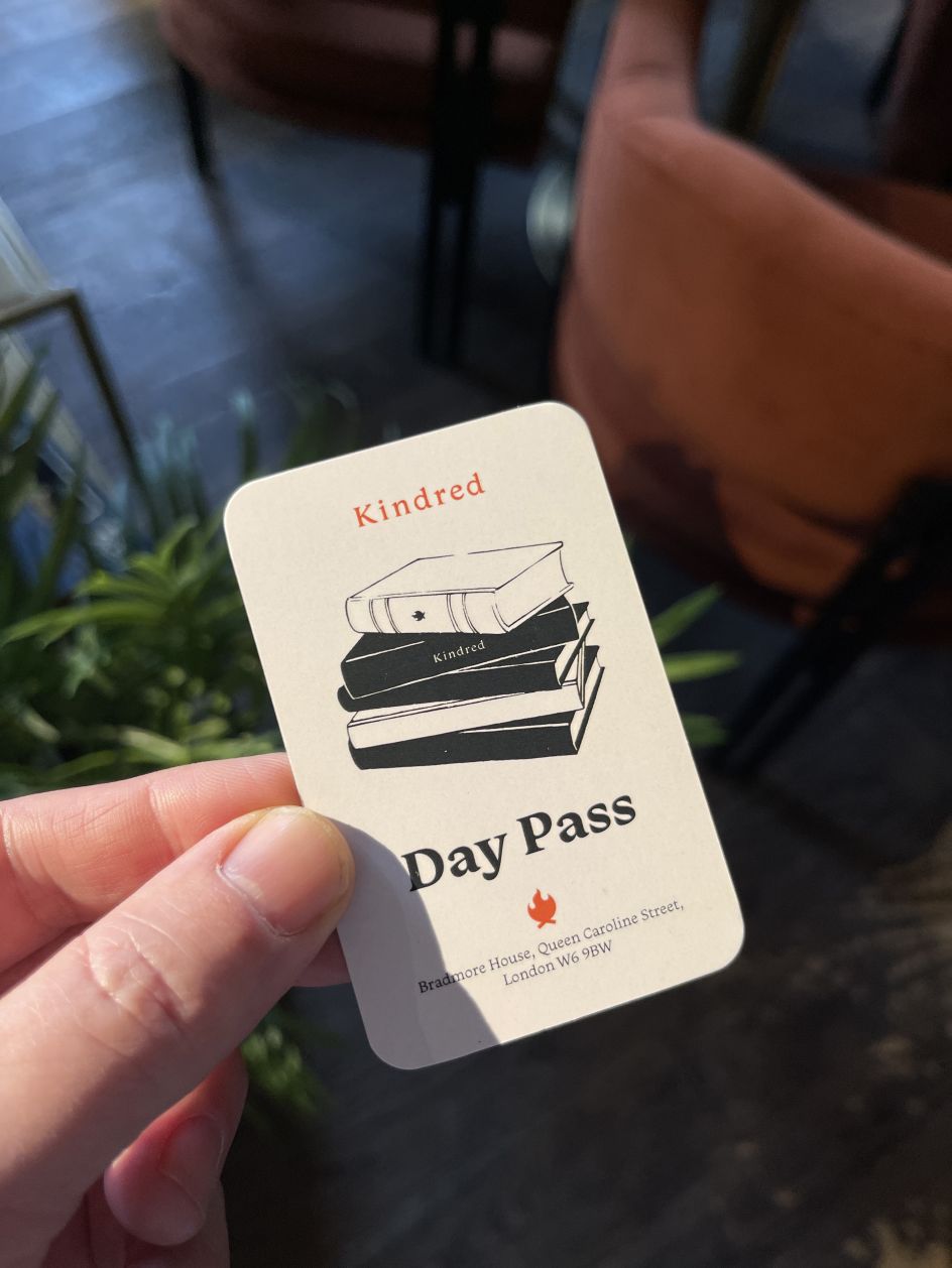
The new branding has now been rolled over all other touchpoints across social media and in-venue items like event posters (for Kindred's busy live programme of music/comedy/networking/socials), loyalty cards and day passes, creating a seamless experience for Kindred's community to thrive in a space where the inspirational brand and interior are harmoniously balanced.
Editor's Picks


Trending


](https://www.creativeboom.com/upload/articles/86/862919952c0ad18439004228895a431dc6e45ffc_732.jpg)
Podcasts


Editor's Picks
Further Reading