Athletics puts people and play at the heart of ShareFile's vibrant new identity
Brooklyn-based brand studio Athletics has collaborated with content collaboration platform ShareFile to create a personable new brand identity that revolves around its users and play.
Founded in 2005, ShareFile is a secure cloud collaboration tool that allows people to sign and share digital documents. Since then, it's grown and transformed, with cloud computing company Citrix acquiring it in 2011. More recently, ShareFile was acquired by Cloud Software Group, which presented it with the opportunity to "narrate its own evolution" in the form of a rebrand.
To realise this ambition, ShareFile brought in Athletics to tell its story. Having previously worked on Citrix's 2020 rebrand, I felt they were the perfect studio for the job. And the startling results that revolve around human elements and modern client experiences prove they were the right choice.
For a platform based on tools, security and efficiency, it would be easy to think that ShareFile posed a tricky prospect for a rebrand. However, the Athletics team cleverly looked at this proposition from a different perspective. Instead, it focused on how ShareFile improves the lives of its customers, real people with needs and expectations.

"The brand we developed to tell this new story would put people at the centre," the Athletics team explained. "Every element of the brand system and experience would underscore the ease with which ShareFile helps customers — and their clients — do their best work by simplifying communication, smoothing collaboration, and automating repetitive tasks."
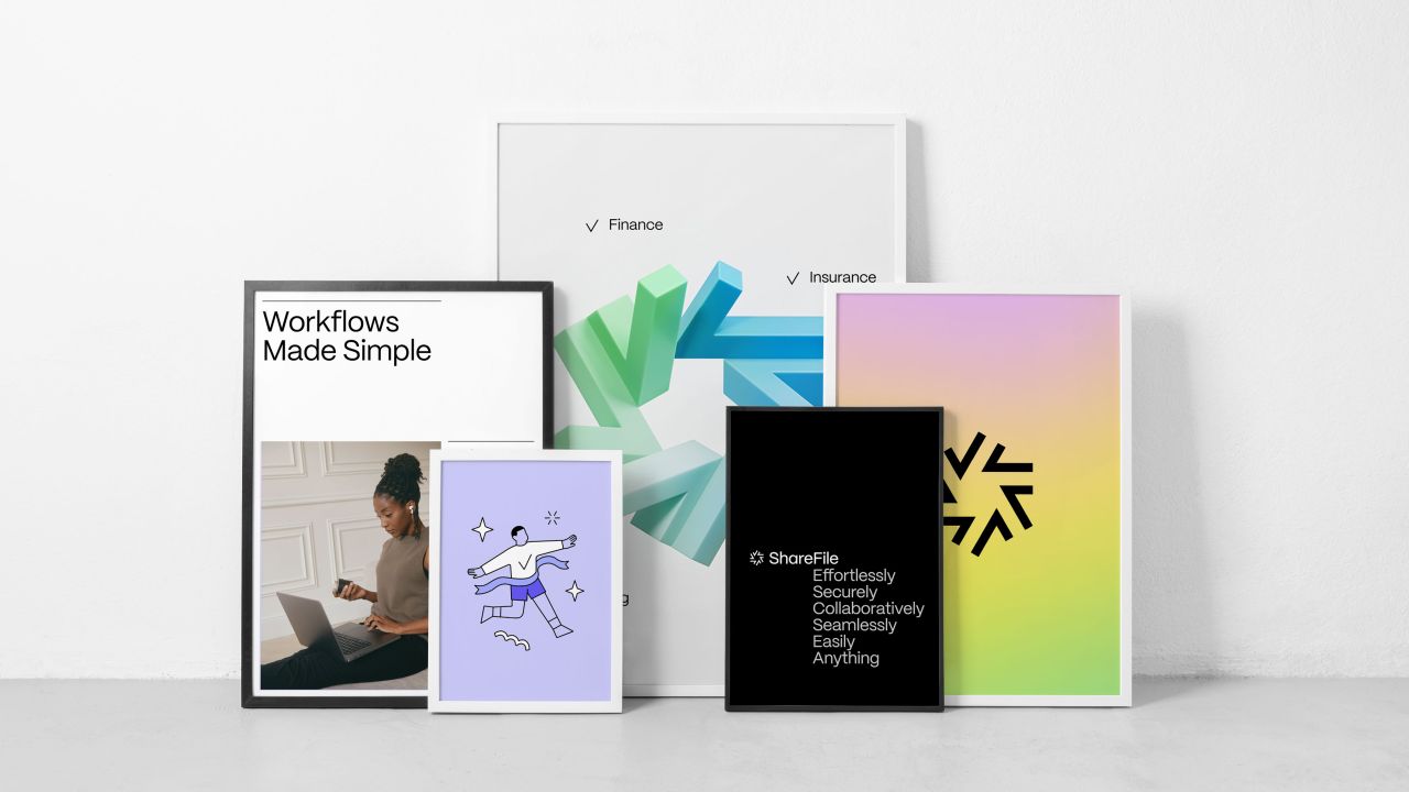
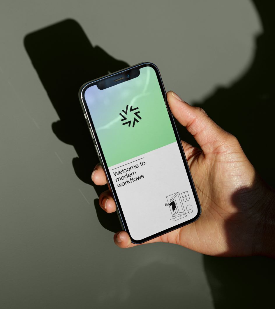
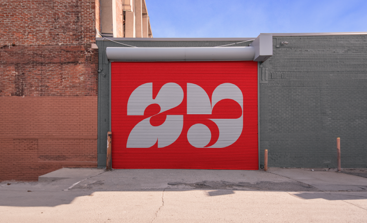
This approach can be seen throughout the whole identity, from the photography, colour palettes, and even little details in the logomark, composed of a delightful pinwheel of checkmarks. All of which helps to "tell a story of forward motion, of flow, and the joy of completing one task after another."
The logo, in particular, is a fascinating microcosm of the rebrand in action. Each individual check comes to life in various ways, animating into a vibrant star or a flywheel. It's a clever new spin on a familiar symbol in the ShareFile ecosystem and helps to change something that could be seen as dry and bureaucratic into something fun and engaging.
Meanwhile, the foundation of the wordmark is PP Mori, drawn by Pangram Pangram Foundry. This versatile and sophisticated gothic sans serif font is inspired by contemporary Japanese design and creates a highly functional and unique aesthetic, complete with playful diacritics and punctuation marks.
Accompanying these elements is a primary colour palette of neutral colours and more vibrant, supportive hues. This gives ShareFile a flexible foundation for the brand system and any future communications to which it's applied. Gradients are used to draw the user in and create a sense of texture and "emotional resonance". They also help to serve as a dynamic background for other brand assets.
Photography, 3D assets, illustrations and animations are also deployed by the Athletics team to place people at the very heart of ShareFile's new look. These include photographs of homes and home-like offices, plus shapes that lean into the same "emotional and aspirational space" as the colour gradients.
"Our photographic approach would begin with warm portraiture," Athletics explains. "Featuring people in relatable work environments, it allows us to tell stories around real personas and solid, credible use cases and brings human warmth to a tech space saturated with product screens. We want above all to highlight moments of connection, joy, and thoughtfulness, pushing beyond what we think of when we think, 'people at work.'"
The library of spot illustrations made up of standalone images that draw attention to a specific detail, further helps underline ShareFile'svalue proposition. And they manage to do this while bringing a " deeper layer of warmth and approachability to the brand system."
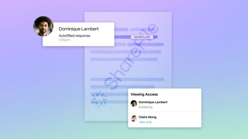
"The whole of the system comes to vibrant life in digital application — the ShareFile website, for one, but also in product UI itself," Athletics concludes.
"To represent and animate product, we developed a spectrum of illustration: on one end, a deeply functional, nearly 1:1 depiction of product screens; in the middle, several abstracted elements of UI that tell a more focused feature story; and on the other end, an expressive fusion of photography, illustration, and UI elements."
"Considering the vital role that motion plays in the brand system, we developed a toolkit and explicit guidelines for its deployment. Working with ShareFile around several key milestones on their marketing calendar, we soon got to deploy the toolkit in full, with several reels and anthem videos that were scripted, designed, and developed to activate the rebrand in full."




](https://www.creativeboom.com/upload/articles/86/862919952c0ad18439004228895a431dc6e45ffc_732.jpg)
