Robot Food creates winning rebrand for sports nutrition leader ESN
Brand studio Robot Food has collaborated with Germany's biggest sports nutrition company ESN to create a new look that refines what had gone before and creates a stronger evolution of its identity.
Standing for Elite Sports Nutrition, ESN is Germany's biggest sports nutrition brand, with an industry-leading array of products for performance-driven people and elite athletes. But just like any big-range brand, ESN has lost its way over time. Enter global branding strategists Robot Food, who have stripped back the fundamentals of ESN's existing identity and built something bigger and better in its place.
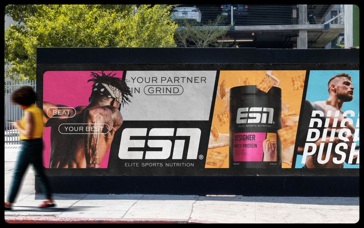
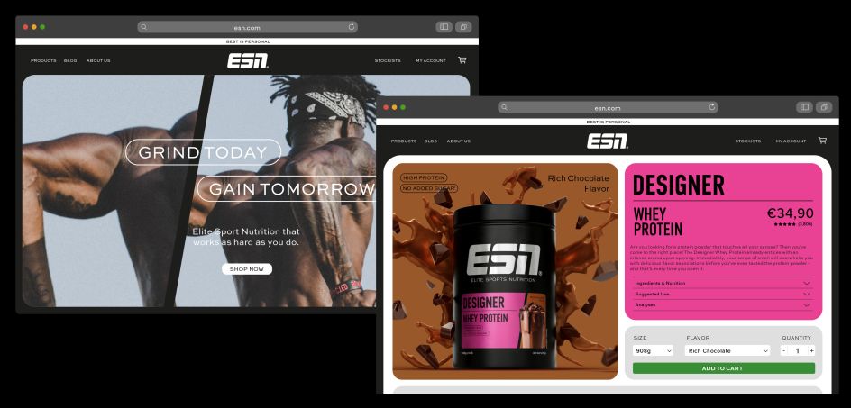
The need for a new identity came at a pivotal time. With ESN moving into physical retail spaces and selling online, Robot Food creative director Ben Brears explains that the brand needed to be stronger to make it "more easily shoppable."
He explains: "Lots of things were working from a product point of view, and people really like the taste and flavours, but we needed to focus on the system — hierarchy on packs and brand segmentation."
It was a conclusion that was agreed upon with ESN, with the creative director at The Quality Group, Marcel Henke, saying: "Our work with Robot Food has ensured our new visual identity better reflects our leadership position in the category.
"The quality of our products now shines through, and the entire design system gives us the flexibility to better manage our large portfolio and provide our consumers with an excellent experience across the entire brand world. We couldn't be happier with the result."
Back to basics
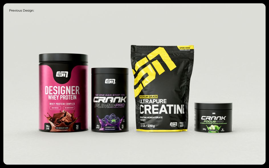
A pivotal part of the rebrand was to examine the existing identity, figure out what was and wasn't working, and refine it. This involved examining what separates ESN from other sports nutrition brands. What Robot Food found was that competitors positioned themselves in the lifestyle space, whereas ESN went after a core audience.
"ESN's own a look and feel which now seems quite category-generic because other brands have come out that also use that predominantly black look," says Simon Forster, founder and ECD at Robot Food.
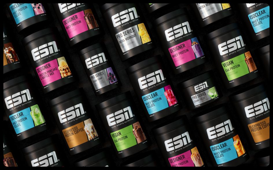
This presented Robot Food with a clear mission statement: reclaiming ESN's striking colour palette of black and white. Over the years, ESN had increasingly relied on designs that promoted the superior quality of its formulations, so the new look had to be not only more instantly recognisable but also prouder and more distinct.
From this approach came the concept for the creative platform 'For the Win.' The rest of the new positioning and visual identity was built on this foundation, and Robot Food set about stripping back the many products and ranges in order to evolve the identity.
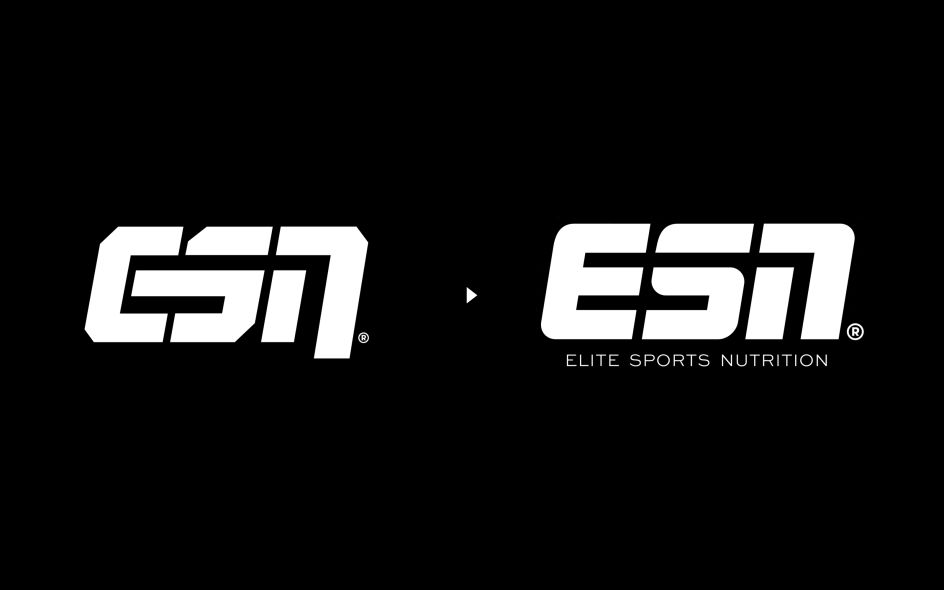
A perfect example of these concepts in action is the new ESN logo. Not only has it been redesigned to be more legible and impactful. It also pays homage to the brand's heritage through a bold, simple and energetic design.
Forster adds, "Before, there were inconsistencies in the negative spaces, and the logo didn't feel ownable to ESN. We wanted to make it more progressive and more considered by softening the corners but still creating something that still feels really heavy and quite masculine. Now, it has more motion and movement to it."
Keeping it dynamic
Keen-eyed branding enthusiasts will notice that the logo now uses a distinctive 'dynamic cut', which is found throughout the rest of the identity. It's a simple but effective way to tie together packaging design layouts and is a striking device across brand photography.
"The graphic system based on angles makes everything feel part of a holistic design framework," adds Craig Lindsay, Robot Food senior designer. "The whole brand world has this slash continuing throughout the typography, photography and labelling system."
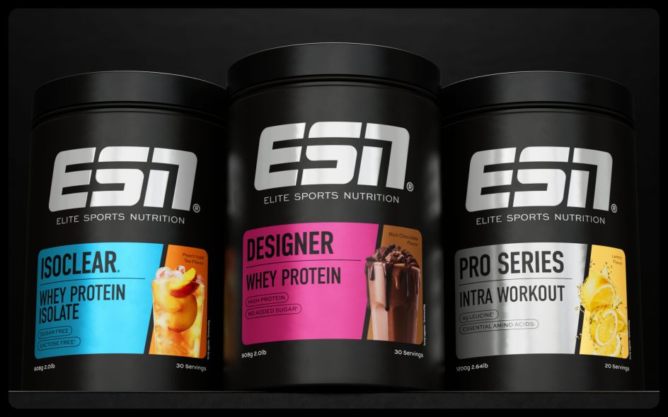
Not wanting to throw away previous brand elements that worked, Robot Food made sure to retain the primary branding colours of black and white. An array of "range colours", including metallic silver, bright blue, bold pink and vibrant green, were then added to round out the palette.
Similarly, the new typography was carefully chosen to reflect the attitudes of the ESN brand. "We chose a clean and modern suite of four typefaces that add character and clarity to the brand and set ESN apart from its competitors," says Lindsay. Din Condensed is at the heart of the brand and appears in various weights as the headline, alongside a utility typeface in the body copy, Sweet Sans Pro Regular.
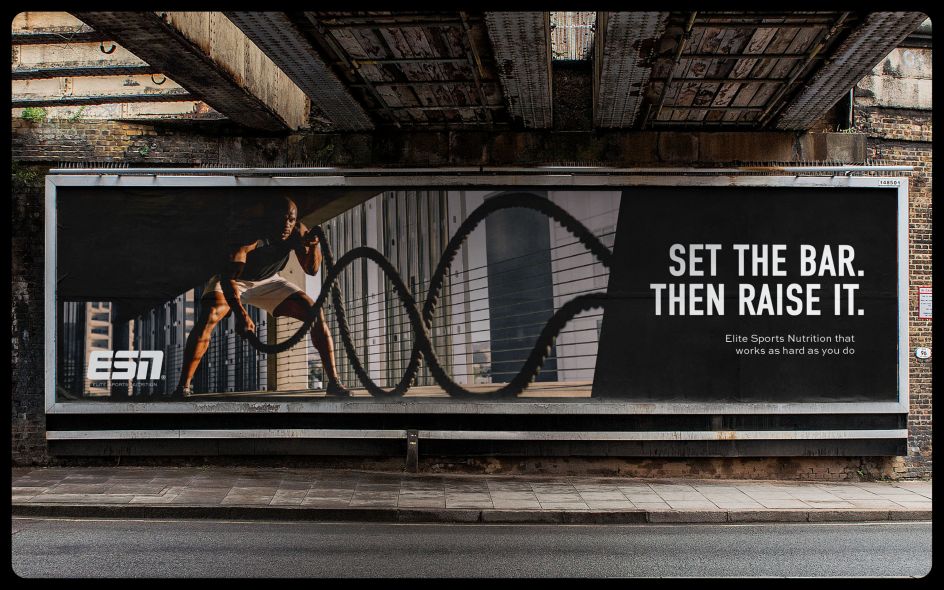
'Crave-worthy' photography
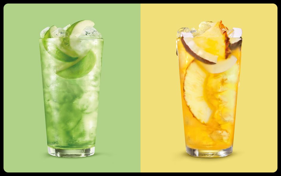
To really make the new identity sing, Robot Food created a new suite of photography with both "functional and emotional" aspects. Working together, these images show both the ingredient credentials and the "crave-worthy" flavour.
"They wanted to depict the taste better on the pack, so we worked on bringing each range to life in a different way," says Brears. "Everything was shot in a really expressive way to show that ESN is full of flavour."
A prime example is on-pack photography, which shows the product with a serving suggestion to add interest and taste cues that "build appetite appeal, focusing on that moment of anticipation." Meanwhile, lifestyle photography has been designed to be "always in action" and features athletes at the peak of their performance ", capturing the constant push for best and self-improvement".
Winning underlines all of these creative decisions, and it's made for a winning rebrand. To reflect this, the identity's guidelines include phrases such as "winning mindset", "winning results", and the idea of the "winning flavour", which can be found in ESN products.
By expressing these concepts in short, snappy sentences and energetic language, ESN positions itself as the audience's workout buddy. It's more than just an energy supplement; it's a friend on hand by offering trusted, science-based expertise.
Cementing the position
Despite containing many moving parts, the brand succeeds because it creates a consistent and ownable system that can be used as ESN pleases. It also includes flexibility for differentiation across the range of products so that they all remain unique and exciting.
"Since they're the leader, they're not too worried about competition: it was about cementing their positioning and giving ESN the brand they deserve, but which was still recognisable for existing customers," Forster concludes.
"It's not always about being revolutionary: it was stripping everything back and starting again to create a much stronger evolution of ESN, but with the same DNA."
Editor's Picks


Trending


](https://www.creativeboom.com/upload/articles/86/862919952c0ad18439004228895a431dc6e45ffc_732.jpg)
Podcasts


Editor's Picks
Further Reading