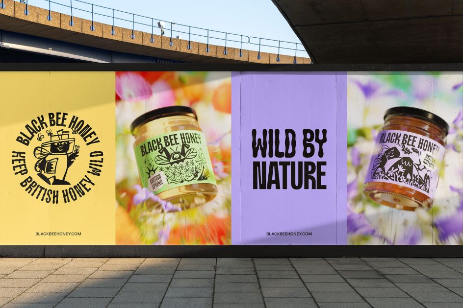
OMSE's charming new identity for Black Bee Honey is inspired by the flight of the bumblebee
A typeface inspired by the waggle dance of a bee and illustrations that help visualise the location and seasons behind each product – OMSE ends the year on a high with its new identity for a British honey brand that aims to "free the bee".
Did you know that honey is the world's third most faked food product? No, we didn't either. That's where Black Bee Honey does things differently. The brand offers pure, single-origin, 100% British honey to combat the cheap sugar syrup blends hailing from anonymous sources. Even more impressive, 2% of its turnover contributes to creating a thousand acres of new wildflower meadows, a vital habitat for honey bees and other pollinators. That's a company we can appreciate.
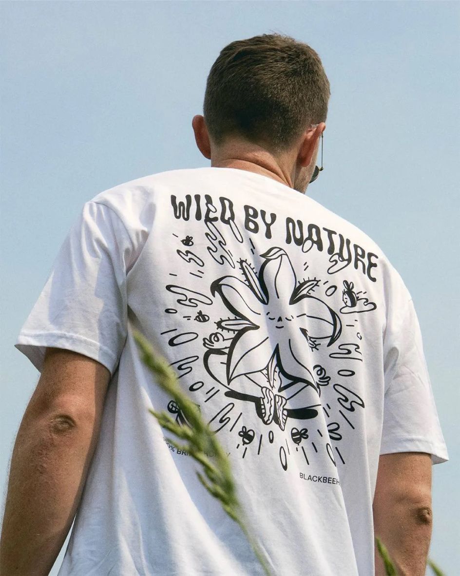
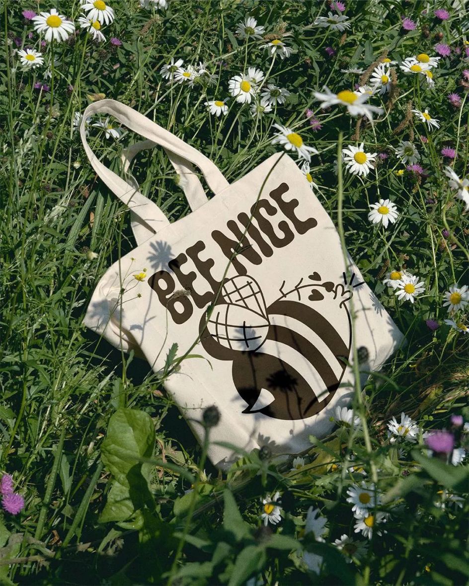
It's on a mission to become Britain's favourite honey brand. So it approached London studio OMSE to create its new strategic positioning under the title 'Keep British Honey Wild' and help evolve its visual identity. And OMSE delivered. The update aims to "free the bee", as OMSE puts it, featuring a set of wild characters that represent Black Bee Honey's key values and act as a celebration of the landscapes and seasons in which each honey product is produced.
The entire brand ecosystem is focused on nature, including bespoke typefaces inspired by the flight of the bumblebee and honey itself. Titled Black Bee Sans, naturally, there are three versions to play with: 'drippy', 'waggly' and 'runny'. Meanwhile, a vibrant colour palette that reflects British flora – we're talking yellows and greens, purples and blues, all of which evoke that feeling of British meadows and warm summer days.
There's even art direction that captures a bee's ultraviolet vision. Side note: A bee's vision is a powerful tool that helps find food sources and even sense danger. As Bees Wiki states: "Bees have a broad range of colour vision and can see ultraviolet light, which helps them identify nectar on flowers. Between their five types of eyes, bees can see the depth and three dimensions, maintain flight stability, judge light intensity, and keep their orientation". This is truly fascinating stuff.
Anyway, I digress. OMSE worked with illustrators Cary Vander Yacht, Inga Ziemele, and Florence Poppy Redmore on the supporting artworks that play a starring role across the brand refresh. Each brought their playful style to the product, packing the entire packaging design, campaign materials, and merchandise with a whole lot of punch.
The 3D design was carried out by Matt Gilbert, with product photography by Emilia Cocking. (Bonus points to OMSE for giving everyone credit on this project – the full list of which can be found on its portfolio.) We also love the simple copy, emphasising the brand's mission again with to-the-point messaging such as 'From Orchard to Jar' and 'Wild by Nature'. It really makes you think about where honey is sourced and will stand out on supermarket shelves, no doubt.
Is the client happy? "OMSE were a real pleasure to work with," says Chris Barnes, co-founder of Black Bee Honey. "They got to know our offering inside out and rebuilt our strategy from the ground up. With such solid foundations and killer design work, they delivered a rebrand that's both coherent and eye-catching. Job done!"
Editor's Picks


Trending


](https://www.creativeboom.com/upload/articles/86/862919952c0ad18439004228895a431dc6e45ffc_732.jpg)
Podcasts


Editor's Picks
Further Reading

. Image courtesy of the designer.](https://www.creativeboom.com/upload/articles/24/24f4101f925e08ac7e10b45bb22a16936b50f6ee_732.jpg)