Pentagram's new identity for Stereolabs repositions it from camera brand to AI leader
When you're known for one thing but want to be known for another, a root-and-branch rebrand is often necessary. That's just what Pentagram has achieved by crafting a fresh visual identity for Stereolabs.
Stereolabs was founded in Paris in 2010 by three graduates of IOGS, a leading French university in the field of optics. They had previously collaborated on a university project to prototype a 3D endoscope that could give better relief images of MRIs.
In the early days, Stereolabs developed stabilising technology perfect for Hollywood. 3D movies of the time were generally shaky and hard to watch, so the company helped James Cameron stabilise his footage for Avatar. After the success, they built their own stereo camera, which soon became the industry standard.
However, despite building impressive software, Stereolabs was still seen as 'just a camera company'. In reality, Stereolabs provided the 'eyes' (camera) and 'brain' (software) to robots. However, their story started and ended with their cameras, meaning customers thought of specs and not the benefits of 3D vision.
To help reframe its narrative, Stereolabs turned to global design consultancy Pentagram to craft a new brand identity for them. Everything is now about the company's mission and what detailed vision unlocks. This changes the view of Stereolabs from 'How good is your camera?' to 'How do I get the most advanced perception?'
Graphic elements
To support the brand story, Pentagram created a visual identity that adapts to real and virtual environments. The identity includes a dynamic symbol, visual toolbox, modular diagram language, icons and data visualisation.
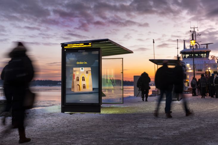
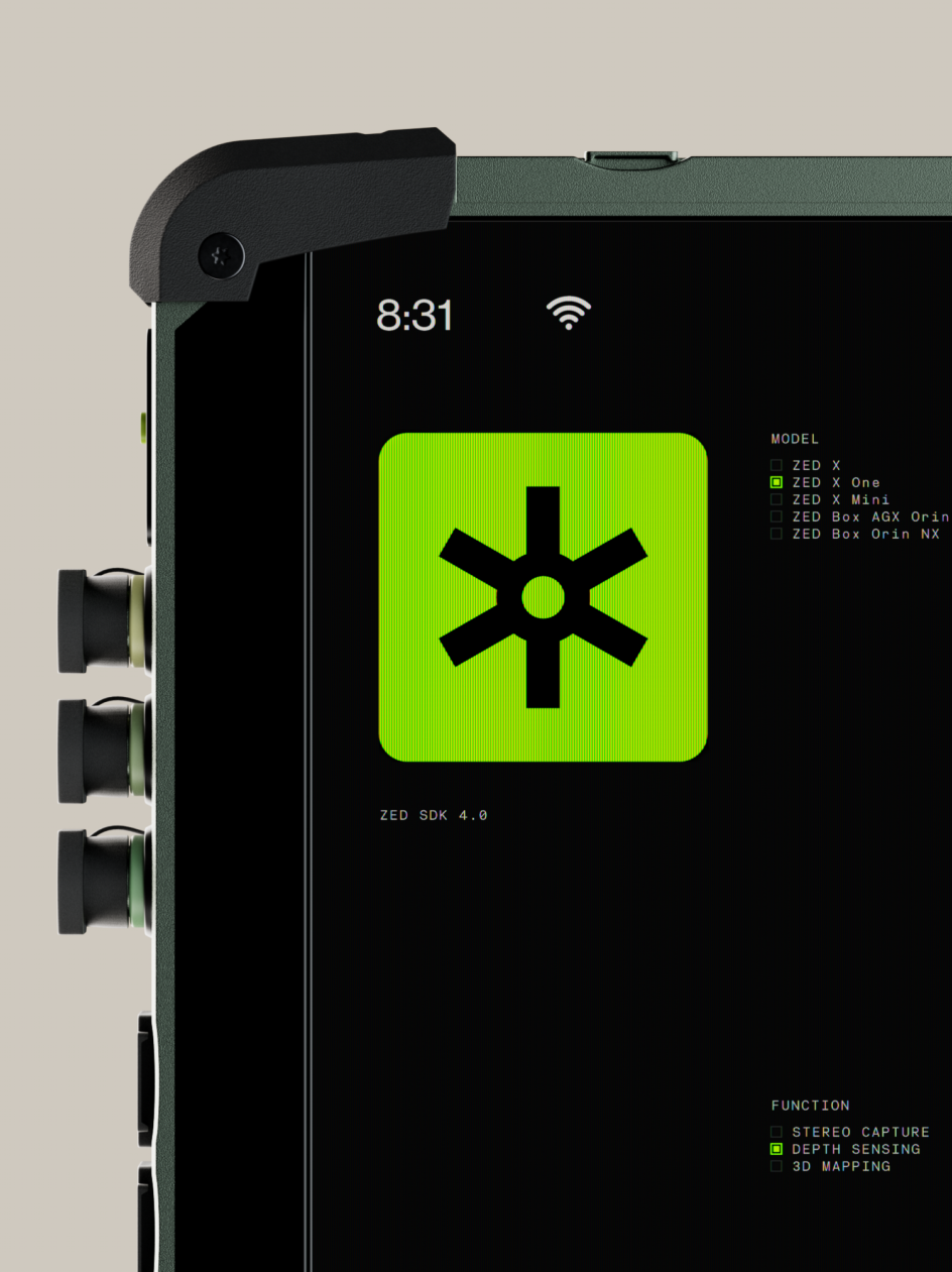
The identity is designed to work across Stereolabs' outputs, from website, marketing, and trade shows to the product itself. Crucially, it also integrates into Stereolab's software products, unifying the brand both in the field and digital environments.
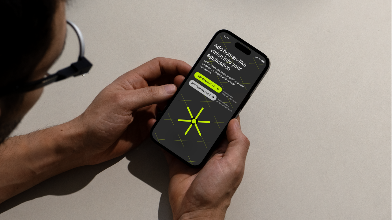
At the heart of the brand identity, the new Stereolabs symbol is a multidimensional spark capturing vision in a digital context. As an intelligent character, this dynamic star-shaped symbol seamlessly transforms across various applications.
Developed to align seamlessly with the brand's identity and the demo process, the symbol appears across the identity as a standalone element, in logotypes and diagrams, and as a hero 3D version, providing a unified and integrated experience.
The symbol represents capturing the vision and transforming it to natively support various applications, including the demos showing the different kinds of perception Stereolabs tech can provide and their diagrams illustrating how easy it is to get set up and achieve human-like vision with Stereolabs.
Typography and demos
The Pentagram team designed a type system using Neubau's NB Akademie. This grotesque style has a mechanical tone due to a strong sense of horizontality found in the flatter stroke trajectories of 'a', 'r', and 's', combined with proportions and character features that hint at monospacing.
The aesthetic is furthered by the use of the family's specific monospaced cut in moments that require a more technical touch, ensuring precision and clarity in conveying complex information.
Stereolabs demos highlight the capabilities of its products, which feature intricate hardware and software systems. The expanded symbol is developed to feel native to the demos, creating a multidimensional tool that adapts to the different demands required to showcase the technology.
Several months were spent working with Stereolabs' R&D engineer, polishing details to optimise quality and ensure compatibility with customers' software.
Icons and colour palette
'Precision through perception' is a theme that runs through everything Stereolabs does, and this is embedded in the design language.
The simple directness of the visual design is underpinned by a technical grid layer, emphasising accuracy, reliability and attention to detail. An exposed crossed-grid framework can be added to brand applications as a subtle graphic artefact and is present as the underlying digital environment in which software visualisations are built.
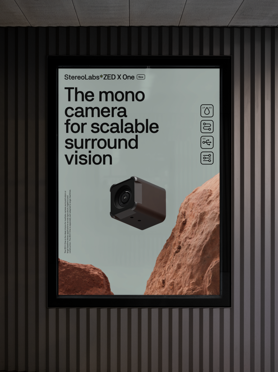
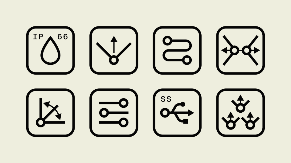
Meanwhile, a set of technical icons distil key features and serve as visual cues to convey the profound readiness and robustness of Stereolabs' technology.
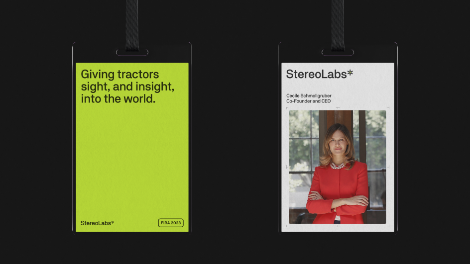
Each hue in the colour palette is chosen with the 'eyes' and 'brains' narrative in mind. White and lighter shades of grey accentuate the hardware narrative, while black and darker shades of grey contextualise the software story.
Elsewhere, a vibrant Signal Green (SL-Lime) is chosen to bind the intelligence narrative together, providing an ownable digital colour that forms the DNA of the Stereolabs brand.
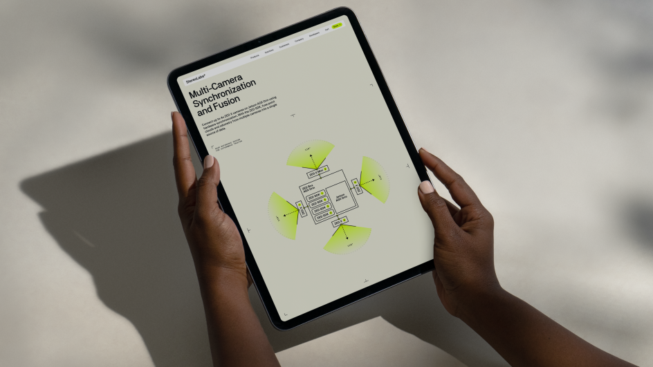
Modular diagram language
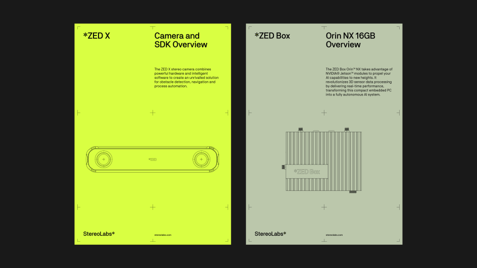
To help Stereolabs effectively communicate how its product family can be configured into tailored solutions for its customers, Pentagram's design team crafted a comprehensive modular diagram language.
The diagrams illustrate just how user-friendly the Stereolabs ecosystem is; all that's needed to get human-like vision is to set up the camera and connect to its AI software.
Using Unreal Engine, the team created a series of renders showing different environment material visualisations that the Stereolabs engineers can use to create brand assets. Focussed on communicating the TRL (technology readiness level), they feature natural elements such as rocks and foliage, as well as industrial features, each designed to contextualise the use case of the technology.
Verbal identity and copywriting
Stereolabs' image was hindering its potential, but the way it tells its story is now crystal clear, unlocking the next growth phase.
Zuki Sedgley and Dom O'Hare led and devised the brand strategy and wrote the verbal identity and copywriting for the website. Based on the ideas of 'Dynamic Detail' and 'Precision Through Perception, ' the strategy encompassed narrative themes, tone of voice, and key messages.
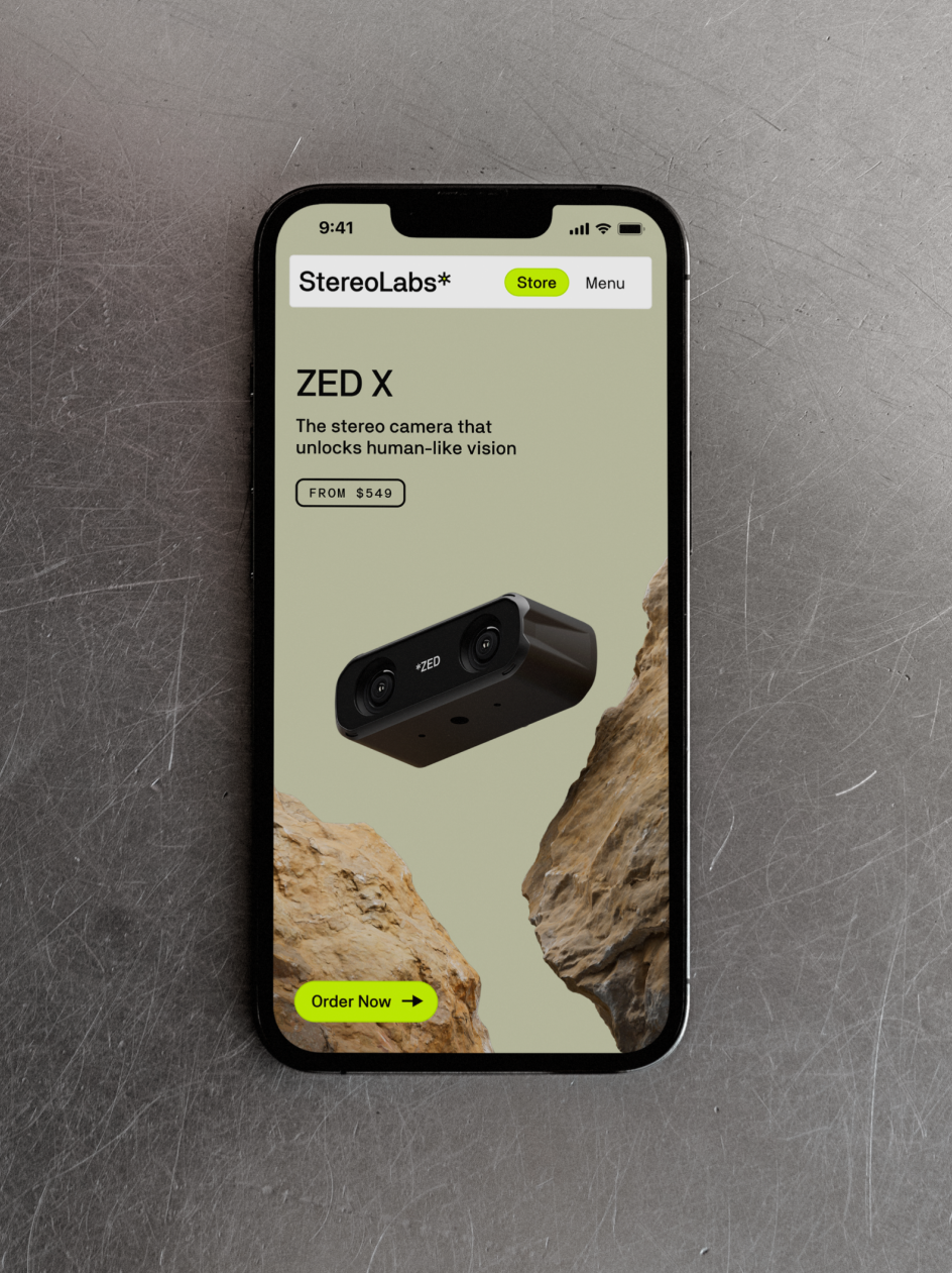
They can now demonstrate to customers how they seamlessly integrate this ecosystem as an 'eyes-and-brains' upgrade for robots or contextual applications, with scalability at its core. The readiness of the Stereolabs' product is echoed in marketing renders that mix hardware and environmental contexts.
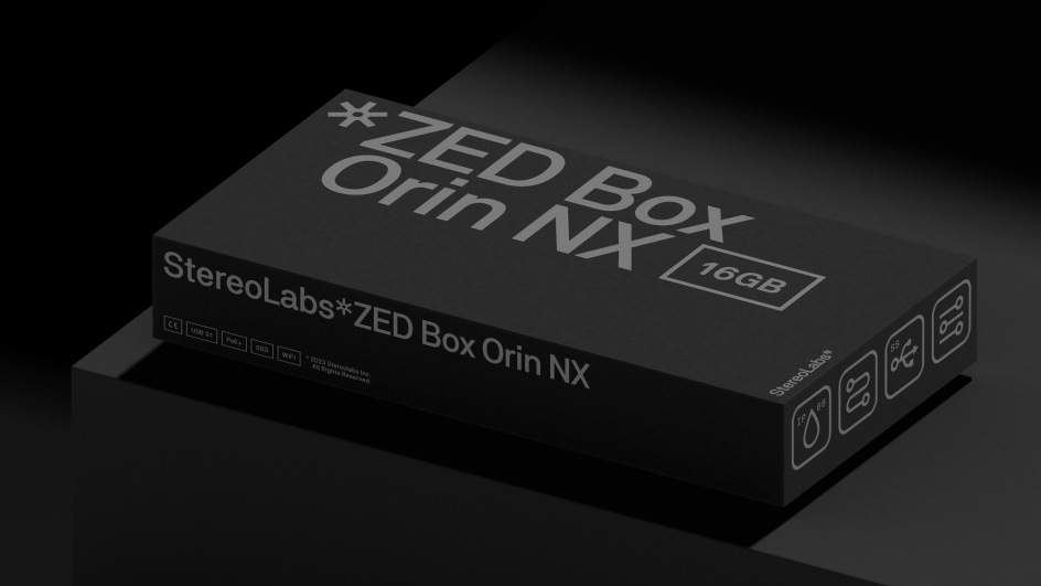
The team also created a functional lockup system that ensures a clear product brand hierarchy, a colour scheme that feels native to the industry, and an icon and labelling system that emphasises the plug-and-play mentality and scalability of the products.
Repositioning the brand
Stereolabs now has a single design system that serves as a visual toolkit for its advanced technology and unifies all aspects of its business through visual identity.
This will enable the company to move to the next stage of its development and push its pioneering work in robot-led spatial analytics even further.
This design choice strategically positions the symbol as a connective element that appears across the Stereolabs ecosystem, harmonising the digital and physical aspects of the business and showcasing how design can play a transformative role in tech companies.
Editor's Picks


Trending


](https://www.creativeboom.com/upload/articles/86/862919952c0ad18439004228895a431dc6e45ffc_732.jpg)
Podcasts


Editor's Picks
Further Reading