DesignStudio's rebrand for Trivago makes the comparison site more distinct from its rivals
The brand unveils a new identity today, with a warm and inviting nature to help it stand out in a competitive market.
If you're trying to book a hotel, using a comparison site can be both helpful and frustrating. Helpful because it saves you from looking at every single hotel in the area individually. Frustrating because you often feel you have to fight the interface to find the best deals rather than the providers the website is clearly trying to promote.
In our experience, we've found Trivago to be one of the better sites to try. But providing a good service will never be enough to survive a brutally competitive market. So recently, they teamed up with DesignStudio, a brand and design agency based in London, New York, Sydney and Shanghai who clearly didn't want to trouble anyone by giving themselves a complicated name.
Today, Trivago is announcing its new brand evolution, which aims to improve its distinctiveness and adoption in the market. And an immediate glance at the assets they've shared with us makes that abundantly clear.
Fresh personality
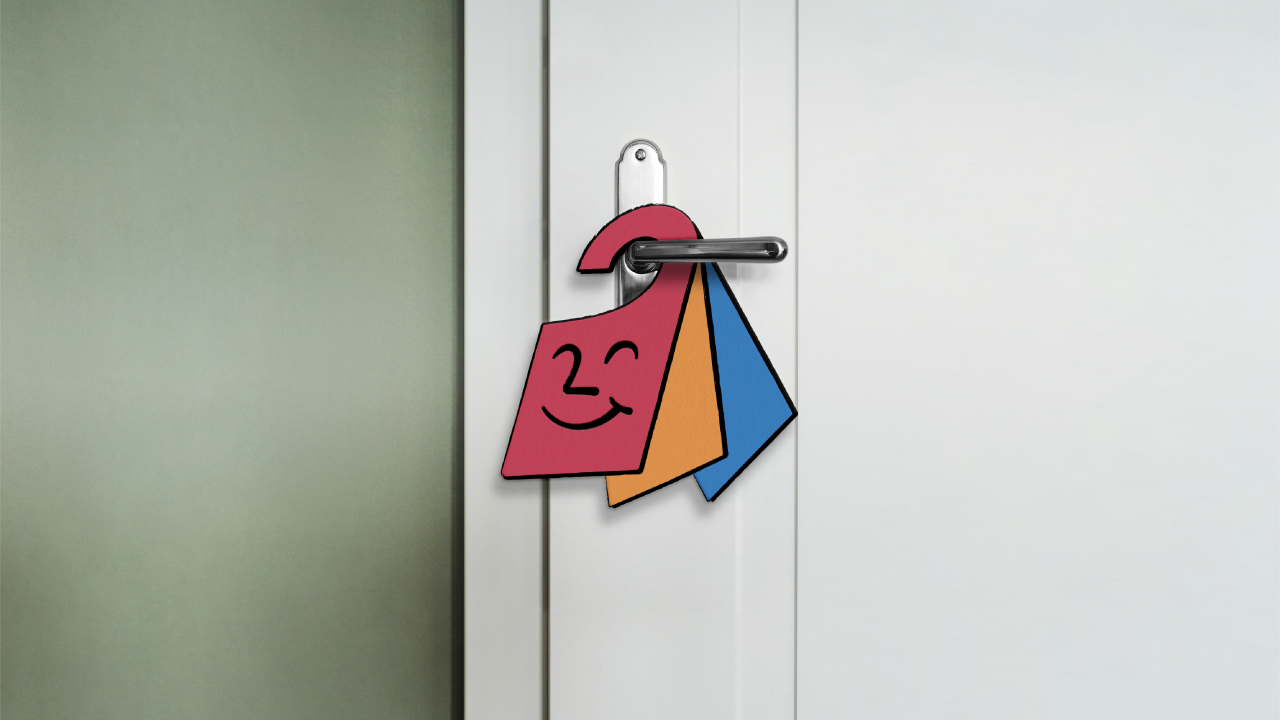
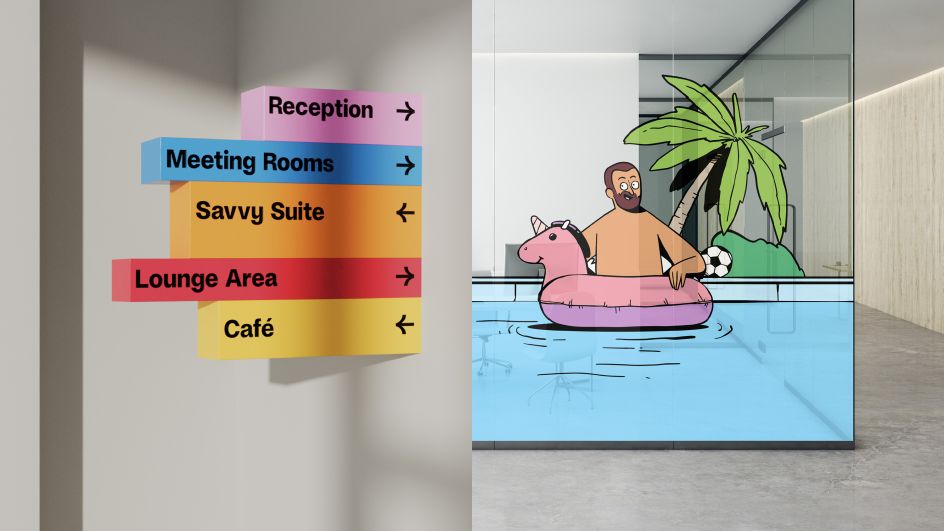
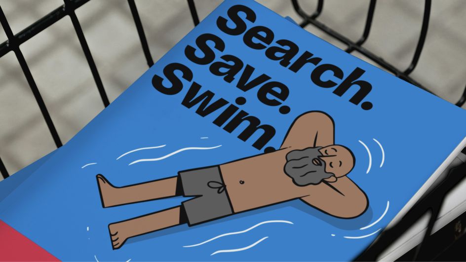
The brand has been given a refreshingly witty nature, packed with personality, through a series of playful hand-drawn illustrations created in partnership with animation and design studio Niceshit. The illustrative scenes are inspired by the Trivago mascot, Hank – a simple door-hanger character created by DesignStudio.
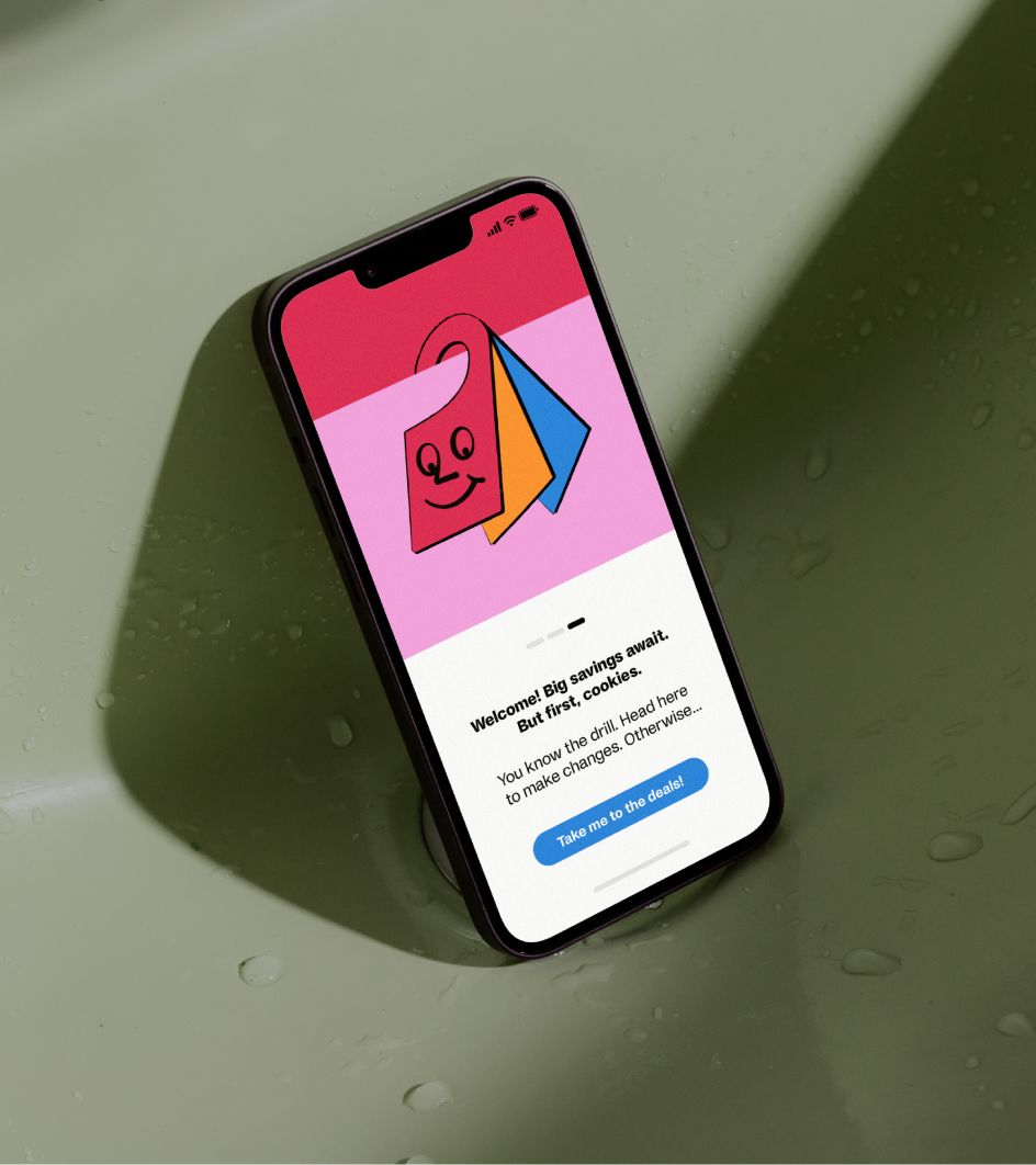
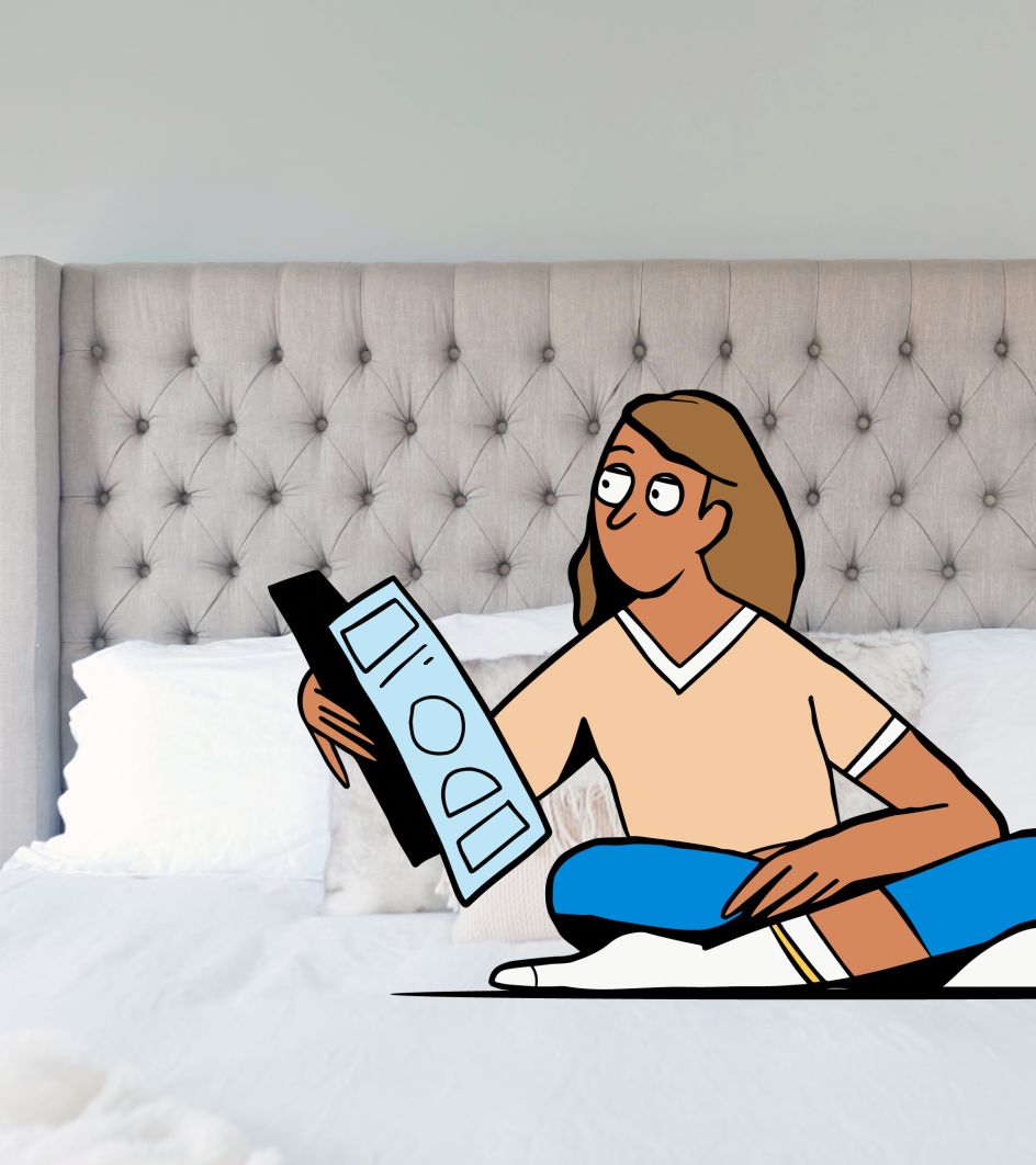
As well as setting the tone, Hank intends to welcome, guide, inspire, and inform users through their search and comparison journey. That might ring alarm bells in the minds of those who remember Microsoft's Clippy, a similar-looking and acting mascot who sprang to life in Office 97 and annoyed the pants off a generation of computer users. Here's hoping Hank will behave in a more helpful and less irritating way.
More broadly, a central feature of the brand is a distinctive tone of voice that is warm and inviting. Key voice principles ensure Trivago always speaks in an assured, upbeat, unfussy, uncomplicated, witty and relatable way to attract and engage a diverse global audience.
Graphic elements
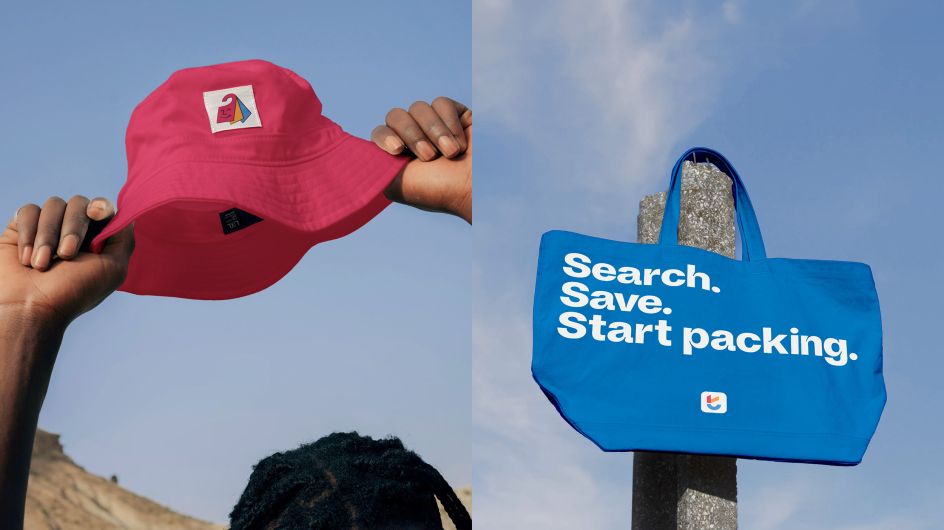
The bold logo is the beacon of the brand and includes a shorthand symbol made up of a checkmark (to represent 'Search savvy') and a smile which reflects the Trivago experience (to make travellers 'Feel super').
This is supported by a new custom font, Savvy Grotesk, created in partnership with Studio Feixen. This contemporary and characterful typeface supports several hundred languages, enabling Trivago to communicate with its audiences across the world.
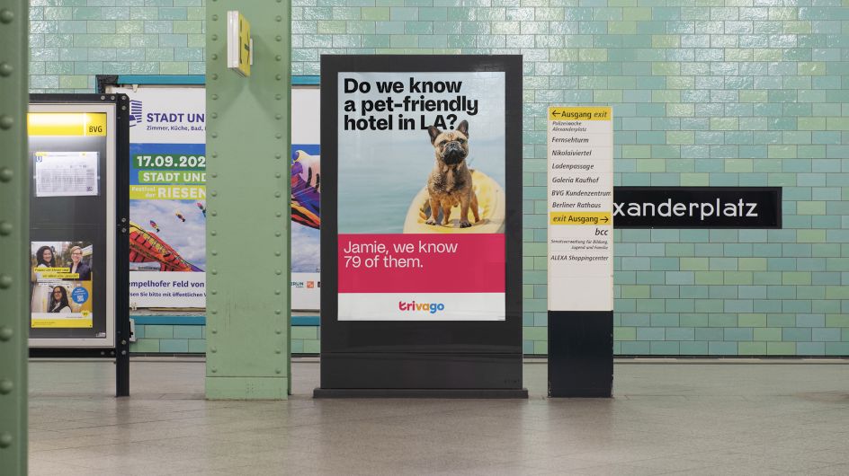
The illustrations are further complemented by photography that captures the feeling of finding a great deal and is used to tell stories, inspire travellers and highlight Trivago's benefits. This works across three levels: hotel lifestyle, memory details and destinations. There's also a revitalised palette of vibrant and expressive colours inspired by the places Trivago can take you to.
Personal and accessible
"Our goal was not just to create a new look but to redefine the essence of Trivago – to make it a brand that people not only recognise but connect with on a personal level and return to time and again," explains Vinay Mistry, executive creative director at DesignStudio. "The 'Search savvy. Feel super.' experience comes to life through a characterful new expression that makes Trivago truly accessible to their diverse audience and sets them apart in the travel industry."
Chloe Jensen, strategy director at DesignStudio, adds: "Our strategy aimed to clarify the brand proposition and messaging, ensuring people have a clear reason to choose Trivago but also come back. At the heart of this is a single-minded promise that captures the power of Trivago's metasearch capabilities and the benefit it provides users.
"The line 'Search Savvy. Feel Super' solidifies Trivago's role as users' shortcut to finding a great hotel deal and reintroduces some of the unique and charming spirit of the brand that had been lost over time. To guide the transformation, three experience principles define how Trivago shows up in the world."

Summing up the rebrand as a whole, Jasmine Ezz, CMO at Trivago, says, "We're building up on the concepts that made Trivago a strong global brand. It's a mix of where we've been and where we're headed. This isn't just an aesthetic upgrade; it's our way of standing out in the competitive travel market, ensuring we cut through the noise."
The new Trivago visual identity has now begun to launch in television commercials and across Trivago's own platforms. It will continue to roll out across all brand touchpoints in the following weeks.
Editor's Picks


Trending


](https://www.creativeboom.com/upload/articles/86/862919952c0ad18439004228895a431dc6e45ffc_732.jpg)
Podcasts


Editor's Picks
Further Reading