Regular Practice rebrands an unusual Japanese snack as an upscale eating experience
How do you make a snack made of bean paste sound like a refined delicacy? Regular Practice explains how it's made Japanese mochi into an upmarket brand.
One of the most fun things about travel is finding fun new things to eat and drink. You don't have to spend much money going to fancy restaurants. In distant countries, their equivalent of the Pound Shop can serve you up a whole host of what are, to us, at least, exotic culinary treats.
Having said that, even the most ardent traveller can't visit everywhere. So it's only fair that, eventually, the best of these hidden gems get spread around the world so everyone can enjoy them. (Have you tried Bubble Tea yet? We'd highly recommend it.)
From a business point of view, though, this is a perilous game. As much as people say they want to try something new, we're all pretty conservative with a small 'c'. So branding plays a key role. And here's a good example of that.
The challenge
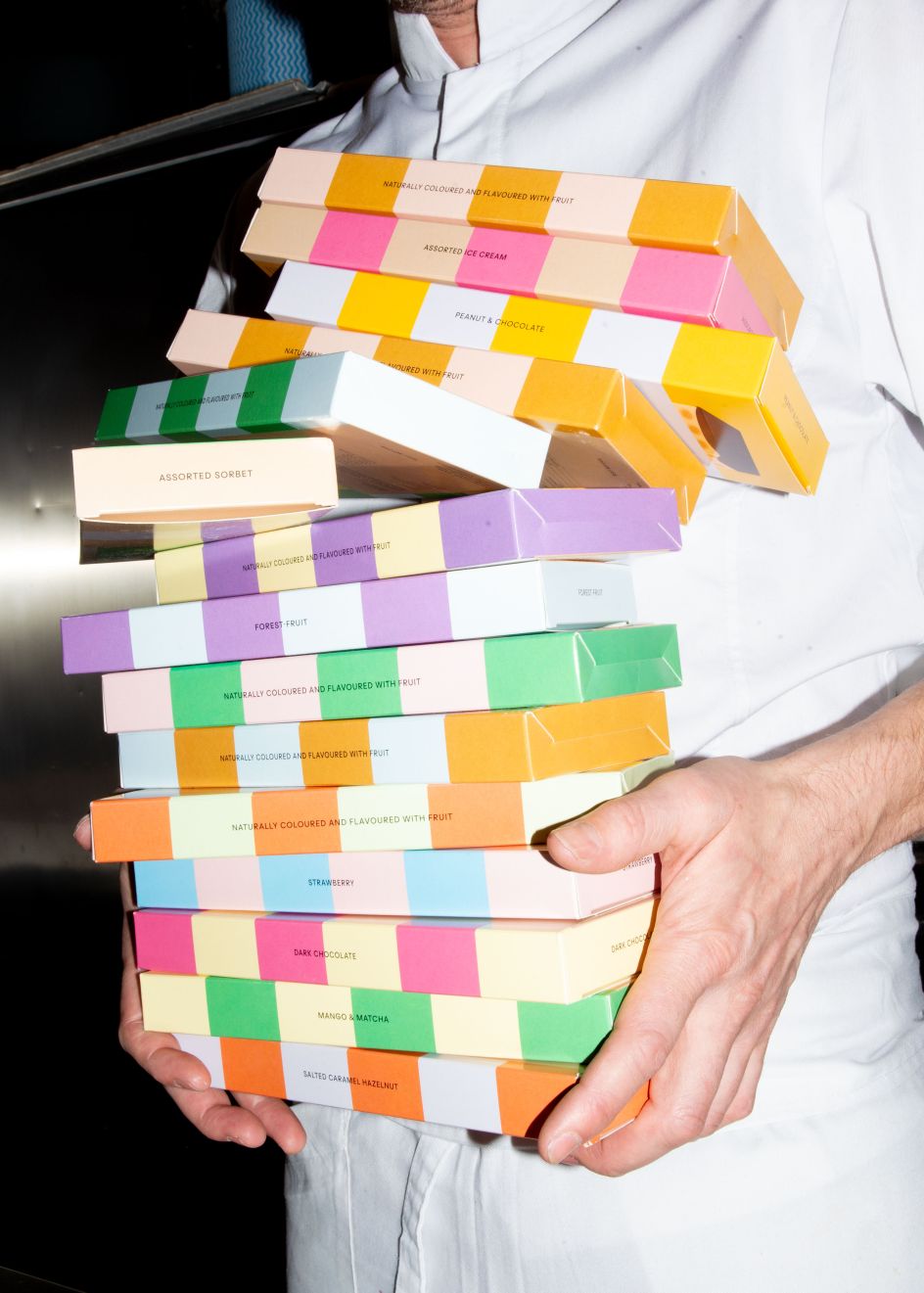
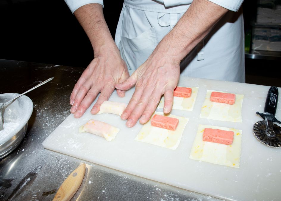
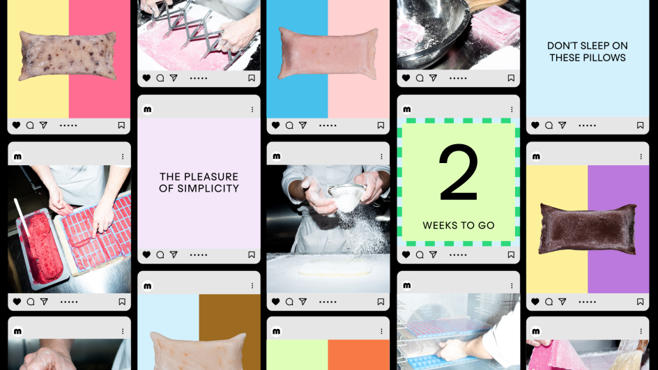
Mochi is a Japanese delicacy that has existed for centuries. But given that it's formed of pulverised, glutinous rice dough, shrouding orbs of bean paste, it doesn't sound instantly appealing to the Western palate.
So when London studio Regular Practice was introduced to a Swiss pastry chef and a Japanese snack exporter and investor, the opportunity was clear: reimagine a traditional Japanese snack for a modern taste experience.
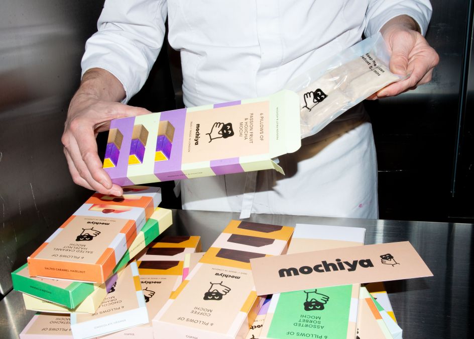
Mochiya was born – the Japanese for 'mochi store' – trading across delivery and retail and with the plan to extend to tea rooms in the future.
Target market
Hailing from galleries, not agencies, Regular Practice describes itself as having "the sensibilities of the art world, with the capabilities of the brand world. Optimising for a combination of beauty meets commerciality." And they certainly needed to put their creativity to work here.

"Nothing of this quality really existed in the UK," strategy director Ed Little explains. Mochi was available in the form of Little Moons Mochi Ice Cream, which is available in many UK supermarkets. But Mochiya wanted to go in a different direction.
"We wanted to create a high-end alternative more akin to luxury chocolate," he explains. "A brand that could work both in the best department stores, as well as their own signature tea rooms in due course."
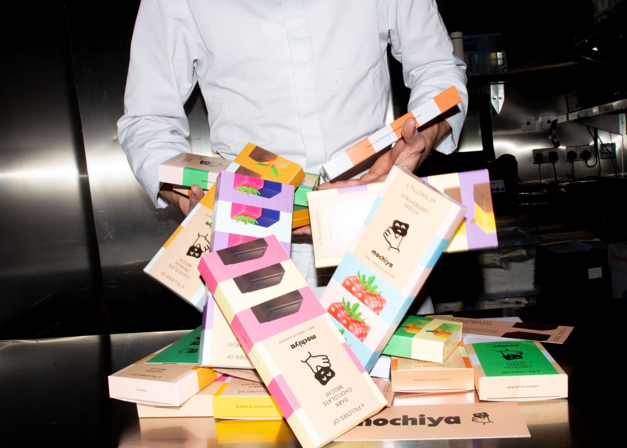
To reinvent the snack, Regular Practice worked with the co-founder of Mochiya, a Swiss-British chef known as Florian, who sourced the traditional mochi ball and flattened it to a plush pastry pillow. He then infused it with ice cream and sorbet using ingredients sourced from around the world, from English fruit farmers to friends in Taiwanese tea fields.
Brand concept
"The brand itself was inspired by the product's pillow-like shape, fluffy texture and uplifting mouthfeel," explains Tom Finn, co-founder and managing director of Regular Practice. "After sitting around our studio table together and trying the range of flavours and teas on offer, we were hooked."
"The design emanates from the idea that 'there's goodness inside' both in terms of ingredients and the comfort you feel from eating them," he continues. "It's escapism from the hardships and noise of everyday life. Mochiya is the destination for relaxation."
Another guiding principle behind the development of the brand was the fusion of cuisine and culture; "from East Asia to East London".
Visual design
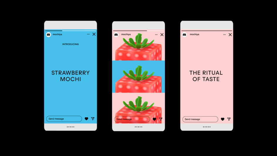
From the floating animations to the soft and squishy wordmark, a sense of doughy ease imbues the brand's visuals with a floaty feel. This was inspired by the idea that Mochiya floats above the noise, above the category, occupying its own space entirely.
As for typography, Regular Practice opted for a "wordmark-centric approach", says Kristoffer Sølling, co-founder and creative director. "The typeface is bouncy and energised, soft yet structured, malleable and doughy – like the mochi itself."
More broadly, "We took our visual cues from the multisensory experience of the product," says Kristoffer. "The texture, the colour, the inherently playful characteristic of the food. And we supplemented this mood with a humanoid motif that feels culturally attuned in terms of its out-there illustration style."
Editor's Picks


Trending


](https://www.creativeboom.com/upload/articles/86/862919952c0ad18439004228895a431dc6e45ffc_732.jpg)
Podcasts


Editor's Picks
Further Reading