New current affairs publication The Signal incorporates Russian samizdat influence
Taking inspiration from an underground, often undesigned, style and elevating it into a premium publication was one of the design studio Sister Mary's challenges with the project.

Sister Mary has designed a limited-edition printed publication for an emerging current affairs brand, The Signal. The project, titled The Long Game, pays homage to samizdat, which translates to "self-publishing" in Russian and refers to literature clandestinely written, copied, and circulated during the Soviet era.
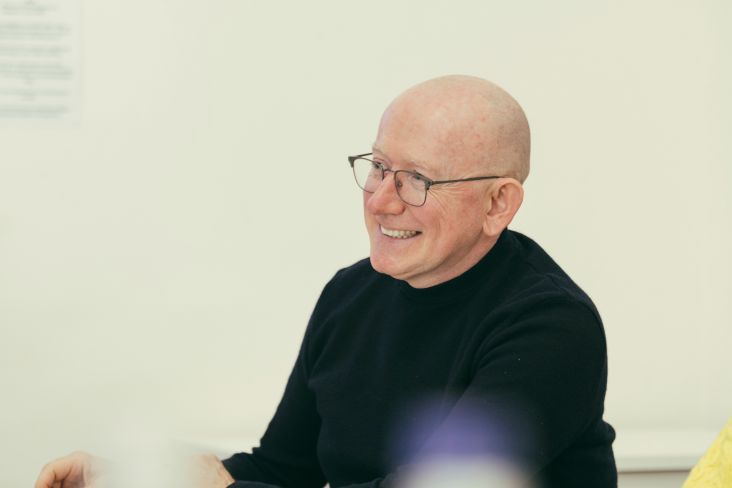
The Signal's CCO, Hywel Mills, has been friends with the studio's founder and creative director, Leigh Chandler, since their days as neighbours in Brooklyn. In fact, it was pure coincidence that Mills started The Signal team around the same time that Chandler launched Sister Mary. Given his advocacy for women-owned creative studios, Mills felt it was a natural next step to invite the studio to be part of the project.
Chandler describes working with print again as "a breath of fresh air", given that most brands have now moved away from printed publications in favour of digital media. She sees the project as a reaffirmation of the "enduring strength of print as a medium", one that is not just surviving but thriving.


Having the samizdat concept at the centre of the design work brought a strong creative vision to the project. Despite the challenges of working with such sensitive material, Chandler believes that designers have "a moral responsibility to contribute positively to the world".
"This can take various forms, from promoting sustainability to choosing not to work with brands that support causes that harm our society", she says. It can also mean supporting brands like The Signal that are not shying away from sensitive subject matter.
"It's true that samizdat was politically partisan in its original context, in a way The Signal is not today," says Chandler, "But samizdat was politically partisan specifically in opposition to authoritarian government, which The Signal very much is today." Instead of taking inspiration from its political stance alone, The Signal and Sister Mary saw an opportunity to draw inspiration from samizdat's design legacy.
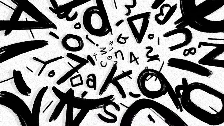
When the studio looked into samizdat's historical context, it found unbleached newsprint, which evoked a sense of age and authenticity. Ultimately though, it aligns with samizdat's "under-designed aesthetic, avoiding over-polishing for a more raw and genuine feel", says Chandler.
Political undertones continue through The Signal's colour palette, with hues carefully selected to align with the brand's ethos without aligning with specific ideologies. Red and black were chosen to command attention – though Chandler says they also symbolise "themes of resistance" – while gold and cream highlights seek to add a premium touch, "softening the contrast of the primary palette and tying back to The Signal's core brand colours", according to the studio.


The Signal's typography is also inspired by samizdat and Soviet-era design. Sister Mary opted for Manuka Bold from Klim Type Foundry for headlines, for its contemporary yet bold aesthetic. Untitled Sans, also from Klim Type Foundry, was chosen for body text, Chandler explains, "offering readability and neutrality while complementing the theme of embracing raw, unfiltered design".
Brand imagery was selected to engage readers and make the deeper themes of The Signal more accessible to readers. According to Chandler, this approach aligns with The Signal's mission of "exploring complexity in a rapidly changing world".
"Balancing the raw, samizdat-inspired aesthetic with a sense of premium quality was our main challenge," she says, adding that Sister Mary believes it struck the perfect balance between "creating a publication that feels both authentic and desirable".
On working with The Signal, Chandler says: "Collaborating with entrepreneurs is always inspiring; their passion ignites our work, and their meticulous attention to detail is commendable."

Editor's Picks


Trending


Podcasts
Editor's Picks
Further Reading