Botânica's visual identity is a sanctuary of serene design
Porto-based graphic designer Chezarit Mattie has combined his love of nature and made a positive change in his lush new visual identity for the city's community garden, Botânica.

When it comes to getting away from the hustle and bustle of daily life, nothing beats retreating to nature. And where better to recuperate from a long day at work than a community garden? That's the idea behind Porto's Botânica, a space where local residents can connect with nature, learn horticulture and contribute to the sustainable development of the environment.
Described as a "green sanctuary" where the seeds of human connection can be sown, Botânica acts as a third place where "hearts meet to share stories and dreams of a greener future come true." What could be more idyllic than that? Well, how about the garden's identity courtesy of freelance graphic designer Chezarit Mattie.


Having previously worked with Nestle and Disney, Chezarit is well-placed to create an atmosphere of serenity and beauty in Botânica. Using its perfumed air and overall celebration of nature as his inspiration, Chezarit has blessed the community garden with a spacious identity characterised by clean and organic lines and colours.
"Botânica is more than a community garden; it is a unique opportunity to unite art and nature for a greener and more sustainable world," he explains. This identity is also rooted in his experiences as an immigrant from Venezuela.
"It is a project that holds a special place in my portfolio as it encapsulates my love for nature and unknowingly helped me to feel part of a place as an immigrant, generating a positive change within the community."


The graphics he's created, with their earthy greens and dynamic splashes of orange, sit comfortably alongside Botânica's goal of promoting sustainable agriculture and environmental education and boosting the overall welfare of the community.
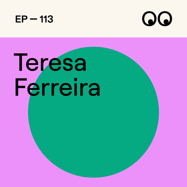
"Botânica's visual identity is a celebration of local flora and the biodiversity that characterises it," Chezarit adds. "Its graphic elements reflect the fluidity and vitality of nature, while its visual simplicity conveys a message of accessibility and inclusiveness. The colours chosen are a palette of vivid greens, oranges and earthy tones that evoke the serenity and vitality of the space."
In fact, Botânica's visual identity hints at something grander. It suggests that far from being simply a community garden, it is a unique opportunity to unite art and nature in favour of creating a greener and more sustainable world.
"As a graphic designer and part of this community, I feel privileged to contribute to this inspiring project by creating a visual identity that reflects its essence and positive impact on the community," Chezarit concludes.


Editor's Picks


Trending


Podcasts
Editor's Picks
Further Reading