Base Design's identity for New York weed museum aims to break the stigma of cannabis use
With marijuana now legal for recreational purposes in New York, a new cannabis museum is drawing crowds to SoHo. Base Design explains that creating its visual identity meant striking a tricky balance.
Even a few years ago, the idea of a museum devoted to dope smoking outside of Amsterdam would have seemed unthinkable. So the launch of The House of Cannabis, aka THC NYC [see what they did there?] has been a pretty big deal.
Even before opening, the SoHo venue had drawn a lot of attention: it hosted a runway show for New York Fashion Week, plus its branded windows acted as a backdrop for myriad photoshoots undertaken by passers-by. And the full launch in April has proved a critical milestone in helping cannabis culture become accepted more widely.
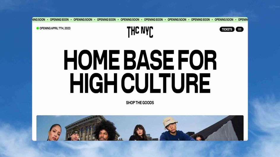
New York legalised the popular drug for recreational use in 2021, and the museum – a multi-sensory and experiential destination across five floors – is aiming firmly at the mainstream audience, including non-partakers and those who are curious. So it needed a visual identity that would transport visitors out of the ordinary and immerse them in the extraordinary – without being too "out there" and offputting for newbies.
To take on this challenge, they turned to global branding agency Base Design, an international network of studios focused on creating brands with cultural impact. And getting the balance right was crucial, given the wider context around cannabis in New York.
The context and brief
In simple terms, the state had officially pivoted its approach towards, and relationship with, marijuana in a dramatic 180-degree flip.
Legalising it for public consumption in 2021 instantly led to dispensaries opening in droves, a slower release and rehabilitation of those previously convicted of weed-related crimes, and a significant growth in general interest in cannabis products and culture.
For many in the general public, that had felt like quite a shock to the system, a continuing phenomenon today. As Min Lew, executive creative director and managing partner, says, "We're witnessing in real time a powerful shift in cultural perceptions of cannabis."
Branding a cannabis museum in this environment would prove quite a challenge.
"The THC NYC founders came with an audacious vision to break the stigma and elevate the cannabis experience," Min recalls. "Our job was to channel that ambition into an equally bold expression and articulation of the brand, one that invites both experienced and newly curious audiences.
"It became critically important to challenge preconceptions about what a museum is and uncover the role this one needed to play, particularly now at this moment in culture."
Concept and design elements
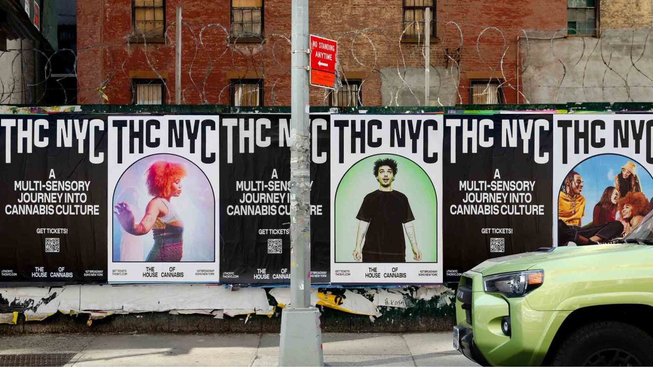
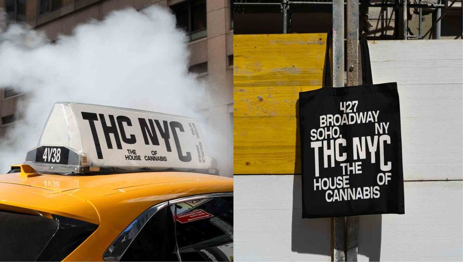
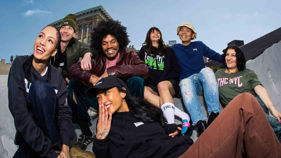
Base touched on virtually every aspect of creating the brand: strategy, naming, visual identity, website, signage, merchandise, and an out-of-home launch campaign. Each facet of the brand centres the museum as a place that's experiential and educational, a cultural institution rather than a dispensary.
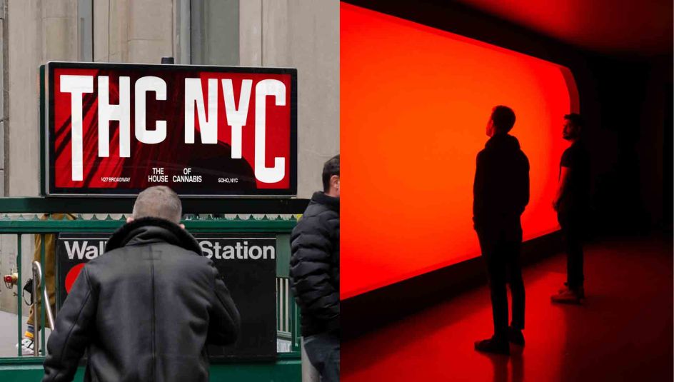
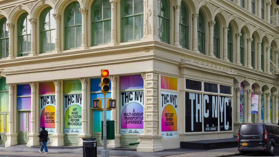
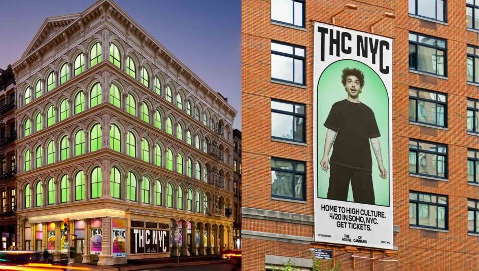
There's a clear theme of arches within the designs, and that's no accident. "Since cannabis can transport the mind to different places, the iconic arched windows of the house's historic building at 427 Broadway were an obvious tie-in to represent portals to other realms," explains senior design director Ross Gendels.
"This shape informed a tight visual framework that revolves around a flexible motif, used to either contain or frame a wide range of content, and acting as both a conceptual and a literal window into the world of THC NYC."
The custom typeface, meanwhile, speaks to urban culture with plenty of attitude. Merchandise, too, was created with a streetwear sensibility.
As for the art direction, clouds represent the ethereal and also act as euphemisms for smoke, while colour gradients evoke the feeling of ever-changing moods and constant discovery. It all adds up to an inventive and thoughtful identity, which subtly evokes the transformative potential of cannabis use while steering well clear of heavy-handed or cliched concepts and imagery.
Editor's Picks


Trending


Podcasts


Editor's Picks
Further Reading