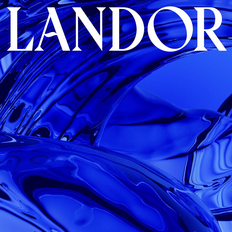
Creative agency Landor makes a splash with water-inspired rebrand
The world's largest brand and design agency Landor & Fitch has unveiled a new name and visual identity reflecting its wider offerings as a company and paying homage to its aquatic origins.
Now going by the shortened name Landor, the refreshing rebrand is the culmination of a five-year strategy. Centred around an ultramarine colour palette, with appropriately watery graphics and soundscapes to match, the revamped look nods to the dramatically expanded consulting, design and experience services the WPP company provides.
These new services include a movement into sonic branding by acquiring sonic specialists Amp, as well as adding workspace and architectural design experts BDG and award-winning motion design specialists ManvsMachine into its ever-expanding family.
Landor is holding up a mirror to its past by opting for a water-themed rebrand. The company was founded by Walter Landor on a ferry boat in San Francisco harbour (which appears at the foot of the agency's new site), making it a perfect and versatile focal point.
Beyond its historical connection to water, though, Landor is also fascinated by the element's transformative properties. And given that the business has recently bolstered its consulting capabilities with a rapidly growing Brand Performance practice, not to mention a 2020 merger with Fitch, it seems like an ideal theme.
"Over the last five years, our business has evolved, and our offer has expanded significantly," says Jane Geraghty, group global CEO. "We've welcomed world-class specialists in sonic, motion and workspace design, and today, most importantly, we have come together as one team with a shared culture. United in our drive to make a positive difference."
Besides being fluid, both literally and metaphorically, water is also ever-present. This is another consideration at the heart of Landor's rebrand as it moves to reposition itself in the long term in a media landscape that is constantly shifting and evolving.
"Our new brand charts an ambitious course for our future," says Teemu Suviala, global chief creative officer. "We use our new brand colour, the ultramarine blue, to signal redefining the brand and design category.
"Our design and expression capabilities are now unparalleled. For our own brand, we tapped into brilliant creative minds from around our network, just as we would do for our clients, to create a brand that comes to life in every facet, from visual and verbal to sonic and motion."

Editor's Picks


Trending


](https://www.creativeboom.com/upload/articles/86/862919952c0ad18439004228895a431dc6e45ffc_732.jpg)
Podcasts


Editor's Picks
Further Reading