Jump around: Majefa's new identity features type that moves to the music
Type foundry and design studio F37 has created a mature new look for Manchester's underground trance scene, Majefa. Boasting dynamic typography and colours inspired by rave culture, the identity is a celebration of the UK's clubbing aesthetic.
Since 2007, Majefa has been bringing rave to the city of Manchester with premier events featuring some of the biggest names in the genre. Now in its 16th year, the organisers felt it was time for a refreshed identity which reflected its maturity and opened it up to different styles of dance music.
Enter F37, a Manchester-based studio and type foundry founded by local boy and Majefa regular Rick Banks. Having already published Clubbed in 2018 – a visual history of UK club culture which features a plethora of clubbing graphic design, including logos, posters and signage – it was felt F37 were the perfect fit for the task and were contacted directly.
The timing for the commission couldn't have been better. As it turns out, F37 had already been working on the perfect design by chance. "On the F37® Foundry site, we have a section called Playground," Rick tells Creative Boom. "This is where our designers can really let loose (without client feedback!) and have fun and experiment with font technology; we also split all the royalties between the designers.
"We were already developing a font for the Playground that bounced up and down when, serendipitously, Majefa emailed, and we thought, BOOM, this is perfect for them!"
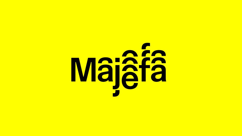
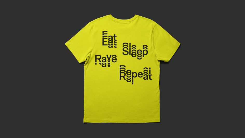
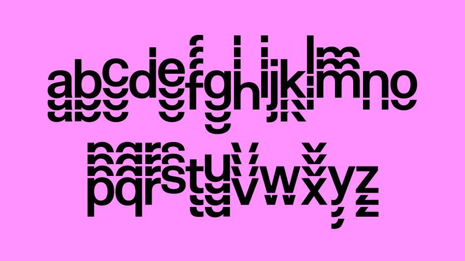
He's not wrong. The dynamic and distinct typography, which contains seven alternates per character that align to a grid, appears to jump up and down to music while remaining readable to passers-by. "The pseudo-random effect between these alternates is achieved with a backtrack sequence of OpenType® feature code," Rick explains.
"In terms of reacting to sound, we analysed the audio waveform to pinpoint the key beats of the track using Adobe After Effects," he adds. "This gave us a visual key for lining up our animation keyframes, which we crafted individually for each separate iteration of type. By randomly synchronising the separate keyframes, we could emulate the look and feel of an audio equaliser in time with the music.
"The font style itself is a pretty sturdy neo-grotesque style that can be put through a lot and remain legible. It is also possible to turn off the tiered effect within the font, using the stylistic set called 'Standard'.
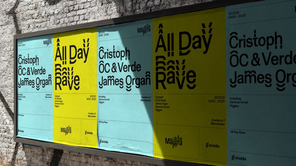
To make Majefa look more grown up, Rick and the team chose a neutral look for its typeface. "We were inspired by the heavy use of Helvetica / Akzidenz in the '90s club scene as we saw with clubs such as Cream, Haçienda and Fabric," he reveals.
"Looking back on those graphics now, they still feel modern; that's what I love about Swiss typefaces, they are timeless."
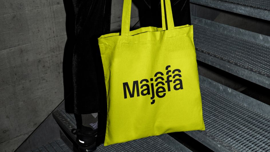
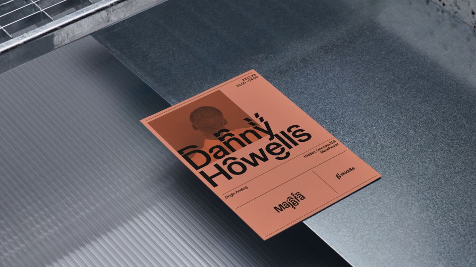
Appearing on digital platforms as well as OOH materials and merchandise, Majefa is now also instantly recognisable thanks to its bold colour scheme. "The client was really inspired by the Hacienda artwork 'Faç Off' by Central Station Design.
"It features a bright yellow background with black lettering. We riffed off this and added brighter colours inspired by various dance flyers that could also work with black lettering and complemented the primary yellow."
The result is a new identity that exudes confidence without being in your face. "Its previous logo was all caps and was quite shouty," Rick concludes. "Having a brand system in place with a bespoke font makes them more grown up, and the typeface is super ownable and works on its own or with photography."
Editor's Picks


Trending


](https://www.creativeboom.com/upload/articles/86/862919952c0ad18439004228895a431dc6e45ffc_732.jpg)

Podcasts


Editor's Picks
Further Reading