DesignStudio rebrands Habyt, a new type of housing company
When you're a new type of company, distilling your message into a simple brand purpose and communicating that through a brand system can be a big challenge. We explore how DesignStudio did just that for flexible housing provider Habyt.
Founded in Berlin in 2017 by Luca Bovone, Habyt is a provider of flexible housing that owns private and shared apartments across 25+ cities worldwide. It aims to remove the barriers of finding a roof over your head, whether looking for a nightly stay, a hassle-free international move, a family home or a co-living community.
After rapid and extensive growth, and following its acquisition of Common in the US and Hmlet in SouthEast Asia, Habyt asked global brand studio DesignStudio to define their brand strategy, architecture, tone of voice and visual and verbal identity.
With over 30,000 units in its portfolio across 50 cities, Habyt's primary goal was to create a distinct, global brand that would reflect its values and mission, as well as create a framework that offers the most seamless experience for tenants.
Brand purpose
"Habyt aims to make it easier to find a place to stay, empowering you to seize opportunities and live anywhere, regardless of your circumstances or background," explains Eric Ng, executive creative director at DesignStudio. "We captured this powerful idea with the brand purpose, 'Your next move unlocked'."
"Unlike other property providers," he continues, "Habyt doesn't sell you a lifestyle or romanticise the experience. Its commitments of 'Tell It Like It Is', 'For your every turn' and 'Breaking barriers' focus on delivering a highly utilitarian experience which fulfils expectations and garners trust."
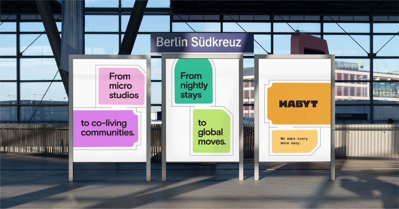
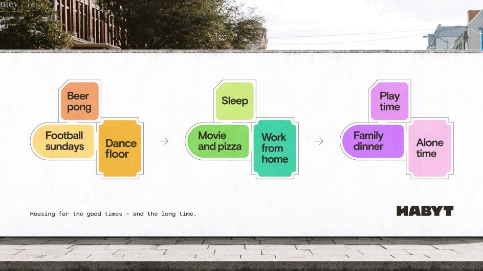
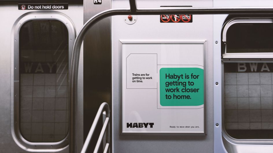
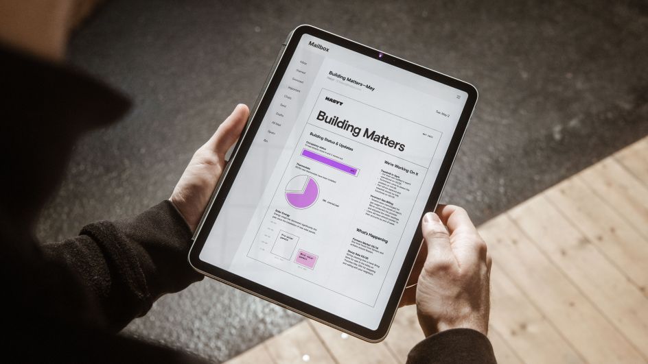
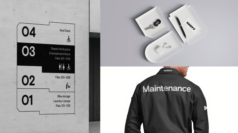
This strategy sits at the heart of the visual identity, which takes inspiration from architectural floor plans. It's highly utilitarian, reflecting that the brand favours function over form at every turn.
The new branding system guides the user through their journey using this vernacular and illustrates how Habyt can be configured to adapt to each individual's needs.
Design elements
At the centre of the system, the new logo builds on the idea of 'unlocking opportunities' through the symbol for opening doors, which is located in the negative space of the 'H'. This bespoke logo is supported by Basis Grotesque, a clean, straightforward and highly legible typeface from Colophon Foundry.
The primarily black and white colour palette is supported by accent colours used strategically to highlight elements or communicate different products across the portfolio.
This is supported by a system of icons – used to communicate key property features or Habyt's offerings – while simple linear illustrations reminiscent of instructional diagrams are used instead of photography to depict inhabitants within the spaces. You can see the new branding live now on the Habyt website.
"The recipe for effective rebranding begins with a profound understanding of our customers' needs, fused with our forward-thinking vision for a fresh category we've named 'flexible living'," says Luca Bovone, founder and CEO of Habyt.
"We've gathered insights from over a thousand individuals, including both tenants and property owners. We've considered their perspectives and radically transformed them into a unique viewpoint, showcased in our state-of-the-art brand elements. We've laid the groundwork to create a distinct connection with clients of all ages and varying needs, positioning ourselves as the preferred brand for their living requirements."
Editor's Picks


Trending


](https://www.creativeboom.com/upload/articles/86/862919952c0ad18439004228895a431dc6e45ffc_732.jpg)


Editor's Picks
Further Reading