Regular Practice rebrands online estate agency Purplebricks over a decade after launch
The marmite property player is back for round two with a renewed focus on shaking up the housing market.

Online estate agency disruptor Purplebricks went from being worth an estimated £1.4 billion to being sold for £1 last year.
But now the brand is revitalised by its new owners thanks to work by London-based agency Regular Practice and its strategic partners Sonder & Tell.
Founded in 2012, Purplebricks launched to empower homeowners to sell their property themselves. The brand's online business model offered a refreshing change to those frustrated by outdated, opaque, and expensive real estate agencies, putting the power back into the hands of the sellers, not the agents, and enabling people to sell their homes for free.
Its new owners – former rival agency Strike and Freston Ventures, the fund behind Carphone Warehouse, Talk Talk and Five Guys- recognised an opportunity to restore pride in the brand and signal its intent to carry on shaking up the estate agent market.
Tom Finn, founder and managing director of Regular Practice, says: "We saw the potential for the power of brand to play a unifying cultural force for both Strike and Purplebricks teams – setting them on a new and exciting trajectory."
Despite having a memorable name, distinctive purple brand colour and a decade of consistent TV advertising, Regular Practice felt that the rest of the identity was tired and neglected and chose to bring the brand to life with a new moving identity, colour palette, photography and logo – all underpinned by the simple phrase: 'Own It' – courtesy of Kelli Corney and her team, strategy director at Sonder & Tell.
"We live in a visual world. Subconscious or not, contemporary consumers across all parts of the market have high expectations of design," says Kristoffer Sølling, founder and creative director of Regular Practice.
"We aimed to modernise the brand for today's more digitally native world. Motion is a key design asset for any digitally-driven brand."
The idea was to draw on Purplebricks' core principle of 'flipping estate agency in the customers' favour' and avoid the generic stock feel of most estate agents.

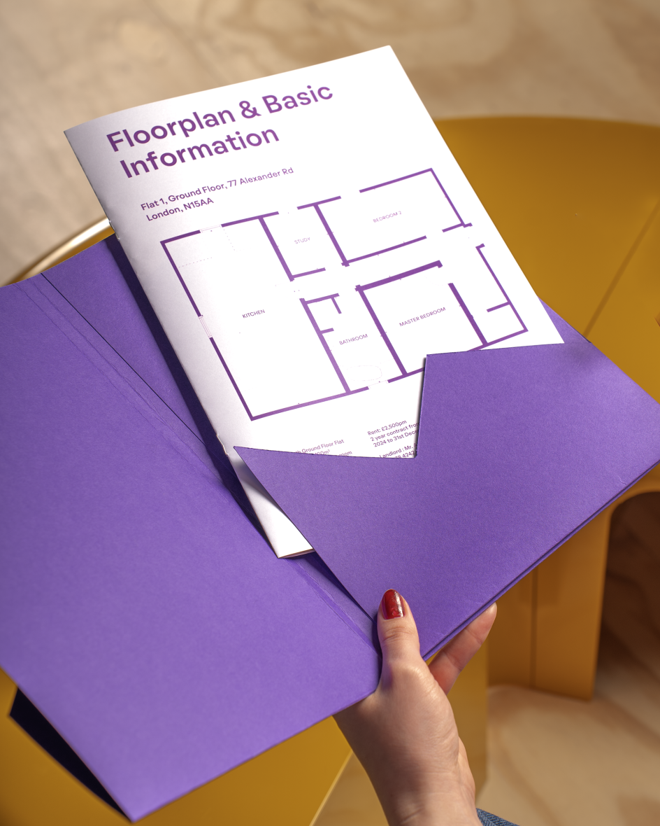
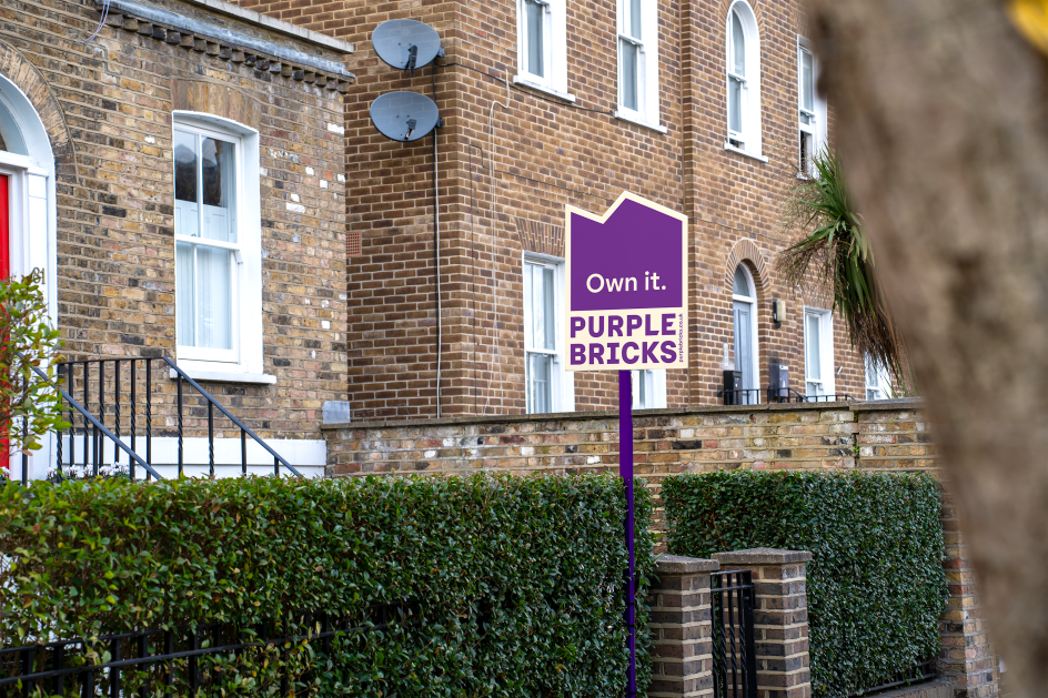
Regular Practice opted for a novel graphic system introducing house-shaped blocks to reflect the diversity of houses and flats on sale. Designed to be used for everything from social media to printed materials and the all-important placards outside people's homes.
A new colour palette focuses on warmer tones of magenta, gold, and pale yellow, while the typeface Oatmeal Semi-bold and Medium was used to optimise clarity and honesty – positives that buyers and vendors don't always associate with the property market.
Kristoffer Sølling adds: "Looking at the recent success of other design-led businesses such as Zoopla and Rightmove, putting their own stamp on the housing market, the time feels ripe for a new approach from Purplebricks. Hopefully, it will resonate with audiences old and new. As we know, buying a house is one of the biggest purchases many people make in their lives, so having an identity that speaks their language will build trust and reassurance in a fractured market."
Editor's Picks


Trending


](https://www.creativeboom.com/upload/articles/86/862919952c0ad18439004228895a431dc6e45ffc_732.jpg)

Podcasts


Editor's Picks
Further Reading