Fresh new fonts for September to satisfy that 'back to school' feeling
Give your designs a fresh breath of air as we bring forth a selection of new typefaces to check out this September.
Ah... September. For those of us who love neither intense heat nor shivering with cold, it's the perfect month. As the excitement of a recent summer holiday fades into the distance, everything just gets a little bit calmer as the leaves begin to change, temperatures cool, and a scent of renewal fills the air.
September brings with it a familiar sensation of new beginnings... and you don't have to be a student to appreciate it. The "back to school" atmosphere isn't limited to just classrooms and roving groups of freshers wandering from pub to pub; it also permeates the world of design and creativity. And so, it's a great time to start playing around with some fresh fonts and giving your designs a new look.
To help you out, we've curated a shortlist of eight new typefaces that aren't just characters on a screen; they're vessels of expression, carrying the weight of tradition and innovation simultaneously. From chunky slab serifs to geometric delights, our selection showcases the diverse range of creative thought shaping the world of typography in 2023. Join us on a journey through these meticulously crafted letterforms as we explain what's different about them and why they're worth giving a go.
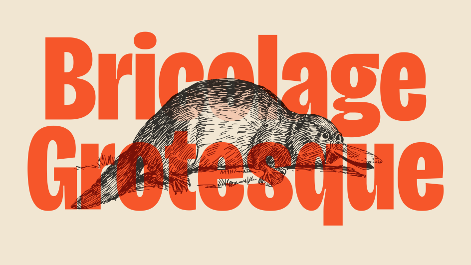
1. Bricolage Grotesque by Mathieu Triay
Want to explore new horizons with your typography? Then make a beeline for Bricolage Grotesque, a new font that explores the connection between typography and personal identity. It's a free and open-source variable font across three axes: weight, width and optical size.
Bricolage Grotesque started as a fork of Mayenne Sans, an open-source single-weight font designed by Jérémy Landes. It then evolved with cues from French sources, namely Antique Olive, and British sources, including the Grotesque series by Stephenson Blake.
Mathieu tells us: "Bricolage Grotesque blends elements of iconic British and French type design with modern trends and tools to traverse an emotional landscape that stretches back to my grandfather crossing the 'Méditerranée' and ends with my own experience as a Frenchman living in England for over a decade.
"This isn't your typical typeface," he adds. "It tries to visually express what it feels like to move countries and rebuild, what it feels like to have a hybrid identity where you cannot be what you were and yet you can never truly be anybody else."
2. Dockland by Tom Holloway
Slab serifs can be a bit samey, but here's a noteworthy exception. Dockland is a low-contrast font crafted in a transitional style.
Referencing the London Docklands development, its crisp and sharp texture adds some calligraphic flavour to the often mechanical genre of slab serifs. And more broadly, its blend of mechanical construction with geometric clarity and a swift stroke fuses the best of past and present into one elegant design.
Inspired by blackletter elements and lithographic prints from the 1890s, this is a solid text face with modern proportions, clearly defined shapes and an angular physique. Whilst the heavier weights are physically strong, the lighter weights are precise and airy. The result is a smart slab serif with seven weights across uprights and italics.
This would be a good choice for corporate typography – everything from food trucks and craft beverages to maritime sports teams and tech start-ups. Plus, as a strong workhorse for text, it's also a strong option for abstract businesses or publications within a cultural and academic context. Dockland is shipped with a weight range from a delicate Extra Light to a strong ExtraBold. The glyph set covers a broad Latin language support, fractions, old style and decimal figures, as well as arrows.
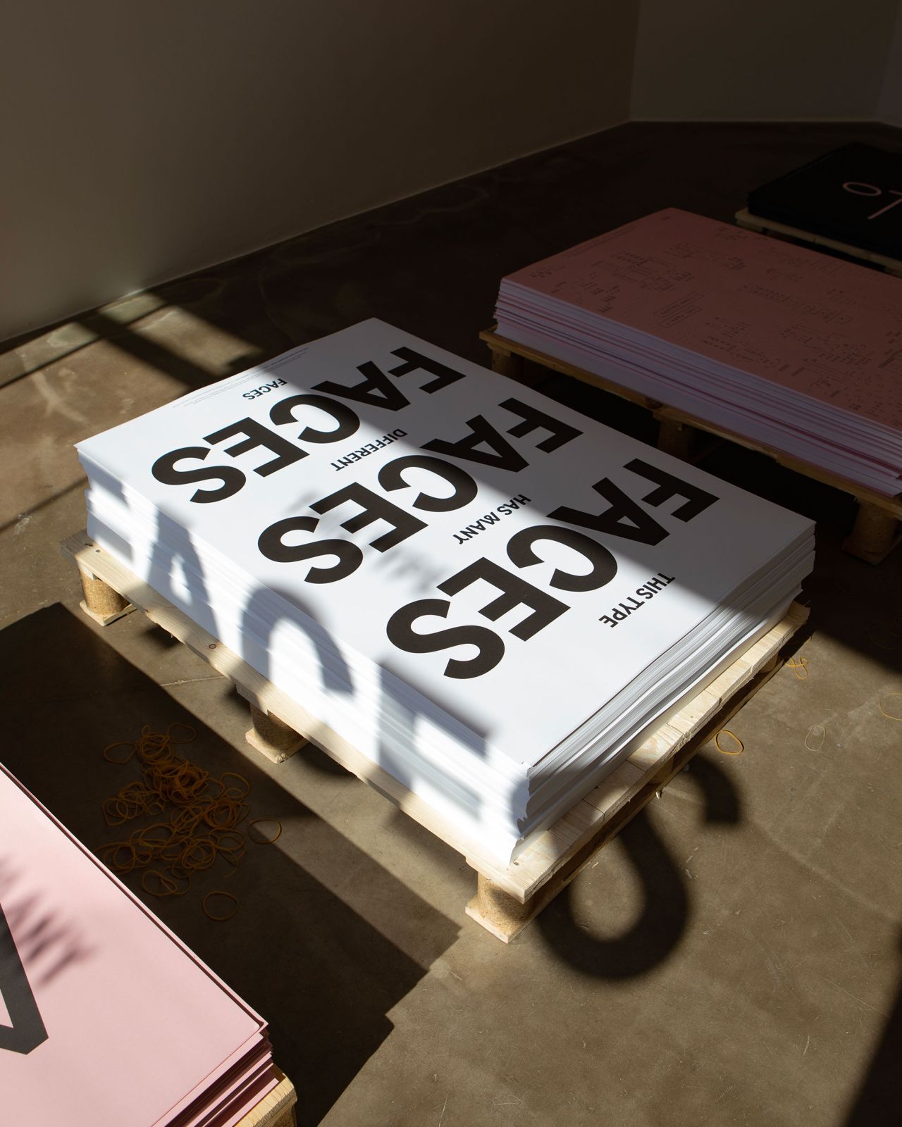
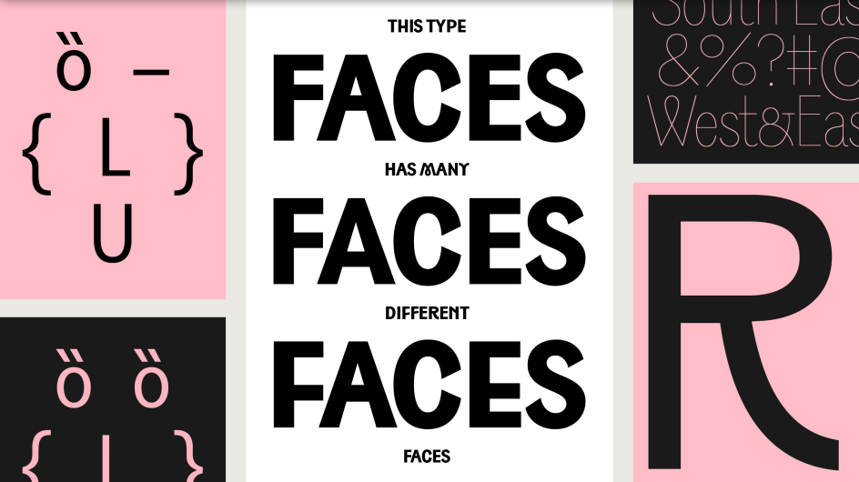
3. South East by Playtype
It's always fascinating seeing how cultural and linguistic differences can affect typography, but few type designers are brave enough to cross-pollinate between languages. Here's a notable exception.
South East is a sans serif type family loosely inspired by the shapes and compositions seen in the curved forms and varying letter heights of Hangul, the Korean alphabet, which is intended for vertical reading. It's the latest release from Playtype, a Copenhagen-based independent type foundry specialising in retail and custom typefaces.
Its genesis began in 2019 via a custom typeface project that Playtype created for a youthful lifestyle brand in Korea. The team found inspiration in sketches by a Korean type designer and was captivated by the essence of Hangul typography. This inspiration led to the development of the South East, forging a connection between Scandinavian design sensibilities and the rich heritage of Hangul.
Designer Jonas Hecksher carefully adapted the characteristics of Hangul to the Latin alphabet, incorporating different centre heights and mimicking its distinctive form. The result is a typeface that pays homage to its inspiration while offering a distinctive typographic experience.
The upper and lowercase characters mimic the pattern found in Hangul, enhancing continuity and playfulness throughout the typeface. To emphasise its playful nature, South East touches the cap line, a distinctive choice that adds an element of fun and breaks away from convention.
South East includes a wide range of stylistic sets, allowing you to choose between three different centre heights and a good number of alternate letter shapes. When used in large sizes, it shows its display qualities while still performing perfectly as a text typeface in smaller sizes.
With many faces and many different expressions, the typeface is available in nine weights across three widths – Condensed, Normal, and Expanded – which makes it a family of 54 styles, including corresponding italics. Latin, Greek and Cyrillic scripts are included, along with more than 220 languages.
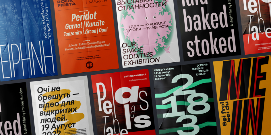
4. Peridot by Foundry5
Looking for a versatile font? Then you won't go far wrong with Peridot by Foundry5. It's a 120-style multifaceted sans serif type system designed to shine in diverse settings, from branding and corporate projects to editorial layouts, advertisements, posters, and even web and screen usage.
A 10-weight family with slanted italics in six widths and a variable format, Peridot is loaded with personality; try the different stylistic variants to change typographic tone depending on your mood. Designed by Pria Ravichandran and Kostas Bartsokas, it supports Latin, Greek, and Cyrillic, with Devanagari and Arabic promised soon, and recently won Original Typeface in the 2023 Greek Communication Design Awards.
Curious to see it in action? You can explore Peridot on the foundry's website and Behance profile to witness its potential. Peridot is also available on Adobe Fonts, Fontspring, and all Monotype channels.
5. Spades by Order
Here's one we couldn't possibly ignore. Spades is a contemporary Baroque typeface that blends the historical influences of ornate 18th-century typography with the modern concept of an ink trap. It's a great concept and brilliantly executed.
Designed by Sascha Hopson and mastered by Tiny Type Company, the Spades family explores the juxtaposition of two distinct historical periods: the Black Arts Movement and the Baroque Era. While these may seem contradictory, Spades somehow finds an overlap between them and forges a distinctive typographical voice via the extravagance, expression and attitudes of the respective eras.
Technically, there is a visual relationship between the shape of the scalloped serifs and ink traps. The juxtaposition of the ink traps inner counter to the scalloped serifs almost represents a mirror of the serif shape itself: a fascinating concept. This font is available in thin, light, regular, bold, and black.
6. Gaisyr by Dinamo
The fusing of old and new takes another intriguing twist with Gaisyr, a beautiful new typeface with house-style butterfly serifs. It takes its point de départ from sketches by the early 18th Century royal typographer for King Louis XIV, Jacques Jaugeon, and reimagines them through the lens of a TikTok content neighbourhood. It's suitable for longer texts but loud enough that, as the creators put it, "it's not just another Times".
Its origins lie in Romain Du Roi, the typeface of King Louis XIV, a heavily rational design drawn by four scientists in 1692 and based on a grid of 2,304 tiny squares per letter. This was arguably the first transitional typeface: a bridge from designs modelled on handwritten letters to typefaces created specifically for the printing press.
This tension between strict geometry and loopy, hand-held lettering was central to the design of the new font. Its butterfly serifs, seen in typically overlooked characters like the lowercase i and l, sprout out like a geyser (although the designers went for the prettier-sounding 'Gaisyr'). Royal swashes, meanwhile, are available as alternates for when you need to make an extra splash; you'll find them in the stylistic sets for e, h, k, m, n, r, and z.
The typeface has a total of 42 styles. It's available in Regular, Mono, and Semi-Mono cuts, all with corresponding Italics, and ranging in weight from Thin to Black.
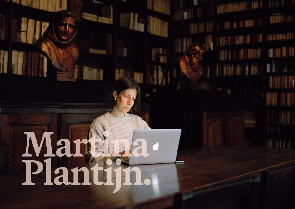
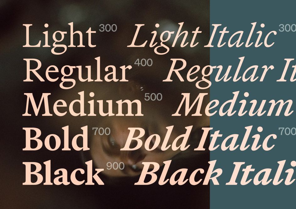
7. Martina Plantijn by Kris Sowersby for Klim Type Foundry
We're always keen to check out what Klim Type Foundry's designer Kris Sowersby has been working on, and his latest project is no exception. Martina Plantijn is a new type family informed by the workhorse qualities of Frank Hinman Pierpont's well-known 1913 typeface, Plantin.
This new design expands upon Pierpont's research of 16th-century type at the Museum Plantin-Moretus in Antwerp, making digital updates across its roman and italic cuts. "It's my third official bite at the Plantin cherry," Sowersby explains. "The first was Galaxie Copernicus (2007) with Chester Jenkins. Tiempos (2010–18), a re-focussing of Galaxie Copernicus through the lens of Times New Roman, was the second. Martina Plantijn is a more accurate rendition. I'm honouring the original spirit and fortitude of Plantin."
In short, this is a formidable next-generation Plantin that reconciles historical analogue qualities with a 21st-century digital reality. Martina Plantijn is very robust at small sizes, hard-working and modest, while larger settings reveal practical and opinionated arcs, cuts and terminals.
Unlike Plantin's looping pothooks, Martina Plantijn's entry serifs are more akin to its roman triangular head serifs. These are usually more cursive, indicating an incoming pen stroke. Martina Plantijn's are consistently horizontal on the flat while the top curve remains fluid. This creates a solid anchor across the x-height that lets the baseline dance. The exit strokes incline abruptly and are slightly longer than normal.
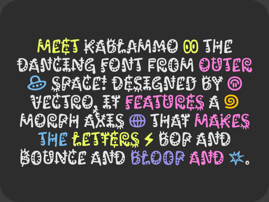
8. Kablammo by Vectro Type Foundry
Our final font will make your head spin but in a good way. Vectro Type Foundry's new typeface Kablammo is a maximalist, absurdist, out-of-this-world love letter to the 90s. This animated variable font with morphing letterforms was inspired by toys and cartoons from the era, as well as the Memphis Group style.
The typeface is the result of a commission from Google to explore the potential of the new variable font format. Vectro's dedicated Kablammo team invested a year and a half, transforming their initial concept into the final design, and it shows.
Vectro developed Kablammo as a joy-inducing, contemporary typeface to stand alongside the likes of Comic Sans, Hobo, and Jokerman. Creative director Lizy Gershenzon envisions it becoming the next go-to font for birthday cards, school parties, and even corny office memos — essentially, anywhere people seek to add some fun.
"In a way, Kablammo reminds me of '60s minimalist music like Steve Reich and Philip Glass," says lead type designer Travis Kochel. "The music feels repetitive on the surface like it's stuck in an endless loop. But on closer examination, it's constantly evolving and moving, with subtle variations in each measure. This creates a fascinating tension, complexity and energy."
Its animated nature makes it well-suited for dynamic movie titles, ads and the web; Kablammo can easily come to life on digital platforms with CSS animation of the variable axis. The Morph axis allows the letterforms to dance between four alternates. On an axis range of 0–60, the morph styles include Zoink at 0, Bloop at 20, Splat at 40, and Eek at 60.
In addition to the Latin character set, Kablammo also features Cyrillic, designed by Daria Cohen and Ethan Cohen. This expansion allows Kablammo to be used in languages such as Ukrainian, Bulgarian, Serbian, and Russian. Kablammo is now available for free on Vectro Type Foundry and Google Fonts.
Editor's Picks


Trending


](https://www.creativeboom.com/upload/articles/86/862919952c0ad18439004228895a431dc6e45ffc_732.jpg)

Podcasts


Editor's Picks
Further Reading