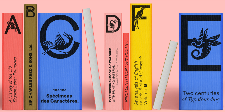
Hot new fonts to play with this summer, courtesy of leading foundries
The reinvigorating days of summer are the perfect time to break out of your typographical comfort zone and try something new. Read on to discover the best new fonts for your design projects.
Cyclops by HVD
As the summer sun literally brings light into our lives, there's a palpable sense of optimism in the air. It's a time for new beginnings, fresh perspectives, and a renewed appetite for creativity. So why not grasp the opportunity to try out some new typefaces?
You don't want to waste your time on rubbish, of course. So in this article, we've hand-picked a delightful array of hot new fonts that aren't just functionally and technically sound but add that certain extra splash of creativity to inspire and captivate you.
As ever, we've got our attention firmly focused on the best independent type foundries, but we've also kept our eyes out for the best fonts from the big players. So read on because have we got a list for you!
From forward-looking typefaces that embody the spirit of an optimistic future to those that draw inspiration from the dependable past and update them for 2023, our curated collection of fonts embraces a sense of playfulness, fun, and a positive approach.
So give them a whirl, and hopefully, they'll add a touch of joy and creativity to your summer design projects. Plus, for more inspiration, last year's list is well worth a look too!
1. Binate by Bruno Mello
Binate offers a synergetic blend of neutrality and expression, all within a contemporary superfamily. Designed with functionality at its core, this font encourages you to experiment with its impressive weight ranges, from Hairline to Black, and arms you with ample tools to refine and tweak endlessly.
The creation of Bruno Mello, a Brazilian type designer working at Dalton Maag, Binate's apertures presents a crisp and rigid style that evokes a utilitarian design. Yet experimenting with some of its lower hooks can nonetheless offer a more approachable and friendly demeanour. Plus, it's adaptable enough to feel at home everywhere, from the tiny details on packaging to large formats like billboards and posters, as well as in digital media.
Binate by Bruno Mello
Binate by Bruno Mello
2. Ivory by Lineto
Ivory is an unusually solid and sturdy serif with pronounced shapes and character and exhibiting relatively little contrast and sharpness. Designed by Aurèle Sack, with font engineering and mastering by Alphabet, Berlin, its three monospaced cuts provide the family with plenty of room for extended play.
The family has been in development since 2016 when Aurèle was appointed typographic consultant to Vogue Hommes Paris. This led to a commission for a new titling font, 'an expressive yet elegant serif typeface', to accompany his own LL Brown, which had already been in use at the magazine.
Aurèle found inspiration in 19th-century wood type and poster fonts of American origin. Applying his signature method of reassessing, interpreting and modulating historical sources, he devised a character set that kept the extended proportions but refined the strong contrast and pronounced serifs. After years of development and refinement, Ivory is now ready for wide release in 2023.
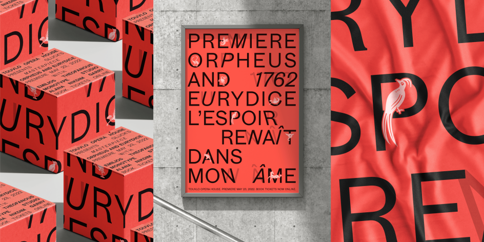
3. Touvlo by Emilios Theofanous
Released last September, Touvlo is a modern, zestful interpretation of early British grotesque typefaces. Created by Monotype's Emilios Theofanous, it skillfully captures the original spirit of this style while adding a dash of personality and energy.
Touvlo, meaning "brick" in Greek, is a homage to London and the view from the designer's studio window. This workmanlike font offers an array of styles, from clean uprights to characterful italics and exuberant back slants. Its regular upright weights are optimised for long text, with vertical contrast creating rhythm and texture for comfortable reading.
The italics are designed to be visibly distinct, with narrower proportions and calligraphic shapes, offering brightness and emphasis wherever needed. The back slants are an unexpected and energetic addition, providing an element of surprise while following similar design choices as the italics, which pack a real punch.
With a total of 24 weights in three styles across three variable fonts, the variety within this typeface makes it a great way to add flavour to your designs, and it can withstand both complex typographic layouts and unexpected and peculiar settings.
Touvlo by Emilios Theofanous via Monotype
Touvlo by Emilios Theofanous via Monotype
4. Weave by Colophon Foundry
Weave is a refined sans-serif that explores the movement and relationship between angular and smooth outlines via moments of high contrast paired with loose, soft curves. Stressed weighting and asymmetrical, arching horizontal cut-offs offer hints of a gestural serif design reinterpreted within the confines of a sans-serif.
Working within this expressive arena allows certain forms to take on unique qualities. These include the curved gestures of the "a" and "b", the theatrical looped "k", and sharp changes in stroke direction in the "f" and "g". Subtle ink traps and notches throughout the character set tame these expressive moments with a sense of detail and precision.
Weave is available in six weights (Regular, Medium, SemiBold, Bold, ExtraBold and Black) and is open to licensing in both Standard ('STD') and Professional ('PRO') versions. The latter contains additional OpenType features and stylistic alternates for the upper and lowercase characters, numbers and punctuation.
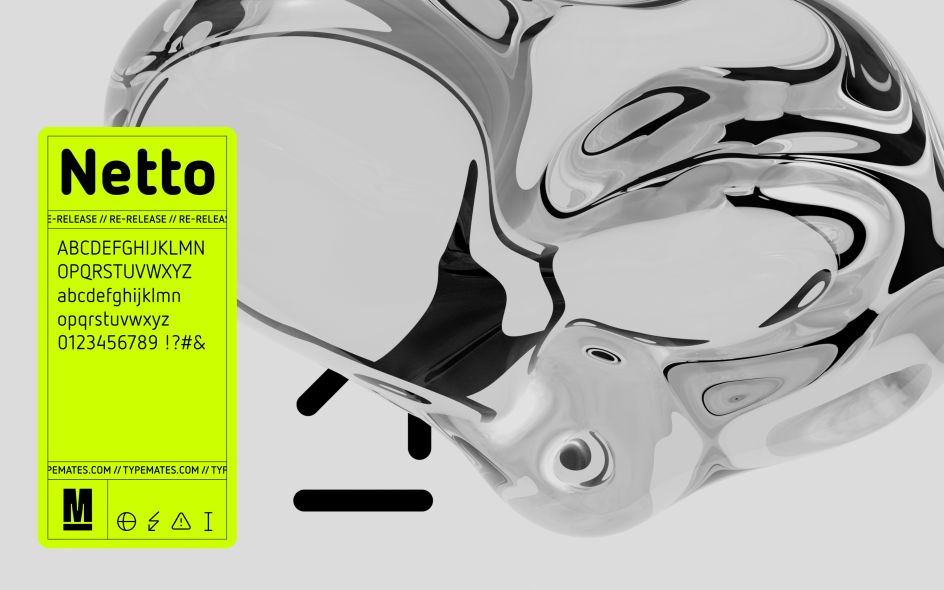
5. Netto by TypeMates
Netto is characterised by simple shapes and clever icons. Precisely drawn, this font is all about geometric, essential forms. Whether they're spurless glyphs or informative icons, every character has been distilled to its essentials. The result is a clear system of letters and symbols that takes information beyond standard text communication, making it a great choice for wayfinding and signage.
Netto by TypeMates
Netto by TypeMates
Designed by Daniel Utz, Netto's simple look is carefully crafted: the rounded and monolinear strokes of the icons neatly match the thickness of its letters. Whether pictographic or alphabetical, all glyphs are flexible and adjustable along the weight axis. Even the icons are responsive, adjusting their strokes according to size and scale.
Netto's extensive set of symbols and pictograms have been designed to integrate with the look and systematic design of its letters. This consistency of form unites the legible with the graphic, allowing Netto to show and tell simultaneously. Netto comes in two variable fonts, and over 580 characters provide broad Latin language support, more than 420 icons, useful alternates, and flexible stroke thickness.
6. 36Dope by Power Type Foundry
And now for something completely different. Created by Teguh Arief as part of the '36 Days Of Type' event held this April-May, 36Dope is a display typeface with an experimental design. This font showcases unique and unconventional serifs, reflecting the creative and powerful spirit of the event. With its bold and experimental look, 36Dope is well-suited for attention-grabbing headlines, titles, or graphic design projects that aim to convey a sense of strength and artistic innovation.
36Dope by Power Type Foundry
7. Family by Klim
Released this January, Family is an everyday typeface based on Clearface, designed by Morris Fuller Benton in collaboration with his father, Linn Boyd Benton and released in 1907. Designer Kris Sowersby originally encountered it when he picked up interior design magazine Apartamento in 2010.
Family is a redesigned version of this classic typeface, keeping its easy-going curves and idiosyncrasies while updating it for modern use. Or, in Kris's words: "an everyday serif without all the stuffy baggage of the 17th century."
8. JAF Cupidus Light by Just Another Foundry
Designed by Tim Ahrens and Shoko Mugikura and published last year, JAF Cupidus is distinguished by its very high x-height. In their earlier rounded sans JAF Domus, they made the counter spaces as even as possible to give that typeface calm and generous spacing. In Cupidus, they extended this concept of equalising the space to vertical directions, which reduces the hierarchy between upper and lowercase letters. The family is available in 10 weights and italics.
JAF Cupidus Light
Although Tim and Shoko originally aimed for a display face, they soon realised that Cupidus could work very well in text sizes despite its extreme design. This led them to create Cupidus Text, adjusted for continuous reading via looser letter and word spacing and a reduced x-height. This makes for a surprisingly inconspicuous text face that can be set at tight line spacing.
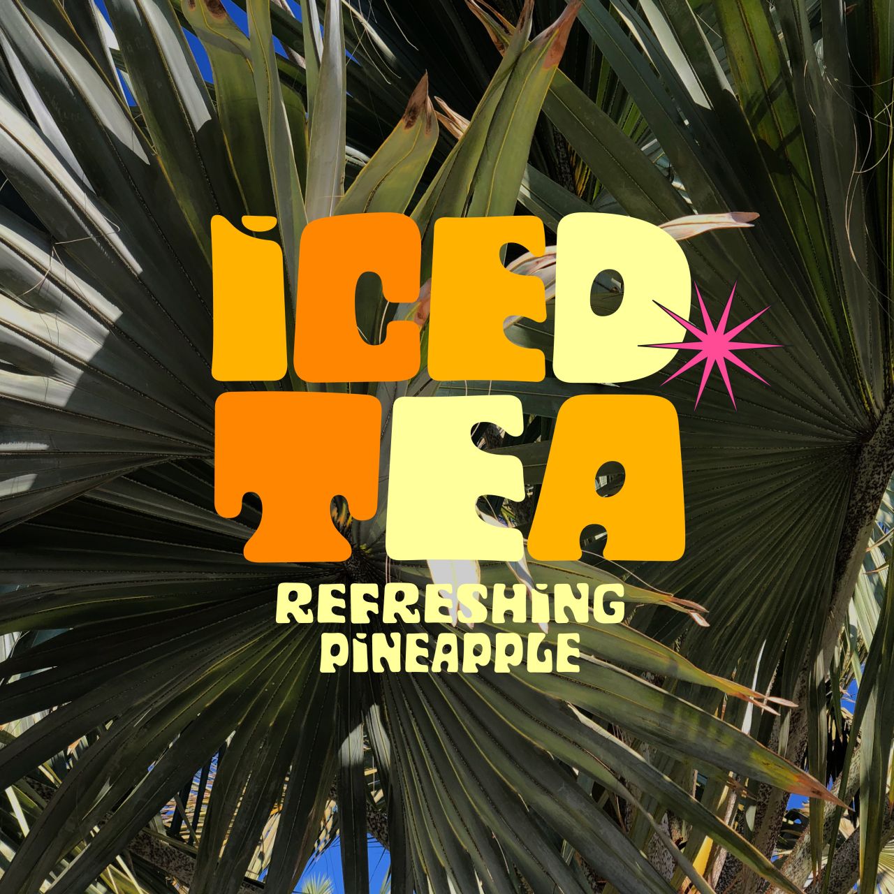
9. Cyclops by HVD
Designed by Hannes von Döhren with support from Bernd Volmer, Cyclops is a display typeface with variable width and variable optical size. Its smooth curves create a warm vibe, and its overall compactness and fixed height make it perfect for tight type settings with a homogenous line height. Even the accents are implemented into the letter height to keep the overall line height consistent.
The Cyclops typeface was designed with the variable font format in mind, giving designers various visual opportunities. This characterful typeface is available in 10 weights and is a good choice for packaging, games and campaigns.
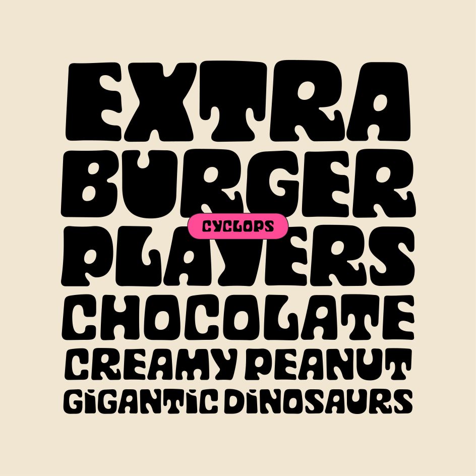
Cyclops by HVD
10. August by F37 Foundry
Designed by Paul Renner in 1927, Futura is one of the all-time great typefaces. Now F37 Foundry has released F37 August, its homage to Futura.
Like its forebear, F37 August uses strikingly symmetrical circular geometric lines in the letterforms' curves and varied character widths. It also stays true to the tall ascenders and descenders that evoke the classical vertical proportions that were popular before the x-height growth spurt of the late 20th century.
At the same time, F37 August does contain its own personality. Distinctive features include an overbite on the 'g', blunt diagonals and updated numbers. F37 Foundry has also developed two alternate character sets. The first is based on experimental drawings by Renner and features extreme geometry with squared-off letters and sharp vertices. The second is their reimagining of the fourth to eighth-century Uncial alphabet through the lens of Renner's Futura.
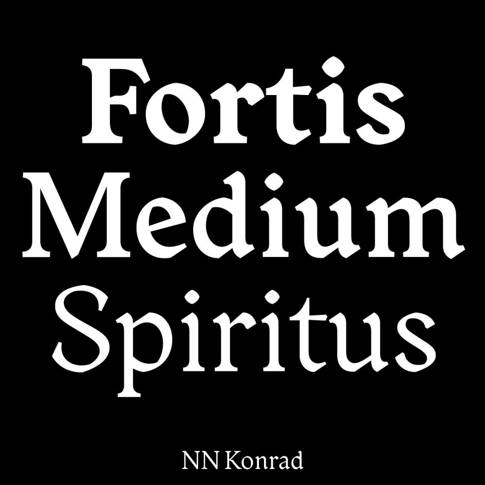
11. NN Konrad by Nouvelle Noire
Here's another modern take on a classic font to tantalise typophiles. Designed by Swiss graphic designer Martina Meier, Konrad is a contemporary take on the first printed Roman typeface, which was printed in 1465 by the Germans Konrad Sweynheym and Arnold Pannartz in the monastery of Subiaco, Italy.
In 2015, Martina discovered type specimens of early Roman fonts in the Zurich University of the Arts library. Hooked by the visual power of this genre, she started to design a contemporary interpretation of this proto-roman typeface.
NN Konrad by Nouvelle Noire
The Konrad family has three weights, Regular, Medium, and Bold. Archetypical elements from gothic scripts have been embedded into this modern and clean contemporary Roman. The typeface covers a broad character set extended with unique and obscure signs. Nouvelle Noire and Martina Meier have also designed a microsite to showcase the typeface, retracing the journey of the two name-giving protagonists Konrad Sweynheym and Arnold Pannartz.
12. Muoto Mono by 205TF
Muoto is an extended type family that began as a collaboration between Matthieu Cortat and the agency Base Design, aka Anthony Franklin and Sander Vermeulen. Published in 2021, it has now been completed with Muoto Mono: the synthesis of a sensitive and human approach to modernist design. This sans-serif combines full curves and solid stems, showing that functionalism can actually be warm and softly effective.
With its robust structure and subdued proportions, it evokes organic forms inspired by Finnish architect Alvar Aalto, who in 1957 wrote: "We should work for simple, good, undecorated things, but things which are in harmony with the human being and organically suited to the little man in the street." Muoto Mono embodies this concept while responding to contemporary typographic standards with its range of weights (Thin to Black) and four set widths (Ultra Condensed to Extended).

Muoto Mono by Matthieu Cortat
Editor's Picks


Trending


](https://www.creativeboom.com/upload/articles/86/862919952c0ad18439004228895a431dc6e45ffc_732.jpg)
Podcasts


Editor's Picks
Further Reading