Osch crafts warm and positive logo and branding for abuse charity Tender
The design agency has hit all the right notes with its new branding for the UK domestic abuse and sexual violence charity.
Let's be honest: most of the time, graphic design serves the fun and the frivolous. And there's nothing wrong with that.
But it's a measure of a truly skilled designer when you can take on a serious subject like domestic abuse and sexual violence and hit all the right notes. And that's exactly what Osch, a design agency established by Oscar Park and Chloë Roach, have managed with their new branding and website for Tender.
Tender is one of the few UK organisations focused predominantly on the prevention of domestic abuse and sexual violence. Launched in 2003, the charity was founded by Tamsin Larby, producer of The Vagina Monologues, whose experience in theatre revealed how performance could be used to engage people in the prevention of abuse.

Tender uses drama, art and media to provide a safe, enjoyable space where people can engage with sensitive topics, 'rehearse' for real-life scenarios and explore their rights, responsibilities and expectations within relationships.
Their innovative, arts-based programmes reach over 30,000 young people aged eight to 25 years annually, preventing them from becoming victims or perpetrators and supporting them to build healthy, respectful relationships.
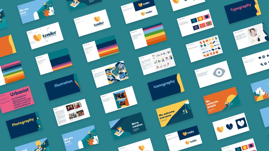
Logo and branding
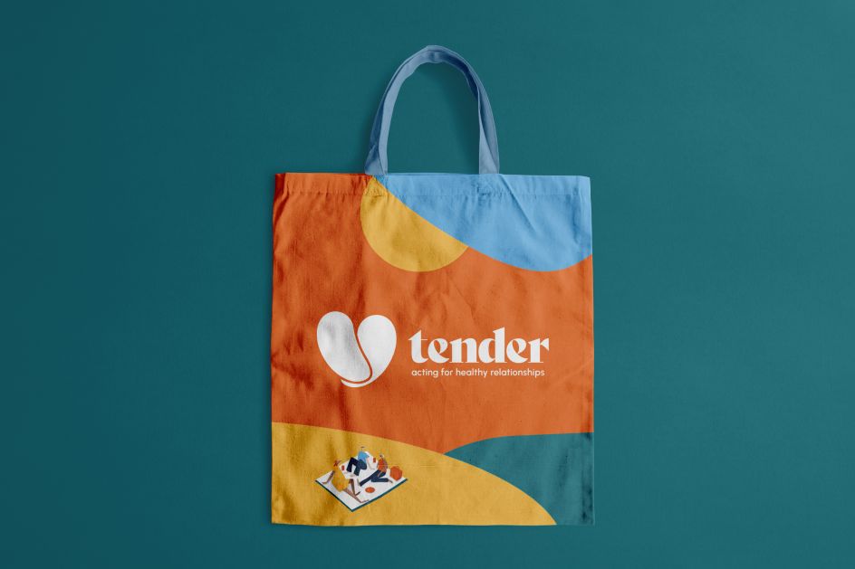
The new Tender logo is one of the most visible transformations in Osch's rebrand. While the heart motif (symbolic of love and compassion) has remained central, it has evolved to reflect connection and warmth.
The new logo alludes to hands coming together – a handshake or an embrace. It's a powerful representation of the unity, support and collaboration at the core of Tender's work. And it reflects the organisation's commitment to kindness and empathy – values that are not just preached but practised daily.

Marking the charity's 20th anniversary, the new brand reflects Tender's creativity and celebrates its commitment to kindness. "We quickly saw that the old brand was trying to both capture the seriousness of the issues they were tackling and celebrate the power of their work," says design director Oscar Park. "So the brand felt fragmented and confusing when it needed to express the warmth, confidence and positivity of their work, along with their creativity."
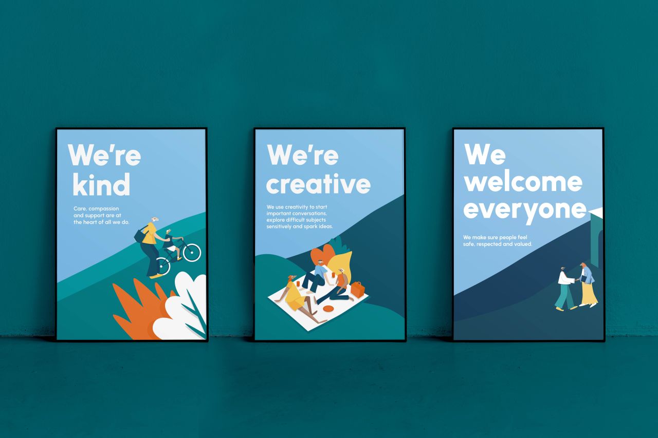
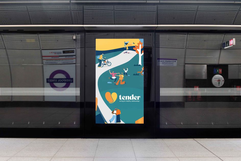
Osch also commissioned Ellie Ross-Wilkinson to produce a suite of illustrations that capture Tender's friendliness, inclusivity and approachability through a series of expressive, colourful characters in different settings.
Overall, Osch's branding evokes the right atmosphere for the topic by being calm, warm and welcoming. The dangers when designing around such a sensitive topic would be to either come across as too serious or depressing (which would be highly offputting) or to go too far the other way and feel flippant or glib. These designs feel like they effortlessly hit the right middle ground, although we'd assume that, in reality, Osch has put in quite a bit of effort to get there.
Voice and tone
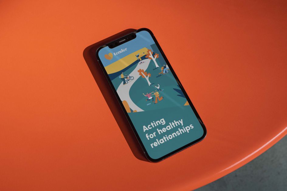
Tender's rebrand also features a more optimistic voice and tone – using the language of hope, empowerment and change. And the new strapline ('Acting for healthy relationships') aligns more closely with this optimistic outlook, making their message more accessible to children in primary schools.
"Centred on our commitment to compassion, empathy and respect, our new brand embodies Tender's journey to the present day – and our ambitions for the future," says Susie McDonald, CEO of Tender.
"From our new logo to our vibrant new website, this brand will help us reach even more people with our innovative, creative programmes, embedding healthy attitudes and preventing abuse throughout the UK. We're so thankful to Osch for their dynamic, inspiring work and couldn't be happier with the results."
Editor's Picks


Trending


](https://www.creativeboom.com/upload/articles/86/862919952c0ad18439004228895a431dc6e45ffc_732.jpg)

Podcasts


Editor's Picks
Further Reading