“Animal Farm” & the Evolution of the Dust Jacket
What is the Purpose of a Book Cover?
The thinking on this has changed dramatically during the evolution of modern trade publishing since the 1900s. Once book jackets were intended simply to protect the valuable binding. Actually, before 1820, books were sold as unbound gathered pages. The book buyer was responsible for getting the text blocks bound, presumably to match the rest of their library therefore no jacket or cover was supplied.
Early Days
The earliest version of the dust jacket, first seen in the late 18th century, was a slipcase. A slipcase is a small box, constructed of board. According to G. Thomas Tanselle, an authority on dust jackets, it was likely these slipcases “gave prominence to the idea of a detachable publisher’s covering.”
Throughout the 1820s, publishers began covering annuals in a sort of wrapping paper, printed with minimal text, enough to identify the volume—these were referred to as “dust jackets”.
In 2009, the Bodleian Library, Oxford discovered the earliest known example of one of a dust jacket. It was a paper wrapper for a gift book, bound in silk, entitled Friendship’s Offering (1829). The dust jacket was most often destroyed upon opening, similar to the way a child rips the wrapping paper off their birthday gift. Very few paper wrapper dust jackets remain.
The modern dust jacket was first introduced in the 1830s. Featuring flaps, these dust jackets could remain on the book when it was opened, providing protection for volumes even as they were read.
By the 1870s, dust jackets were common, but their marketing value remained unexplored as they were left blank. A letter from Lewis Carroll to his publisher in 1876 provides insight into how dust jackets were viewed at the time. He requested that the publisher print the title of his latest book, The Hunting of the Snark, on the spine of the “paper wrapper”.
Carroll’s letter is evidence of the next stage of dust jacket evolution. From plain paper, publishers began printing titles on the spine of the jacket--allowing customers to view a book from the shelf and know its contents without opening it or removing the paper. While some dust jackets of the 1870s and 1880s did feature printing on the front, back, and flaps, these practices were not common throughout the industry and were instead specific to each publisher.
20th Century
Through the early 20th century, dust jackets were employed to preserve the ornate bindings underneath. Many owners discarded the jackets, preferring to display the bindings of their books instead.
A fundamental change in attitude occurred in the 1920s. For the first time, publishers began emphasizing the dust jacket instead of the bindings. After World War I, publishers began to employ commercial artists to design attractive dust jackets.
In addition to being thoughtfully designed dust jackets featured more information than ever before. Instead of including only a printed title, or perhaps a design similar to the binding, publishers began printing book synopses as well as author biographies. And so the modern view of the dust jacket as a marketing tool emerged.
As the 20th century progressed, dust jackets became increasingly ornate and the bindings beneath correspondingly plain. The golden age of bookbinding came to an end, and the once-disposable dust jacket became an essential component of the book industry.
Let Us Now Consider the Example of “Animal Farm”
“Animal Farm” is a perennial summer reading list favorite, therefore most of us have read it. “Animal Farm” was first published by Secker and Warburg in England on 17 August, 1945 days after the official end of World War II. Although it was released after the conclusion of the war, it is a product of the war and the mind of its author George Orwell who described his story as a fable that reflects events leading up to the Russian Revolution of 1917 and then on into the Stalinist era of the Soviet Union.
The story takes place on the farm of Farmer Jones. The action surrounds the farm animals rebelling against their overlord, and taking control of his farm. From a book cover design perspective, this story is full of visual opportunity! It is no wonder that this book has experienced an embarrassment of riches in the area of inspired cover solutions.
Because of its timeline, “Animal Farm” is representative of the evolution of marketing in modern publishing and the use of a dust jacket as a marketing tool.
The following are but a few of the design solutions that have graced the cover of the book over the past seventy plus years. They represent the changing relationship of the book jacket to the book, and the changing approach to book design and by extension book marketing over time. Viewed from this perspective the “Animal Farm” cover design illustrates these changing approaches and, by the looks of it, will continue to do so into the future!
1945 Secker and Warburg Edition (UK)
1. Let us start at the beginning, a very good place to start:
1945 Secker and Warburg first published “Animal Farm” in London. With a print run of 4,000 copies, the first edition is bound in green cloth. The original green and grey dust jacket is famously fragile as it was cheaply produced to meet Wartime Economy Standards and is austere by necessity. This all type execution is straight forward and exemplifies a very “name, rank and serial number” approach to cover design. It provides the reader with no hints about the theme of the book. This is in keeping with the book cover design approach of the period.
1945 Harcourt Brace (First US Edition)
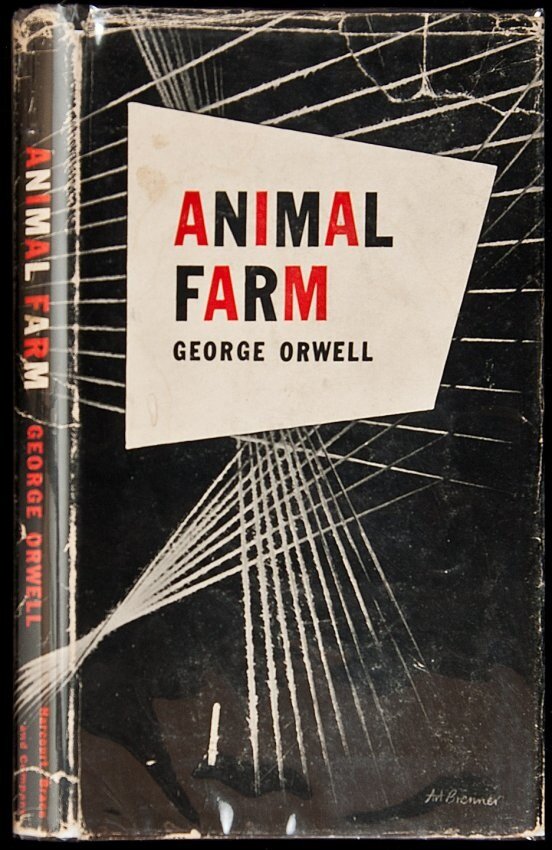
2. One year later and on the other side of the pond:
One year later in the US, Harcourt Brace published “Animal Farm”. Although this solution is somewhat more visually complex, the cover still provides no visual clues of the story to the potential reader. Like the UK cover, it is two color, with white of the paper providing the third color for the composition.
1954 Penguin Books
Illustrated by Joy Batchelor & John Halas
3. Boy, what 10 years can do!
The 1954 edition of “Animal Farm” with illustrations by Joy Batchelor & John Halas is quite a departure from the previous two versions. We see a figurative depiction of the animal characters in a pivotal scene in the story. The use of bold color enforces the fiery image. The typography is active, perhaps even unruly. The cover designer has decided to provide the potential reader with some information about the storyline. An illustrative cover design approach had become more popular in the years intervening between the first two editions and this one.
1955 Penguin Books
4. Returning to their roots:
In 1955 Penguin UK came out with this edition. Penguin’s approach to book design is influenced by the art director, Jan Tschichold’s heavily branded cover solutions. By using Tschichold’s cover template, the publisher avoids representing the content of the book on the cover. The cover design signals to the Penguin reader that this is a fiction title (denoted by the orange colored bands). The educated reader is meant to know what the book is about. This is a very different approach from what we will see going forward.
1986 Signet Classics
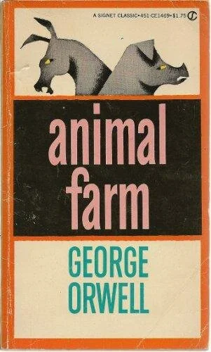
5. Jumping ahead
In 1986 when Signet published this paperback edition, we can see that approach to book cover design has changed dramatically. The cover is now an aperitif, whetting the reader’s appetite for the story to come. The cover designer does this by including visual representations of the key players in the story. The typography playfully uses only lower case letters printed in pink, a reference to the pigs. Although the illustration is cartoony and the overall feel of the cover is childish, the sinister looks on the faces of the animals provide a sinister mood to the cover.
6. Illustration takes center stage:
In the mid-1990s this cover appears. The type is simple. The color scheme is monotone. The image of the pig which is made up of silhouettes of all the barnyard animals in the story is the point of focus. The austerity of the color scheme and typography allow the intricate illustration to be the focus of the design.
7. Cut to the chase.
Penguin published this cover in 2004. Very different from the earlier edition. The feeling is menacing. Rather than being an aperitif, to stimulate the reader’s appetite for the book, this cover is a foregone conclusion, revealing the plot at the very onset. Obviously “Animal Farm” is a well-known story by 2004, the publisher appears to feel that selling it with the conclusion on the cover is a viable strategy.
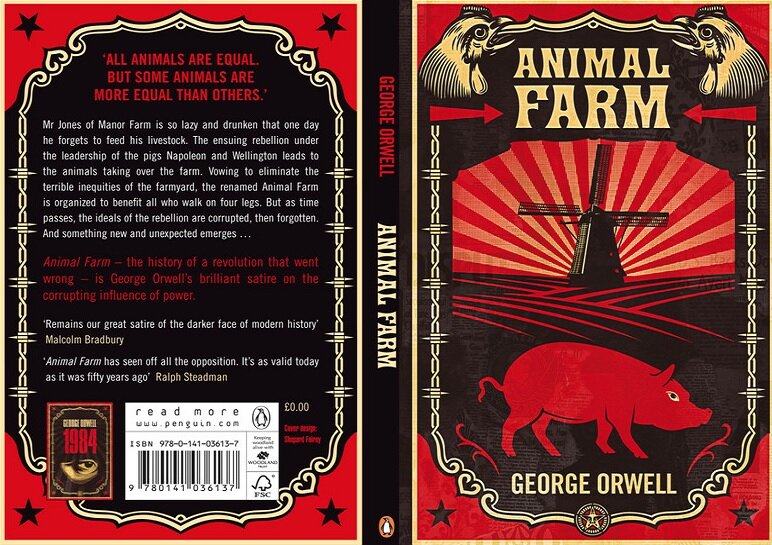
8. HOPE?
Penguin again in 2008 with a cover by Shepard Fairey, the man who designed the emblematic “Obama HOPE” poster. Here Mr. Fairey creates a composite image that evokes soviet era heroic propaganda posters. This cover doesn’t exactly present the story’s conclusion, but it does influence the way the reader interprets the book.
9. PIG!
Penguin again in 2014. The pig is covered in seminal text from the story. This cover is more subtle than what we have seen previously. The typography and layout are evocative of older designs while still looking contemporary.
Conclusion
This is just a small example of the many “Animal Farm” covers that are out there. You should check it out yourself, just google “Animal Farm” book cover in an image search.
Looking at them like this you can see many of them rely strongly on color, the use of strong black, red, and pink. Pig images and animal images are also everywhere. Many of these covers look sinister to me. Looking at these discrete covers as a whole is a great way to see how different designers have interpreted the same content to very different effects, no doubt in collaboration with publishers and marketing departments whose views on the approach to marketing the title have changed.
Do you remember the cover of your first copy of “Animal Farm”? Did it impact the way you understood the story? Please add your thoughts in the comments section!
Source credits:
Unfortunately, it is proven beyond difficult to discover the names of the designers and illustrators of many of the fabulous covers shown here. Whenever possible those names have been noted. Please feel free to be in touch with any illuminating information, I'd love to update this publication with as much detail as possible.
*I would like to acknowledge Andrea Koczela, for her wonderful scholarship in “A Brief History of the Dust Jacket” which contributed to my thinking in this piece. https://blog.bookstellyouwhy.com/a-brief-history-of-the-dust-jacket
First image is from https://www.biblio.com/animal-farm-by-orwell-george/work/3687


