Learn everything that you want to know about the seafoam green color. Find some great seafoam green color palettes, and discover the colors that go with seafoam green the best. Get inspired!


What Color Is Seafoam Green?
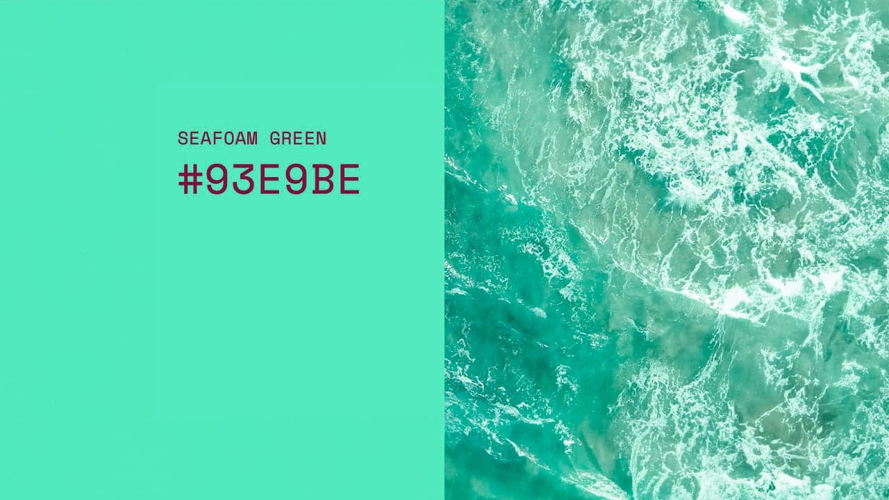
Are you wondering what the color seafoam is? Is seafoam blue or green? Well… it’s a mixture of both, with a small tint of grey too. The overall mood of the color is affected by the green notes which are dominant, making it look refreshingly bright green but soft at the same time.
With a hex code of #93E9BE, this soft color associated with the ocean is often confused with mint green. While many people see these two colors as the same, mint green has its own hex code #98FF98 and is therefore considered a different color.

History and Meaning of the Seafoam Green Color
Now that we know what the color seafoam is, we’ll briefly talk about its history. Seafoam green, like other shades of pale green, has been used since the 1700s, but it gained more popularity in the 1950s, when it was mostly used for clothing. The color soon spread to cars and furniture, being intensively used at this time.
The name of the seafoam color comes from the foam that the sea creates, which isn’t actually seafoam green but white. This means that the color was named after the lighter color notes of the sea and the sparkles of the sea, instead of the foam it creates.
When you usually look at the color green, you may think of money, nature, and the environment. Green is also used in many places considered “healthy”, as green is so tightly bound up with the concept of the environment and growth. And, while many think of the ocean as blue instead of green, when mixed together correctly, the color seafoam green has a lot of feelings attached to it as well: calm, relaxation, peace, vitality, and freshness. Because of its softness and brightness, it can be used to cheer up, to feel a little more fresh and connected to the sea. It’s the color of serenity and revitalization!
Seafoam Green Hex, RGB, and CMYK Color Codes
- Sea foam green has the hex code #93E9BE.
- The RGB values are 147, 233, 190, which means it is composed of 28% red, 39% green, and 33% blue, and we can see now where seafoam’s green-blue appearance comes from.
- The CMYK color codes, used in printers, are C:39 M:0 Y:35 K:0.
- In the HSV/HSB scale, #93E9BE has a hue of 150°, 37% saturation, and a brightness value of 91%.
Now that you know what values make up the seafoam green color code, you can be sure that you’ll get the right swatch every time.
Shades and Tints of Seafoam Green
If you are looking for the specific color values of seafoam green, you will find them here. These values can help you match the specific shade you’re looking for in your designs and even help you find complementary colors.
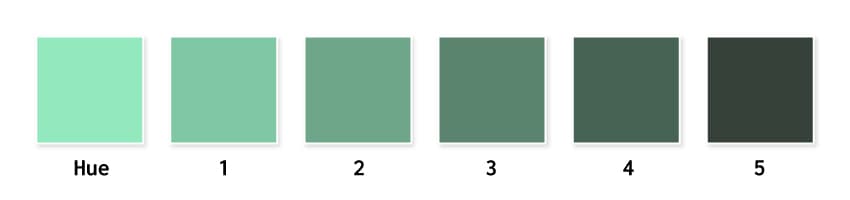
By adding black to a hue, we will obtain darker shades. In the left image, you can see a palette of darker shades of sea foam green color.
- Hue (original color):
#93e9be - Shade 1:
#80c7a4 - Shade 2:
#6ea689 - Shade 3:
#5b846f - Shade 4:
#466354 - Shade 5:
#36413a
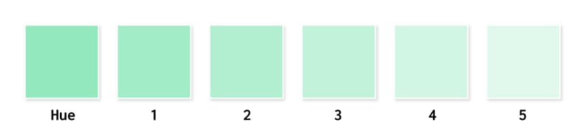
By adding white to a hue, we get tints and make the color less intense. This is how pastel colors are born. Below you will find a selection of pastel green colors that you can use.
- Hue (original color): #93e9be
- Shade 1:
#a2ecc7 - Shade 2:
#b2efd1 - Shade 3:
#c1f2da - Shade 4:
#d1f6e3 - Shade 5:
#e0f9ec
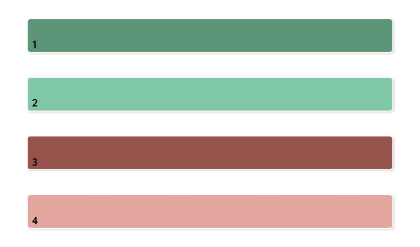
Are you wondering what color complements seafoam green the best? If you include seafoam green dark shades in your artwork, go for brown, beige, and nude shades to complement them beautifully. Complementary colors are:
- Shade 1:
#5a9677 - Shade 2:
#80c7a4 - Shade 3:
#96534b - Shade 4:
#e3a69f
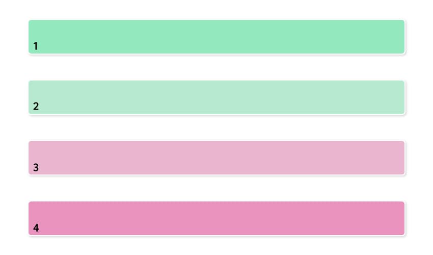
If you decide to go for lighter colors and pastels, pink shades will complement them to perfection. Complementary colors of seafoam green tints are:
- Shade 1:
#93e9be - Shade 2:
#b6e9cf - Shade 3:
#e9b6cf - Shade 4:
#e993be
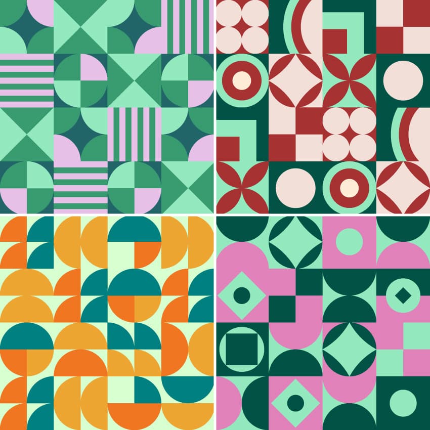
Seafoam Green Color Palette Inspiration
Are you looking for seafoam color palette inspiration? We’re influenced by the things we see, and color combinations have a major impact on how we perceive and react to things. The right color combinations can draw attention, generate emotion, and leave a lasting impression. Find the best colors that go with seafoam green in the following images.
The following seafoam color palettes provide an unlimited range of color inspiration for any project. They’ll help you get a better idea of the colors that go with seafoam green that you like and don’t like for your project, and which variations of hues resonate with you.
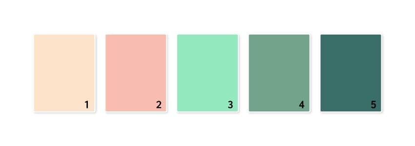
1. Seafoam Color and Peach
Combine seafoam green dark shades and peach along with the original hue, and you have a hit. The warmth of the peach is balanced by the cool seafoam tone, creating a well-balanced color scheme. It’s a beautiful color combination for a fresh, dynamic look and a youthful glow.
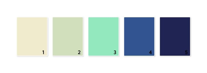
2. Seafoam Color and Navy
This is a powerful and bold color palette put together with the help of deep navy shades. This combination of colors is made for projects that want to establish trust and be associated with revitalization.
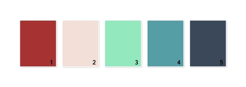
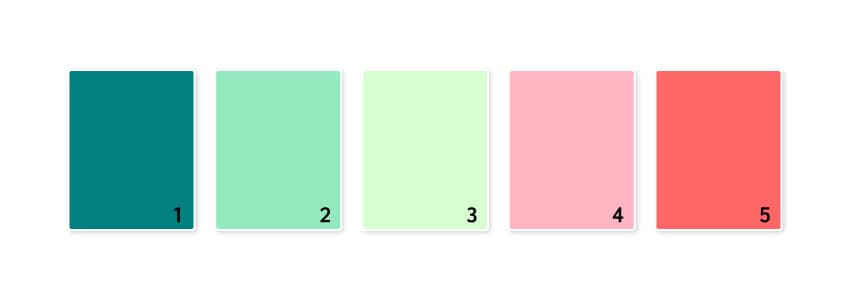
3. Retro Feelings
This color palette inspiration is vintage-inspired but with a twist of bright seafoam color to draw attention. It combines darker shades for that cozy retro vibe and the power of red. It’s perfect for rustic designs and vintage posters.
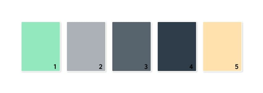
4. Modern Grays
Sometimes, using a gray color palette is the best way to make an impact in a cluttered world. By using subtle shades, you can rely on colors like pastel green and pastel orange to accent important elements in your designs. This would work very well for a variety of business materials, brochures, or even home decor.
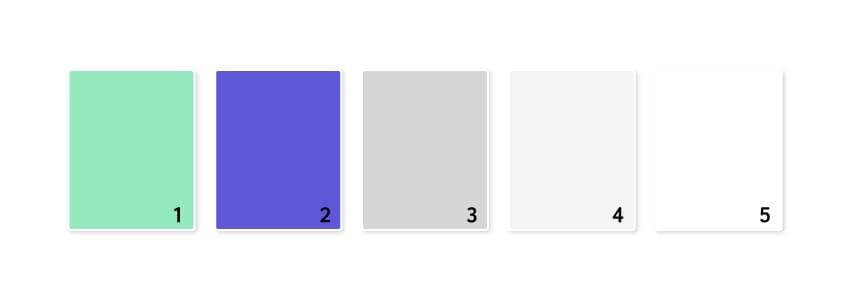
5. Saturation
Supercharge your designs with this powerful color palette. The electric purple is very bold but is well balanced by the sea foam color, while the grays act as neutral colors. This color scheme is bold and daring, made for projects that want to be unstoppable.
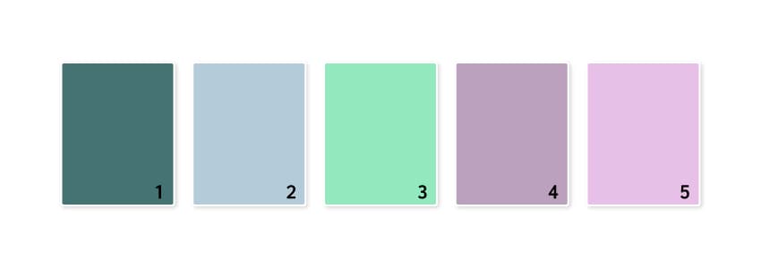
6. Lavender Dreams
We can’t get enough of this purple and lilac color combination, which is as energizing as it is calming. This is a gorgeous ensemble of soft, approachable colors. The palette feels clean and is perfect for the beauty and fashion industries, as well as designs looking for a captivating splash of color.
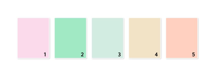
7. Summer Fresh
This looks like the perfect summer color inspiration palette—it makes you think of delicious sorbet, fruit, and all things good. The pink and coral shades will create a real pop of color, while the sea foam shades will act as neutrals.
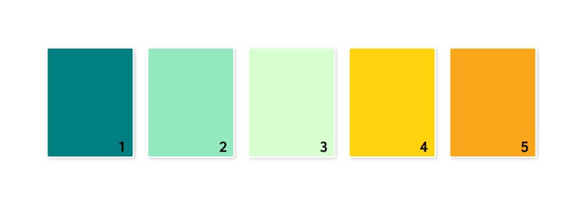
8. Citrus Power
Pair seafoam green with citrusy shades to get a fresh injection in your designs. Make them vibrant, eye-catching, and definitely never forgotten. Orange represents optimism, youth, and creativity, making this color palette great for product photography, lifestyle shoots, and everything summer-related.
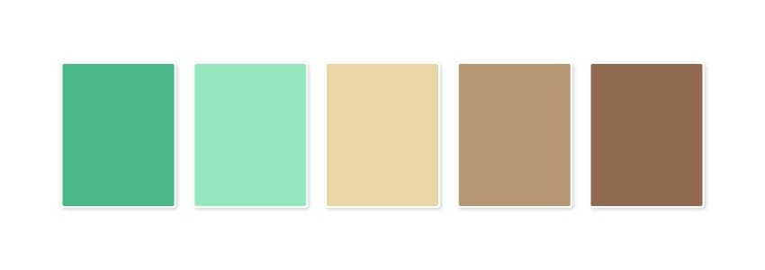
9. Sea Foam Color and Browns
Inspired by bright and earthy colors, this color palette is fresh but understated, creating a charming and cozy feel. The warmer tones brighten and illuminate your design, while the bright and fresh greens act as a complement by cooling the palette. This color combination is ideal for interior decor, wall color inspiration, and even vintage branding or fashion. You can also go towards caramel shades for a sweeter and warmer feeling.
10. Pastels
We all need some pastels in our lives, right? Here, sea foam green along with pastel green and any other pastel colors work in perfect harmony. The soft, pretty colors create a soothing feeling, and they would pair together almost anywhere, but we see them doing well on social media, in gentle illustrations, and for beautiful romantic wedding designs.
How to Use Seafoam Green Color
As a trendy color of the season, seafoam green retains a soft characteristic while being eye-catching. You can definitely design stunning graphics using this color, from print design to branding, social media posts, logos, product design, and patterns. Here are some designs that will give you an idea of how to use seafoam green in your future projects.
Brochure Design
For brochures, catalogs, and other prints, we usually have white or black text and use only a bold font to highlight important information or details. I highly suggest giving seafoam green a go, using it to highlight text or make certain areas stand out. It’s quite impressive how a color can be bright and soft at the same time, right?

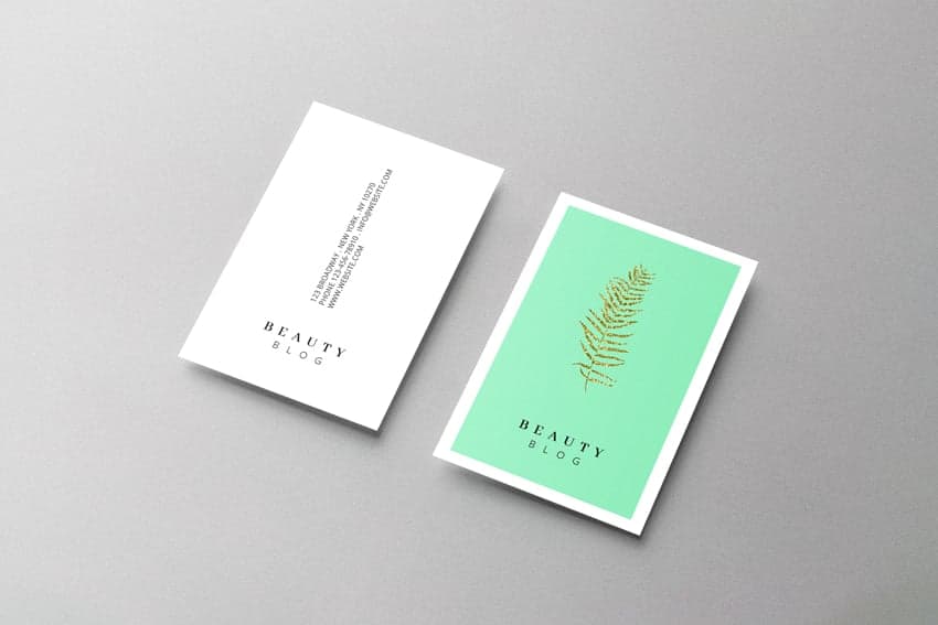
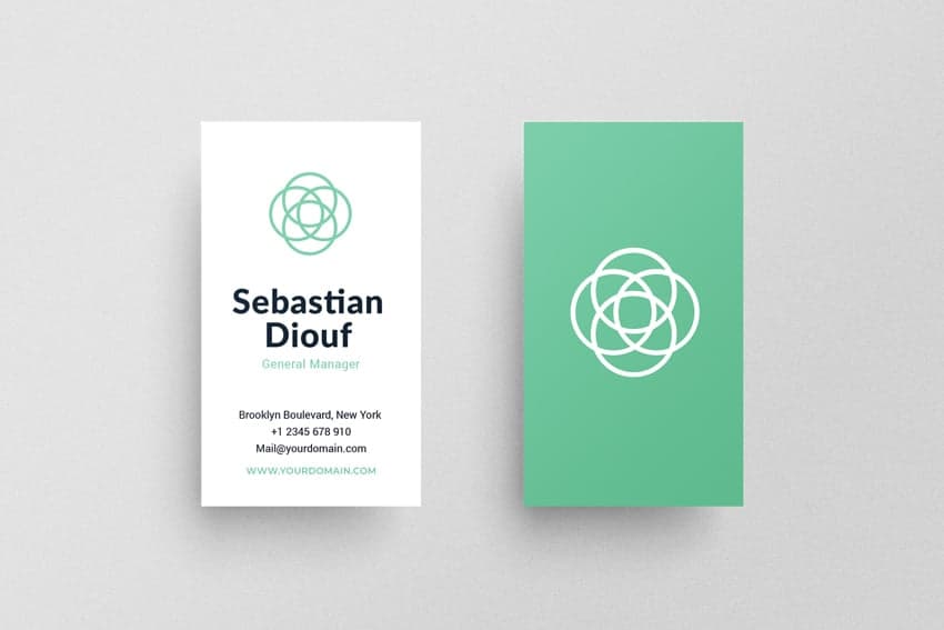
Business Card Design
Ditch the boring black and white business cards and use some sea foam color to make it pop. You can either use it as the text color, as your logo color, or for any other symbols that you might have on it. Be bolder and color the entire front or back background, and surely everyone will remember your business card after they see it.
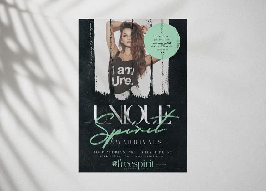
Flyer Design
In the image below, I have recolored the Live Stream Flyer using the seafoam and peach palette. The seafoam color is the main star here, but its cool tone is warmed up by the soft peach shade, creating a perfect visual balance. The resulting flyer looks fresh and youthful.
I can also imagine the colors in the pastel palette working successfully here too, instead of the peach. You will get a trendy pastel flyer every time.

Logo Design
Take a look at this beautiful Rose Bouquet logo colored using seafoam green tints and pinks, which are complementary colors. This color combination is just unbeatable. Go ahead and use it in your logo projects to make them vivid and memorable.
Another great pairing is sea foam green and yellow, as you can see in the Cockatoo Mascot logo shown below. Using two bright colors together makes your logo vibrant and eye-catching. The pop of yellow is definitely needed to break through the brightness of the sea foam shades, making it a very successful color combination.
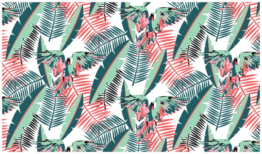
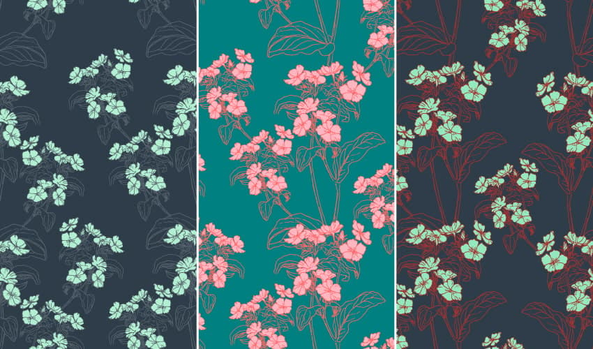
Pattern Design
For pattern design, I suggest using this gorgeous sea foam color to either color details like flowers, leaves, symbols, or smaller shapes that you find in the pattern design or use it to color the entire background.
In the examples below, you can see how perfectly the sea foam shades go with the pink and coral from the Summer Fresh color palette inspiration, which are complementary colors. If the seafoam shade is used for the background, then I suggest using the pink for the flowers (or any other elements) to make them stand out.
You can also see the Modern Grays palette and the Retro palette in action. The grays act as neutrals. The red is also quite visible, but it does not steal attention from the bold sea foam color.
When it comes to abstract patterns, you can go all out. You will never go wrong using seafoam shades and pinks, or go with citrusy colors if you want an explosion of freshness and brightness in your designs. Give all of them a go and experiment!
Explore More Color Combinations Today!
Aside from aesthetics, color schemes can be used to evoke emotions. Based on scientific research, colors and emotions are closely linked and can be used to enhance your messaging. Choosing the right color combination can seem intimidating, but keep this guide on hand to stay inspired and on top of trending colors.
Now that you know what colors go with seafoam green, don’t be afraid to use it in your designs. This color is powerful whether it’s used as an accent color or as the main star.