Implied consent is something some designers use with the best intentions possible when they don’t want to disturb the users’ flow in accomplishing a task. However, when you deliberately hide information, hoping your users will overlook it, it can be a problem. Let’s look at some striking examples of designs that use this design pattern.
The banner at the bottom of The Times website (from this historical example) represents an example of implied consent; by continuing to use the site, the users would provide their consent indirectly. The assumption was that users accepted the terms and conditions of use after viewing the message. Nevertheless, with all of the other information on the page competing for their attention with bright colors, the implied consent banner is easy to miss. When designers really don’t want you to overlook information, they tend to use pop-up alerts in the center of the screen, which immediately grab your attention. Furthermore, by plying users with many message alerts, the designer ensures the users must interact in some way, such as clicking 'OK', to show they agree or provide their consent.
In the case of this old website from The Times, the user could simply continue without clicking the button. When they followed any link on the page, the banner would disappear. Therefore, as the cookies message was far from the center of the screen, it reduced the likelihood users would reject the request for consent.
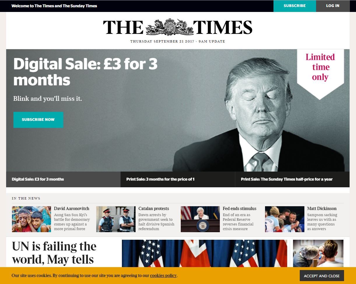
This historical specimen from The Times’ website above used a cookie banner placed at the bottom of the page, and colors that blend in with the rest of the interface. This was an implied consent design pattern, which tried to trick users into overlooking the option not to accept the cookies.
© The Times, Fair Use
Another example of implied consent is when users are making bookings or purchases online. In most instances, users are provided with a checkbox that they must select to show they have read and agree to the terms and conditions associated with using the site, making bookings, or purchasing goods or services. Nonetheless, on occasion, designers link a command button to the terms and conditions; so, when the user clicks the button, they’re automatically accepting the terms and conditions. We see another historical example of this dark pattern below, where users provided their consent the moment they clicked the ‘Submit Order’ button. Although designers who use this kind of pattern might argue they are merely trying to save the users’ time, the tiny print used to state 'By clicking “Submit order”, I agree to the Terms...' might well suggest otherwise.
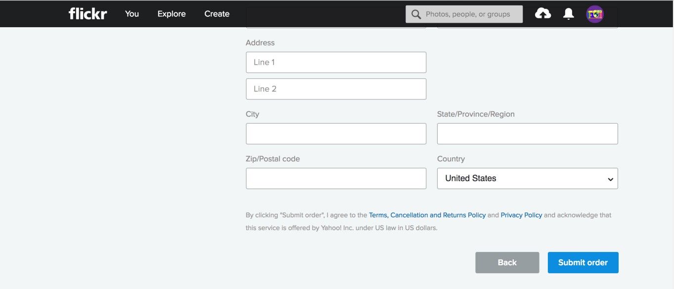
The designers of this historical Flickr page may have intended to improve the user flow while registering, but actually implemented a dark pattern in doing so. By clicking the ‘Submit order’ button, the user implicitly consented to the terms, cancellation and returns policy, and privacy policy. Some users may have missed this.
© Flickr, Fair Use
Why is this classed as a dark pattern?
In a completely transparent and user-friendly web design, users would be asked to provide informed consent. Even if they simply click 'OK' to a request without reading all of the information, they have been given the opportunity to state in no uncertain terms whether they are happy to proceed or not. Some users might find these messages a nuisance—if they have to respond in an active way before carrying out their tasks—but a simple design that allows them to move on to their tasks with the minimum amount of effort lets them decide whether they are happy for their information to be used.
As designers, we want to remove as many obstacles to our users when they’re making bookings or purchases as possible; therefore, by our linking the command button to the acceptance of the website's terms and conditions, users do not need to carry out any separate action to show they agree. But this is not necessarily in the users' best interests, particularly when the instructions, informing the user that clicking a certain button serves as agreement, are so small and hard to read. Hence, it takes a healthy grasp of ethics and a good eye for empathy to help our users in the best way here.
“Education is when you read the fine print. Experience is what you get if you don’t.”
— Pete Seeger, American folk singer and social activist
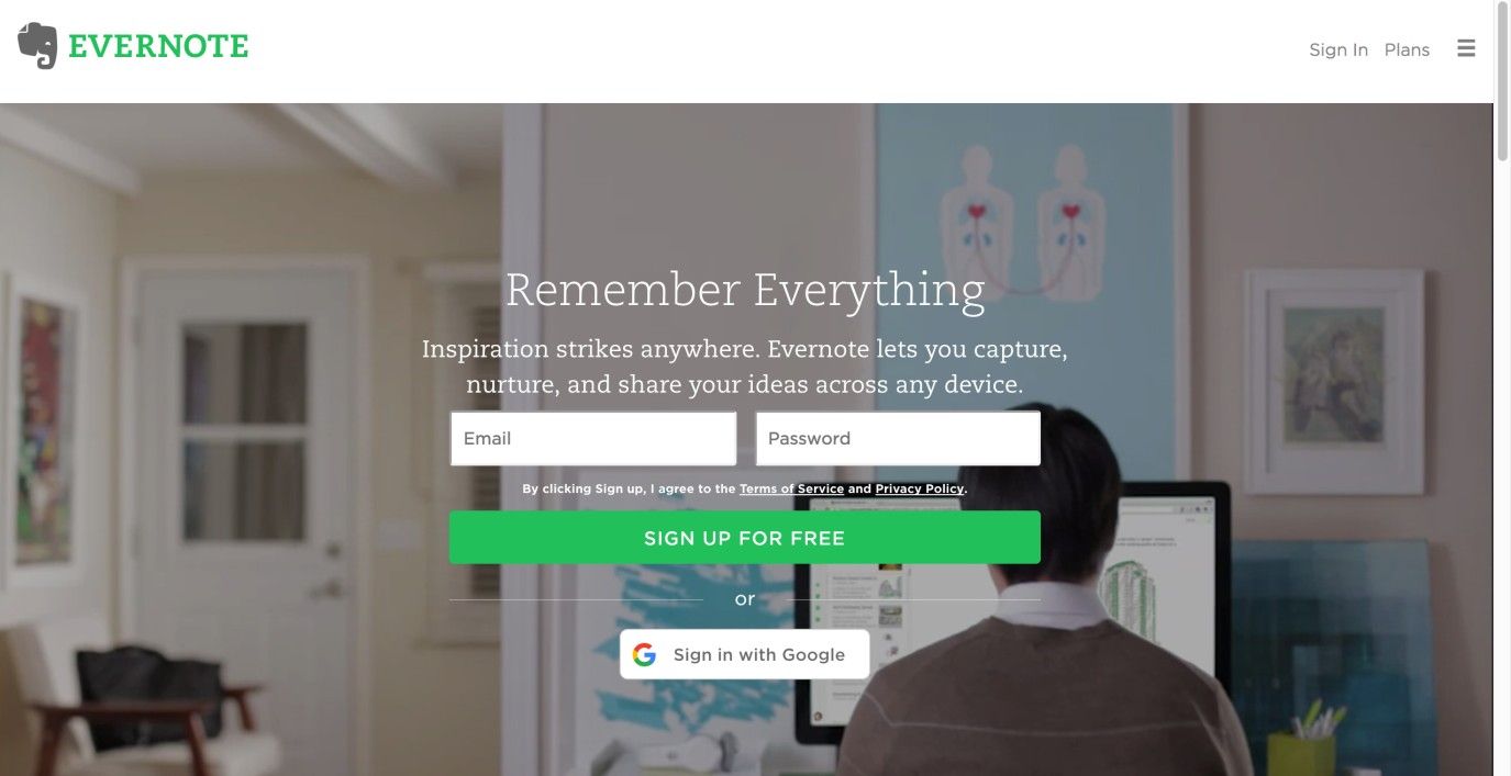
In this historical example, Evernote also used the implied consent pattern for registration, but at least placed the links to the terms and policy statements closer to the sign-up button. Arguably, it was less readable due to the lively background.
© Evernote, Fair Use
We might argue that all of the information needed to make informed decisions was provided to the user. However, with the use of small print and weak colors for important text, the effect was to trick users into following links, making purchases, and agreeing to terms and conditions without considering all of the information provided.
Users are 'informavores', constantly scanning the user interface in search of information directly related to their current aims and objectives, to get them to the end point as quickly as possible. By using small print and other wily techniques, some designers try to weaken the information scent for important details, such as the additional extras applied automatically on the next page. Subtle methods such as using different font colors and sizes might seem a relatively mild form of dark pattern; however, when they are used to sneak costly extras onto your purchases, you might be far less ready to dismiss them as ‘harmless’.
Research from Deloitte suggests just 9% of us read online terms and conditions when making purchases and signing up for services. Failing to read the small print can lead to costly errors of judgment, as Jen Palmer, who was threatened with a $3,500 fine after leaving a negative review of US online retailer KlearGear.com, found. While the majority of users choose not to read the terms and conditions, assuming (sometimes wrongly!) their interests are protected, small print can be used as a dark pattern in a number of different interface design situations.
Ultimately, how you make this judgment call is going to be influenced by the brief for your client organization’s design. In view of this, you can be creative with how you deploy your buttons and text. Sure, you’re hardly going to work for a client who is so nefarious as to try getting users to sign away their rights to their property or suffer a loss. Still, you may find it challenging to strike a balance between your obligation to your client and your ethical duty to your users.
The Take Away
Implied consent is a dark pattern some designers use to reduce the likelihood that users end up rejecting the request for consent when accessing a web page or site. It is often used for consent to terms and conditions of online purchases, or for consent to the use of cookies on a web page. Designers use visual design elements such as color, size, and position to make the request for consent as inconspicuous as possible, hoping that users will glance over it and continue to use the service. As users are constantly scanning the interface for information that is directly relevant to their current task, chances are that designers can be successful with this dark pattern. Just remember it is a dark pattern and, as such, your duty to your users should come first.
References and Where to Learn More
Hero Image: © Kat Sommers, CC BY-SA 2.0.
Jenifer Tidwell, Designing Interfaces: Patterns for Effective Interaction Design, 2010
Martijn van Welie, Pattern Library, 2008
Harry Brignull’s website dedicated to dark patterns
Some vital points about Dark Patterns
Some more points to consider about Dark Patterns and laws
Terms and conditions: not reading the small print can mean big problems