Book Design Process • Choosing the Cover
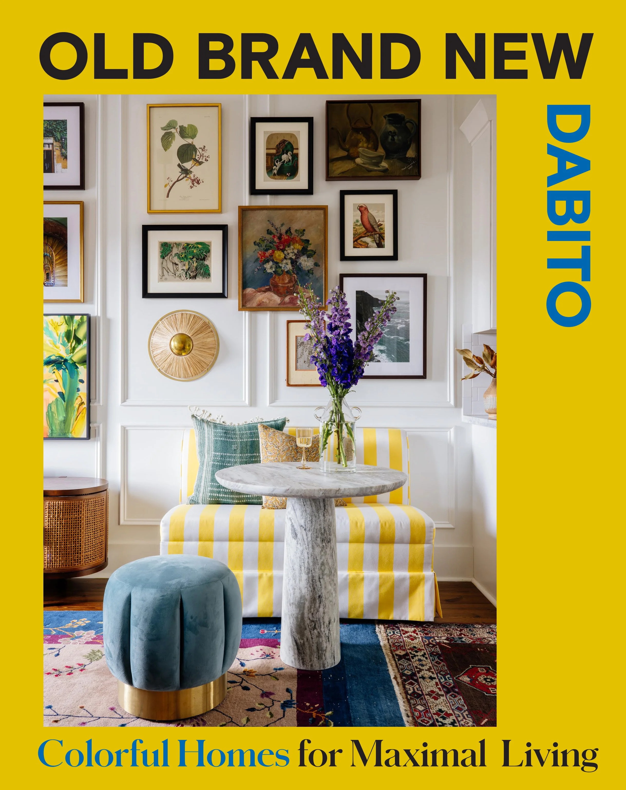

While I was digging through my folders for a file yesterday, I found these alternate book options. I thought it’d be fun to share them with you all to see the process. This was the first pass They were designed by Ten Speed’s talented graphic designer, Lizzie Allen. I loved that the whole team embraced my love of color and was intentional in making it a vibrant one. The top two were my favorites of the bunch. I love the yellow border and yellow striped banquette. Initially I wanted my book to be yellow since it’s so me. But I felt like the space itself wasn’t vibrant enough. And on the right is our New Orleans living room. It has a left border which is from one of my artworks. I kinda liked this mix of print and photo but wasn’t sold on it either.
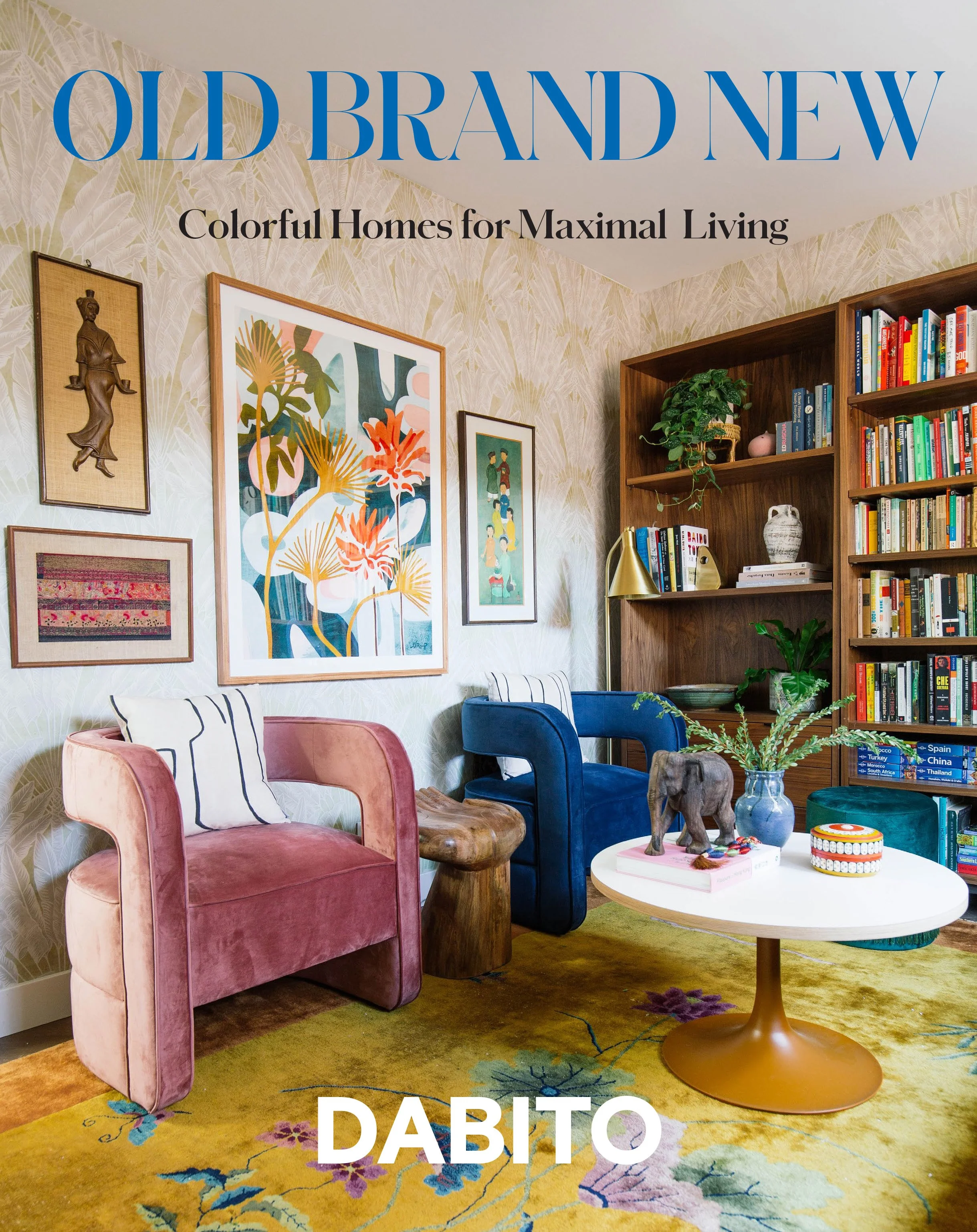
Here on the left, I thought the photo was a little too busy for a cover. This space felt a bit dated to me. Don’t get me wrong I love the space but there’s something off.


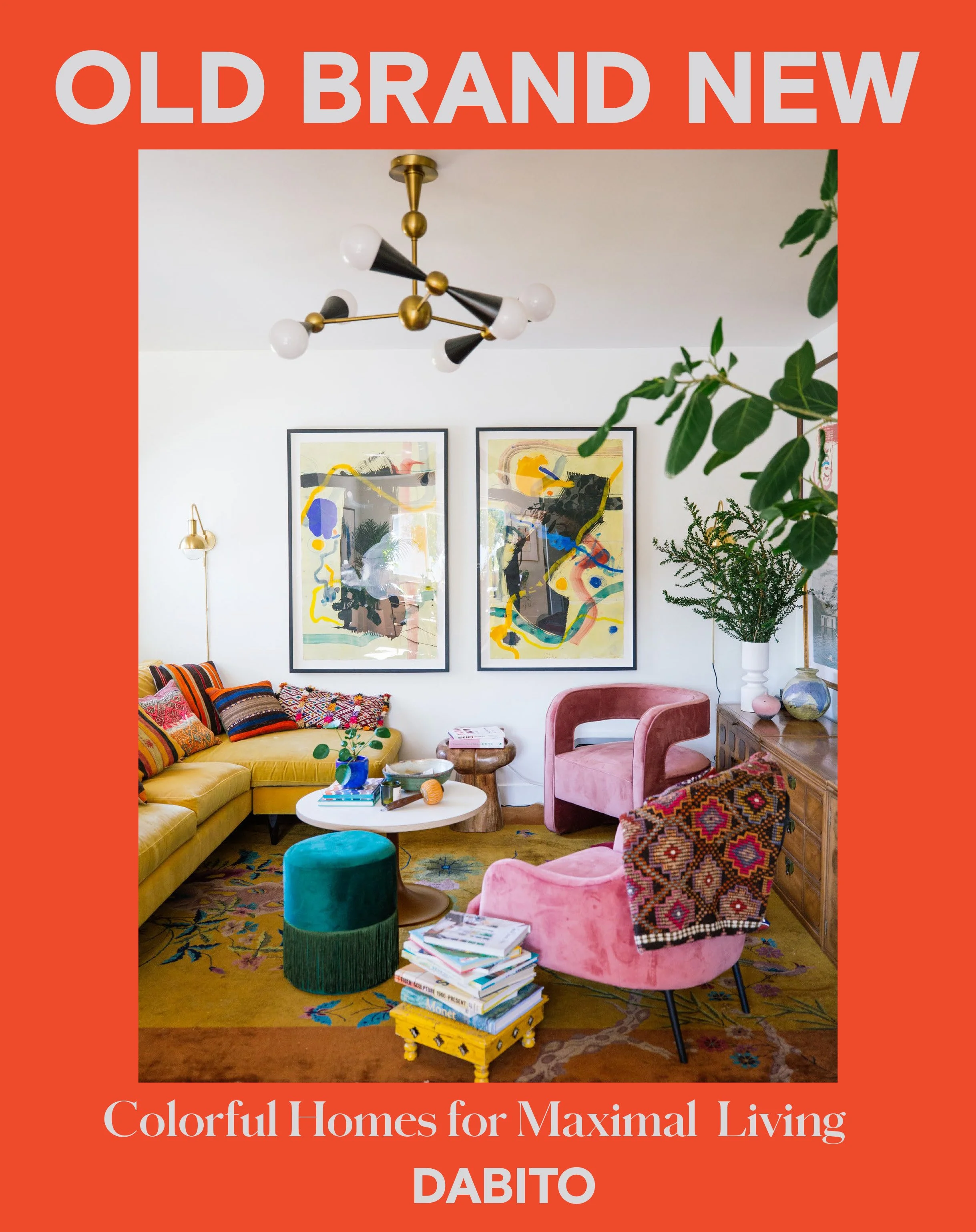
When I photographed this space, I knew that it was gonna be the cover. We ended up removing the artwork to fit the title of the book better. I really loved the yellow border but felt like it was giving National Geographic so we went with a reddish color to match the walls. And here’s the proof copy we landed on! Which cover option is your favorite? And don’t forget to order your copy today!
