What Your Colors Are Saying About Your Brand
Believe it or not, colors are tied with a psychological and emotional response for us humans. When you put on a bold, red lip for the day you’re telling the world to watch out for your confidence. When you choose the bank with the blue log, it makes you feel like your money will be well taken care of. When you look at the bright yellow flowers sprouting in your neighbors yard you get a sense of warmth and happiness because spring has arrived. Those are all examples of how color can say something without actually saying anything. So you can see how important it is to know exactly what the colors your choose for your business are saying about your brand.
I’ve made a hand-dandy infographic to give you some of the basics about choosing your brand colors. (Right click and select Save Image if you’d like to keep it on hand to remember.)
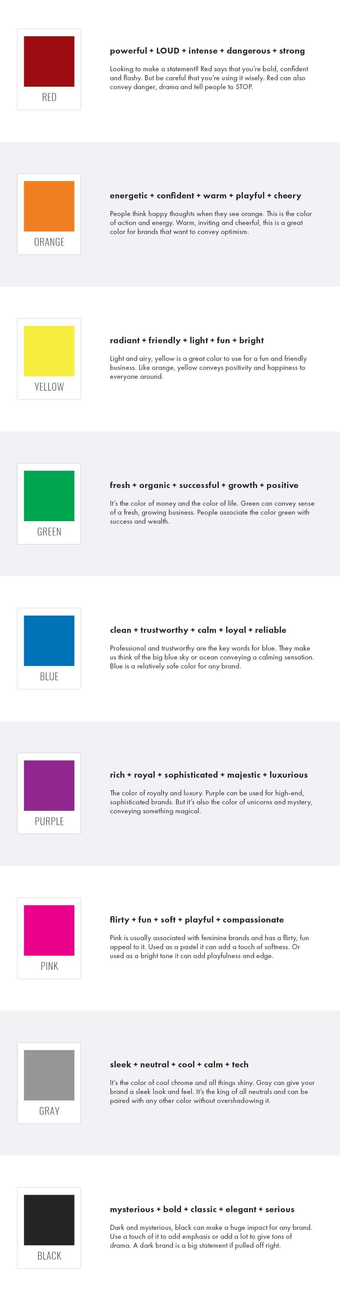
RED powerful + LOUD + intense + dangerous + strong Looking to make a statement? Red says that you’re bold, confident and flashy. But be careful that you’re using it wisely. Red can also convey danger, drama and tell people to STOP. ORANGE energetic + confident + warm + playful + cheery People think happy thoughts when they see orange. This is the color of action and energy. Warm, inviting and cheerful, this is a great color for brands that want to convey optimism. YELLOW radiant + friendly + light + fun + bright Light and airy, yellow is a great color to use for a fun and friendly business. Like orange, yellow conveys positivity and happiness to everyone around. GREEN fresh + organic + successful + growth + positive It’s the color of money and the color of life. Green can convey sense of a fresh, growing business. People associate the color green with success and wealth. BLUE clean + trustworthy + calm + loyal + reliable Professional and trustworthy are the key words for blue. They make us think of the big blue sky or ocean conveying a calming sensation. Blue is a relatively safe color for any brand. PURPLE rich + royal + sophisticated + majestic + luxurious The color of royalty and luxury. Purple can be used for high-end, sophisticated brands. But it’s also the color of unicorns and mystery, conveying something magical. PINK flirty + fun + soft + playful + compassionate Pink is usually associated with feminine brands and has a flirty, fun appeal to it. Used as a pastel it can add a touch of softness. Or used as a bright tone it can add playfulness and edge. GRAY sleek + neutral + cool + calm + tech It’s the color of cool chrome and all things shiny. Gray can give your brand a sleek look and feel. It’s the king of all neutrals and can be paired with any other color without overshadowing it. BLACK mysterious + bold + classic + elegant + serious Dark and mysterious, black can make a huge impact for any brand. Use a touch of it to add emphasis or add a lot to give tons of drama. A dark brand is a big statement if pulled off right.
There is definitely so much more that goes into choosing the color and style to start adding a personality to your brand, but knowing a bit about the psychology behind the colors you choose is a great place to start. And once you know the basics, you can begin mixing and matching until you have a color palette that's uniquely your own!
What brand colors reflect the feelings you want your business to evoke? Are you brand colors doing their job?