The Logo Smith was hired by RxLess in 2019 to redesign their existing logo design, and to also revamp their general brand identity.
Below you can see the comparison of the old RxLess logo, and the new RxLess logo.
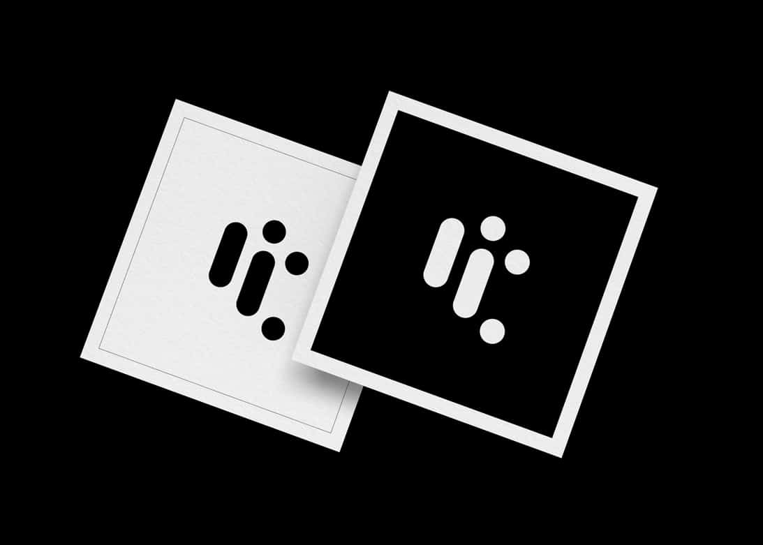
The final solution that was chosen for the RxLess logo design reflects the shape of common medicines: round pills and capsules, and arranges each to for the letters for ‘r’ and ‘l’.
This clean and bold logo mark works incredibly well on all aspects of stationery and other branding applications.
The RxLess logo looks particularly striking when reversed out in white on the magenta background, such as is used for their envelopes and also Prescription Savings Program cards.

RxLess Website
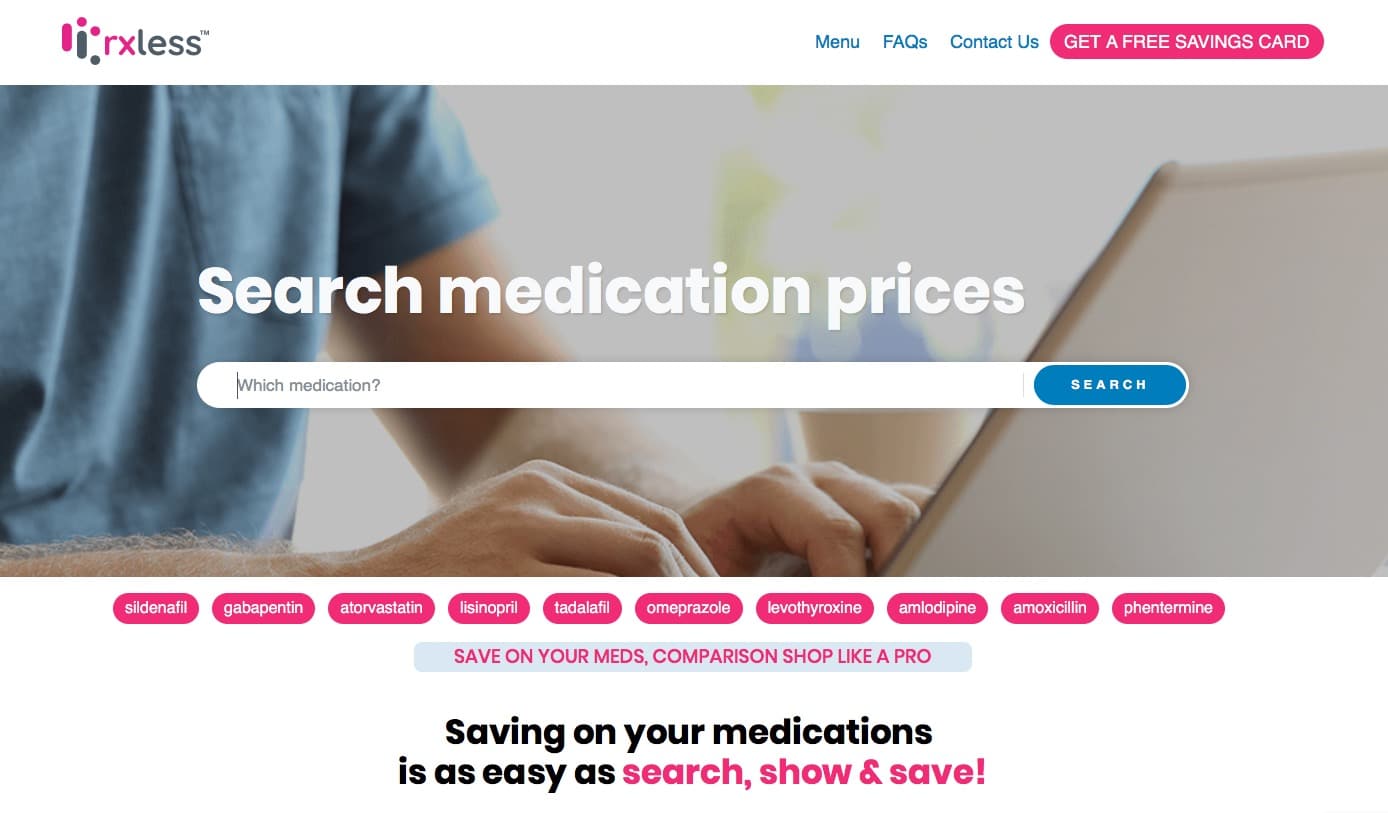
About RxLess
Rxless.com searches millions of medication prices and offers on trusted prescription savings programs.
Program administrators negotiate top discounts with pharmacies and manufacturers on behalf of their users.
We only include offers that are easy to use and have accurate prices. Note: Pricing can fluctuate daily and varies by program and pharmacy chain. On average, individuals save $150 per year with the offers listed on rxless.
RxLess Monomark