Nicole Caputo breaks out the glitter for Godshot

Nicole Caputo is the Creative Director of Catapult and Counterpoint Press and the co-founder of She Designs Books, an organization that celebrates women in book design. She also regularly contributes to our monthly Book Covers We Love! feature. Here she takes us through her process for designing the sublime cover for Godshot by Chelsea Bieker.
Chelsea Bieker’s Godshot was a thrill to work on. I had been hearing about the manuscript months before the project landed in my lap at Catapult and along with the great title I knew I would be moved by the material because I was already familiar with Chelsea’s soulful writing.
14-year-old Lacey May Herd is growing up in drought-stricken Peaches, California. Lacey’s alcoholic mother has run off with a man she met through her job as a phone sex operator and her grandmother is more interested by her taxidermy than of helping her. The area Lacey lives in is bankrupt due to the once lucrative raisin fields, now left dried and scorched by the sun. In the town’s desperation, residents have turned to a cult leader named Pastor Vern for guidance. He promises, through secret “assignments,” to bring the rain everybody is praying for. Abandoned, Lacey endures the appalling acts of the men following Vern and is forced to find her way through unthinkable circumstances, to come to learn about the disturbing relationship between religion and sexuality in this town and to find salvation in unexpected places. The book is full of heart and grit and the heartbreak of motherloss.
Even though the book is set in a rural farming town the story is peppered with garish details like a magenta hearse, sex work, metallic gold robes, neon grass. I knew the author wanted to see some of that reflected on the cover and I also knew she wanted to see some foil or metallic details and it was not hard to find the material to support this foil idea because the book is bathed in “God glitter” which Pastor Vern wore in his hair, smeared on his cheeks along with his gold robes and the dramatic rain of sparkle that would fall from the rafters of the church coating the floor in a permanent varnish of glitter.
In order to give the word Godshot the attention it deserved I knew I would need to break the original title because as one word the title would need to be shown at a much smaller scale on the cover and apart from giving this cover a commercial bold look, conceptually I knew the design would need to shout to match the material.
This was also one of those personal design processes where I got to see up close and personal my own overthinking. The first idea that came to me ended up being the final design you see today on shelves, but I had kept it to myself and did not even show it in the first round! I had felt it may be too simple but sometimes the most simple minimal idea says much more. So in the first round I had shown these:


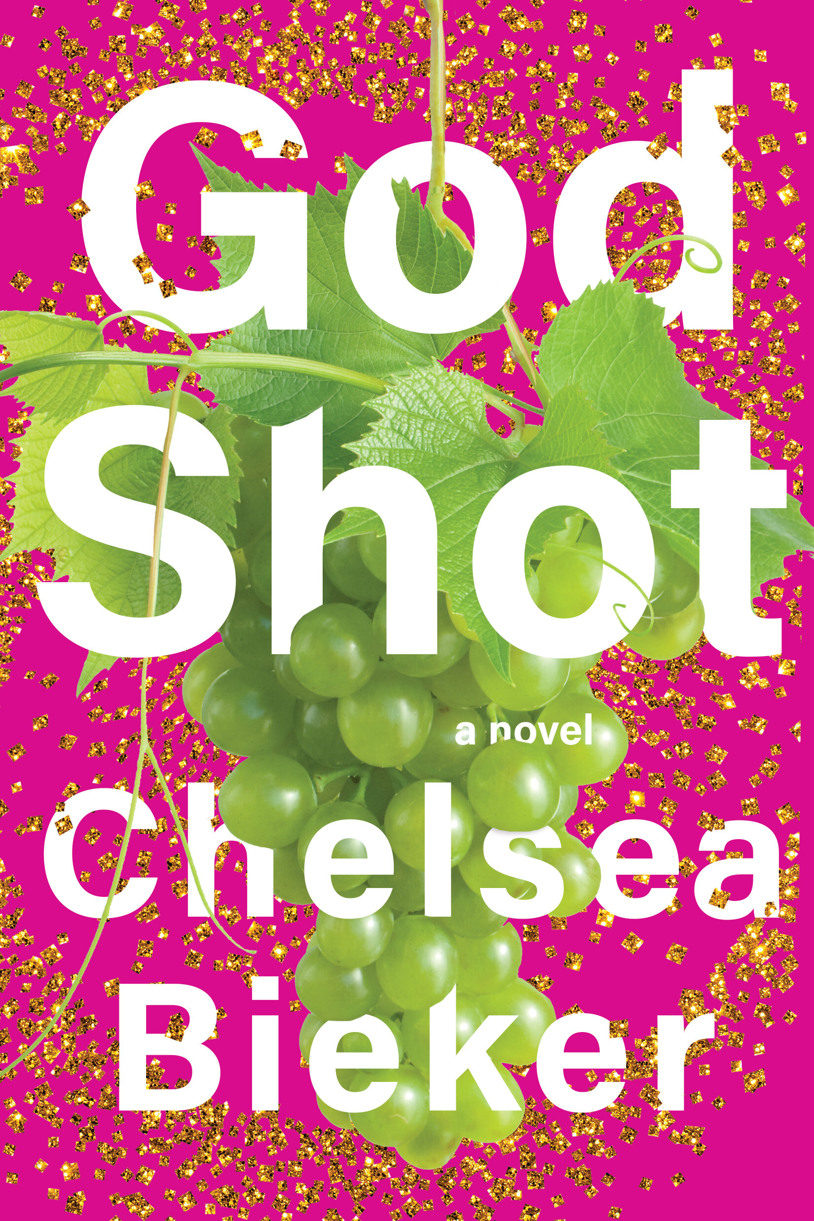

The grapes are not only symbolic of the raisin farms but also the religious connotations (birth/rebirth, ripe harvest, abundance and fertility) and a specific pivotal scene where our narrator sees one green vine with the most perfect grapes in Vern's yard which leads the reader to learn a bit more about Vern. I also sent along these which are cleaner but are also social media eye candy and still feel very much like California. One represents a circle of crows found in the story and another drips with feathers which were also tossed from the rafters of the church.


The team thankfully had mixed feelings about the above covers:
The grapes were too clean and perfect, perhaps a more naturalistic grape image would work… or maybe not when combined with the glitter, would it look too much like the cover of Sour Heart? Something seemed missing in terms of the tone of the book and the pink was off putting to most. Some felt it looked more like a bouncy novel about a bachelorette party rather than a big, bold, golden, Californian literary debut and they were afraid it could limit the audience. They wanted fun and classy. The editor did love the abundance of glitter in the feather design and loved how the feathers almost suggested land masses or pools, but not everyone was in agreement.
I spoke with the editor and my publisher and let them know this simple idea of a simple nearly solid gold cover and they were excited by the idea. The type was set in all caps to represent more of a forceful proclamation and to not confuse the glitter and lower case with anything too soft and overly light and playful. The team loved the simplicity and the screen popping potential. Chelsea thankfully agreed, and shared that her husband had reminded her that years ago she mentioned wanting a solid gold book cover and we are so elated that we were able to give her just that for her debut novel.
For production I had tried lithofoil but the printing effect, although beautiful, softened the texture of the glitter edges and I wanted to retain that crisp detail so I decided to go with the lower cost, but really effective option, of a raised gloss layer that covered just a smattering of the grains of glitter sitting on top of a velvety soft touch finish. It worked beautifully.
Final cover
I am so glad that the cover has been shared widely online inspiring some beautiful photographs and many glittering outfits worn by Chelsea’s readers and Chelsea herself. This was one more opportunity for me to have such gratitude for the work I get to do, to help place books into the hands of the readers they are meant to reach and to contribute to amplifying such a great talent.


Editor, artworker and lifelong bibliophile.