The Gestalt Principles: Theory of Good Design Psychology
The Gestalt Principles are rules of composition and arrangement. They are based on the idea that there is a natural way that objects, people, and things fit together in space. These principles are Similarity, Continuation, Closure, Proximity, Figure/Ground, Common Fate, Symmetry and Order.
In the early 20th century, an Austrian-Hungarian psychologist named Max Wertheimer set out to discover what was behind how humans perceived reality. He came to a startling conclusion—that the world around us is not merely a collection of individual objects. Instead, our perceptions are created by the interaction between what we see and experience.
These interactions are called the Gestalt Principles in the brain's visual system. Wertheimer's discovery is an integral part of Gestalt psychology and has helped us to understand how humans perceive and interpret the world.
If you're like me, you've probably heard about the Gestalt principles of good design. I'm sure you've seen the famous “The Design of Everyday Things” book by Don Norman. And if you're into psychology, you probably know much about Gestalt. But I'm not talking about that.
- Product Condition: No Defects
- Good one for reading
- Comes with Proper Binding
- Norman, Don (Author)
- English (Publication Language)
In this article, we'll look at several ways you can use the principles of good design to improve your business.
Table of Contents
The Law of Similarity
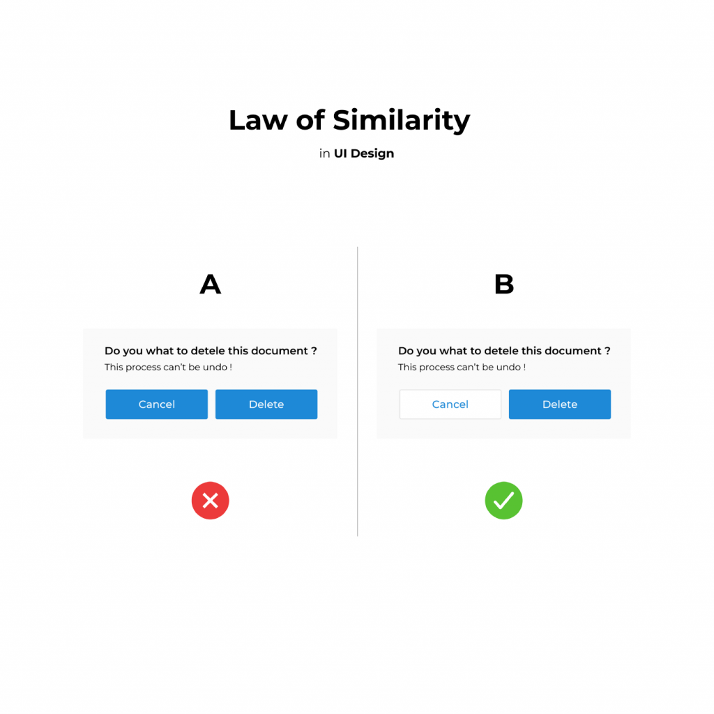
When faced with a problem, people tend to think about the solution rather than the problem itself. If you think of a problem as having two solutions (one being the solution you've already come up with), you'll start to consider the alternatives.
In design, this principle is used to create a compelling image that attracts attention. The Gestalt principles of similarity suggest that we're attracted to what's familiar, even if we don't realise it.
We subconsciously pick up on similarities between things, such as objects that look similar. For example, a photo of a landscape with trees and buildings could evoke feelings of safety, happiness, or comfort because these are the elements we associate with home and warmth.
We also use the principle of similarity to decide whether something is “good” or “bad.” If the packaging looks like a child's toy, we'll likely avoid it. We recognise the similarity to an unsafe item and immediately associate the good feeling of a safe toy.
How does the law of similarity work in design? It can help designers create a strong, memorable logo that stands out from competitors and attracts your audience. Using this principle, you'll see logos that evoke a specific emotion, like joy, sadness, or love.
Using this principle also improves the way we perceive logos. Research has shown that when we see logos that look similar to ones we've seen before, we think they're “good” and “trustworthy.”
What Does This Mean for Logos?
The law of similarity makes logos that look similar to one another more compelling. This principle allows you to create a distinctive logo that will stand out among your competitors.
You'll know that your logo evokes positive feelings in your target audience and that it will attract your target market. This is a great way to develop a brand people want to buy.
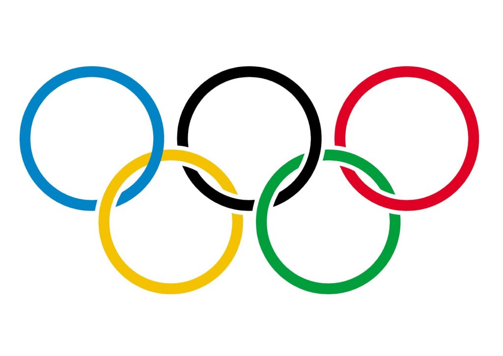
How Do You Use the Law of Similarity?
There are a few ways to incorporate the law of similarity into your logo design.
Use similar colours.
If you have a basic shape in mind, like a circle or square, you can create a unique logo that draws on the law of similarity. A common choice is to create a circle or square logo and add details that evoke the same feelings as your original shape.
For example, if you're considering a circle, you can include the sun or moon or add a star or leaf. Adding a symbol can also help you connect to your audience. A smiley face or a flower can be great ways to create a strong logo.
Similar fonts
Logos that use similar fonts may look similar, but this can be a powerful tool for creating a memorable logo.
Using the same font in a logo is common, but it's not always necessary. Using a font that is close in style to your existing logo may evoke the same feelings in your audience.
This is why some logos use a similar font to convey a sense of warmth. For example, the names “Nestlé” and “Tetley” have similar fonts but still feel different. This is because their fonts are entirely different, and we can tell them apart immediately.
Keep the same colour scheme.
If you use a similar colour in your original logo, you may be able to use the same colour for your new logo. This is the simplest way to use the law of similarity in your logo.
The most popular way to use this technique is to use the same colour scheme for both the logo and your brand. This makes your new logo look familiar and helps your audience remember it's your company.
What If I'm Already Using a Similar Logo?
If you're using a similar logo already, you may be missing the opportunity to use the law of similarity to your advantage. There are several options for incorporating the law of similarity in your logo.
Change the colour
You may be able to create a more vibrant logo by changing the colour. If the original logo uses a dark colour, try adding a lighter, more open colour to your new logo.
You can also use a similar light colour to create a more playful logo. The key is finding a light colour that's close in tone to your original logo. The goal is to find a light colour close in tone but not quite the same.
Change the style
If the font or colour in your original logo doesn't match your desired tone or message, it's time to change the style.
You may want to use a more elaborate font, like a script font, or you may want to keep the font simple. You can also choose a different colour, shade or tone to stand out.
These are just a few examples of how you can incorporate the law of similarity in your logo.
The Law of Continuation
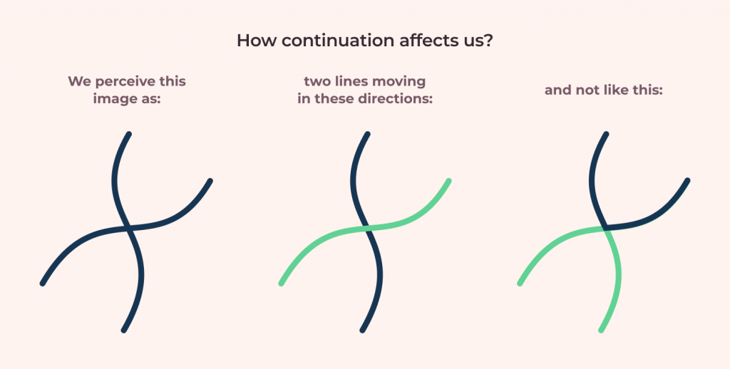
Continuation is the repetition of forms and elements across two or more elements in a composition. This effect is common in graphic design but occurs in art, fashion, architecture, and even biology. For instance, the same tree branches that repeat across a forest can be seen as continuation.
Continuation is visually attractive in a composition, but it can also provide order and unity to a design. The repetition of a shape, colour, texture or other element allows the viewer to comprehend the design and its message faster.
Continuation occurs in many forms, such as repeating the same typeface across multiple pages, lines, or headlines. It can also occur by repeating the same logo or brand name. For example, Nike uses the same running shoe design on both sneakers and shirts, allowing consumers to recognise the brand without needing to read the words “Nike” or “Air Jordan.”
In graphic design, continuation is often used to add a visual dimension to a design. When creating a brochure or a poster, repetition is common to add visual interest and unity to a design. Using repetition of elements like type, colour, line, or shape can create a sense of balance in a layout.
To avoid the appearance of randomness, designers can avoid repetition by ensuring that the repeated elements in a design are meaningful to the content or message of the design.
Continuation is commonly used in graphic design to add interest and unity to a design. The repetition of the same logo or brand name in a design or layout provides a sense of order and visual continuity. The repetition of the same typeface is common in magazines, newspapers, or billboards.
Continuation of Type

Typefaces are the fonts that appear in a document, webpage, or email. They're essential in communicating information and ideas, and typefaces are used for various purposes.
Regarding typefaces, there's an endless variety of choices available, from the simple serif font of Times New Roman to the bold and geometric Helvetica.
Typefaces are essential to graphic design because they can enhance its visual impact. They can create a sense of consistency, unity, and harmony in a design and convey a specific emotion or message.
You'll need to choose the most appropriate typeface for your project as a designer. In addition to choosing a font consistent with the rest of your design, you may also want to consider its personality, meaning the typeface's energy, warmth, and familiarity.
For instance, the more casual, informal, and familiar a typeface is, the less formal and serious it will appear. If you use a playful and informal typeface in a corporate report, it will be perceived as more personal and friendly than if it's a more formal and professional style.
By selecting the suitable typeface, you'll communicate your ideas more effectively.
The Law of Closure

In graphic design, there is a law known as closure. The closure is an aesthetic principle that describes how the eye perceives the visual field. It is used in both illustration and graphic design.
Closure is a psychological law that describes how people perceive information. Closure is a process of making something that is ambiguous into something straightforward. Closure aims to help the viewer understand the image's meaning. Closure is used in photography, painting, advertising, typography, and many other fields.
Closure is achieved through various elements such as focal point, balance, symmetry, proportion, repetition, order, and contrast.
In graphic design, it is crucial to create a visually appealing design that communicates clearly. Closure allows the designer to achieve this.
To create closure in an image, the focal point should be obvious. If the focal point is unclear, the viewer may look around the image to try and find a focal point. It is easier to create closure when the focal point is centred.

Balance is an essential element of closure. It involves equal amounts of negative and positive space. For example, in a layout, white space should be evenly distributed throughout the page so no one area appears to have more space.
The human eye is drawn to symmetry and repetition. Symmetrical layouts tend to look more exciting and attractive than asymmetrical layouts. Repetition is also necessary. It allows the viewer to make sense of the content. It is easier to see the same object in multiple places, so it helps the eye grasp the image and become more familiar with the content.
In addition to symmetry, the proportion is also significant. Proportion refers to the relationship of the parts to each other. For example, if the body of the page is larger than the content, it doesn't look balanced. The elements must be in proportion to each other.
Proportion is also related to scale. A large image of a car doesn't necessarily mean that it is more important than a smaller image. It's also possible to create balance in a smaller image with greater detail.
Order is similar to balance, but it involves the arrangement of elements. Order creates a sense of rhythm. For example, how the words are arranged on the page can create a sense of rhythm.
Contrast is the difference between the lightest and darkest areas. In general, black and white images are more difficult to close than colour images. Colour tends to blend, making it easier for the eye to connect between different colours.
The four main Gestalt principles are balance, symmetry, order, and contrast. There are many more closure principles, but these are the most common.
The Law of Proximity
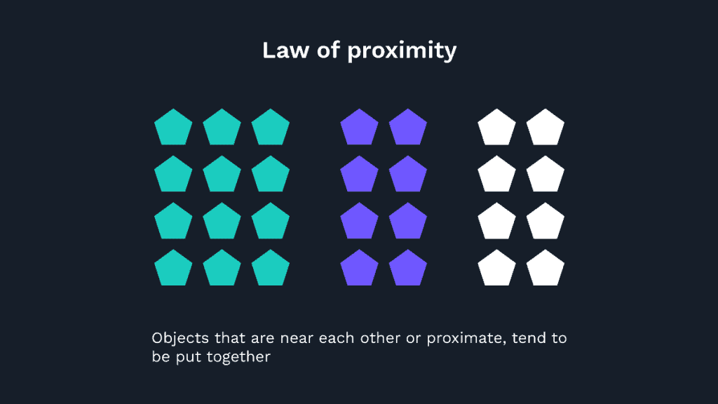
The law of proximity describes how objects in a visual field compete for attention. The closer something is to the viewer, the greater it's chance of being noticed.
In graphic design, the law of proximity refers to the positioning of visual elements within a visual field. The placement of text, images, and shapes influences the reader's perception of them. A well-designed page should be visually exciting and balanced.
Readers are less likely to notice text on the page if it is placed too far away. Placing text close to other text can help readers scan pages and read more content in the same amount of time. Text too close to other text, such as headlines, may be challenging to read.
Text that is too close to other text on a page may make it difficult for the reader to distinguish or separate them, so the message can be confusing or difficult to understand.
Similarly, image placement affects the reading experience. If the image is too small, it may not be noticeable enough to hold the reader's attention.
On the other hand, images placed too close to other visual elements may disrupt the harmony of the design. When an image is positioned too close to another element, it may be difficult for the reader to discern what is happening in the scene.
It's a valuable tool for understanding the principles of effective graphic design.
The Law of Figure/Ground

The Law of Figure/Ground in Graphic Design is a visual principle that applies to how people experience space and shape. It's the idea that when a design features one element of space — such as a line, shape, or object — it should be the focus, while elements that lie “behind” should recede into the background.
When we look at something, we mentally take it apart into smaller and smaller units. When we see a line in a design, we think of it as a series of points, and we identify the shape with lines. These are examples of how Figure/Ground is applied to graphic design.
Figure/Ground is used to direct the viewer's attention and create the illusion of space. It's similar to the law of proximity. Both say that the closer one thing is to the foreground, the greater its prominence, while the farther away it is, the less it appears.
Regarding graphic design, Figure/Ground tends to place the most crucial element at the forefront of the design. A good example is a logo or product name placement on a package, poster, or other printed item. The name is the main element and the largest unit of space.
As far as graphic design is concerned, there are two types of Figure/Ground:
- Positive
- Negative
Positive Figure/Ground places emphasis on a figure or shape. It's a positive, active force that is more prominent. This is a good design choice for logos, posters, packaging, and other printed items.
Negative Figure/Ground emphasises ground or background. It's an opposing force that is less apparent.
A positive Figure/Ground is the letter “M” on a street sign. When viewed from the front, the M is the dominant element, and it's placed in the foreground.
A negative Figure/Ground is the background of a person's photo. As it's the opposite of the positive Figure/Ground, the person is not visible and appears as a negative.
How Can You Use Figure/Ground to Create Effective Designs?
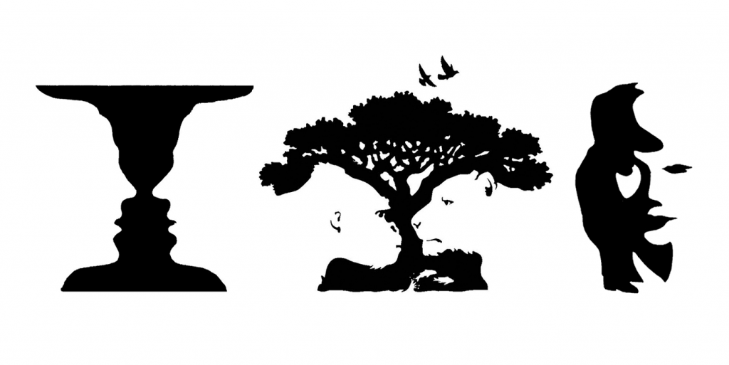
A good design will feature a good balance of positive and negative Figure/Ground. If you can apply the principles of Figure/Ground to your designs, it can help them appear more balanced and cohesive.
Here are some examples of how you can use the Law of Figure/Ground in your work:
1 – Balance Your Design
The first step is to identify your design's dominant or focal point. Place this focal point in the foreground. Then, place the less critical elements in the background, but make sure they are close enough, so the eye travels back and forth. The less critical elements should recede into the background.
2 – Emphasise the Best Elements
A good design features a well-balanced ratio of positive and negative Figure/Ground. This will help your designs look more unified and less cluttered.
When you're looking at a design, what do you notice first? The focal point, the most crucial element, or the most interesting or exciting element? The one that draws your attention?
3 – Use More Ground and Less Figure
If you want to emphasise the figure, make it larger. If you want to emphasise the ground, make it smaller.
4 – Choose the Right Size
When creating a layout or poster, be sure to choose the size that fits best. A poster with too much space looks cluttered and busy, while one with too little space doesn't offer a strong enough focal point.
5 – Add or Eliminate Negative Space
You can use Figure/Ground to direct the eye of the viewer. Add negative space to create a more important focal point, while eliminating it will create a more balanced image.
6 – Avoid a Single Line
If a single line is used, it usually makes the design look unbalanced. Avoid this by splitting the line into multiple components. For example, a line that splits in two creates a V-shaped focal point.
7 – Add Visual Interest
If your design lacks visual interest, add more elements. You can draw the viewer's eye in different directions or add more layers of information.
8 – Use a Bold, Stiff Brushstroke
A stiff brush stroke is like a hammer. It hits the canvas and forces it to stand out. A soft brush stroke is like a feather. It glides over the canvas, barely touching it. Choose the right tools for the job.
9 – Keep It Consistent
Balance is achieved when all parts of a design are consistent with each other. If you make a mistake, the entire design looks off-kilter. Be careful and keep your design consistent.
10 – Be Careful Not to Get Distracted
If you think about the background, make sure it's consistent with the rest of your design. If you lose focus on the focal point, your entire design looks off-kilter.
The Law of Symmetry and Order

Graphic design is concerned with the presentation and arrangement of visual elements. Symmetry and order are two principles that guide graphic design, as they are used to ensure a pleasing appearance for the finished product.
Graphic design is the art or skill of designing, developing, or implementing a piece of work's overall look, organisation, and composition. This includes the visual elements, the space, and the media use.
Symmetry means an exact or near-exact repetition of design parts on either side of a central axis. Symmetrical designs often create balance and unity. The symmetrical element is placed on both sides of the image.
Order is defined as an arrangement or placement of objects or features in a way that makes them easy to perceive or understand.
An example of symmetry and order is in the arrangement of the colours. The image's colours are repeated symmetrically, and the images are placed on either side of the page.
How Can Symmetry and Order Guide Graphic Design?

Symmetry and order are essential principles of graphic design. They are used to create balance and unity.
When you view the finished design, your brain instinctively processes information by following the rules of symmetry and order.
For example, if you look at the top and bottom of the image, you may notice a few words that are the same. The text on the top and bottom of the image is mirrored on the opposite side.
As you read down the page, you may notice that the word and letterforms are repeated on opposite sides. This helps create an impression of balance.
The symmetry and order are repeated on the right and left sides of the page. The letters and numbers are mirrored, and the text is positioned, making it easier to see the left side of the page.
As you continue reading, you may notice that the same colour is repeated. There are several areas of colour on the page, and they are repeated on the opposite side of the page. The combination of symmetry and order creates unity.
Symmetry and order are essential in graphic design because your brain naturally follows the rules. The goal is to create a harmonious and unified composition.
The Law of Common Fate
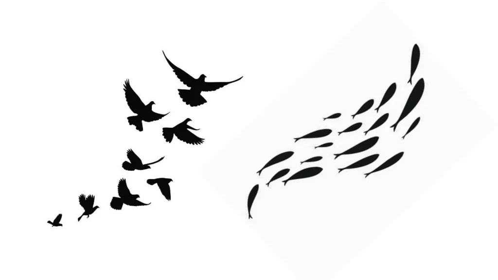
In graphic design, a “law of common fate” refers to the idea that certain design elements appear more frequently than others appear in a group. For example, if you look at a piece of text that contains much red ink, you might notice that every other word in the line is also red.
When this happens, you see an instance of the law of common fate in action. According to the law of common fate, two or more similar things tend to be related. This means that if red ink and letters appear together in the text, they tend to look the same.
Similarly, if you look at the colours in a piece of artwork, you'll see that many of the colours appear together more often than others. Take a look at the below image. Notice how the reds and greens are grouped, whereas the blues and oranges are less often associated.
In graphic design, this phenomenon is known as “graphic taxonomy” or “colour taxonomy.” In the world of typography, the concept of graphic taxonomy was popularised by Walter Gropius and other architects in Germany in the late 1920s and early 1930s.
Graphic taxonomy is often used to determine whether the colours in a piece of artwork work well together. A design might call for warm reds and yellows with a cool blue, for example, or perhaps light blues and greens with a dark purple.
You can use the principles of graphic taxonomy to decide which typefaces are best suited for a specific project. Certain typefaces are more commonly found together. Using this information, you can choose the best font for a project by combining the styles that most often appear together.
Graphic taxonomy is also essential when choosing colours. If your goal is to create a cohesive colour palette, you might choose one colour that is often associated with another. If you notice that the colours that often appear together are green and yellow, you might consider choosing a yellow and green palette.
Other Ways to Use the Law of Common Fate in Graphic Design

The principles of graphic taxonomy also apply to the structure of a page. In the world of typography, the concept of “font hierarchy” describes how specific fonts are arranged in a layout. In graphic design, the same idea is known as “font hierarchy.”
Font hierarchy is a crucial element of graphic design. To create a coherent layout, you must make your typeface choices logically.
The law of common fate can help you decide the best font for a layout. For example, if your document calls for three different fonts, you might notice that the fonts are all associated. If you notice that the fonts are all red, for example, then you might use a similar colour for your text. The law of common fate can help you decide which fonts are best for a particular project.
The law of common fate also helps you understand which fonts go well together. If you notice that the same fonts tend to be used together more than others, you'll be able to make better choices when designing a font family.
The principles of graphic taxonomy also help you choose between similar fonts. For example, if you notice that the fonts are all associated, you can use this information to choose the best one.
Why is gestalt theory critical?
Gestalt theory is an approach to studying art and design that emphasises the idea of a whole being more significant than the sum of its parts. It's based on the idea that specific patterns or elements in art and design work together in a way that can influence other aspects of the design.
Gestalt is an abstract word that refers to the whole rather than a specific shape or pattern. Gestalt means “form” in German, and in the late 19th century, it was used to describe how the brain combines information from different senses.
In graphic design, Gestalt is often described as the “big picture” or the “overall concept”. These terms refer to how a single element in a design relates to other elements and how the entire design should look and function. For example, a font choice can influence a page's overall look and feel.
There are three main approaches to Gestalt:
- Organic: This refers to how objects relate to one another within the composition.
- Symmetrical: This term refers to how symmetrical shapes and elements interact within the design.
- Functional: This means the design serves a purpose, such as helping someone complete a task.
Gestalt is often used in the study of design and graphic arts. Graphic designers may spend hours designing an image, but they may not know the underlying gestalt principles.
Gestalt is also used to describe a way of organising ideas or information. For example, when writing or presenting information, you can use a structured outline to break down the information and guide the reader through the presentation. However, this approach may not work for all topics. When creating a complex idea or concept, it's often necessary to break down the idea into more minor elements and use Gestalt to explain the relationship between the elements.
How does gestalt theory apply to graphic design?
In graphic design, gestalt theory is often used to help develop concepts and ideas. For example, it can help designers understand how to organise information in a way that makes sense to the reader.
The same principle applies to layout and page design. A layout can include several types of elements. For example, a newspaper story may include text, pictures, charts, and graphs. How these elements are laid out and grouped can create a cohesive and consistent page that tells a story or conveys a point.
The Key Ideas Behind Gestalt Theory
Emergence

Fritz Heider and Marianne Simmel developed this theory in the late 20th century. It is a framework for thinking about how individuals understand and interact with their surroundings.
The concept of emergence helps us understand human interactions with the world around them. Emergence refers to the idea that a pattern emerges from the interaction of the parts that make up the whole. Therefore, the pattern is more important than the individual components that created it.
To help illustrate this idea, consider the following example:
Two people are playing a game of checkers. One person makes a move, and the other response. When the first player makes a move, the response by the second player is determined by the location of the checker on the board. If the first player moves the white checker to the top of the board, the second player will move the black checker to the top.
Although the first player's move is irrelevant to the second player's response, it does influence the outcome. The second player's response is based on the first player's move, and the arrangement of the checker pieces determines the outcome.
Similarly, the arrangement of the pieces in an object affects how we perceive and interact with it. For example, a simple object like a car can appear complex because it consists of hundreds or thousands of separate parts. But removing one part makes the car more apparent and easy to understand.
Similarly, the arrangement of the components of a car – the seats, steering wheel, and windows – determines how the driver uses the car. If one of those parts is missing, the driver's experience with the car changes.
We all know that the parts that make up our bodies are interrelated, but it is easier to appreciate the concept of emergence when we can visualise it.
In Gestalt Theory, emergence is the idea that the whole is greater than the sum of its parts. According to this theory, the parts of the whole are not independent but rather form patterns that create new wholes.
This is why, according to this theory, the eye is not just the light-sensitive membrane that connects the retina to the brain but is also the whole image the brain perceives.
This is also why it is so difficult to identify a person's facial expression, even if you can tell their gender, age, and emotional state from their eyes. The eyes and the whole face are perceived together as an integrated unit.
How Does Emergence Work?
In the case of checkers, two people's responses to a given move are determined by the location of the checker on the board. As a result, the second player's response is determined by the first player's move.
Similarly, a car is perceived as a whole despite its many parts. The seat, steering wheel, and windows combine to give the driver a sense of where the car is located and where the driver is travelling.
The perception of the whole is based on combining all the parts. This is what gives rise to the term “emergence.”
So what is it about the arrangement of the parts of the whole that creates the pattern? It's the way the parts interact with each other.
Think of it this way: If you are standing next to the edge of a cliff, and someone jumps off the cliff, the impact of the fall is determined by the height of the jump.
Even if the jumper is high in the air, the impact of the fall is only half as high as it would be for a low jumper.
Similarly, when a group of people sit in a circle, the number of people in the circle is determined by the arrangement of the circle, not the number of people sitting.
This means that the pattern we observe is not something that exists independently; the arrangement of the parts creates.
This is why we greatly appreciate a car's complexity after removing one of the wheels. The arrangement of all the remaining parts makes the whole, and without the missing wheel, the car no longer looks complete.
Reification
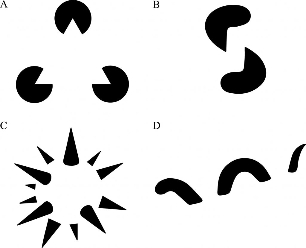
According to gestalt theory, we are constantly filled with thoughts, memories, and ideas that simply “fill in the gaps.” This happens when we perceive something that isn't there or experiences something that isn't happening. It's when we fill in the blanks, which happens every day.
For example, when a child sees a dog, the child interprets what they see and fills in the blanks with the idea that the dog is friendly and wants to play. The child's mind has created a story to tell them about the dog.
It's not until we think about it or consciously decide to do so that we have the opportunity to learn a new truth or perspective on a situation. If we didn't have brains, we would think that all dogs want to eat us.
In the same way, when we think about someone or something, we create a story in our minds. We make assumptions and fill in the blanks based on what we know and believe.
Sometimes we can recognise our thinking patterns and become aware that our beliefs and assumptions may limit us.
We all fill in the blanks, so don't worry about it because we all do it. It's the nature of being human.
Multi-stability

The mind seeks to avoid uncertainty. We learn through experience. When we repeat an action repeatedly, our brain becomes more and more confident that it knows what to do next. Our subconscious mind is constantly seeking out this consistency by comparing previous experiences. If we don't see the same event happen, we assume the new situation is different and uncertain. This is why we repeat the same thing without thinking, even when we know we should change our behaviour.
If we continue doing the same things repeatedly, it's like building a positive feedback loop in our minds. The more we do something, the more confident our brain becomes.
This is called Multi-stability because the mind thinks it knows what to do. Still, when it encounters a situation it doesn't recognise, it looks for a more stable position to accommodate the new situation.
Gestalt Theory explains this concept well. It says that humans are “the result of multiple interactions.” Instead of the whole being more significant than the sum of its parts, the parts become more and more significant as we interact with them.
In this case, if your mind repeatedly sees a situation that it doesn't understand, it will begin to seek stability in the form of repetition. Over time, this leads to habits.
Invariance
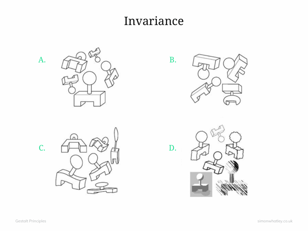
If you've seen any of the movies “Babysitter Wanted,” you may recognise the concept of invariance, which is a core element of gestalt theory. The term refers to the ability of the brain to recognise patterns and form impressions based on similarities.
For example, if someone asks you to identify a face in a crowd, you're likely to pick up on the differences, like whether the person has a moustache or is bald. However, your ability to recognise faces isn't based solely on differences; it's also influenced by how similar they look.
When thinking about the similarities and differences between people, the brain uses the concept of invariance to create a mental model of the world. This process helps us better understand others and makes it easier for us to interact with them. It's this shared understanding that's crucial to creating relationships that are fulfilling and lasting.
Invariance, like gestalt theory, refers to the human ability to compare and contrast patterns, which is why it is a significant part of the brain's visual perception.
What is the difference between invariance and recognition?
Recognition refers to how the brain processes information. It involves a single pattern of stimulus, which is also called simple matching.
The process of invariance includes the ability to compare multiple patterns and determine how similar they are. This is where the concept of gestalt theory originates.
In short, the brain creates a model of the world that allows it to understand and communicate with other people.
Conclusion
So, I'd like to close by mentioning a few of my favourite resources for learning more about the psychology of good design.
These include the book: The Design of Everyday Things by Donald Norman. This concise book gives an excellent overview of fundamental design principles.
It's also a very readable book, and I recommend it as an entry point into the subject.
I recommend watching this video series: How Psychology Affects Design, from Google. It's a more extended video series, well-produced, and the content is good.
Read my article about design psychology, and check out the book!
Last update on 2024-05-13 / Affiliate links / Images from Amazon Product Advertising API

