George Orwell's Animal Farm gets Revamped for its 75th Anniversary
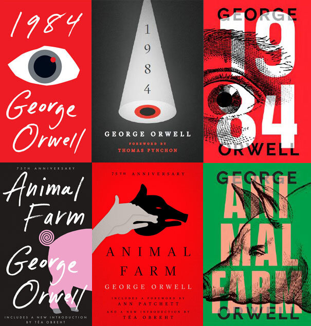
George Orwell's classic Animal Farm became 75 years old in August 2020. To celebrate this milestone, Berkley Books and Signet Classics have given their mass market and trade paperback editions some brand new covers. The equally seminal 1984 has had its editions revamped as well.
Art Director Christopher Lin and designers Kaitlin Kall and Jason Booher share their experiences.
When asked to redesign George Orwell’s iconic titles, my team and I couldn’t have been more thrilled. We actually publish three editions each of both 1984 and Animal Farm, so we had not just two covers to redesign, but the opportunity to tackle six repackages in total. Thankfully, my talented designers, Kaitlin Kall and Jason Booher, were more than up for the task. Here’s how they each approached the challenge:
Kaitlin Kall
“I was very excited by the opportunity. And perhaps a little nervous given the audience size and the continued importance and cultural relevance of these novels. Like many of us, I first read 1984 in high school, so I was aware that my design could be a student’s first impression of these great books. With this in mind, I set out to create something that would appeal to both old readers and new.
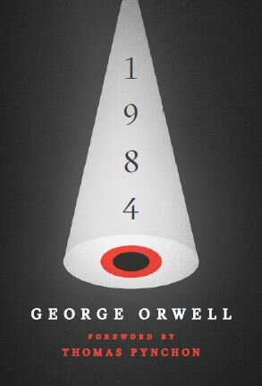
For 1984, I focused on the idea of Big Brother, the ever-present leader of the Party. For the trade, I used the device of a spotlight with an eye in the middle. The image could simultaneously be viewed as an eye and as a target, showing how one is always in the sights of the Party, always a potential suspect of thoughtcrime.

For the mass market, I used the eye in a more literal sense: a dilated pupil with a glowing red camera light in the top right, conveying a fear of inescapable surveillance and lack of privacy.


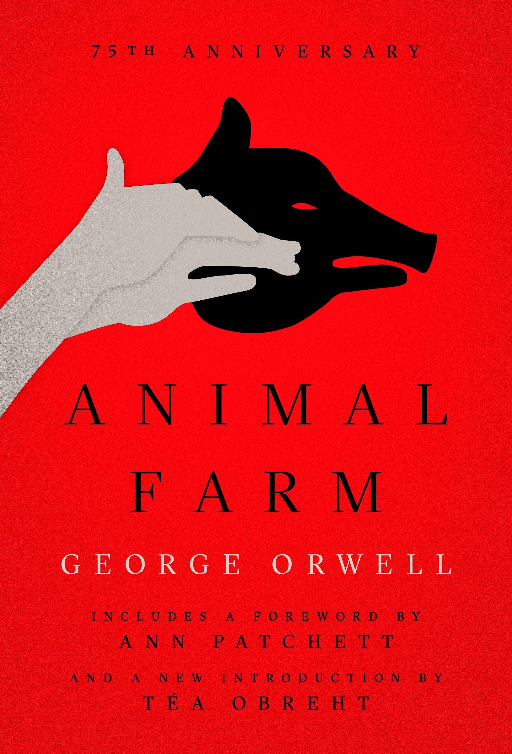
For Animal Farm, I chose to highlight the pigs, who became the leaders of the farm after the revolution. For the trade, I used a hand puppet to showcase the pigs’ “shadow” side—that behind their outwardly noble ideals lay the very same human capacity for tyranny and oppression.

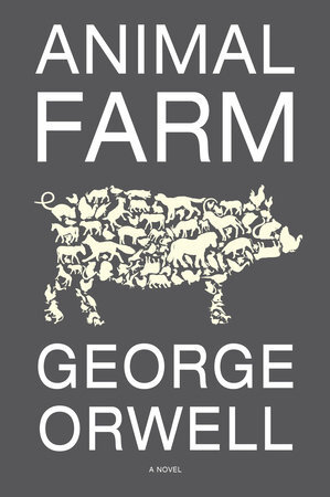
For the mass market, I wanted to show a pig on four legs (a nod to the pigs’ propaganda, “Four legs good, two legs bad”) and used a hypnotizing, spiral pig's tail to symbolize the manipulation and gaslighting of the farm animals.


For all four covers, I was inspired by the elegant, minimalist designs of Paul Rand.
I did look at the past packages before I started designing. Given the stature of Orwell and the longstanding cultural relevance of these novels, I thought it was important to see what had been done before getting started.”
Jason Booher
“With 1984 I started with two main things. I wanted the figures in the year to be very much part of the big move, and I couldn’t get away from the eye. So many eyes used before on 1984 past editions for sure; I tried to imagine what the eye could do that was different or how to use the association between the eye used on previous covers to my advantage. There’s a Paul Rand design ad for the Container Corporation of America (Great Ideas series) about the freedom of speech. He uses an abstraction of eyes that carry a lot of tension and anxiety. The idea I wanted to execute was using the eye to not just represent Big Brother, but also or more-so the citizens themselves and Winston Smith. Conceptually, the eye being both the oppressor (we as readers associate the eye with Big Brother) and oppressed (the fear of the eye and knowing what is to come for poor Winston) at the same time gets to the core of the people themselves being the totalitarian power. Hopefully with more weight on the anxiety and fear.
So I adjusted the engraving of an eye opening it up, cropped it off on the left, and interacted it with the 8 to create that sense of fear and tension. Discovering the relationship between the eye and the white/position of the 8 was the thing that I found really exciting. That’s what really activates the entire cover for me, playing off the other suggestions of dimension and layers that is all ultimately collapsed into flatness. This was the formal innovation that would set the cover apart.


Animal Farm followed on from that. In the same vein, I wanted to take something that was an expected visual icon associated with the book and shift it in some way. This, while using the same set of formal relationships from the 1984 cover. I found the solution again in the eye which helped tie the two covers closer together. Even if the expressive human eye on the pig isn’t knock you over the head human, the concept still works to capture the conflation in Orwell’s metaphor/allegory of self-aware intelligence and pigness. This one gathered a few extra lines of copy as we all know covers sometimes have a tendency to do.”

We presented our designs in pairs, to ensure that each edition would form a matching set. My publishing group was so impressed by Kait and Jason’s brilliant work that they had a hard time choosing which ones to print! In the end, we went with Kait’s simple and immediately eye catching graphic approach for the mass market edition, because we agreed that it would have the most impact on the smallest surface area. For the trade paperback edition, we wanted to target the audience that shops regularly at independent bookstores who may already own copies of these books, but will be enticed by Jason’s bold and daring designs to purchase them again for their collections. And finally, for the deluxe edition trade paperback, it was plain to see that Kait’s classic and arresting approach was the way to go.
Each design is uniquely striking and beautiful, yet thoughtful and timeless at the same time. Both Kaitlin and Jason’s tremendous work on these groundbreaking titles are sure to attract and delight a broad range of readers for many years to come.
Editor, artworker and lifelong bibliophile.