Natasha MacKenzie on Designing Everyday Monsters

Natasha MacKenzie (aka miss nat mack) is a coffee-addicted book designer primarily based out of Manchester. With a professional background in marketing, branding and book design, she helps authors and publishers across the globe bring their stories to life! Here she takes us through her process for designing the wonderfully weird cover for Everyday Monsters.
"Insanity and power are like black ink and water — beautiful for a moment, but destined to sink to the bottom.”
I recently had the absolute pleasure of designing the cover for award-winning writer and director Travis Betz’s debut novel Everyday Monsters. A book that takes the tropes of a traditional Young Adult story, its themes and elements, and blends them together to create a ridiculous, dark and hilarious book fitting for both YA and Adult Fiction readers alike.
As a book designer, every so often, a brief will land in your inbox where you are itching to get your ideas to page before you’ve even finished reading the brief, the synopsis, or even the manuscript. One that sparks creativity and a need to start drawing before you even know what’s happening. Everyday Monsters was one such brief for me.
This story follows the misadventures of an awkward teenage supernatural mess named Paxton Hellswood, and a lanky high school loner named Derek Stabbers. Stabbers has been planning on getting revenge since his parents were (he believes to be) falsely convicted of several brutal murders, and Hellswood, who just wants to be left alone – having barely left the house since the night she was reborn as a Vampire. When their two worlds collide, they embark on a hilarious and poignant journey that ultimately proves there’s no such thing as monsters—just a world full of terrified creatures all hungry for a connection.
The story plays in several genres from horror and comedy, to adventure and even fantasy – its aim was to be big and fun, but dark and twisted. A read that sits nicely next to the works of I Am Not Okay With This (Charles Forsman) and You Suck (Christopher Moore), as well as Good Omens (Terry Pratchett and Neil Gaiman) and John Dies At The End (David Wong). Developing a cover that could sit comfortably on a shelf next to all these titles would be difficult - it needed to be an illustrated design, have playful typography with bold contrasts, and make light of the dark undertones of the story. Whether that be the monsters the pair encounter on their journey, or the internal struggles they are each forced to face throughout.
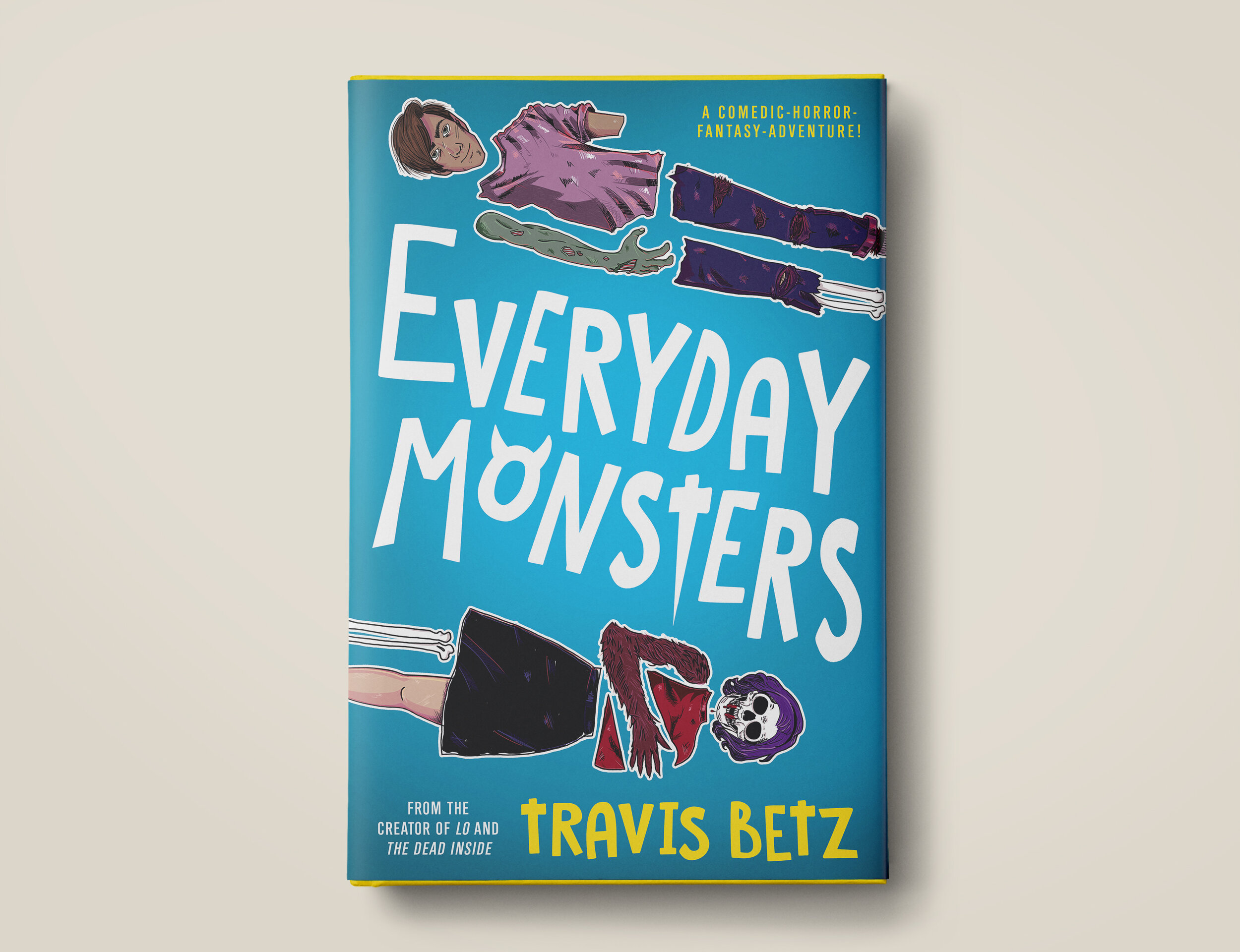
When developing the initial roughs, I looked to highlight these key attributes, along with the important themes of death, love, self-identity, and human-connection, each found within the story. I looked to bring each of these elements to life in a different way, to give each concept its own unique interpretation depending on which theme was deemed to be the most important when pitching to potential readers. Some concepts focused more on the internalisation of Stabbers’ struggles within his own mind, others the meaning of death and reinvention, while some focused on the parallels as well as the connections that can occur between two opposing sides. Discussing with Betz the different approaches and where we could go from here, he was most drawn to the concept illustrating Hellswood and Stabbers on the cover in their many forms. Focusing on the satiric humour of the story, with a Frankenstein mix-match of the various forms they take on throughout the course of the book.


In the process of finalising the design, we made minor adjustments to both characters clothing, touched up the types of creatures they become, swapped in the more icon-infused typography and tested out various versions of the colour palette finally landing on the complementary contrast of the bright blue and warm yellow. The end result being a cover design that is bright and eye-catching, an overall layout that balances both YA and Adult Fiction, and illustrations that both show the dark and light-heartedness of the book.


I was so pleased that Travis felt as passionate about this concept for Everyday Monsters as I did. When working up the mock-ups, I just knew this one had to be it and was so glad it was the one we ended up with. As human beings, no matter what age, we are constantly reinventing ourselves, whether that be on purpose, through forced experience or by accident. Whether you are 16 and finding your way in high school, starting a new career in your 30s, or figuring out what your next chapter should be in your 50s, we are all made up of different pieces. As a book that focuses on two characters being constantly reinvented, figuratively and literally, with the good bits and the bad bits, a puzzle-pieced-person cover just seemed so fitting of this wonderfully weird, sad but heart-warming, dark yet humorous, adventure story!
Final cover

Editor, artworker and lifelong bibliophile.