Glen Wilkins on Designing The Cabinet
Glen Wilkins is a Graphic Designer and Art Director with more than 20 years’ experience in crafting print, websites, apps, and email campaigns. Here he takes us through his process for designing the wonderfully quirky cover for The Cabinet.
I worked through a lot of concepts for this cover, as I liked the idea of going quite left-field with the design. So I looked at Eastern colour palettes and imagery, especially toys and Manga-style images. I really like the jackets designed for Ryu Murakami, they have a lovely balance of photography and pop art.


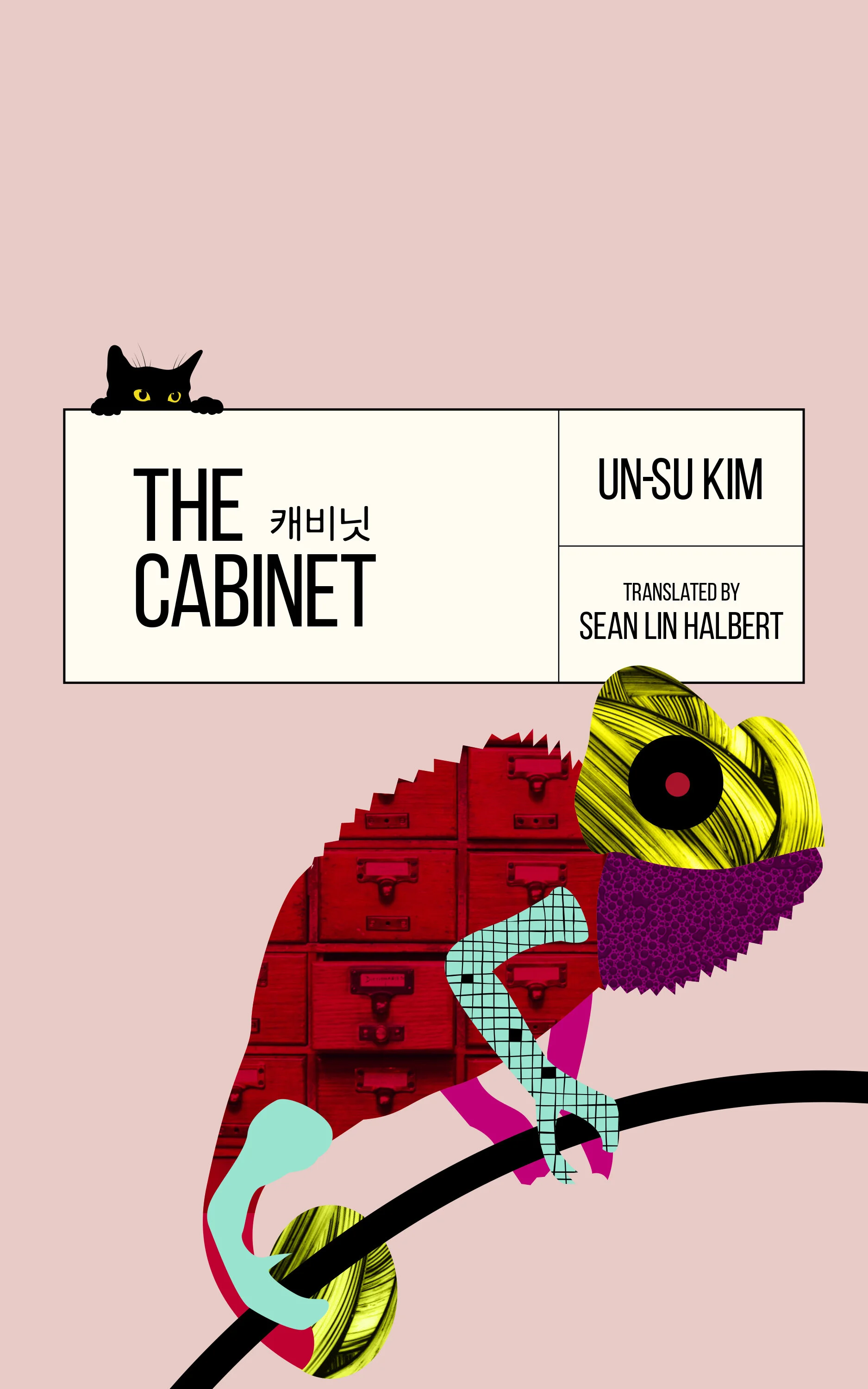
As I rough out (my roughs are quite polished but I still call them roughs) each round of design ideas they are shown to the publishers, marketing and sales teams for feedback or comments. This way I know that everyone is on board with the design, that it meets any sales criteria and that it fits in with ideas the publisher may have had. Design elements can trickle down the cycles, some kept, some abandoned and some spark new ideas. By round three I'd worked out the typography and the "Millennial Pink" that ended up on the cover. I took the typography and the boxed motif from an old library index card and kept the typeface very simple, all in the same weight, all caps and then just varied the size to give emphasis to the title and author.
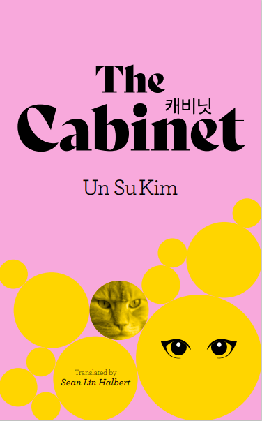


My design technique is to constantly evolve and tweak the covers, broad strokes of ideas first, then iterations of type, of colour and of technique (illustrated, photographic, 3D etc). I also throw in new ideas that I may have. It's extra work but it does mean I get to explore every possible solution and that makes for a cover that I'm proud of. I keep all the work as some of the ideas or techniques used can occasionally be recycled for other projects and it's also very satisfying for a designer to enjoy the whole process and not just the end result. By cycle five of ideas, I had started drawing flowers and ginkgo leaves in a very stylized, graphic way. Simple shapes of leaves and petals filled with graphic shapes, photographic images, patterns and textures and coloured with primaries - red, yellow and black. They really popped from the pink background and were very strong, unlike a lot of titles on the shelves right now, I think.
I was now up to the eighth cycle of design ideas and decided to use the same treatment but instead of flowers, to draw a lizard (I also liked the idea that lizards and chameleons can change colour so it seemed quite apt). To reinforce the books title I dropped an image of old library cabinets into the illustration itself. The shape of the lizard was more arresting on the cover and allowed me to play with layering and positioning. Some of the illustration bleeds off the bottom and right of the cover, making a slightly awkward shape and then I overlapped the title box and this pulled everything together.
The final small touch was adding in the peeking cat with bright yellow eyes. I think it adds a playfulness and a hint that there's lots to discover in the cabinet. There's a lot of intentional empty space on the cover and that beautiful pink was desaturated a little. This all helped the title and the imagery fight for your attention.
Final cover
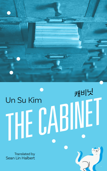
Proof copy cover
Editor, artworker and lifelong bibliophile.