I knew Chutz would be the first typeface to start off the new year when I saw the lower-case letter “n” in a test setting of Chutz Bold. It reminds me of two physical positions: One is of a short-distance runner with its vaulted back, legs ready to sprint and head down, waiting at the starting line for the referee to begin a race. The other is less heroic, albeit no less human; the position looks a lot like a person holding a scrub brush in hand, crouching on their knees, washing a floor. The same can be said for the lower case “m”, where the person has two arms placed on the floor. I am curiously drawn to letters that contain unexpected anthropomorphic characteristics.

This is an utterly subjective and decidedly unhelpful measure (for you the user) to evaluate and recommend a Font of the Month, but there are many subtle elements of a typeface (some that are purely aesthetic, others practical) that draws both typographer and reader into identifying with a font (like a thematic apperception test). There are no other surprises in Chutz that I can see, but there is one overall sensibility that Michcael Rafailyk notes: The alphabet is based on Hebrew letters and was originally designed as a proprietary face for a Kosher food company (Feisty Foods) in Brooklyn, New York. (Perhaps that is why I see the “n” as my grandmother, who was continually washing her floors). Using the type-tester, I recognized another subtle reference, that ignited my tastebuds, the word “SECOND” brings to mind the sign of the once-legendary, now gone SECOND AVENUE DELI in New York.
Whether a typeface triggers simple memories, like I have described, or not, Chutz is an enjoyable face to play with. The slanted nature implies motion. This is not a static face in any of its weights. The typeface has integrity beyond the initial starting point of faux-Hebrew pastiche. And there is an intoxicating relationship between the letters that feels like the best of Speedball and brush lettering.

I experimented with randomly mixing the two cases within the same word, with great pleasure. Take the word “EXOTiC” (with lowercase “i”) as an example: Each letter has individuality, while together they are harmonious, not dissonant – and in this case there is also a pleasant surprise: The cap “O” is not a circle or oval but a roughly drawn character that enhances the other more precisely rendered letters.
A final note: Some of the letters, including the lower case “i” have serifs, and others a swash-like tail; likewise, the upper case “T” has alternative serif and flourish bottoms. This is a family of charmed, unconventional characters, and after an hour of test-driving, the most impressive aspect of Chutz is its unpredictable wit — Chutz made me smile.
| Font of the Month: Chutz | |
|---|---|
| Designer: Michael Rafailyk | Foundry: Michael Rafailyk |
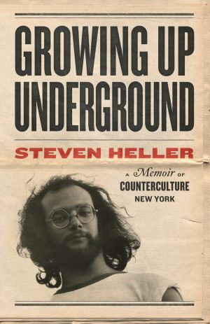
 Steven Heller is nothing short of a legend in the design community. Award-winning graphic designer, author and editor of hundreds of books (yes, 100s!) and one of the world’s foremost authorities on graphic design history; and arguably its best design commentator. Follow Steven on the must-read The Daily Heller and read his latest book, Growing Up Underground: A Memoir of Counterculture New York.