
The creative people at studio Futura created this fresh, fun brand identity for Oop.
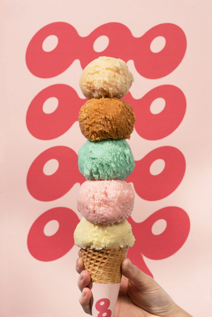
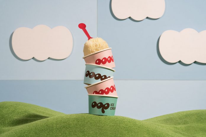
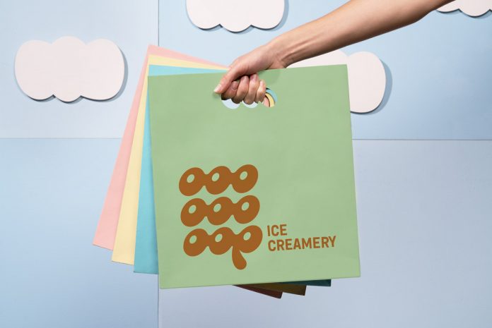
OOP is an ice cream shop based in Qatar. Based on the friendly and familiar concept, the people at studio Futura created a visual experience that looks fun with a nostalgic wink.
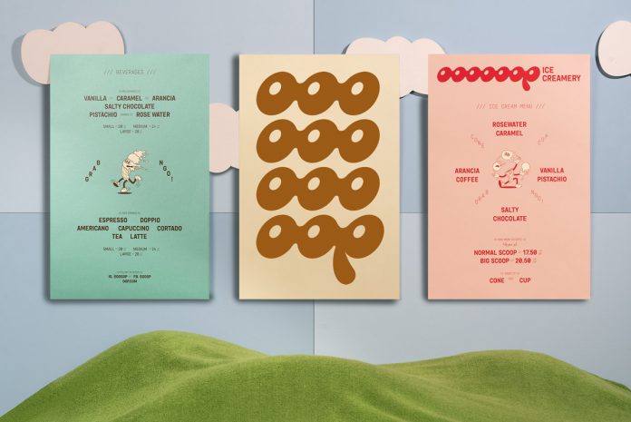
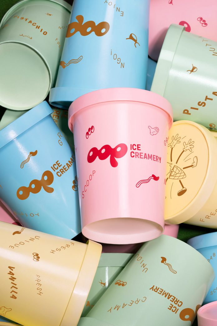
For the logotype, they went with the flow (literally) and played with the melting sensation of one letter into the other, personalizing the typography and avoiding edges for a round, wavy finish. Through repetition, they achieved a staple look that feels fun and lively.
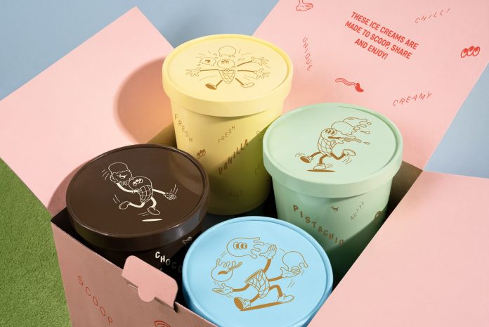
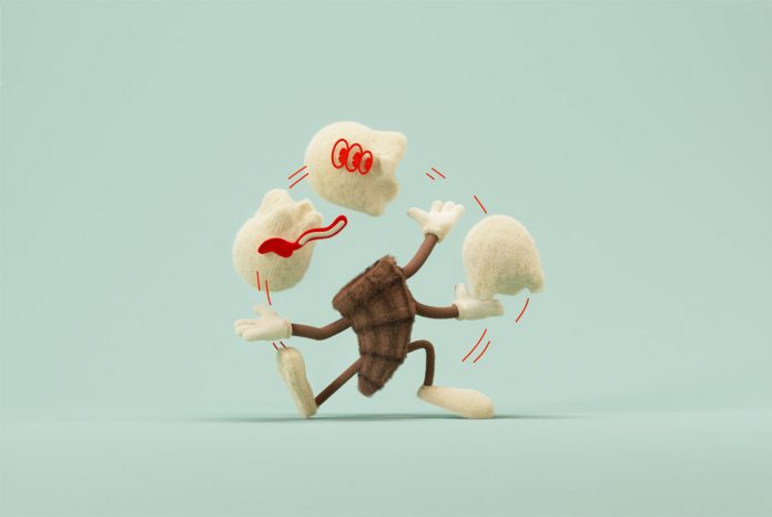
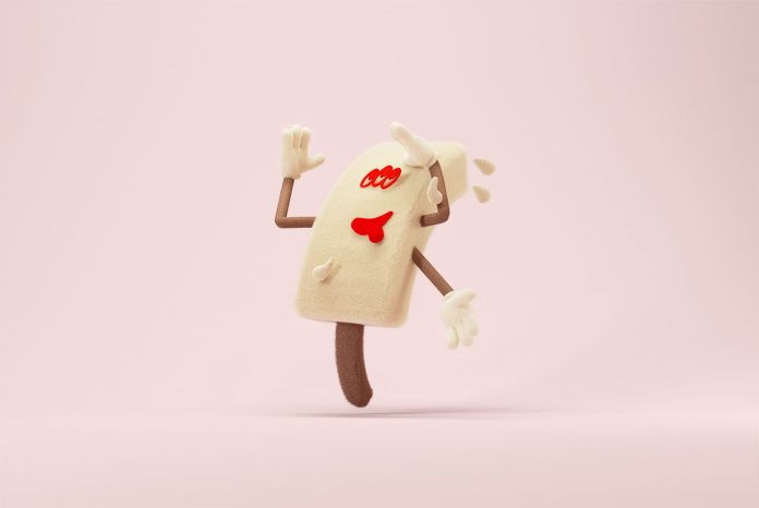
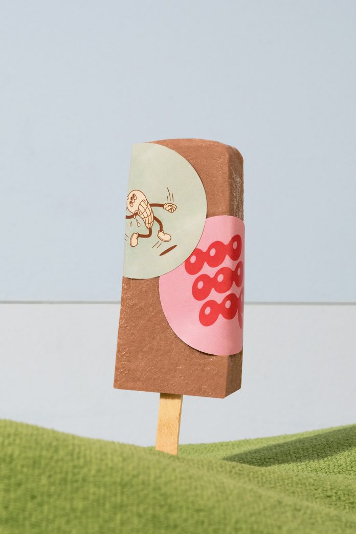
The editorial system uses a more structured, monospaced sans, that contrasts with the constant loop of the logotype. They complemented the brand identity with illustrations of a vintage cartoon-inspired character in order to tell the story of how living on the run can be pretty hard while melting. Diagonal text compositions reflect a spontaneous nature, just like the whim for ice cream. The color palette is inspired by the pastel tones of vintage ice-cream shops, only disrupted by bright tones to make it interesting and contemporary.
All images © by Futura. Do not hesitate to find more creative work in the Branding, Packaging, and Graphic Design categories.
Subscribe to our newsletter!


