I am somewhat perplexed why designers like myself are seduced by the streamlined styles of Italian Futurist-era type and typography? Are revivals like this month’s selection, Valvolina (Device Fonts), appealing as radically aesthetic alternatives to classical Italian letters? Does Valvolina’s thrusting geometric angularity evoke a radical ethos of motion and energy? Does it suggest today or yesterday?

Perhaps I am reading too much into it? Valvolina (which borrows the name from a motor oil) is not symbolic at all but rather has startling resonance on a page or screen. Or as Sigmund Freud might have said, ‘often a typeface is just a typeface.’

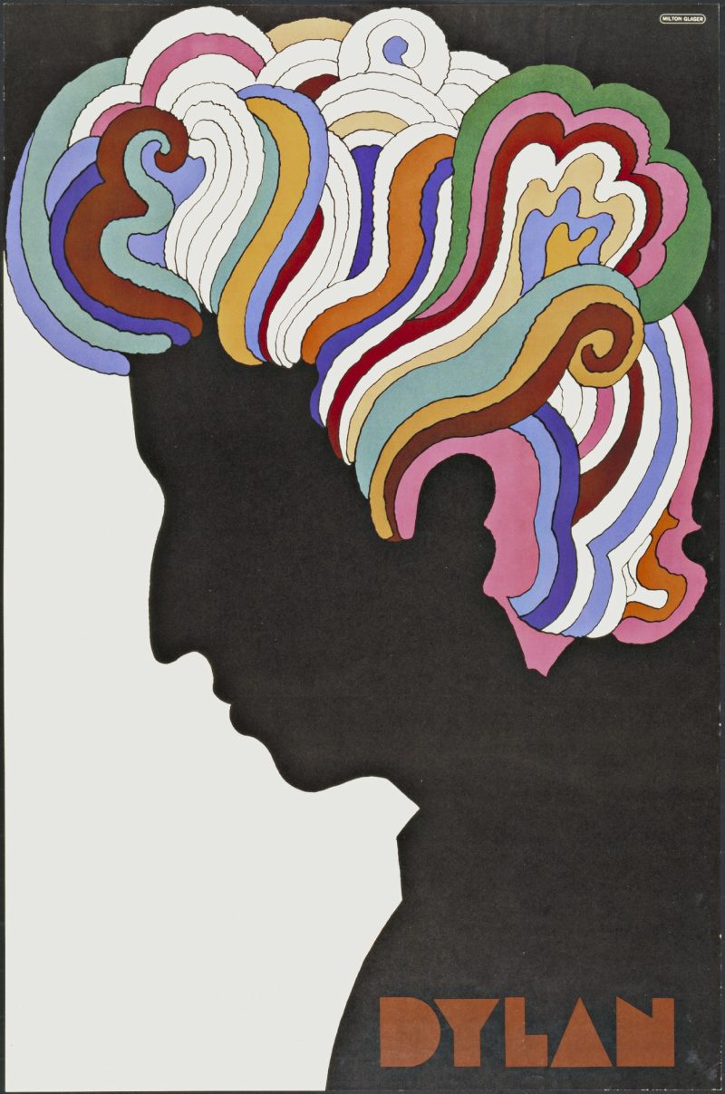
Dylan by Milton Glaser, 1966. Image © MoMA
This sharp-edge-abstract sans-serif has sparked other appropriations, notably Milton Glaser’s 1968 Baby Teeth typeface (the only type used on his famous ‘Dylan‘ poster), which he had originally found on a sign in Mexico and was a popular display face there. During the 1920s and '30s, Italian foundries released similar hand-drawn, wood and metal iterations.

So, unless my eyes and memory deceive me, it seems that the Valvolina style may be on the verge of a new popularity inspired by its bizarre yet engaging assemblage of contrapuntal shapes; when used for display in large and small sizes it exudes a sense of modernist hieroglyphics. It comes in an outline style as well, which allows for much flexibility.
 Steven Heller is nothing short of a legend in the design community. Award-winning graphic designer, author and editor of hundreds of books (yes, 100s!) and one of the world’s foremost authorities on graphic design history; and arguably its best design commentator. Follow Steven on the must-read The Daily Heller and read his latest book, Type Speaks.