Shreya Gupta on Illustrating a Timeless Classic: Little Women

Shreya Gupta is a New York based illustrator. She is originally from India, but her passion for drawing and illustration brought her to the United States, where she pursued an MFA in Illustration as Visual Essay from the School of Visual Arts, NY. Here she takes us through her process for illustrating the 150th Anniversary edition of Little Women.
Here’s the process of creating the cover and the illustrations for one of my favorite projects to date.
Carina Guiterman, who was then an editor at Little, Brown, came across my work and reached out to me for this project Little Women - 150th Anniversary Illustrated Edition. I was thrilled to get this project but also the timeline was very short. We had two months to finish the cover, the endpapers and 47 chapter headers along with reading the entire novel! But working with Carina and the art director, Mario Pulice, was such a pleasure.
The Cover:
My editor had mentioned at the beginning of the project that even though the story is over a hundred years old, the book should look very contemporary. I know the book has been printed many times, and most times an artist had interpreted the March sisters in their own way on the cover. So I wanted to stay away from repeating that. I do editorial illustrations also, in which I use symbols a lot. So I thought of bringing that approach to the cover. Each March sister has a very different personality and things they like. So I used a hand mirror for Meg (who cares about beauty), a book for Joe (who loves reading and wants to be a writer), piano keys for Beth (who loves music) and a paint brush for Amy (who aspires to be an artist). We also wanted the book to look charming and timeless, so I decided to use flower patterns to bind all the symbols together. Following are very quick sketches sent for the first round, then color options along with final layout, and then the final color sketch.


Final cover
Initially, I was commissioned to do just the front cover, but after the sketch round I was asked to do the whole jacket. The typeface Kennerly was suggested by my art director Mario Pulice. It's an old style serif, and seemed to perfectly integrate with the illustrated cover, so we decided to go ahead with that.
The back copy was later changed to a quote from the book. Here’s the final cover:
Final full cover
Chapter Header Illustrations:
For the chapter headers, I wanted them to have a similar look as the front cover. Also they were going to be 2-color illustrations. One color was black, and I decided blue as the second color as that was the dominant color on the front cover. I first read the chapters, and then sent sketches for ten chapters at a time. While Carina reviewed my sketches, I would start working on next ten, until completing all 47 chapters in total.
The illustrations for chapter headers were done using ink on paper, and then colored in Photoshop. Here are some of my ink drawings:
And a few final chapter headers:


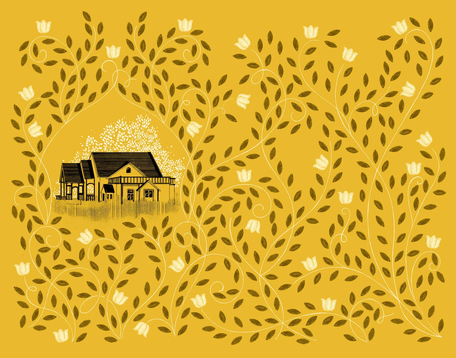
The Endpapers:
The endpapers were done at the end, because I wanted to do them after I had read the entire book which I was doing as I was sketching the header illustrations. I wanted to do a story telling concept for them, and suggested the idea of showing the homes of the March sisters. At the beginning of the story, the sisters are poor but still happy, but at the end they have inherited a mansion from their aunt and are very happy with their own families. I continued the flower pattern on to the end papers, and on the front one a few are blooming, but in the end one they are in full bloom.

Throughout the entire process, my editor and my art director put a lot of trust in me, and I think that gave me the opportunity and freedom to create something very special.
Editor, artworker and lifelong bibliophile.